SK-II - Concept Pitch
Hugo Jackson
SK-II - THE ESSENCE OF CELEBRATION
Purity Meets Passion.
THE CHALLENGE
Balancing Science and Festivity.
SK-II is a brand defined by two distinct pillars. First, the "Miracle Water" (Pitera), which represents scientific purity and translucence. Second, their bold, artistic Limited Edition releases that celebrate culture and holidays.
The brief was to create a cohesive visual series that could showcase both identities simultaneously. I needed to visualize the iconic "Crystal Clear" skin benefit while introducing the vibrant, matte-red energy of the New Year Limited Edition bottle without them feeling like two different brands.
THE CONCEPT
Structure and Flow.
I developed a concept based on Architectural Minimalism.
Instead of using standard holiday props like confetti or gold dust, we deconstructed the idea of "Celebration" into geometric forms.
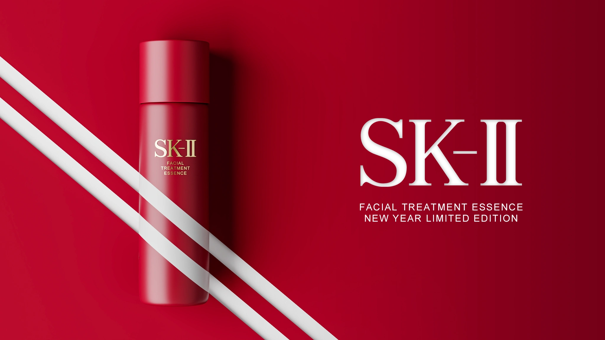
The Ribbon: Represented by sharp, diagonal white lines cutting across the red bottle.
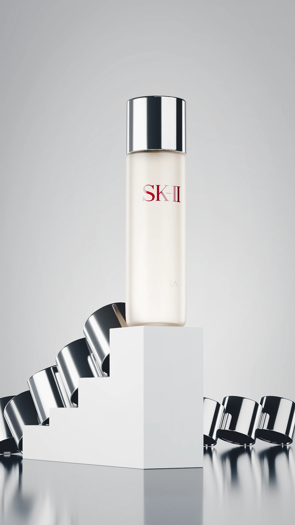
The Ascent: Represented by the white staircase, symbolizing the elevation of skin quality.
The DNA: Represented by the chrome rings, hinting at the science behind the luxury.
THE VISUALS
Three Dimensions of Luxury.
The Red Edition (The Art of Gifting): This image focuses on bold graphic contrast. I placed the matte red bottle against a matching deep red background to create a "tone-on-tone" infinity curve. To break the flatness, I introduced rigid white diagonal bands that mimic the wrapping of a gift or the dynamic movement of a ribbon, creating a striking, poster-ready graphic.
The Silver Ascent (The Science): For the classic clear bottle, I built a surrealist environment. The bottle stands atop a pristine white staircase, suggesting a step up in skincare rituals. In the background, unspooling chrome rings reflect the studio lighting. These metallic curves act as a visual metaphor for the molecular structure of Pitera and the cyclical nature of skin renewal.
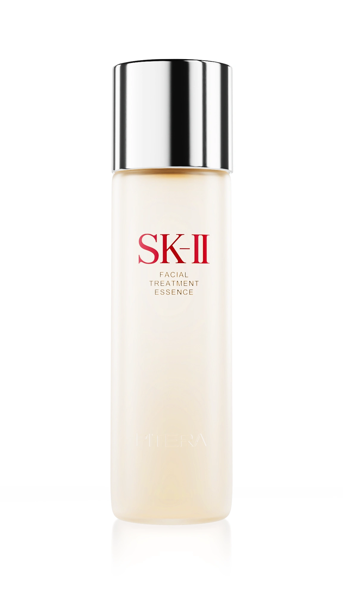
The Icon (The Pure Essence): The final shot is a study in translucency. I isolated the classic bottle on a pure high-key background to focus entirely on the liquid inside. The challenge here was the "Cloudy Liquid" shader. SK-II isn't water; it is a fermentation filtrate. I dialed in the subsurface scattering to capture that slight, golden-yellow hue that proves the product's authenticity to the consumer.
TECHNICAL CRAFT
Defining Surfaces.
The success of this project relied on differentiating materials.
Matte vs. Gloss: The Red Edition required a "soft-touch" matte shader that absorbed light, contrasting heavily with the sharp reflections of the white bands.
Chrome Anisotropy: For the silver cap and the background rings, I utilized anisotropic reflections to stretch the specular highlights, giving the metal a brushed, premium feel.
Liquid Volume: I calculated the refraction index of the glass wall versus the liquid volume to ensure the inner tube and the meniscus line looked physically accurate.
THE RESULT
A Unified Portfolio.
This project bridged the gap between the clinical and the emotional. By keeping the lighting crisp and the geometry simple, I allowed the materials to do the talking. The result is a set of assets that feels festive enough for a holiday campaign but clean enough to live on the permanent product page.#
Let's work together! Do you need branded visuals for your product or company? Book a call today!
Like this project
Posted Jan 4, 2026
A 3D campaign contrasting the iconic "Crystal Clear" glass essence with the bold, graphic energy of the New Year Limited Edition.
Likes
0
Views
7
Clients
SK-II