The network for creativity
Join 1.25M professional creatives like you
Connect with clients, get discovered, and run your business 100% commission-free
Creatives on Contra have earned over $150M and we are just getting started
Back to feedPost
Taste Test
Old vs New hero section for "Coacha" template
Live preview - https://coacha.framer.website/
24 voted
18%
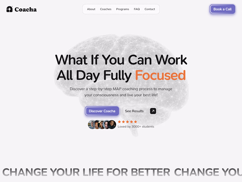
106 voted
82%
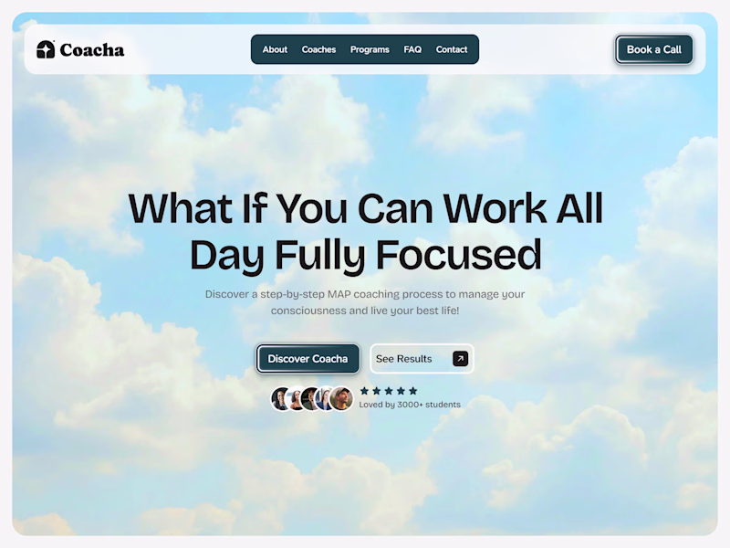
130 votes
Closed
The new design feels more focused and clean.
Appreciate!
Amazing 🔥
Thanks!
The New looks so unique!
Thanks, that was a goal!
You're welcome!
Both works for me
The old would be even more amazing if the brain is a vector element that has a subtle mouse effect.
Great work in all
Valid, Timothy!
The new one looks far more better than the old one
Tysm!
The information pacing and readability on the left layout is vastly superior.
Appreciate it!
The New works better for me. The old looks a bit too dull. But the new looks attractive and vibrant in the eye
Thanks!
You are welcom
both are nice the brain represent a lot
Yep!
the worst thing of the old was the font 💀
I loved it at first, but now it doesn't look right for me too :)
@Rokas Griškonis I have a suggestion for the "What Sets Coacha Apart" section. You should change the placement as "Working with Coacha - on the left side" should come first, and then there will be "What your competitors - on the right side" are doing.
I hope this will help you! 😃
OK, but why?
Your brand features should come first while comparing with others
Interesting! I will look into it.
New is better!
Much love, Atolani!
Love those reveal animations!
Thanks!
I just like the brain in the hero section make it urge but both are really amazing
Tysm!
New
💯
I would go for the new version because the background suits the content so well
💫
I would be ready to apply for it
Hahah! I like it, thanks.
New one
🫶
New one is better!
Ty!
New one is way improved
Tysm!
Of course, Cipher. I agree! Do you have any suggestions?
Appreciate your opinion!
I have tried to make secondary button white and to reduce BG image opacity.
1. Secondary button doesn't look good fully white
2. BG with 85% is maybe better, not sure yet, I think body text is more readable now.
And what about nav bar? Do you I think...
Nice composition, the hierarchy makes it very easy to understand. (New)
Happy to hear that!
I will go with the old for clarity
Cool, Chris. It’s all good!
New version is refined with clear and captivating framework.
🤝
the right version is an absolute banger 💯
Love it! Thanks for beautiful comment!
The old works for me
It's better than new one for you?
yeah, new one:)
Appreciate it, Hanna.
I like more the new one. The old version was too ordinary. But despite I like more the new version, I have to say that for me at least, it doesn't convey the energy of what the company is about. A beautiful sky with clouds is more related to daydreaming and that's the opposite...
The sky is your potential. The clouds are what's currently blocking it :)
Happy to hear it!
Looks amazing!
Tysm!
Wow! 😯
🔥
The network for creativity
Join 1.25M professional creatives like you
Connect with clients, get discovered, and run your business 100% commission-free
Creatives on Contra have earned over $150M and we are just getting started
Related posts
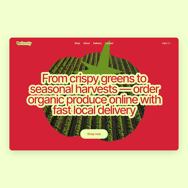
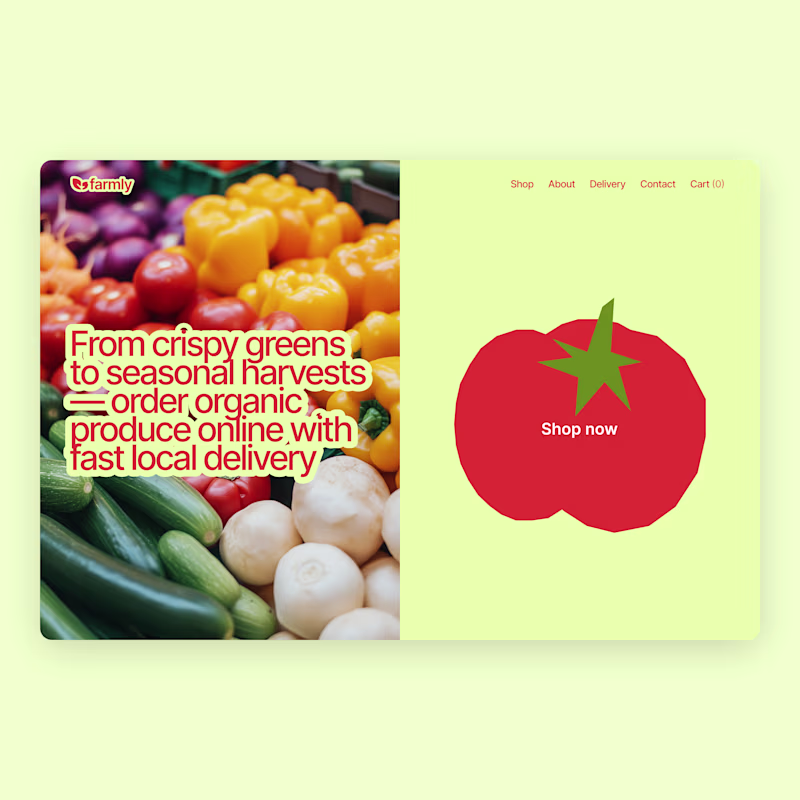
Planning to publish my first ever Framer template and can't help obsessing over the details. Which mockup should I choose?
2 voted
13%
14 voted
87%
16 votes
Closed
Looks minimal! What's the category of this template?
New project in the works - OneCare.
One app for premium care delivered to your address. Cleaning, beauty, healthcare at home, handyman, plumbing, pest control, pet care, laundry, and a lot more.
More to come soon 🤌
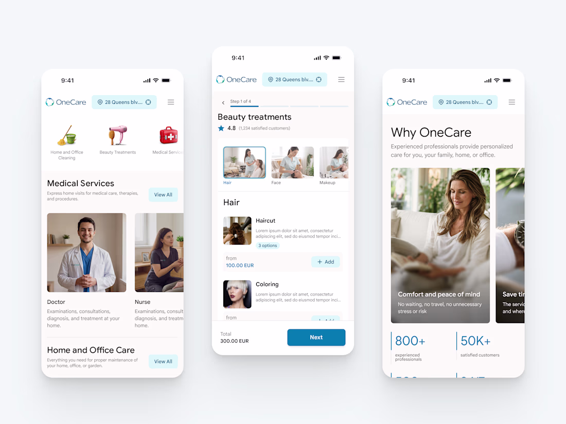
Nice work
I already shared the first concept a few days ago, but I couldn’t stop exploring 😅
So here’s an alternative direction.
Which one would you pick?
Vote below 👇
75 voted
63%
45 voted
37%
120 votes
Closed
Trending
Claude
Claude has entered the design space. How are you using Claude Design?
Contra University
Learn from expert creatives how to earn more using next-gen AI tools.
creativeaiflow
Creative AI workflows are evolving. What tools do you use, and what are their strengths and weaknesses?
freelancerlife
Freelancer life is wins, pivots, and everything in between. What’s yours right now?