
pro
Mian Muhammad Umer Parvaiz
Brand Identity & UI/UX Designer
Ready for work
Mian Muhammad Umer is ready for their next project!
Not every website should look the same.
Different industries.
Different users.
Different expectations.
This video shows how I approach design across multiple types of websites, from service-based to product-focused to corporate layouts.
Each one is built with a clear goal:
make it easy for users to understand, trust, and take action.
Same thinking.
Different execution.
Now I’m curious👇
Which design feels the strongest to you?
7
2
114
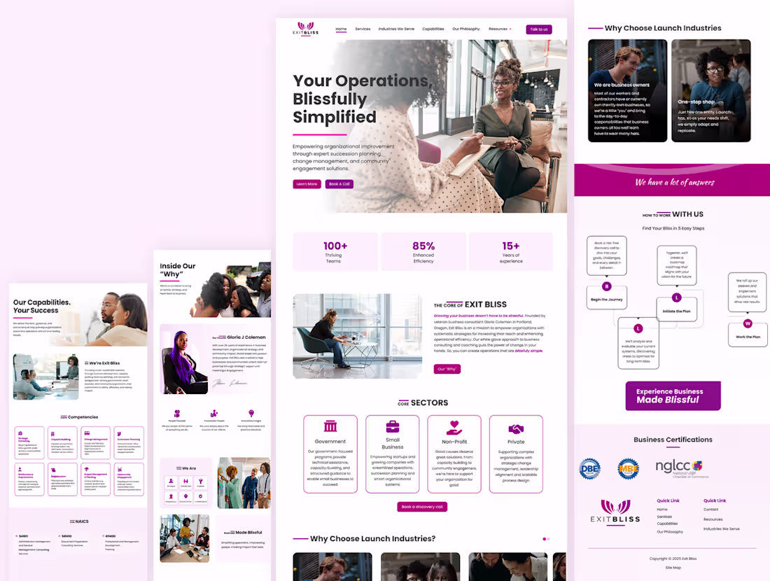
Conversion-Focused Website Design for Consulting Brand
0
3
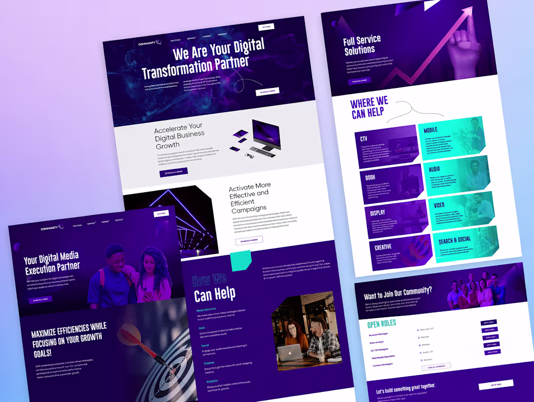
Digital Transformation Website Design
0
2
Different brands. Different goals. One approach.
This video shows a collection of websites built with the same focus
clarity first, design second.
Each layout is shaped around what the user needs to do, not just how things look. Whether it’s exploring services, understanding an offer, or taking action, every screen is structured to keep people moving without confusion.
No unnecessary elements. No noise. Just clean hierarchy, strong direction, and a clear path forward.
Because when the experience makes sense, users don’t hesitate.
And that’s where results start.
When you visit a website, what keeps you engaged longer
clear structure or visual styling
2
1
147
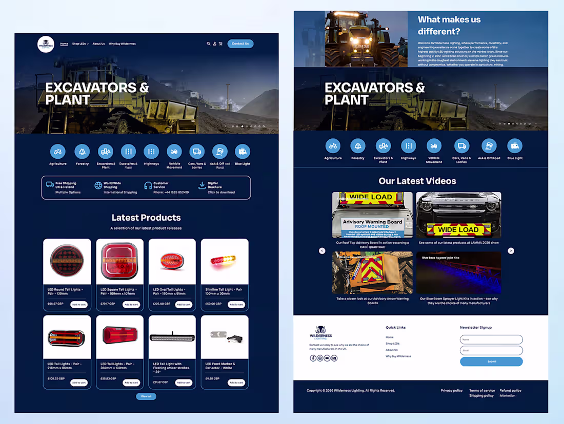
Ecommerce websites don’t fail because of bad products.
They fail because users don’t find what they need fast enough.
This project was built for speed of decision.
From the first screen, the goal is clear. Show the category, guide the user, and remove friction. No unnecessary steps. No clutter.
The navigation is designed to reduce effort. The product grid keeps things structured. Every section helps users move forward instead of slowing them down.
Even the darker interface isn’t just a visual choice. It creates contrast, highlights products better, and keeps attention where it should be.
Because in ecommerce, the easier it feels, the faster people buy.
When you land on an online store, what makes you stay
easy navigation or strong visual
2
1
132
This one was all about clarity.
A marketing website should explain value fast, build trust instantly, and guide users without friction. That’s exactly what this design focuses on.
Strong hero with clear messaging, structured sections that are easy to scan, and visuals that actually support the content instead of distracting from it.
Everything is designed to keep users moving forward without confusion.
When a website feels simple, people stay longer and take action faster.
That’s the difference.
2
136
There’s a difference between websites that look polished and ones that actually guide users to take action.
This video brings together multiple website experiences designed across different projects, each built with a clear structure and purpose behind it.
The focus is not just on visuals. It’s on how users move through the experience.
Layouts are designed to direct attention naturally.
Sections are placed to remove confusion.
Interactions are kept simple so users don’t hesitate.
Different projects require different approaches, but the thinking stays consistent.
Clarity over noise.
Structure over randomness.
Decisions based on how people actually use websites.
If your website feels disconnected or isn’t performing the way it should, the issue is usually not traffic.
It’s how the experience is designed.
1
116
People don’t struggle with design tools.
They struggle with making websites that actually work.
This video is a collection of website experiences I’ve designed across different projects. Each one is built with a clear focus on usability, structure, and real user behavior.
Instead of treating every website the same, the approach changes based on the goal. Some are built to drive sales, others to generate leads, and some to strengthen brand presence.
What stays consistent is the thinking behind them.
Clear layouts that guide users without confusion.
Interfaces that feel simple but are carefully structured.
Design decisions that reduce friction and keep users moving.
These are not just screens put together.
They are systems designed to help businesses communicate better and perform better online.
If you’re working on a website and want something that feels intentional and easy to use, this is the kind of work I focus on.
4
1
145
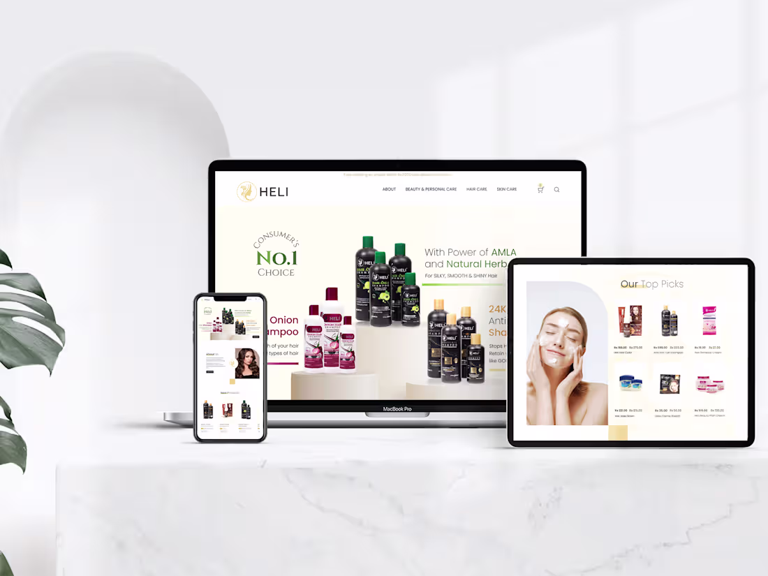
People don’t buy beauty products just because they exist.
They buy when the experience feels right.
This design was built around that idea.
The focus was to create a clean, premium interface that instantly feels trustworthy. Soft tones, balanced spacing, and refined visuals work together to give the brand a polished presence without overwhelming the user.
Every section has a purpose.
Products are easy to browse without clutter.
Key offers are visible without feeling pushy.
Important details are placed where users naturally look.
The entire experience is designed to feel smooth, especially on mobile where most users interact. Navigation is simple, actions are clear, and nothing gets in the way of the journey.
This is not just about making things look good.
It’s about making users feel confident enough to take action.
When design removes friction, conversions follow.
If your website looks decent but isn’t performing, it’s usually not a traffic problem. It’s a design problem.
2
156
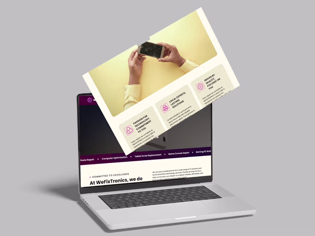
When something breaks, people don’t want to figure things out. They just want it fixed fast.
This project is a UI and UX design for a tech repair service focused on making that experience simple, clear, and reliable.
The goal was to remove confusion and guide users directly to what they need. Services are easy to find, actions are obvious, and the overall flow feels effortless.
The design focuses on clarity, strong visual hierarchy, and a clean interface that builds trust from the first interaction. Every section is structured to help users understand services quickly and take action without hesitation.
It is designed to work smoothly across desktop and mobile, ensuring users can book or explore services anytime without friction.
The result is a modern, conversion-focused experience that helps users move from problem to solution as quickly as possible.
1
152
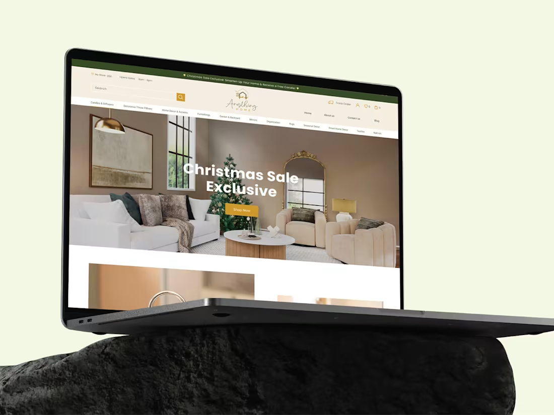
Most eCommerce websites feel cluttered and hard to navigate.
So I designed a clean, modern experience for a home décor brand.
The goal was to create a premium interface where products stand out and users can browse effortlessly.
The design focuses on:
– Clear visual hierarchy
– Minimal and balanced layout
– Consistent experience across desktop, tablet, and mobile
I also worked on product sections, collections, and promotional areas to improve product discovery and overall user flow.
The result is a modern, user-friendly eCommerce design that balances aesthetics with usability.
2
5
192
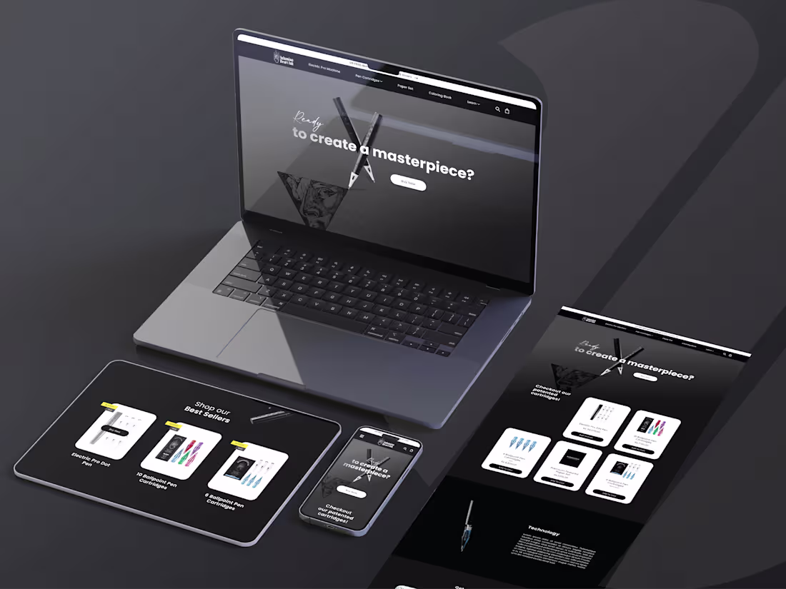
This project explores a clean and user-focused UI/UX approach aimed at improving usability and visual clarity. The objective was to design an interface that feels intuitive, structured, and easy to navigate.
I focused on layout systems, visual hierarchy, and consistency across components to create a seamless user experience. Each screen was designed with purpose, ensuring users can interact with the product without confusion or friction.
The result is a modern, minimal interface that balances aesthetics with functionality and supports a smooth overall experience.
2
2
171
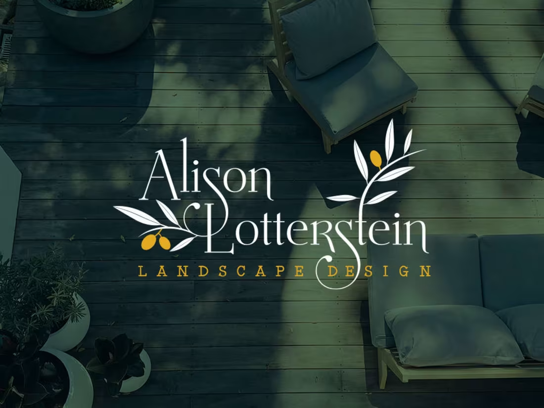
Alison Lotterstein Brand Identity Design
0
26
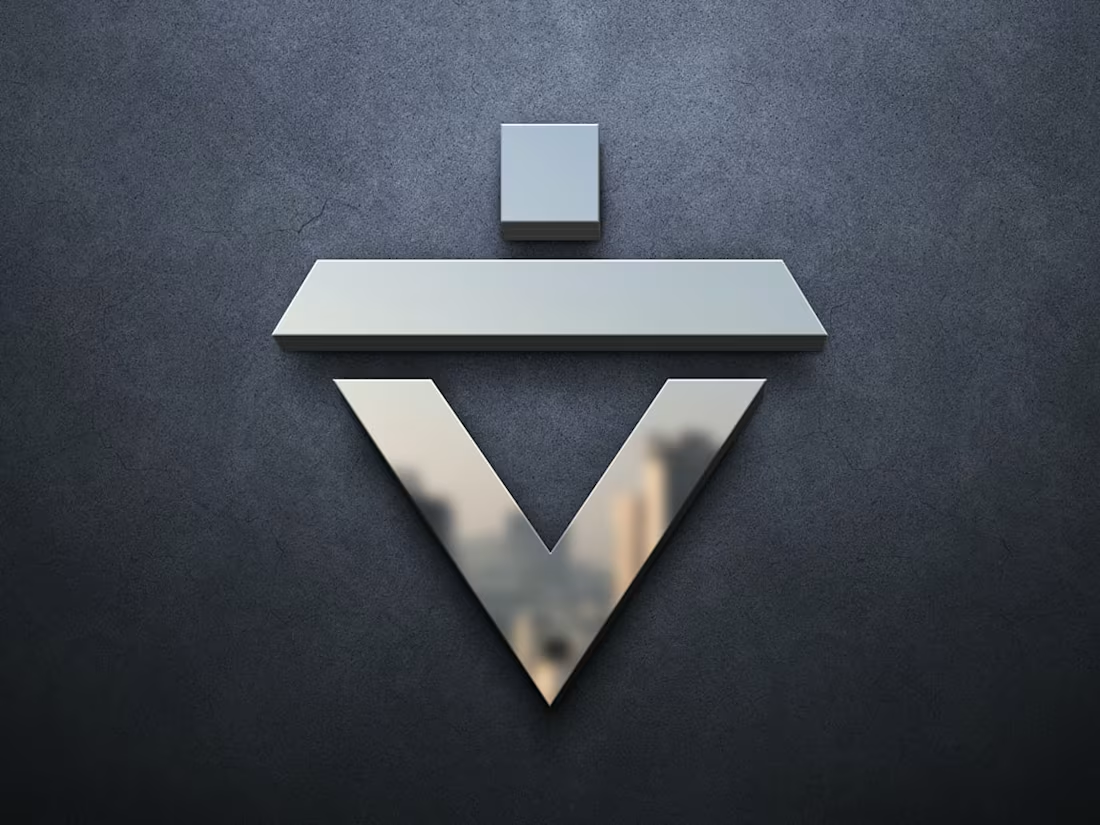
Valley Structure Brand Identity Design
0
14
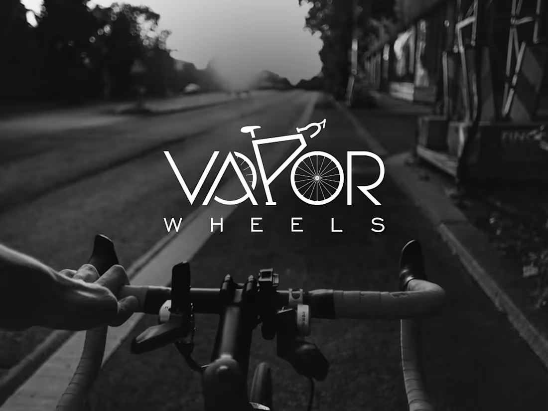
Vapor Wheels Brand Identity Design
0
16
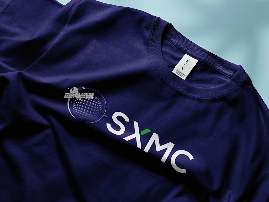
SXMC Brand Identity Design
0
13
Arcadia Ventures Brand Identity Design
0
6
Lizud Brand Identity Design
0
17
Holden Constructions Brand Identity Design
0
65
Involved Talent Brand Identity
0
54
Regnosa Brand Identity
0
23