
pro
Redesigned the FTUX for a fashion app for better conversion.
FTUX is where users decide if your product is worth their time. A few things that matter more than people think:
• Don't explain everything -> show one clear win FAST
• Reduced choices will guide user actions
• Progress is motivation (micro wins MATTER)
• Good defaults over asking too many questions, ALWAYS
• Let users feel "I get it" WITHIN SECONDS
FTUX should not be tens of onboarding screens. Nail the first experience, and retention becomes a lot easier.
2
17
1.7K
Designed a calm, decision-first product for RetailBook.
The core journey focuses on:
Discover → Understand → Evaluate → Participate
Where most financial apps push you to act, this one reduces the noise and helps you decide.
7
7
718
Mobile app design for AI based podcast generator. Design and prototype in Figma
3
6
564
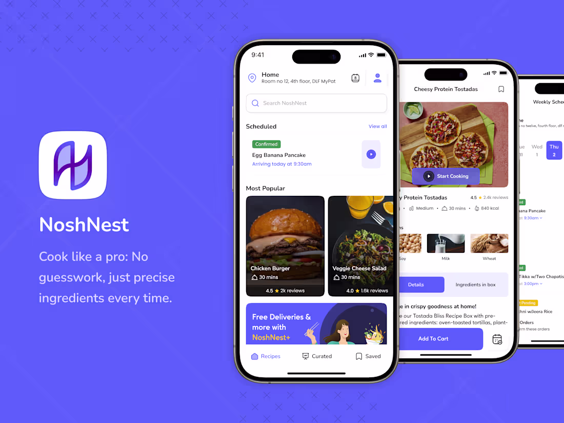
Redefining Culinary Convenience: Streamlining Cooking Process
3
31
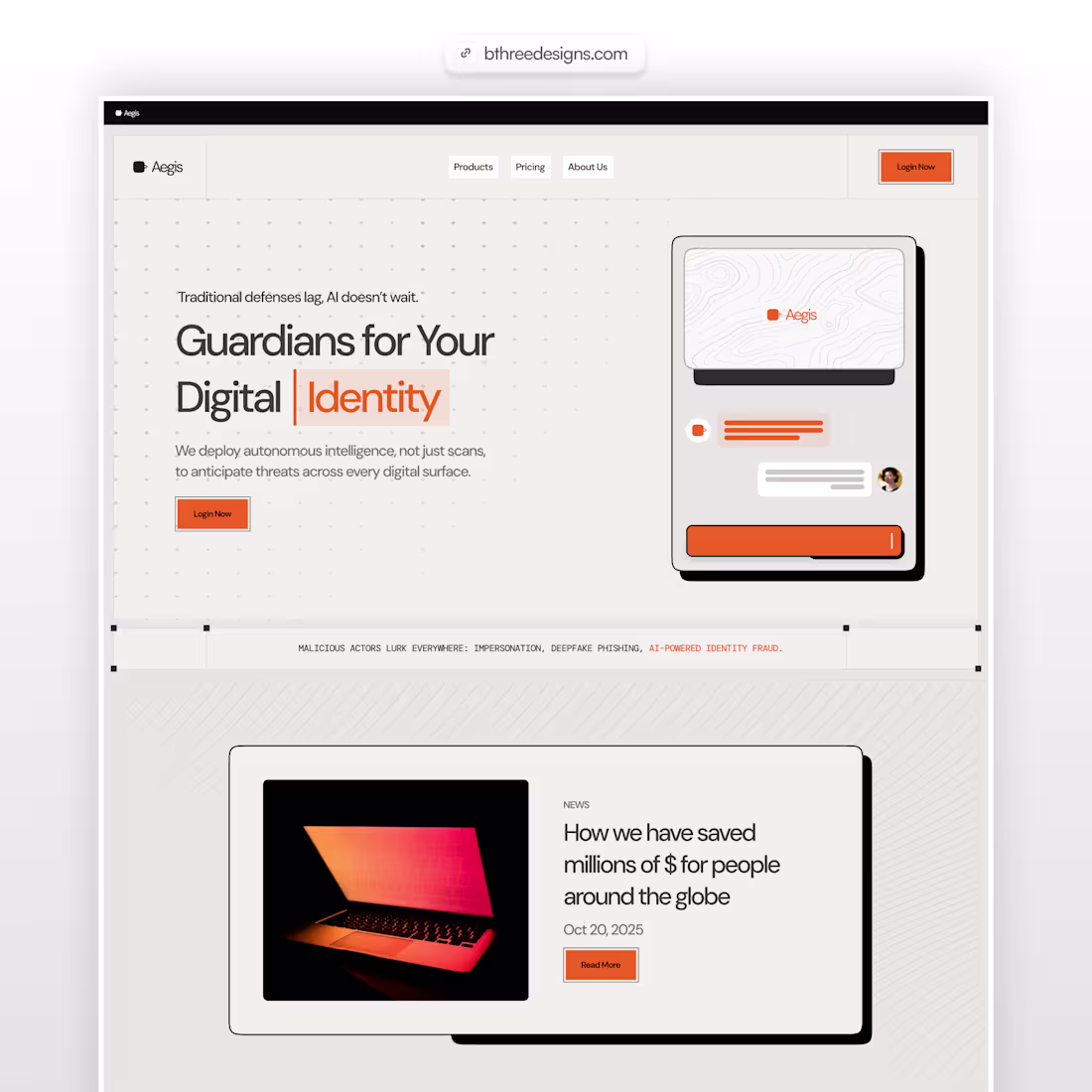
RetailBook Website Redesign for Institutional Trust
2
13
Just launched a fresh new website for a client. From ideation → designing → webflow development → live.
7
7
971
Another client website went live yesterday. Built in Framer in collaboration with Black Prism.
6
9
218
Designed this hero section in Figma. It is great to see ideas come to life without leaving the design workflow. Figma Motion is going to change how designers communicate interactions.
2
65
Webflow development
2
17
Delivered a complete website experience for an animal nutrition & feed science brand working at the intersection of animal health, food safety and sustainability.
This project was far more complex than "designing a clean website."
The real challenge was balancing two very different audiences on the same platform:
• A local Indian farmer looking for clarity, trust, and ease of use • A dairy CXO / institutional visitor expecting scientific credibility, validation, and product confidence
The website had to feel:
scientifically backed, but not intimidating
modern, but still familiar to rural users
natural and plant-based, without looking “alternative” or untested
premium enough for global scalability, while remaining accessible to on-ground farmers
Our approach focused heavily on simplifying complexity through visual storytelling.
Some key decisions we made:
→ Used farmer-familiar visual patterns for information-heavy sections The “Did You Know?” sections were intentionally designed with a visual rhythm similar to the way Indian users consume news and awareness content — making scientific facts easier to absorb quickly.
→ Simplified product discovery & buying flow Large product imagery, clear product hierarchy, and direct add-to-cart / inquiry pathways helped reduce friction for non-tech-savvy users.
→ Focused on multilingual accessibility from the start The entire structure was planned to work seamlessly across English and Hindi without breaking layouts or hierarchy.
→ Balanced “natural” with “scientific” The visual system used earthy tones, farm imagery, and organic textures — while integrating validation sections, trials, certifications, and ecosystem-based storytelling to establish scientific trust.
→ Designed for low-attention and non-digital-native users Spacing, typography hierarchy, contrast, CTA placement, and section pacing were carefully optimized to make scanning easier for first-time or less experienced users.
→ Built around visual education, not feature dumping Instead of overwhelming users with charts and technical language, we translated complex feed science into intuitive diagrams, illustrations, before/after storytelling, and easy-to-grasp systems.
→ Mobile-first thinking throughout A large portion of the audience would access the site from mobile devices in field conditions, so readability, tap targets, and quick navigation became core UX decisions.
→ Created trust without looking corporate-heavy The goal wasn’t to make it feel like a laboratory website. It was to make science feel approachable.
One of those projects where branding, UX, content structure, SEO, farmer psychology, and business credibility all had to work together as one ecosystem.
Would love to hear your thoughts 👇
1
307
Custom Landing Pages Collection
3
28
I have been using AI for brainstorming (majorly ChatGPT), to build wireframes and prototypes (Relume and Figma Make), to build assets (Midjourney, NanoBananaPro and ChatGPT). Sharing a quick hero exploration below. Did I miss any major design tools? Would love to learn more from fellow designers.
4
6
97
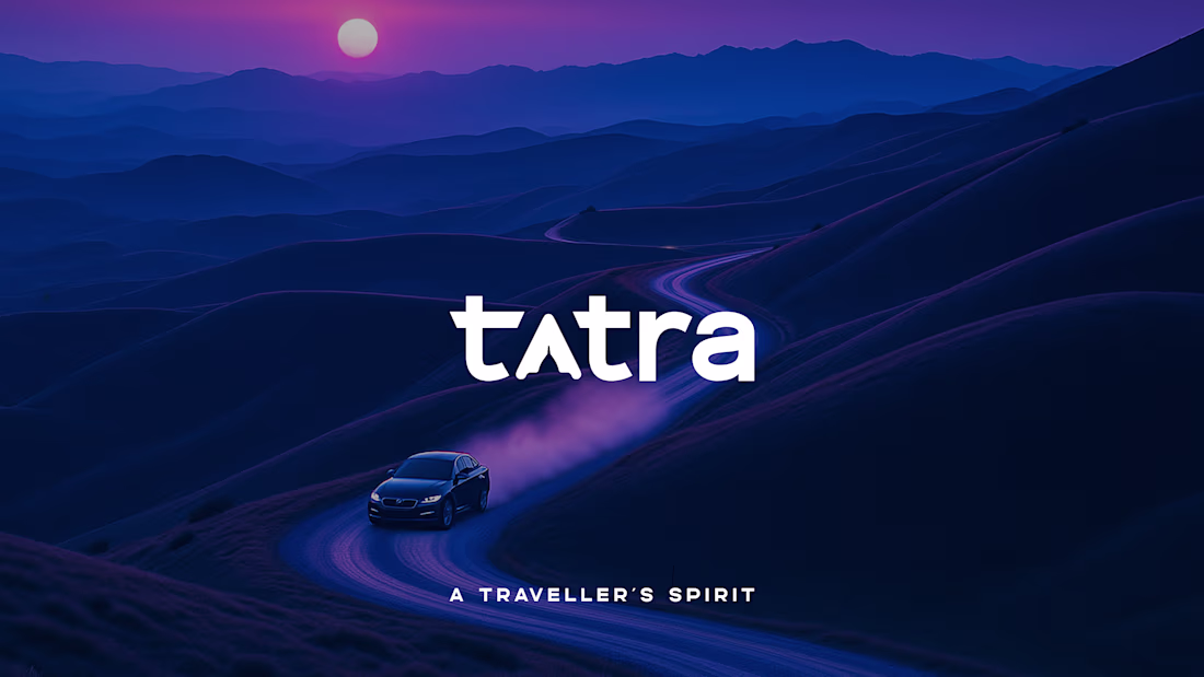
Tatra - Brand Identity
5
28
Deck design for a commercial real estate client.
In a world where prompts make decks, this one was made by a human. With opinions.
1
4
394
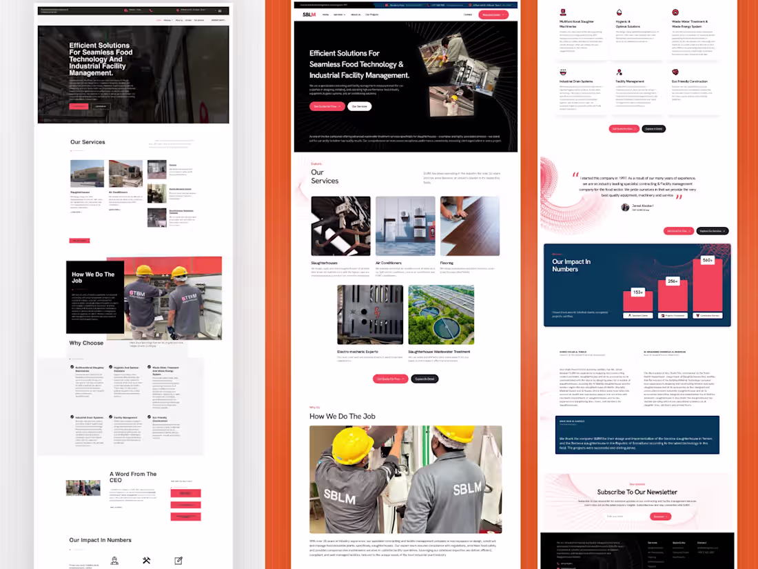
STBM website revamp proposal
1
17
Built this brand guideline for a deep tech VC, aiming for a muted yet distinctive presence that reflects intelligence, elegance and vision.
Curious to hear your thoughts.
6
464
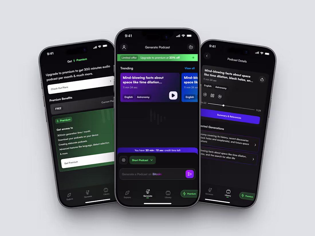
Podfast App - Generate Unique Podcasts with AI
4
25
Hero section design built on Framer. Explored the brutal style for the first time, how is it?
5
3
47
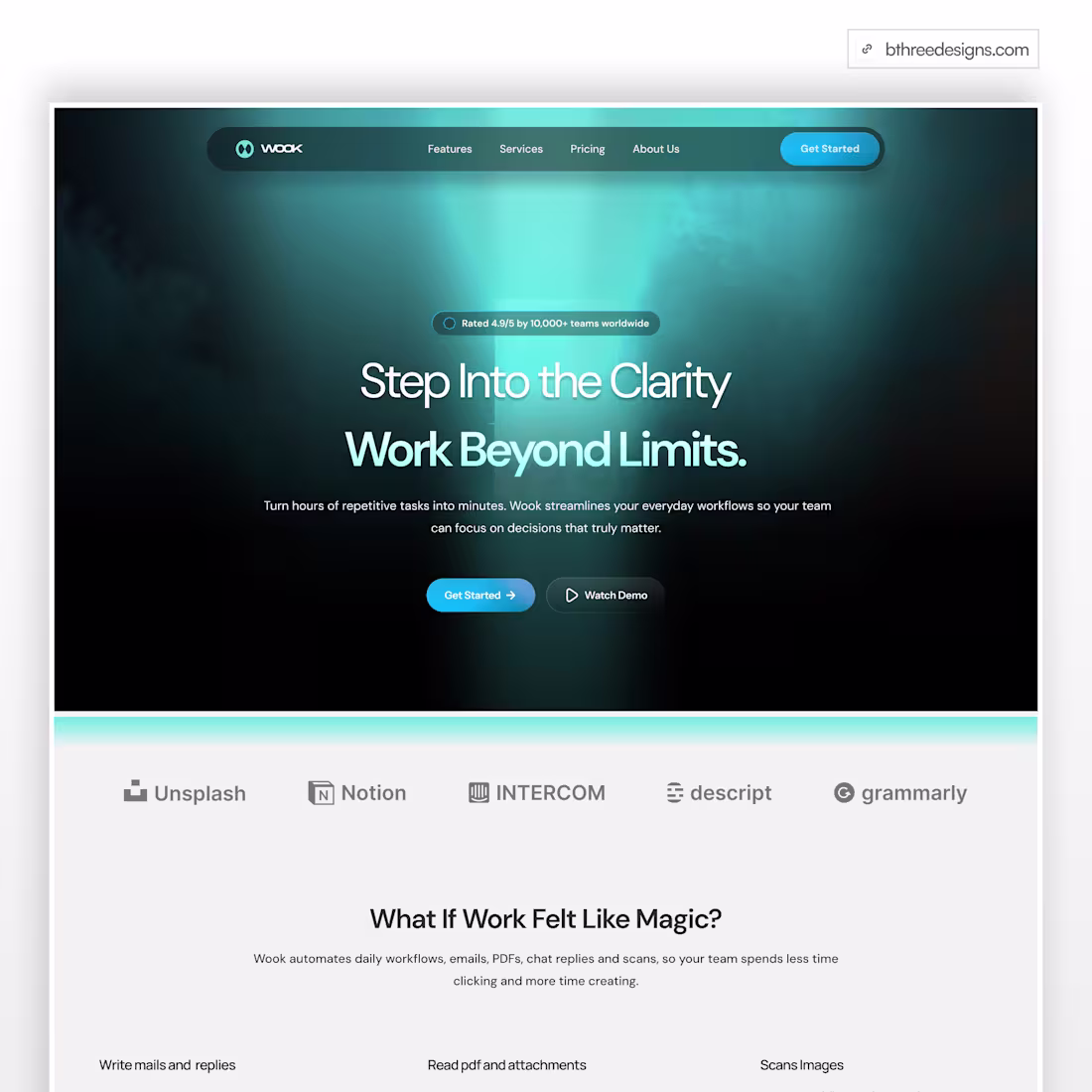
Step into clarity with my website design.
1
2
35