The network for creativity
Join 1.25M professional creatives like you
Connect with clients, get discovered, and run your business 100% commission-free
Creatives on Contra have earned over $150M and we are just getting started
Back to feedPost
Taste Test
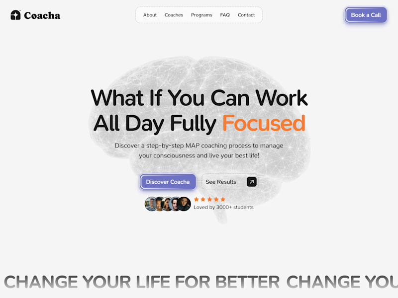
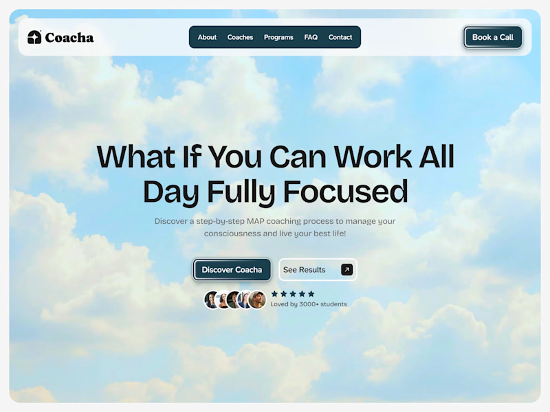
Old vs New hero section for "Coacha" template
Live preview - https://coacha.framer.website/

24 voted
18%
106 voted
82%
130 votes
Closed

Amazing 🔥

Thanks!

The New looks so unique!
Thanks, that was a goal!
You're welcome!

Both works for me
The old would be even more amazing if the brain is a vector element that has a subtle mouse effect.
Great work in all
Valid, Timothy!

The new one looks far more better than the old one
Tysm!


The information pacing and readability on the left layout is vastly superior.
Appreciate it!


The New works better for me. The old looks a bit too dull. But the new looks attractive and vibrant in the eye
Thanks!
You are welcom

both are nice the brain represent a lot
Yep!

the worst thing of the old was the font 💀
I loved it at first, but now it doesn't look right for me too :)

The new design feels more focused and clean.
Appreciate!

@Rokas Griškonis I have a suggestion for the "What Sets Coacha Apart" section. You should change the placement as "Working with Coacha - on the left side" should come first, and then there will be "What your competitors - on the right side" are doing.
I hope this will help you! 😃
OK, but why?
Your brand features should come first while comparing with others
Interesting! I will look into it.

Love those reveal animations!
Thanks!

I just like the brain in the hero section make it urge but both are really amazing
Tysm!

New
💯

I would go for the new version because the background suits the content so well
💫

I would be ready to apply for it
Hahah! I like it, thanks.

New one is better!
Ty!

New one is way improved
Tysm!

Of course, Cipher. I agree! Do you have any suggestions?
Appreciate your opinion!
I have tried to make secondary button white and to reduce BG image opacity.
1. Secondary button doesn't look good fully white
2. BG with 85% is maybe better, not sure yet, I think body text is more readable now.
And what about nav bar? Do you I think...

Nice composition, the hierarchy makes it very easy to understand. (New)
Happy to hear that!

I will go with the old for clarity
Cool, Chris. It’s all good!

New version is refined with clear and captivating framework.
🤝


the right version is an absolute banger 💯
Love it! Thanks for beautiful comment!

The old works for me
It's better than new one for you?

yeah, new one:)
Appreciate it, Hanna.

I like more the new one. The old version was too ordinary. But despite I like more the new version, I have to say that for me at least, it doesn't convey the energy of what the company is about. A beautiful sky with clouds is more related to daydreaming and that's the opposite...
The sky is your potential. The clouds are what's currently blocking it :)

Happy to hear it!

Looks amazing!
Tysm!

Wow! 😯
🔥

The improvement is great 👍
Thank you! I really appreciate your likes on my other posts too :)
You’re welcome ☺️
The network for creativity
Join 1.25M professional creatives like you
Connect with clients, get discovered, and run your business 100% commission-free
Creatives on Contra have earned over $150M and we are just getting started





Related posts

One small detail I didn't want to let go unnoticed in STUDIO HRSE: the nav doesn't just show you where you are, it follows you there.
It's the kind of thing most people won't consciously register, but it's exactly the level of care I wanted this template to carry throughout.
Free template, live on Framer


The layout is perfectly balanced, great eye for spacing.

$10K earned on Contra. 🎉💸
Grateful for every client who took a chance on me. This is just the beginning. More great products, more real partnerships, more milestones to hit. 🙌
Thank you to everyone who's been part of it. Onward. 🚀
#10k #contraearnings #Freelance #Webflow #Framer #Webdesign


Congratulations nice job 🎉🎉


Sharing a few recent projects 👋
It has been an exciting few months! A good mix of industries in this one, from an arcade and a mini golf hire company to car inspections and hospitality.
Excited to see what the rest of the year brings!


I should try adding blur also when slide goes back or a 0.1 delay in upcoming one,
the mid transition phase is bothering me