The network for creativity
Join 1.25M professional creatives like you
Connect with clients, get discovered, and run your business 100% commission-free
Creatives on Contra have earned over $150M and we are just getting started
Back to feedPost
Just shipped a new one. Marketing site for Elfa Studio, built in Figma + Relume + Webflow.
The goal was simple: make it minimal, make it convert, don't overthink it. Every section had to earn its spot on the page.
Went from wireframes to live site in about a month. Collaborated with Svitlana Subbota, who brought sharp UX/UI thinking to the project.
Site's not live yet (waiting on final content from the client, the classic hold-up), but the case study has the full walkthrough.
This is what I do: design it, build it, ship it. No handoff limbo. If you need a site that looks good and actually works, let's chat.
Full case study here:


Sick 🔥

Thank you!

Nice!
Thanks!🙌

Welldone!
Thank you!🔥

This is so 🔥
Thanks! Your NYX Smushy looks 🔥


Beautiful work.
Thanks man! I like how you handle a Supahumans brand🚀 🧠

Hi! Nice work. Which program you use to make this animation of all screens of work? Thx.
Jitter
Payed version or free?
paid😊


The layout on this is incredibly sharp, @Ruslan Subbota. Cleanest project I've seen today. 😍
If you ever want a second pair of eyes on the SEO or AI-readiness side, feel free to give me a shout. Would love to help make sure this gets the eyes it deserves. 🚀
Thank you, @Stanley Black ✨ I will keep in mind 🙌

Really good work man
Thanks man👍

wowoo~
yea yea🚀
🙌

Awesome!
Thank you!

so cool
happy to hear💯

Amazing work 😍
Thanks!

this is SO stunning.
Thank you SO MUCH!🔥

great work
Thank you 🙌

This is a nice work here

nice animation

Nice work!

Amazing!

nice animation

This looks good

Great execution, the orange system is consistent all the way through and the grid layout feels intentional without being rigid. Clean work. 🙌

good job


stunning!

Gorgeous work 🙌

This is an amazing project man

Pls can you walk me through getting hired on contra. im new here, need funding

Love this, great work team!

💯Amazing🔥

Nice work
The network for creativity
Join 1.25M professional creatives like you
Connect with clients, get discovered, and run your business 100% commission-free
Creatives on Contra have earned over $150M and we are just getting started





Related posts


Collage

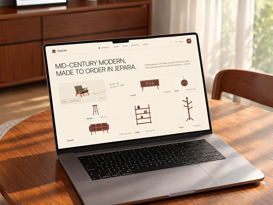
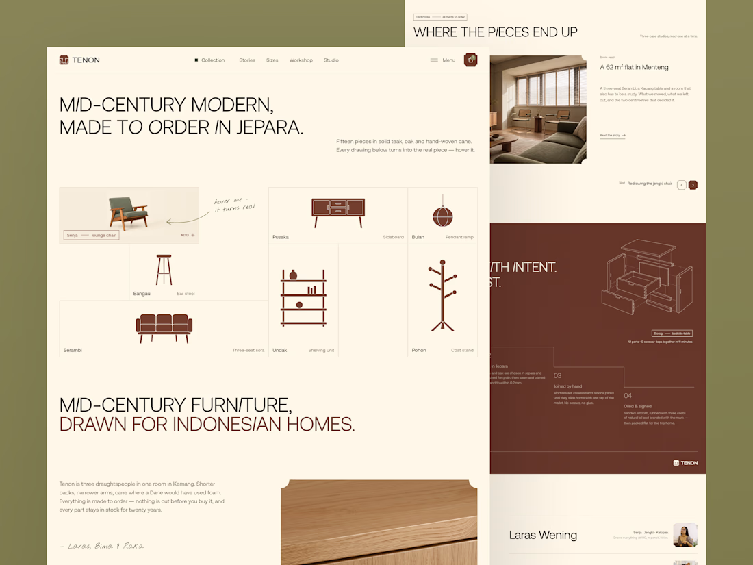
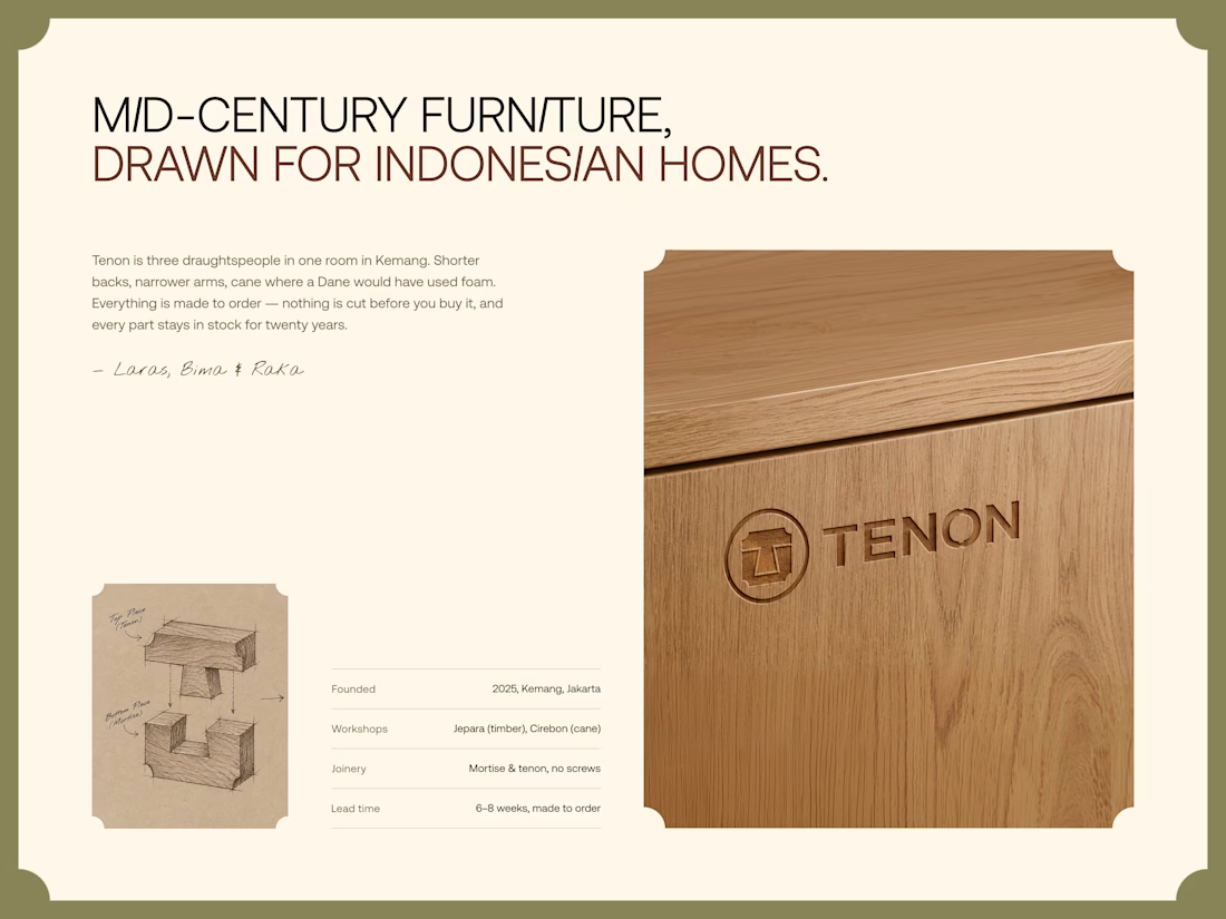
Tenon is Furniture Website Design
Exploring a digital experience for an Indonesian furniture brand inspired by mid-century modern design.
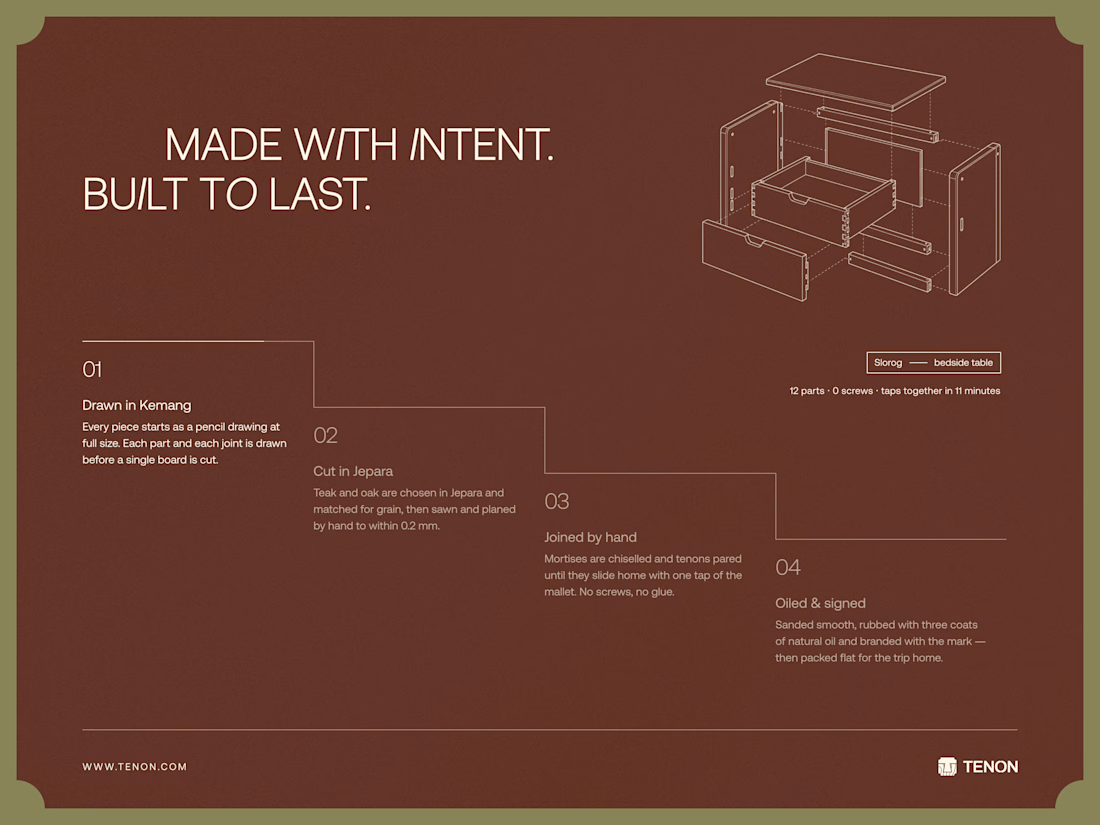
The website brings together product discovery, storytelling, and visual direction to make the digital experience feel as considered as the furniture itself.
Made to order. Made to last.


Love the color choice used

Post
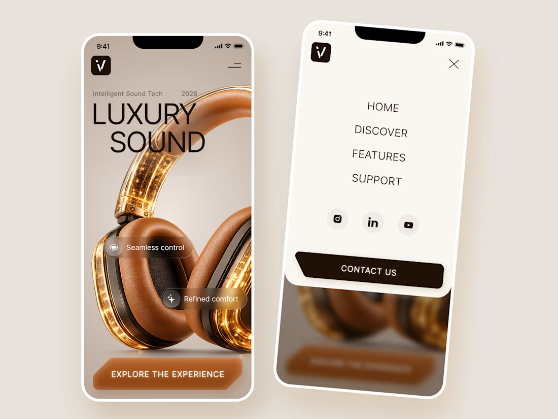
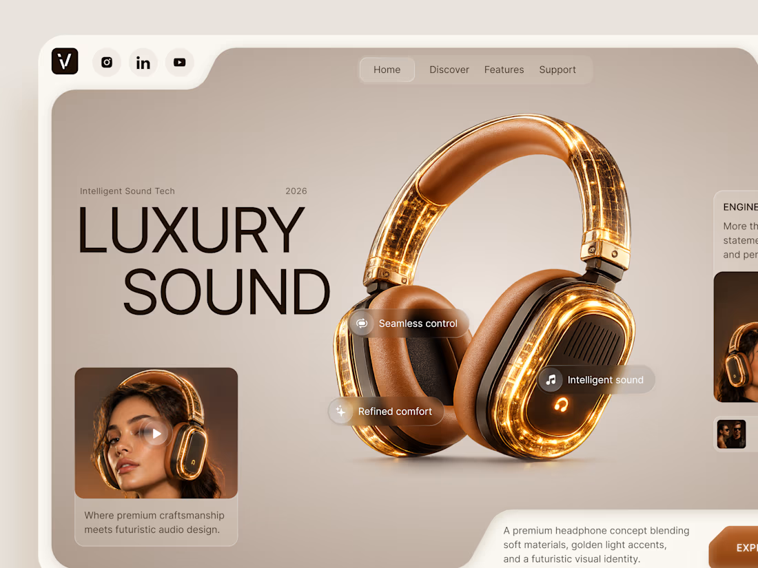
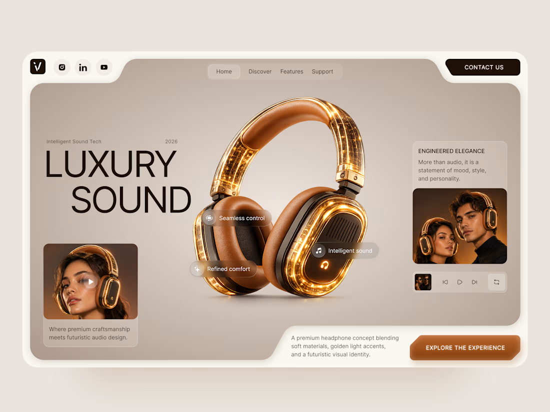
Luxury Sound — Premium Headphones Landing Page 🎧✨
A premium landing page concept for a luxury audio brand, built around a bold headphone design and a refined visual experience
The design combines warm neutral tones, glowing details, oversized product visuals, and minimal typography to create a futuristic yet elegant feel
Special attention was given to:
• Product-first composition
• Premium visual direction
• Feature highlights
• Lifestyle imagery
• Clear CTA placement
• Responsive mobile experience
The result is a clean, immersive product experience that makes the headphones feel like more than tech — they become part of the lifestyle 🔥


The amber glow on the headphones against that warm beige is lovely. How does the mobile menu handle the product image?