The network for creativity
Join 1.25M professional creatives like you
Connect with clients, get discovered, and run your business 100% commission-free
Creatives on Contra have earned over $150M and we are just getting started
Back to feedPost
Taste Test

Currently, I'm working on the onboarding screens for Dandelion, a nightly journalling app 🌙
Which one would you tap “Start reflecting” on after a long day?


2 voted
25%
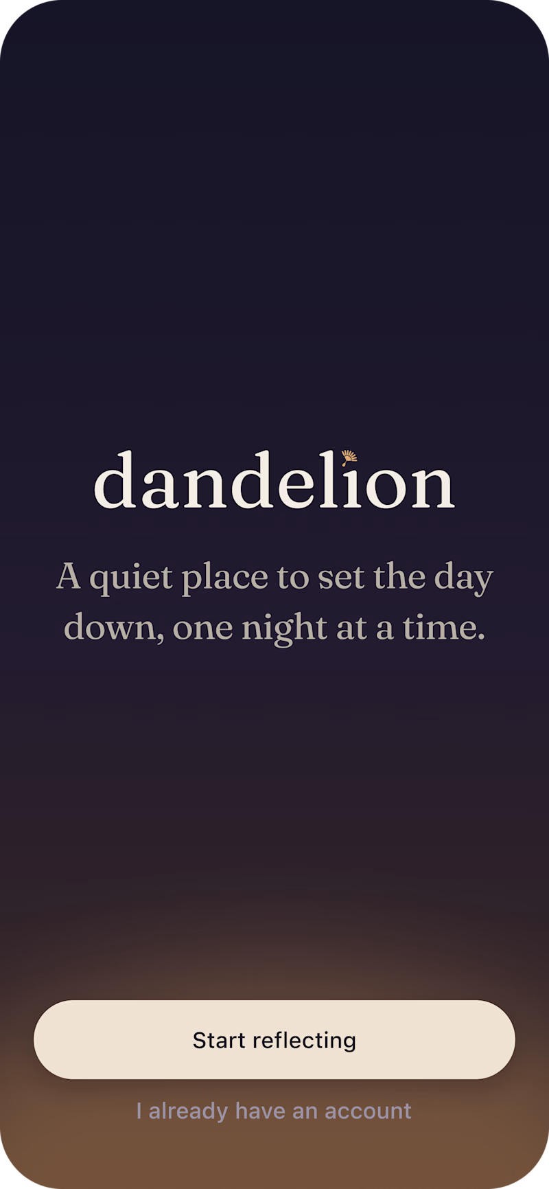
6 voted
75%
8 votes
Closed

I’d choose the Dandelion in Bloom, one with the calmer, softer feel. 🌙


quiet and minimal gets my vote for a nightly app.. nobody wants a busy screen at 11pm

This is nothing but impressive. only love this
Welcome Rimsha, my pleasure 🙌🙌

Dandelion in bloom gives the app a memorable identity.

Went with Dandelion in bloom. The illustration gives the screen a mood that fits a nightly journaling app.

Definitely with bloom

Both feel lovely and calming, but I'd go with B! The dandelion illustration adds a gentle, comforting touch without taking away from the simplicity. It feels especially fitting for a journaling app you'd open to unwind after a long day.
The network for creativity
Join 1.25M professional creatives like you
Connect with clients, get discovered, and run your business 100% commission-free
Creatives on Contra have earned over $150M and we are just getting started






Related posts


Love the direction! Feels clean and the product offering comes through nicely.

two brands, one tiny taste test.
would you rather look through an Oriel or answer a Calling?
winner gets the full brand. reply with your pick.
35 voted
85%
6 voted
15%
41 votes
Closed

The biggest misconception about branding is thinking it's just a logo. What actually saves founders time and money later is a compact system a focused 2–3 color palette and clear sub-brand rules so every new deck, social post, or product launch looks cohesive without starting from scratch.

A system makes it work. A brand makes it matter.
Through Adora Garden, we explore how a structured visual system can evolve into a cohesive brand identity — bringing consistency, character, and a more meaningful visual experience to every touchpoint.
Because branding isn't just about how a brand looks. It's about how it feels, speaks, and connects.
6 voted
27%
16 voted
73%
22 votes
Closed

Identity 💯


