
Leonard Adams
UX Designer crafting clean, modern, user-focused designs
Profile in progress
Leonard is building their profile!
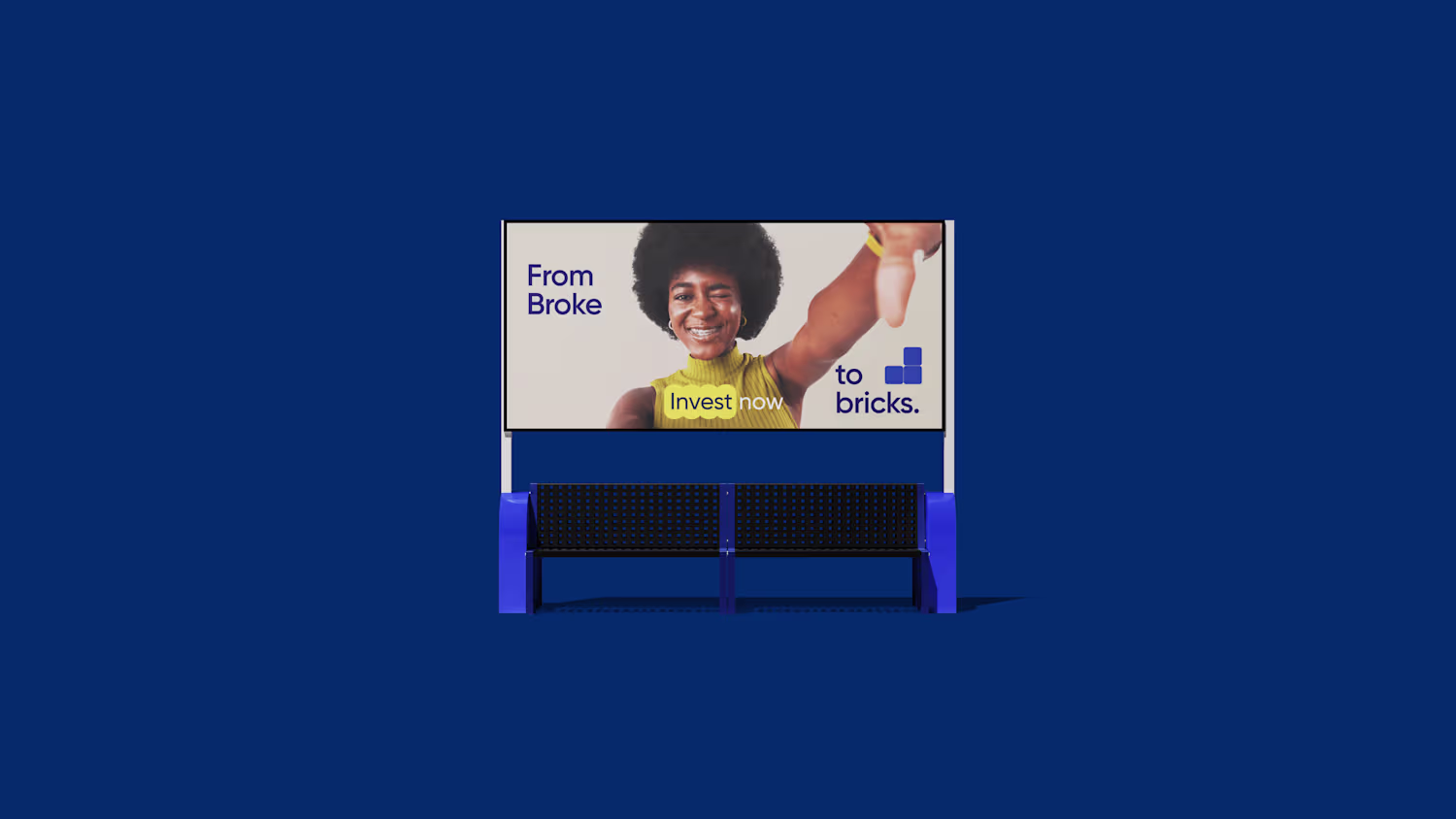
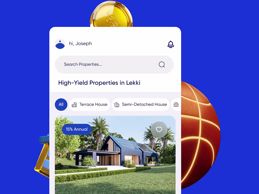
Fractional Real Estate Ownership Platform Development
0
0
Good products can fail when the experience feels confusing.
For Valcetra, I stepped in to improve the UX after identifying friction in the onboarding experience.
From revamping onboarding to redesigning parts of the mobile app, the focus was on making the platform feel more intuitive, seamless, and easier for users to navigate.
Design is more than visuals — sometimes the biggest win is simply making things make sense.
#UXDesign #ProductDesign #MobileUI #UIDesign #CaseStudy #DesignProcess
0
19
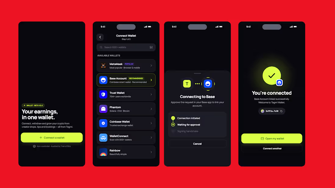
Designed a standalone crypto wallet experience for a social platform with a high-energy.
The challenge was creating something that feels fast, premium, and trustworthy while staying visually aligned with the platform’s dark, modern identity.
Key focus areas:
• Wallet overview with quick-scan balance & transactions
• Multi-wallet connection flow (MetaMask, Trust Wallet, Base, etc.)
• Smooth crypto withdrawal experience
• Clean hierarchy, subtle neon accents, and premium dark UI
I explored ways to make crypto interactions feel less intimidating and more intuitive through strong visual hierarchy, minimal clutter, and motion-friendly layouts.
Goal: make managing crypto feel seamless, social, and effortless.
#UIDesign #ProductDesign #Fintech #CryptoDesign #MobileAppDesign #UXDesign #UIUX #FintechDesign
0
32
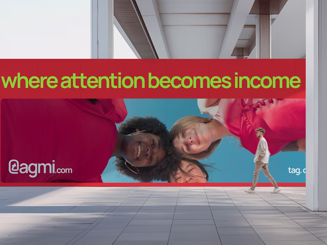
Built a complete brand system for TagMi — a social economy platform designed around connection, visibility, and earning.
From logo usage and color systems to typography, imagery, and real-world applications, every detail was crafted to feel bold, premium, and scalable. The goal was simple: create a brand that looks as powerful as the opportunities it represents.
The result is a clean, structured identity that translates seamlessly across product, marketing, and physical touchpoints — from social media designs to merchandise.
Branding isn’t just how it looks, it’s how it works. TagMi is built to do both.
1
132
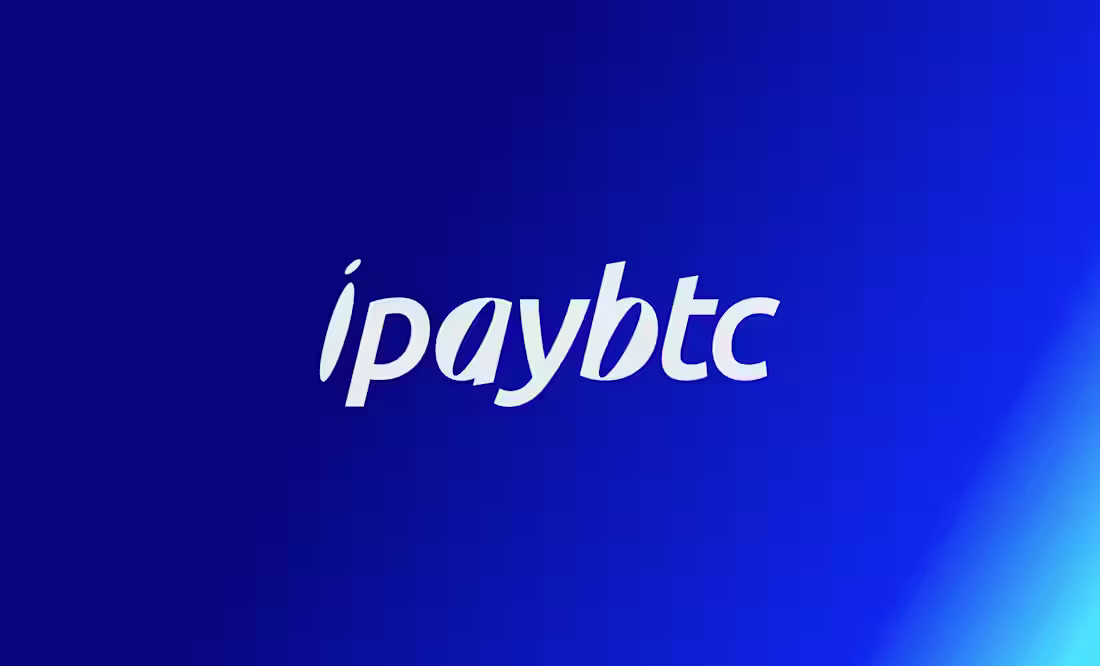
iPayBTC — Brand Repositioning & System Design
iPayBTC wasn’t a design problem — it was a clarity problem.
The brand had already run campaigns, but without a defined voice or system, every execution felt disconnected. Messaging was vague, the website lacked direction, and the product wasn’t communicating trust to new users.
I stepped in to fix that at the root.
This was a full repositioning — not just visuals. I restructured how the brand thinks, speaks, and shows up across every touchpoint.
I defined a clear voice, rebuilt the messaging to be direct and human, and replaced abstract, crypto-native language with communication that actually converts. The goal was simple: make Bitcoin feel usable, not intimidating.
On the design side, I developed a scalable identity system built for both product and marketing. The logo reflects value in motion, reinforcing speed and usability. Typography was split intentionally — Futura LT Condensed for bold, disruptive marketing, and Neue Haas Grotesk for clarity across product and interface.
Every part of the system was designed to work together:
A website that explains without overwhelming
Marketing that communicates in seconds
A product experience that feels clear and trustworthy
Brand assets that scale across real-world touchpoints
This wasn’t about making things look better.
It was about making the brand work.
The outcome is a cohesive, high-performance brand system that positions iPayBTC as a serious, user-focused Bitcoin product — built for adoption, not just awareness.
2
1
134