Victory Batubo
Building web platforms for real estate & property developers
Ready for work
Victory is ready for their next project!
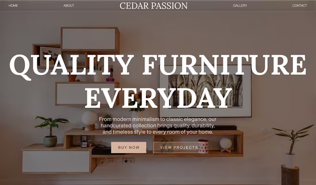
Design exploration for a furniture brand.
Just seeing how it goes.
Taking it easy today, some light designing, some light coding, wrapping up the week.
1
25
Finished the UI design for Haven&Form — interior design studio concept.
- Clean,
- minimal,
- built to let the work speak.
Taking 2-3 clients at 50% off.
DM if you need a site.
5
4
71
Working on the homepage layout today
Exploring different layout directions and making small structural tweaks across sections
Still a work in progress, just refining the flow for now
Will share the final version soon, stay tuned
2
15
New project: Boutique Interior Design Studio — Website & Project Showcase
Currently in the early concept phase for a boutique residential interior design studio. The studio designs modern, calming living spaces for urban homeowners, beautiful work that had no digital presence to match.
Scope: full website design and build
Direction: minimal editorial, premium, warm
Focus: trust-building, project showcase, inquiry conversion
This is the work I do best, helping creative studios in the built world close the gap between the quality of their work and how it's presented online.
More updates as the project develops.
0
31
I’ve been quiet on socials lately — focusing on building the MVP of a real estate listing platform.
While UI refinements and responsive fixes are still in progress, the core search and listing experience is coming together.
Sharing this now because even early progress can illustrate the approach: making property browsing intuitive for clients and practical for agents.
— Batubo Victory | Vicante Studio
0
23
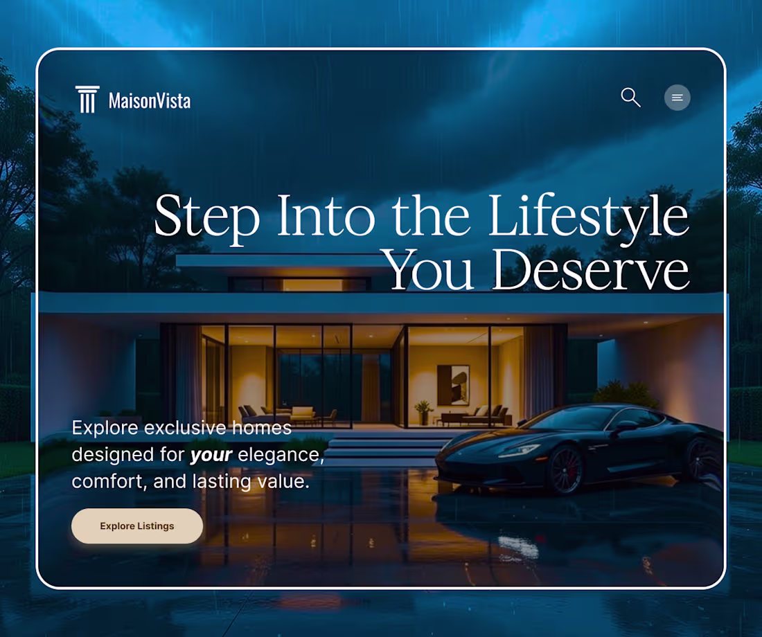
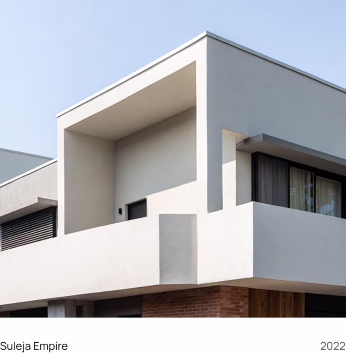
Exploring a homepage direction for a luxury property brand.
Clean typography, soft atmosphere, and a layout that lets the architecture speak first.
I like when real estate design feels less like advertising…
and more like arrival.
More progress soon.:
2
3
71
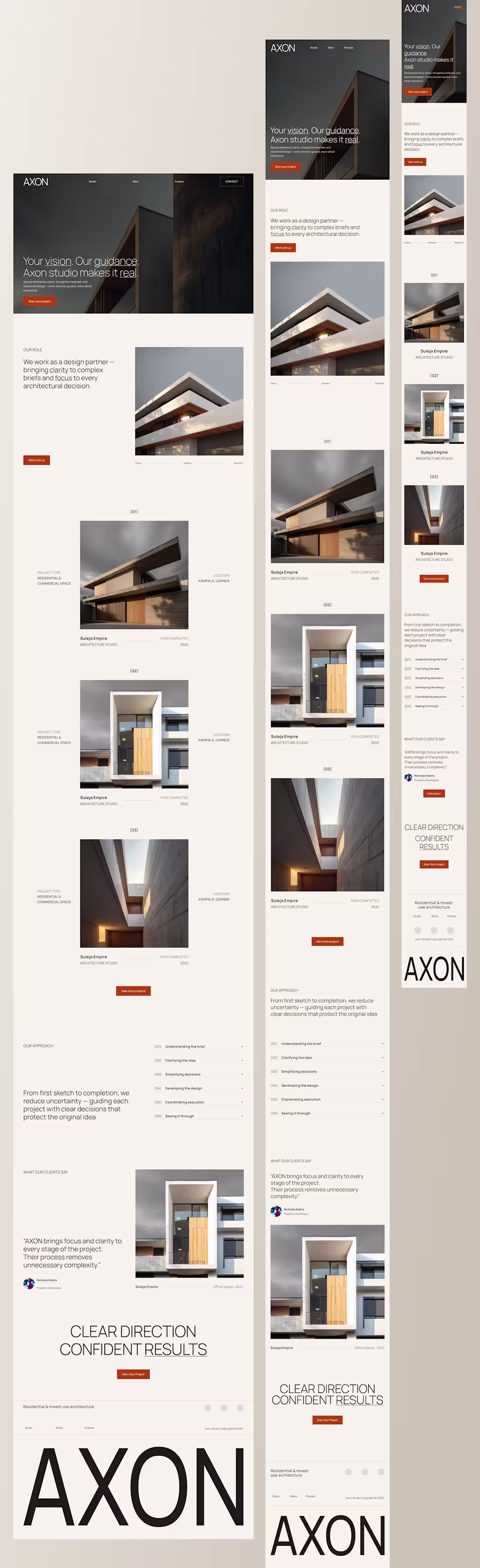
There’s a stage in a project where things start to feel settled.
This is AXON, an architecture studio website concept I’ve been working on. The focus was structure and pacing across the hero, work grid, and process sections.
Here’s the free Figma file. 👉 AXON Free Template (https://www.figma.com/design/VswkPPuA3VrIVxLnaAQZrp/AXON-Free-Template?node-id=1-54&t=jbtzESX2qSQZvZaA-1)
If you find it useful, drop a comment or share — I’d love to hear how you use it.
1
51
Currently working on an architecture studio site.
Exploring how clarity, restraint, and simple language shape:
• the hero narrative
• the process breakdown
• how decisions are communicated visually
Sharing a few in-progress sections as I refine the direction.
1
39
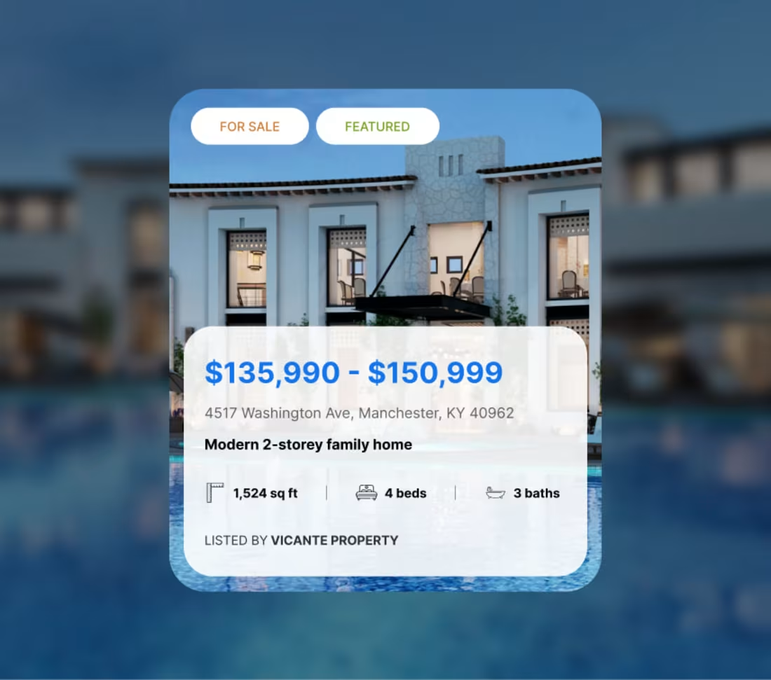
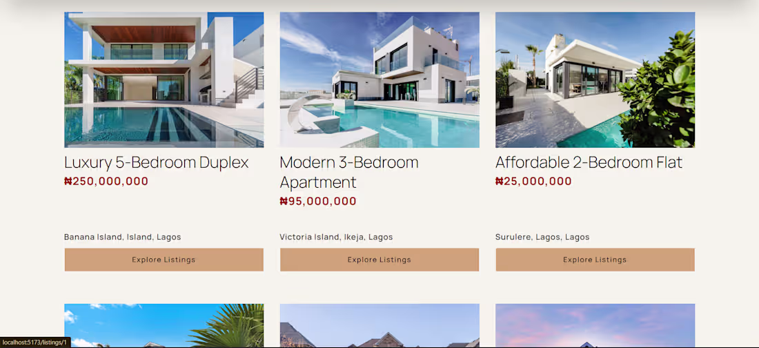
Been thinking a lot about how people actually scan property listings.
This card focuses on clear hierarchy
- price first,
- location next
Then the details that help someone decide whether to keep looking or move on.
Designed to sit comfortably in a 3-card grid without competing for attention.
1
33
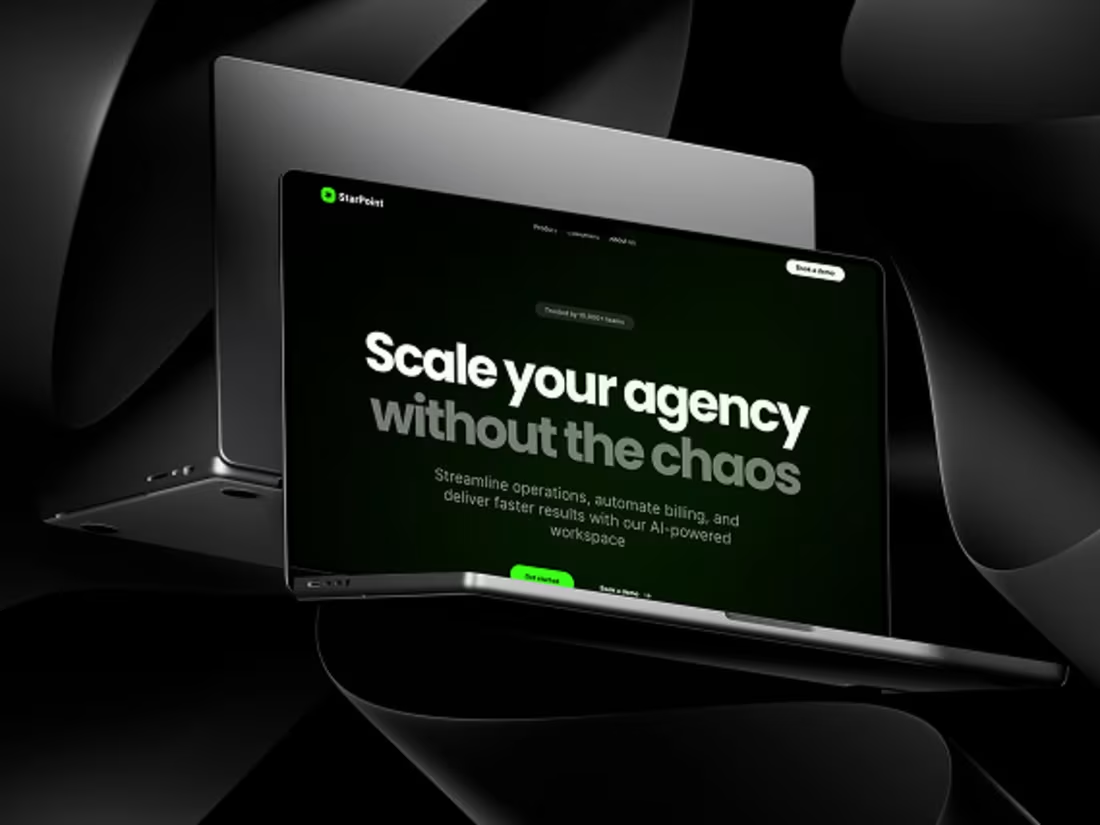
Just wrapped up this Framer design for agency management. Tried to keep it clean, dark-themed, and focused on clarity.
Would love any thoughts — layout, vibe, copy, anything. Always open to feedback and ways to improve.
0
38
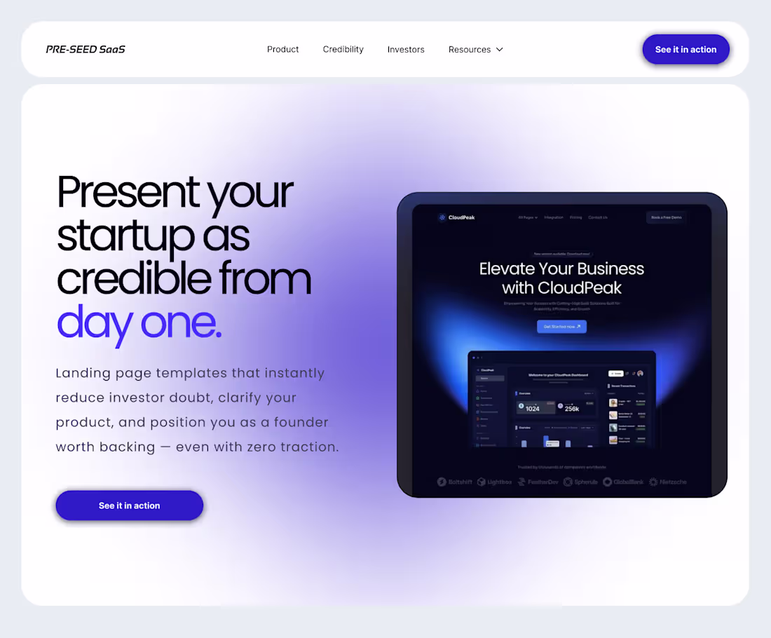
Designing a Framer template for pre-seed founders who need clarity before traction
I’m currently designing a new Framer template for pre-seed founders.
Not another “SaaS landing page.”
This one is built for founders whose product makes sense internally, but still feels unclear on the homepage.
The focus is simple:
Explain the value fast
Reduce confusion
Build trust without hype
I’m applying story-driven UX and frontend principles to guide visitors through a clear narrative — so founders don’t have to over-explain their product in calls or decks.
If you’re early-stage and your website still feels vague, I’m happy to share what I’m building or get feedback from your use case.
2
7
46
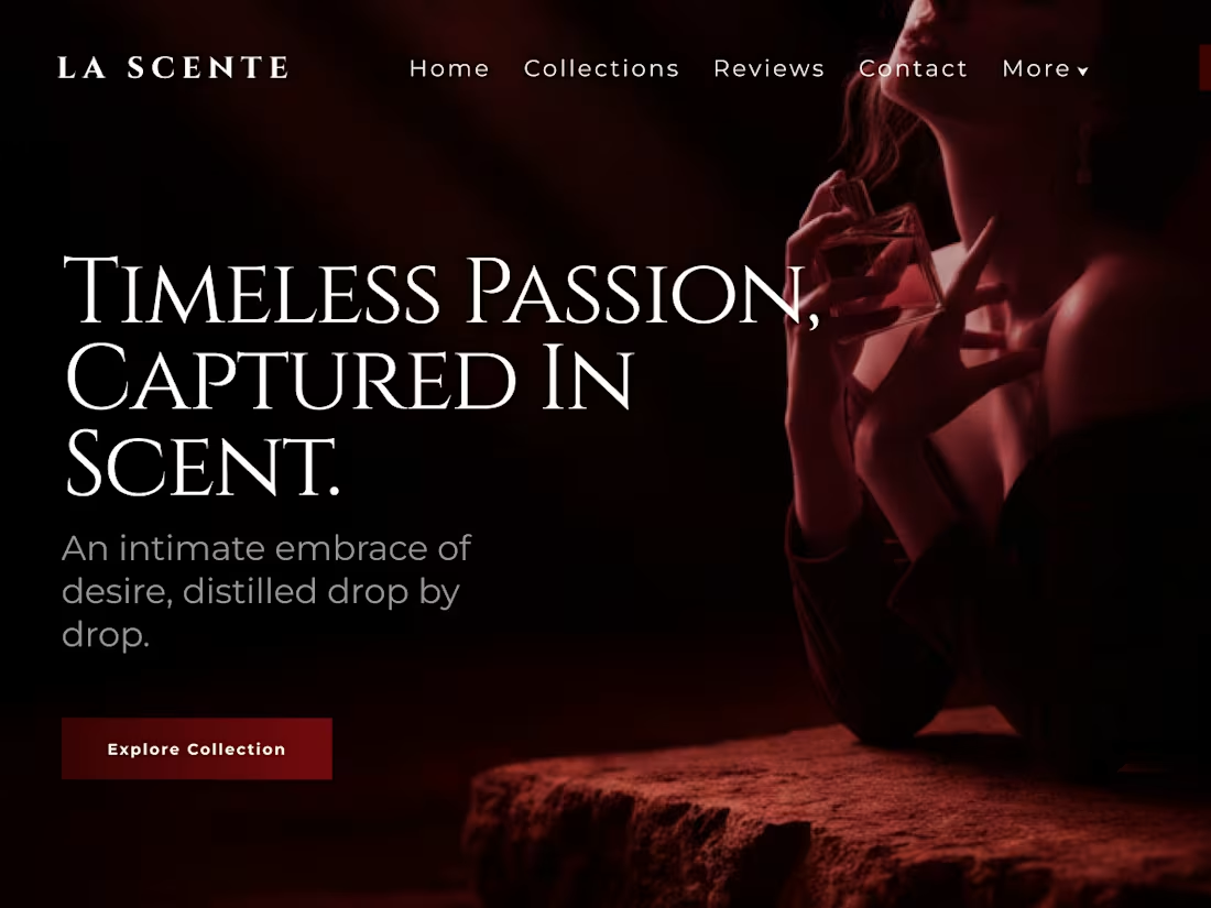
A/B Design Showcase — LA SCENTE Perfume Brand
Passion is at the heart of LA SCENTE. I explored two design directions to capture this mood:
🅰️ Close‑up bottle — intimate, intense, focused
🅱️ Sensual pose — expressive, emotional, bold
Both designs highlight the hero line: “Timeless passion, captured in scent.”
💬 I’d love to hear your thoughts: Which design evokes passion more deeply — A or B?
Open to collaborations and commissions. You can reach me directly here on Contra or visit my portfolio: [https://batubo-victory.vercel.app/ ]
0
43
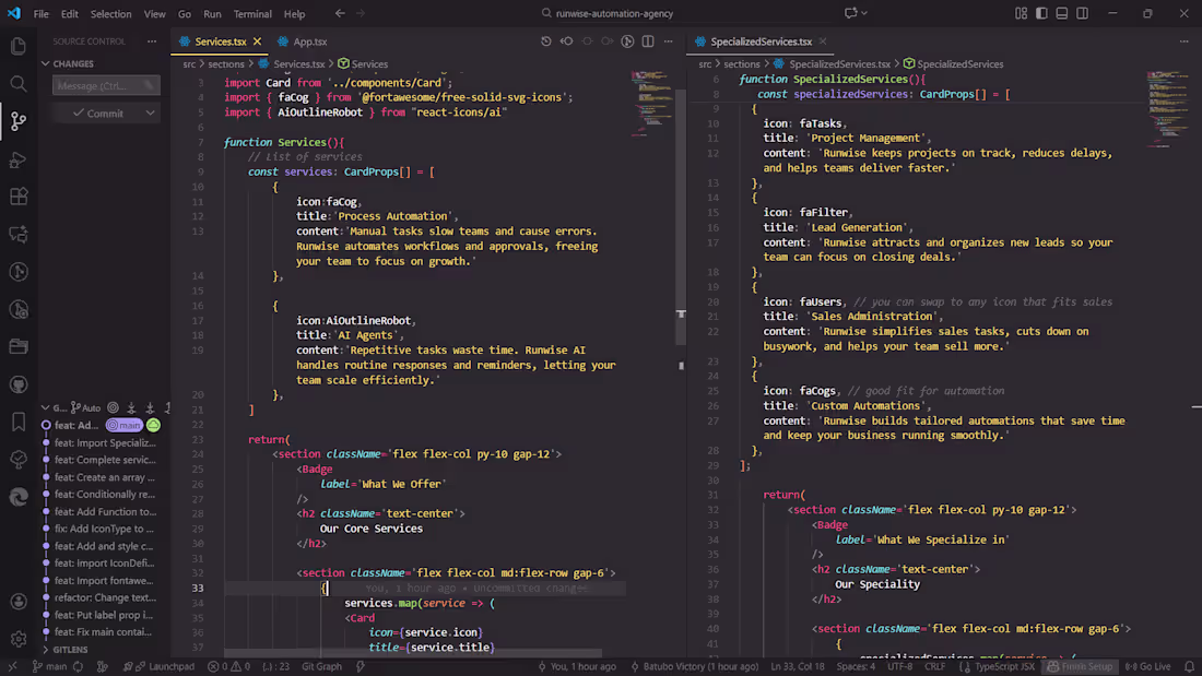
While working on a new project for Runwise Automation, I was reminded of why I combine design and frontend development in my work.
Most businesses struggle not because they lack ideas —
but because the vision gets lost between the designer and the developer.
My dual skillset solves that:
✔ I design with motion, responsiveness, and user flow in mind
✔ I develop the exact experience I envisioned — no misinterpretation
✔ I collaborate easily with teams, speaking both design and dev fluently
✔ I deliver sites built to convert, not just look good
My philosophy:
Design with intention. Build with precision. Deliver with purpose.
If your business needs a website that feels seamless, thoughtful, and conversion-focused — let’s talk.
0
39
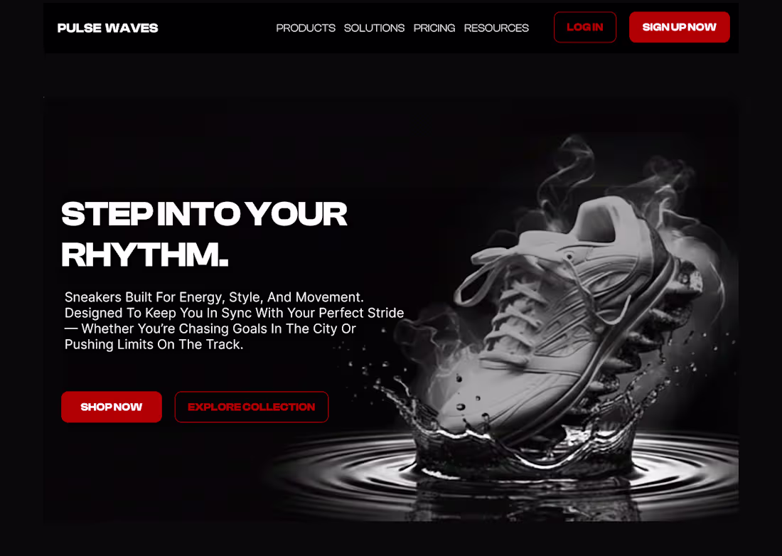
Designed a landing page concept for a sneaker brand called Pulse Waves 👟
Clean layout, energetic vibe.
If you need a website for your brand, I'm your guy😌.
1
38