Elfa Studio Marketing Site Design
Ruslan Subbota
Verified
1 collaborator
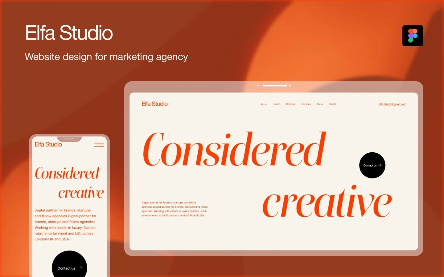
Elfa Studio - Website Design for Marketing Agency
Role: Web designer (UX + UI, Figma)
Tools: Figma
Deliverables: Desktop + mobile design, full marketing site (single page, multi-section)
Client: Elfa Studio — digital partner for brands, startups, and fellow agencies. Works with luxury, fashion, retail, entertainment, and B2B clients across London/UK and the USA.
The brief
Elfa Studio needed a site that did one thing well: convince the kind of brand that would normally hire a London creative agency that Elfa belongs in that conversation. Their existing presence read like a generic SaaS marketing site — clean enough, but interchangeable with a hundred others. Nothing in the design carried the editorial weight their actual client roster called for.
The goal: a minimal, confident, visually distinct site that communicates the agency's style and services in the first scroll, and converts visitors into "let's talk" form fills.
The audience
Three buyer types, each with different patterns:
Brand decision-makers in luxury, fashion, retail, entertainment — visual people, will judge the agency by the site's typography and pacing before reading a word.
Startup founders — scanning fast, want to see services and proof, then jump to contact.
Other agencies looking for a white-label or specialist partner — care about the case studies and the team.
The design had to land for all three on one homepage.
The approach
1. Visual identity direction
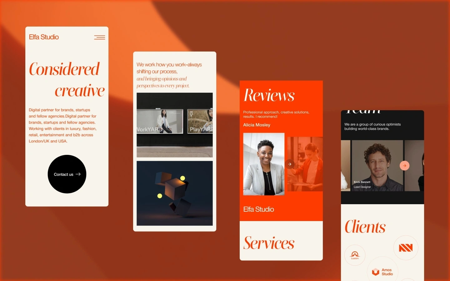
The strongest editorial creative agency sites lean on one bold typographic move. I built the entire system around an italic serif display ("Considered creative" as the tagline-meets-hero), paired with a quiet sans body. The serif carries the personality; the sans keeps the content readable.
The palette is restrained on purpose: a single saturated orange against cream backgrounds, with black used only for primary CTAs (the "Contact us" pill). One accent color, used consistently, reads more confident than a multi-color palette.
2. Structure & information architecture
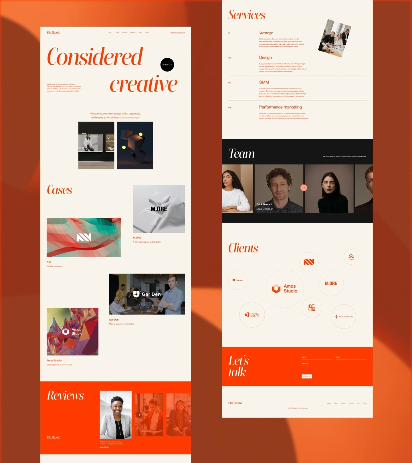
Single-page architecture with seven anchored sections in the nav: About, Cases, Reviews, Services, Team, Clients, Contact. The order is deliberate:
Hero — the tagline does the positioning work, supported by a one-paragraph summary of what Elfa does and who they work with
Process intro — "We work how you work" — answers the "what's it like working with you" question early
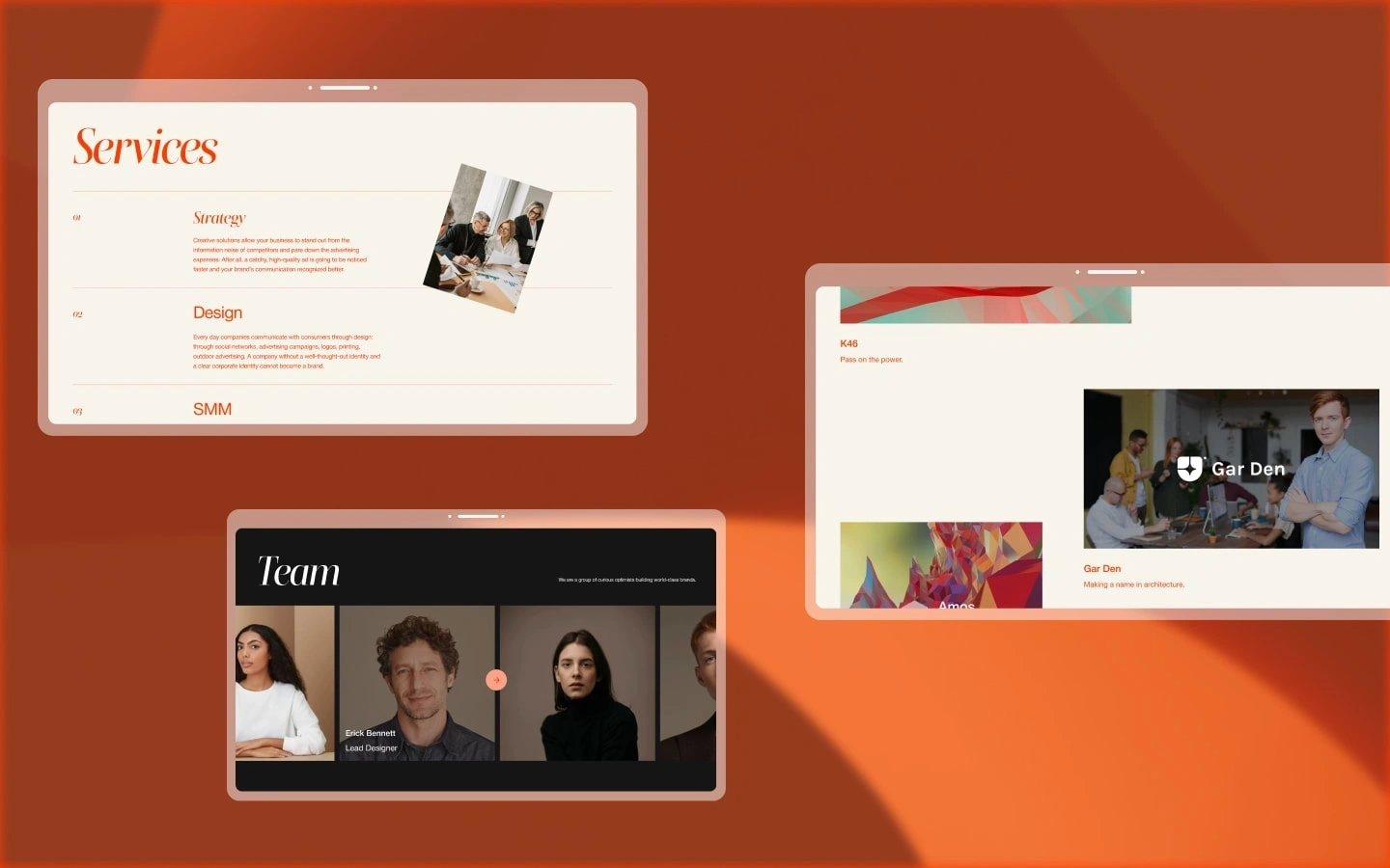
Cases — four featured projects (K46, M.ORE, Gar Den, Amos Studio) with logos, hero images, and one-line outcomes
Reviews — social proof in a horizontal carousel against a saturated orange block, so the visual rhythm of the page changes
Services — numbered list (Strategy, Design, SMM, Performance marketing) with a paired image to break up the density
Team — full-bleed dark band with the team grid, named lead designer visible
Clients — clustered logo bubbles instead of a grid, so it feels less corporate
Let's talk — orange CTA block with inline form, visible above the footer
3. Mobile
The mobile design isn't a stripped desktop. The hero stacks the italic display to two lines ("Considered / creative") so it stays readable at phone width without losing impact. The "Contact us" pill anchors the bottom of the first viewport so the primary action is always one tap away.
4. Conversion details
The Contact us pill recurs in the hero, in the nav, and in the final CTA block — three opportunities, no friction
Email visible in the nav for buyers who skip forms
Reviews and Clients positioned before the contact block so the visitor lands on the form already convinced
What I delivered
Full Figma file: desktop + mobile, all eight sections
Type system, color tokens, component library (cards, CTAs, section dividers)
Hero treatment with responsive breakpoints
Spec-ready handoff for development
Why this works
Three things make this design hold up:
One typographic move, used consistently. The italic serif is the entire personality of the brand. It shows up exactly where it needs to and nowhere else.
Restrained palette. One orange. One cream. Black for primary actions. The site reads expensive because it doesn't try to do six things at once.
The structure mirrors how the buyer decides. Tagline → process → cases → social proof → services → team → contact. Every section answers the question the previous one raised.
Tools
Figma · UX/UI Design · Web Design · Visual Identity · Responsive Design · Marketing Agency
Want a similar treatment for your agency or studio? Drop me a line — I design and build sites end-to-end (Figma → Webflow / WordPress / Framer).
— Ruslan / Horizoners
Like this project
Posted Apr 28, 2026
Designed a minimal, impactful marketing site for Elfa Studio using Figma and Webflow. Conversion optimized and user centered.
Likes
6
Views
77
Timeline
Feb 4, 2026 - Mar 3, 2026
Clients
Social Organica
Collaborators