The network for creativity
Join 1.25M professional creatives like you
Connect with clients, get discovered, and run your business 100% commission-free
Creatives on Contra have earned over $150M and we are just getting started
Back to feedPost
EarthHub – A Platform for Nature Expeditions ⛰️
Stumbled upon this project in my hard drive, had to publish!


Good one!


Thanks Mia 🙌🏼

Thanks!

Top to bottom nice work
Thank you Mahmudul
You are most welcome

Wow I love this
Appreciate it Daniil

The attention to detail really makes this stand out.
Thank you!

TOP!!
Thanks!

Nice designs.
Appreciate it Sahil

nice color palette, good job on that!
Thanks Rustam!

That tree mark in the dark tile is a lovely logo moment. Glad you pulled this one out of the archive.
Thanks Timothy

Nice work
Thanks Sujon

highlighting discover and experience right in the headline does the hierarchy work a whole tagline line would've needed
Great catch
Headlines are usually the first thing cut when a page needs to be shorter, so glad this one earned its keep.

Really nice type choices
Thank you. Chose the serif because it gave me that earthy feel

It is always fun finding a great project hiding in the hard drive. This one definitely deserves to be published. The overall presentation here is really professional.

Really like the idea behind EarthHub! Great to see you giving this project a chance to shine.

Love this concept—clean and inspiring work!

Glad you dug this one up. The earthy palette really suits the expedition vibe.

It's clean and pro, just a little more nature and wild and less techy would be perfect.

The highlighted words in the headlines give the serif a lot of personality. Hard to believe this was sitting on a hard drive.


Nice work🔥👏👏

Nice work every single section looks amazing


Modern work❤️

The split between the headline and landscape photography gives the page a clear entry point, and the green highlights connect the typography to the setting. How does that hierarchy adapt on mobile?


super clean!🔥

Great design and presentation

Fantastic visuals! 🚀🚀

Amazing design! 🙌

Congrats on finally launching EarthHub Sergej! Beautiful work

Clean and immersive layout! The typography choice fits the nature expedition theme perfectly. One quick tip to push the UX even further: adding subtle micro-interactions or hover states on the location cards would make the browsing experience feel much more organic

😍 😍
The network for creativity
Join 1.25M professional creatives like you
Connect with clients, get discovered, and run your business 100% commission-free
Creatives on Contra have earned over $150M and we are just getting started



Related posts

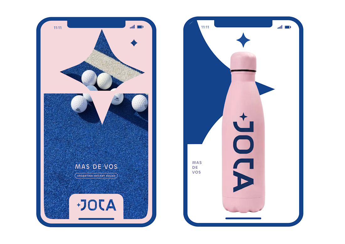
JOTA is an Argentine field hockey brand built for players who play with personality. The founder reached out to rethink how the brand shows up beyond the stick itself.


Wow project


Some concept work from the agency. Planning to share more of what we create, from clean interfaces to the little motion details that bring them to life.
Check out the website: https://urest.agency/


Great!!