Daniil Anikin
Web Designer | UI/UX, Landing Pages, Branding
- 10
- Followers


Meet BLOK, a brand identity concept for an SMM agency. ⚡
I wanted a logo that stops the scroll and still works everywhere. The result is a brutalist mark in electric lime: a hard-edged block, a bold arrow ↗ and zero decoration.
In this video, one logo moves through 14 different worlds: notification walls, growth charts, a feed grid, ticker tapes, a viral ripple and a live stream. The mark stays centered and recognizable in every one of them.
What I wanted to prove:
→ A strong identity doesn't depend on its background
→ Brutalism can feel energetic, not cold
→ An SMM brand should look like the content it creates
1
23
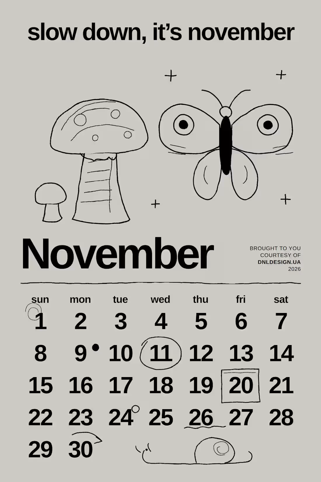
slow down, it’s november. 🍂
November is created to slow down, drink hot tea and not demand the impossible from yourself ☕🍄
Reminder for a month: slow down, everything will be in time.
0
31
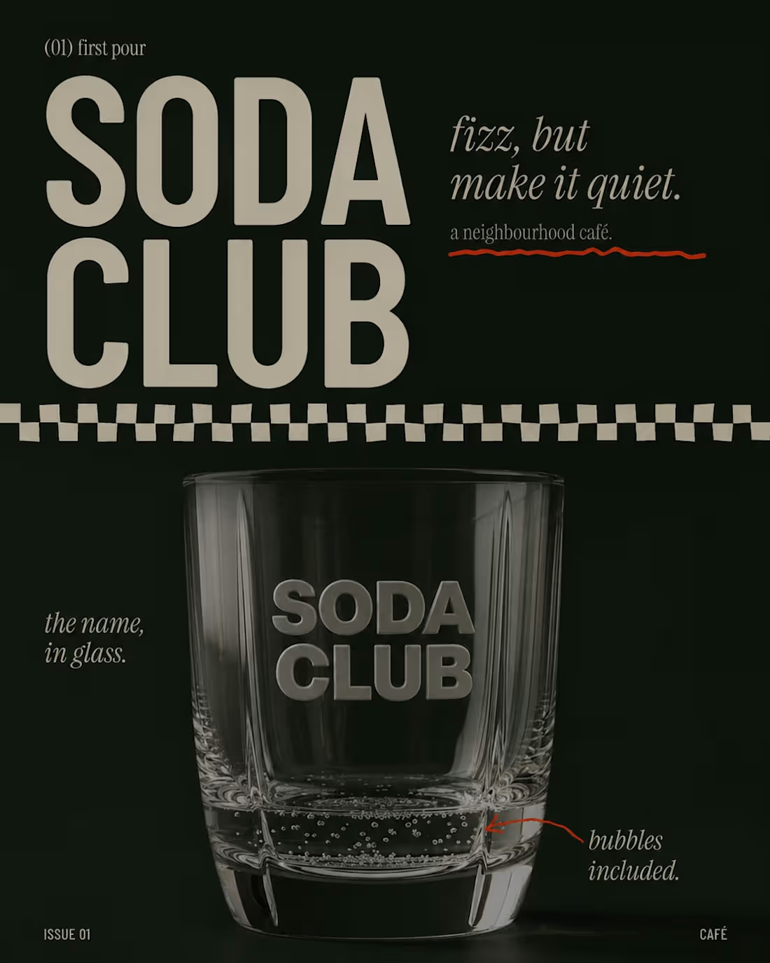
SODA CLUB — a retro-inspired website concept for a neighborhood café. 🥤
For this project, I wanted to create more than just a website — I wanted to build a whole visual world around the brand.
The direction combines retro typography, warm colors, editorial layouts and lifestyle photography to create a playful but sophisticated café identity.
From the website concept and visual direction to social media and supporting brand elements — every detail was designed to feel like part of the same story.
The goal was simple:
make people feel the brand before they even visit the café.
Would you stop by for a drink? 👀
3
44
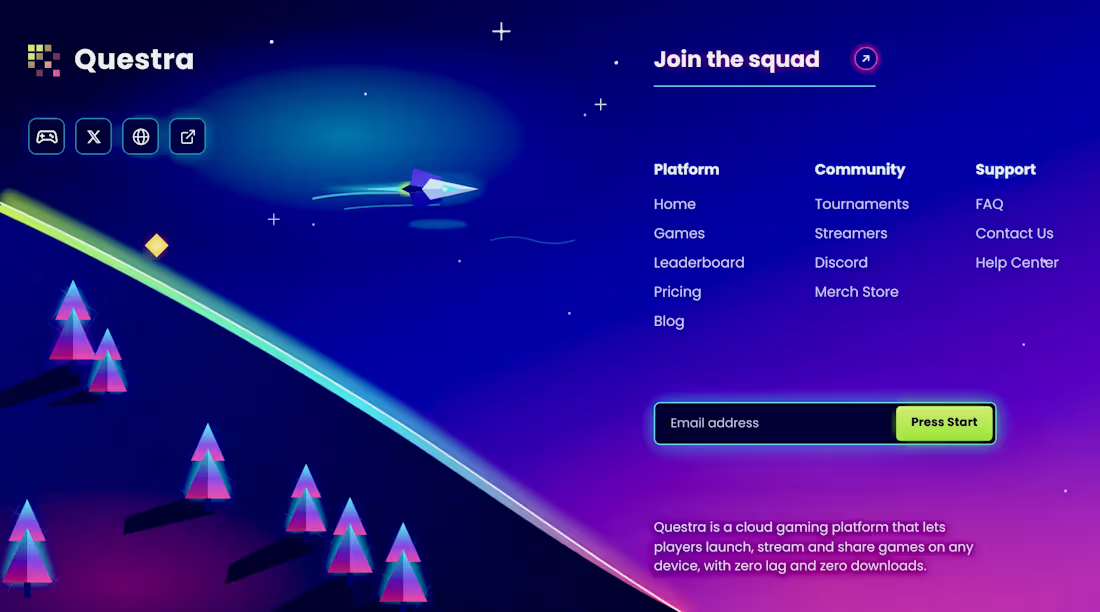
Questra is a cloud gaming platform with zero lag and zero downloads. The design builds a retro-futuristic synthwave world: a spaceship racing along a neon horizon, glowing low-poly trees, and a deep blue-to-magenta gradient that sets the mood.
What I focused on:
→ Clear navigation split into Platform, Community and Support
→ A playful CTA, "Press Start", in acid lime that stands out against the dark UI
→ Glowing, game-style icon buttons and a pixel-style logo mark
→ Illustration and UI working together instead of competing
1
56