The network for creativity
Join 1.25M professional creatives like you
Connect with clients, get discovered, and run your business 100% commission-free
Creatives on Contra have earned over $150M and we are just getting started
Back to feedPost
Taste Test
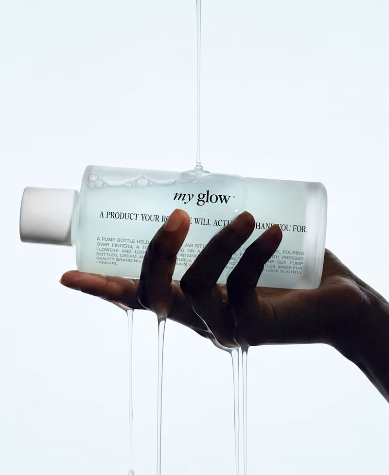
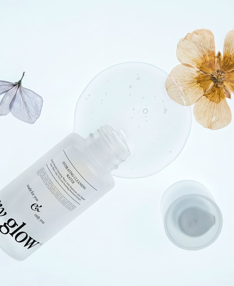
Which one to use as a cover for an insta carousel ?
89 voted
80%
22 voted
20%
111 votes
Closed

The first option looks great


First one looks perfect

These are too good but went with the first one since it showcases the product clearly

2nd one is fav. Eye catching

Anna, amazing work 🫠

Thank you 🙏

Hi Anna! Personally, I prefer the second one. The strong tonal contrast between the hand and the light background instantly catches the eye, creating a great interplay between negative and positive space. Plus, the dynamic gesture and moving liquid make the scene feel unusual...

Go for number 1, it shows the full product and catches more attention.
Thank you 🙌🏻

1 for sure!

1 i’d say because it gets to catch more viewers attention


Number one is more direct and conversion focused

Nice work for me the second one

Thanks !

From a designer's perspective, "Option 2" is much more visually cohesive and eye-pleasing. The composition lacks abrupt contrast, creating a seamless, fluid look that avoids any visual jarring or color shock. While "Option 1" has a strong concept, the execution on the hand feels...


dripping one, no contest


1 for me


love the visuals. how did you create them?

I prefer number 1

Awesome 👍

first one looks dope.

nice product
Thanks !

This looks good.
Thank you !

Love both of them, the first one is more catchy though

both look nice


Both 😁
ahahah 😆

First one for sure! Great job!
Thank you !

The water splash shot on the right has more movement and would stop a scroll faster than the flat lay. The 80% split makes sense for a carousel cover specifically, though the flat lay might work better as a slide further in once you already have their attention.

Love it 🧡
Thank you !☀️

great
The network for creativity
Join 1.25M professional creatives like you
Connect with clients, get discovered, and run your business 100% commission-free
Creatives on Contra have earned over $150M and we are just getting started








Related posts

The previous poll on this preloader had exactly 50-50 results between Horizontal gallery and Circle intro. Now I'm continuing with 2 other options. Which one is better? Check the live preview here
19 voted
53%
17 voted
47%
36 votes
Closed

Team mosaic!!


Fresh case study 🚀🚀🚀
Brand identity for Peak, an all-in-one website builder for WordPress that I design and build. A four-letter mark, a warm paper-and-ember palette and one system that runs from the favicon to the packaging.


A four-letter mark that has to hold from favicon to packaging is a tough constraint. Did you draw one letterform first and build the other three from it, or design them together as a set from the start?


