

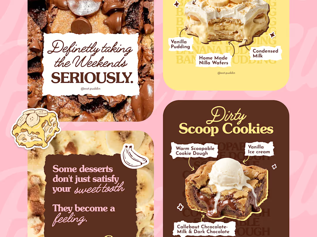
The idea for Puddin’ was to create a dessert brand that felt playful, nostalgic, and full of personality. I didn’t want it to look like just another polished food brand. I wanted the identity to feel warm, slightly quirky, and something you’d actually want to interact with.
So we built the visual direction around soft, playful colours, expressive typography, and a hand-drawn illustration style.
This is where we started, turning the personality of Puddin’ into a visual language.
30
50
3.1K
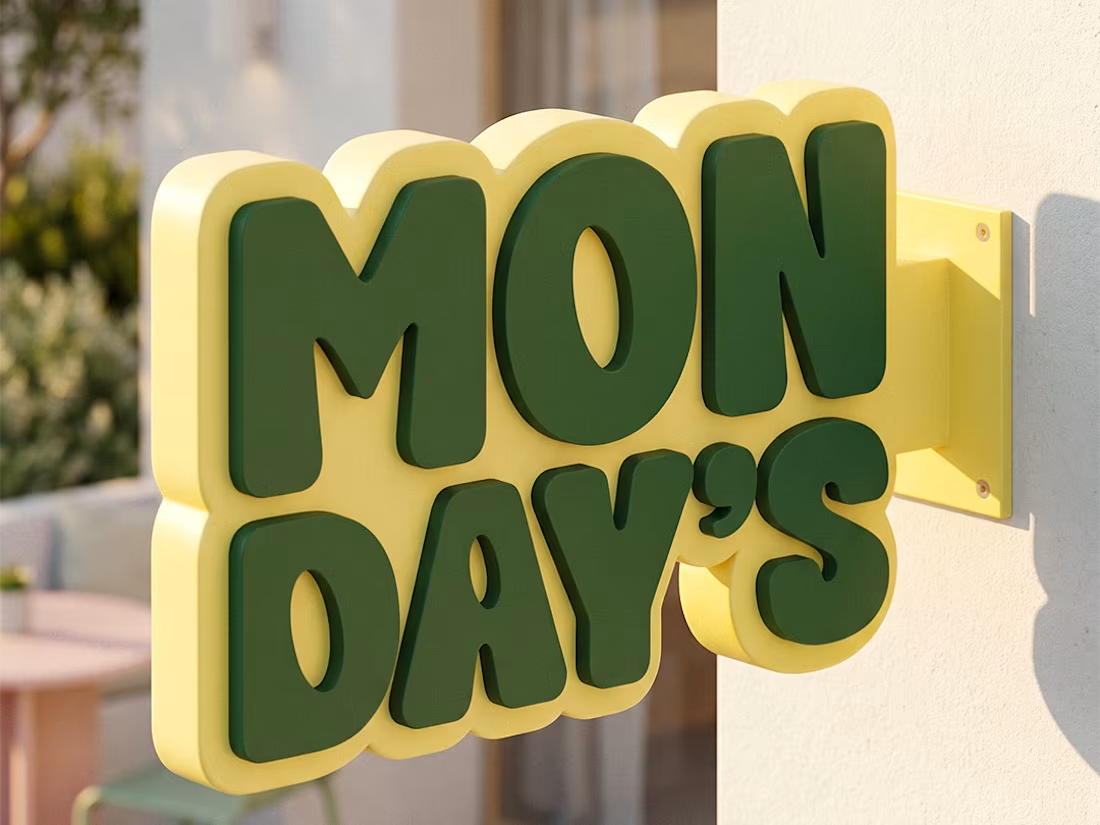
What comes to mind when you think about Mondays?
For most of us, it's the start of a busy week. Early alarms, packed schedules, and the feeling of wishing the weekend lasted just a little longer.
When the client first reached out, that was the question they asked me.
Instead of fighting that perception, we decided to flip it completely.
What if Monday became something people actually looked forward to?
That idea became the foundation of the entire brand.
We explored a slower, more intentional direction. A place where grabbing a matcha isn't just another stop in your day, but a small ritual. A space that feels calm, playful, and welcoming.
That's where the turtle came in.
It represents slowing down, taking your time, and enjoying the little moments. More than just a mascot, it became the face of the brand, carrying the same feeling across packaging, merchandise, menus, social media, and every customer touchpoint.
Every colour, type choice, illustration, and application was designed around one simple goal:
To make Mondays feel a little better.
I'd love to know what you think.
5
10
1.3K
Human by Design — NOCAFF ☕🧢
For the Envato Challenge, I created NOCAFF, a coffee brand inspired by Gen Z culture, internet slang, and fashion editorials. Instead of following traditional coffee branding with warm browns and vintage café aesthetics, I explored a bold visual identity using electric blue, orange, black, and white, building a brand that feels playful, contemporary, and unmistakably digital.
Using Envato as my primary creative toolkit, I developed the complete brand experience—from logo design, typography, packaging, mockups, and visual identity to a fully art-directed commercial. I used Envato Elements for fonts, mockups, music, and creative assets, while Envato AI helped me generate the initial campaign visuals that became the foundation for the final film.
✨ Human by Design moment:
AI-generated possibilities, but it didn't define the brand.
The biggest creative decision was rejecting what was expected. Coffee brands usually lean into earthy palettes and cozy aesthetics, but I deliberately chose a bold, fashion-forward direction. Throughout the process, I refined prompts, changed lighting, camera angles, compositions, styling, and pacing until every image and every frame felt consistent with the world I wanted NOCAFF to live in.
The final result isn't just an AI-generated campaign—it's a brand shaped through creative direction, taste, storytelling, and human judgment.
AI generated the possibilities.
Human creativity built the brand.
Created with Envato Elements + Envato AI
Envato Elements used:
Fonts | Mockups | Graphics | Photos | Music | AI Image Generation | Creative Assets
#envatochallenge #HumanByDesign #Envato
16
34
7.6K
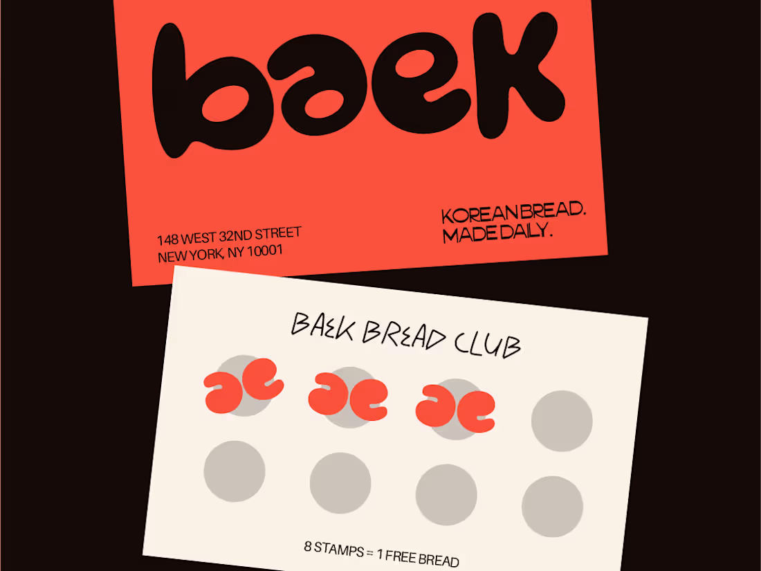
Baek is a korean bakery that knows what it is. warm without being loud, korean without being a costume.
The logo letterforms mirror each other and double as a comma - that one detail runs through everything. bread that’s worth slowing down for.
2
792