pro
Mariyam Afzal
Brand designer building bold, strategic brands.
- $1k+
- Earned
- 1x
- Hired
- 5.00
- Rating
- 35
- Followers
Human by Design — NOCAFF ☕🧢
For the Envato Challenge, I created NOCAFF, a coffee brand inspired by Gen Z culture, internet slang, and fashion editorials. Instead of following traditional coffee branding with warm browns and vintage café aesthetics, I explored a bold visual identity using electric blue, orange, black, and white, building a brand that feels playful, contemporary, and unmistakably digital.
Using Envato as my primary creative toolkit, I developed the complete brand experience—from logo design, typography, packaging, mockups, and visual identity to a fully art-directed commercial. I used Envato Elements for fonts, mockups, music, and creative assets, while Envato AI helped me generate the initial campaign visuals that became the foundation for the final film.
✨ Human by Design moment:
AI-generated possibilities, but it didn't define the brand.
The biggest creative decision was rejecting what was expected. Coffee brands usually lean into earthy palettes and cozy aesthetics, but I deliberately chose a bold, fashion-forward direction. Throughout the process, I refined prompts, changed lighting, camera angles, compositions, styling, and pacing until every image and every frame felt consistent with the world I wanted NOCAFF to live in.
The final result isn't just an AI-generated campaign—it's a brand shaped through creative direction, taste, storytelling, and human judgment.
AI generated the possibilities.
Human creativity built the brand.
Created with Envato Elements + Envato AI
Envato Elements used:
Fonts | Mockups | Graphics | Photos | Music | AI Image Generation | Creative Assets
#envatochallenge #HumanByDesign #Envato
5
13
339
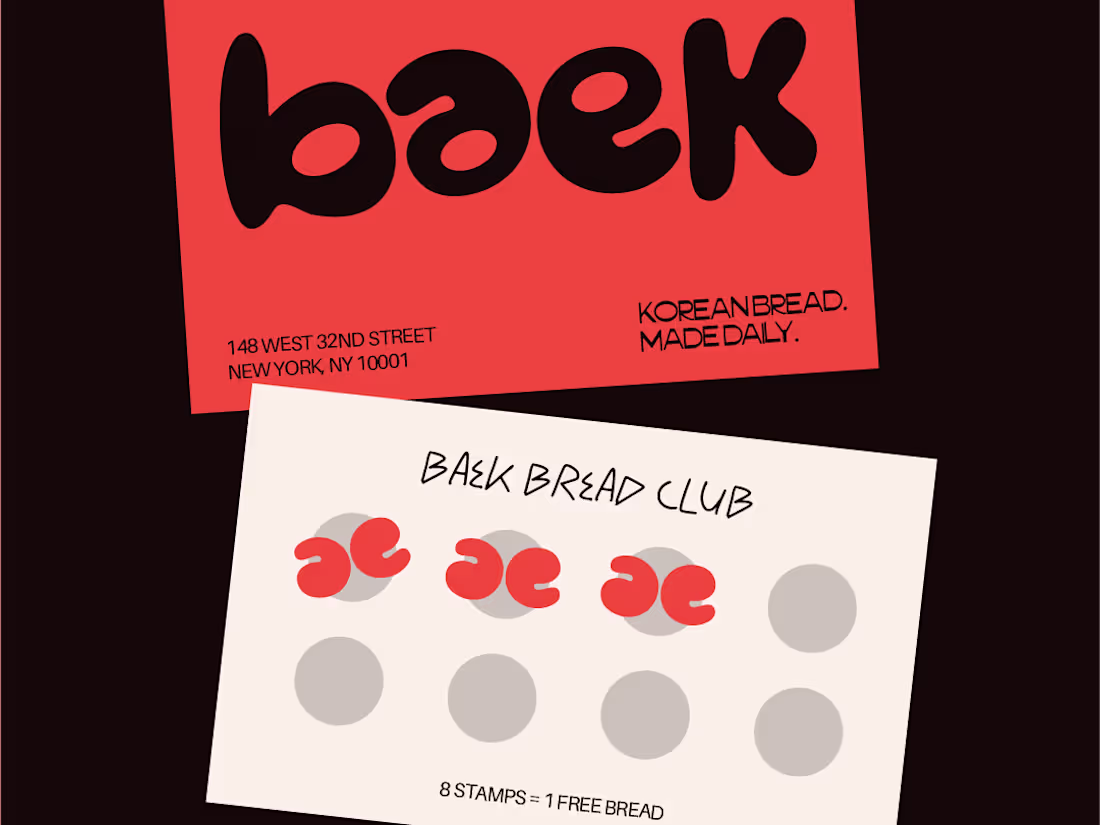
Baek is a korean bakery that knows what it is. warm without being loud, korean without being a costume.
The logo letterforms mirror each other and double as a comma - that one detail runs through everything. bread that’s worth slowing down for.
0
115
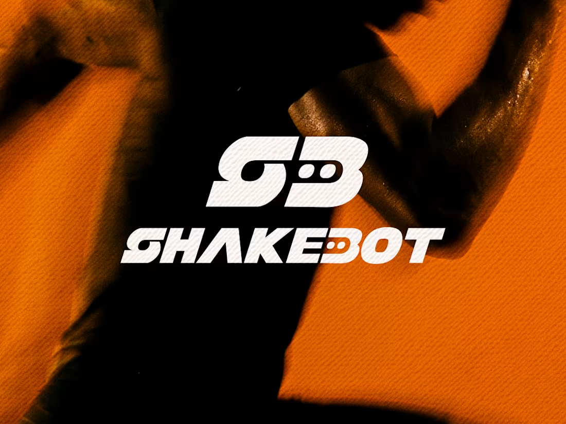
SHAKEBOT is a UAE-based protein dispensing machine designed for gyms, fitness studios, and wellness spaces. Built to make sports nutrition more convenient and accessible, the machine serves freshly mixed protein shakes, pre-workouts, and recovery drinks within seconds. The concept focuses on simplifying everyday fitness routines through smart vending technology and clean nutrition.
For the branding direction, the goal was to create a visual identity that feels modern, performance-driven, and minimal. The logo combines fluid shake-inspired forms with subtle robotic elements to represent movement, energy, and the automated experience behind the product.
1
401
Nocaff is a decaf cold brew brand that refuses to apologize for removing caffeine.
The name said everything. No caff the product, no cap the slang, a literal cap on the character. That one connection built the whole brand.
Electric blue, transparent cans, a faceless pixel art bean wearing a different hat per flavor, and copy that speaks the same language as the people drinking it.
Three flavors, No Extras, Chill Pill, Late Shift. One thought expanded into a full brand world. No cap, it’s no caff.
3
456
Client reveal 🏃♀️
BAB is a building a community that supports young girls through puberty with clarity & confidence.
Its visual language blends athletic energy with expressive femininity, using bold color, raw imagery, and structured elements to reflect bodies in motion and transition.
0
472
BAB is a building a community that supports young girls through puberty with clarity & confidence.
Its visual language blends athletic energy with expressive femininity, using bold color, raw imagery, and structured elements to reflect bodies in motion and transition.
0
456
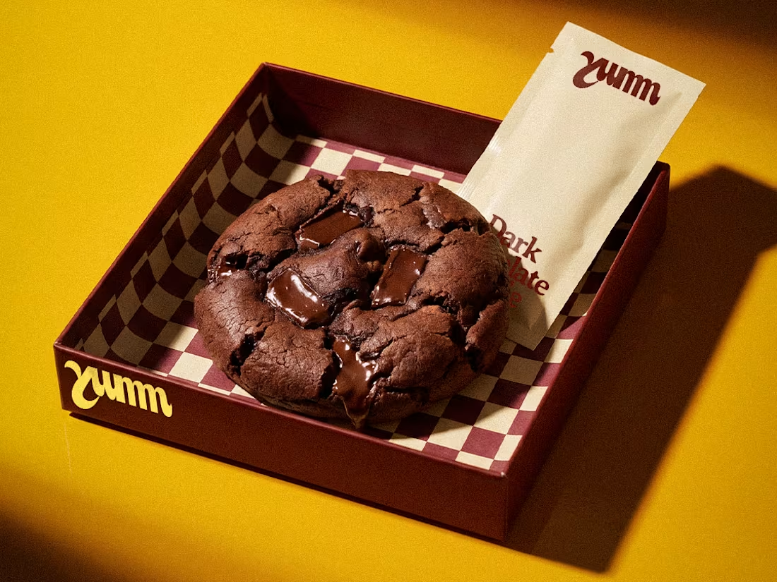
Baked a cookie brand recently 🍪
YUMM is a cookie bakery for people who take cookies seriously.
The inspiration came from the ketchup sachet. Something so simple, so familiar, and completely reimagined. Your cookie arrives loaded and indulgent. Your toppings come in a sauce sachet. You tear, you drizzle, you eat. That’s the whole ritual.
#brandidentity #packagingdesign #artdirection
3
537
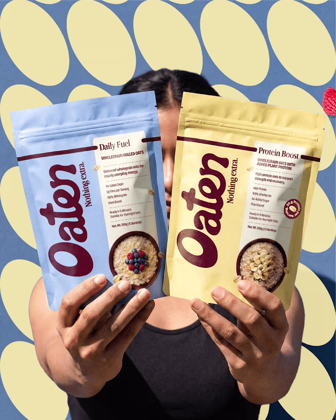
Meet Oaten - a modern oats brand.
Oaten is designed as a functional nutrition brand - structured, honest, and system-led.
Lemme know what do you guys think?
1
3
522
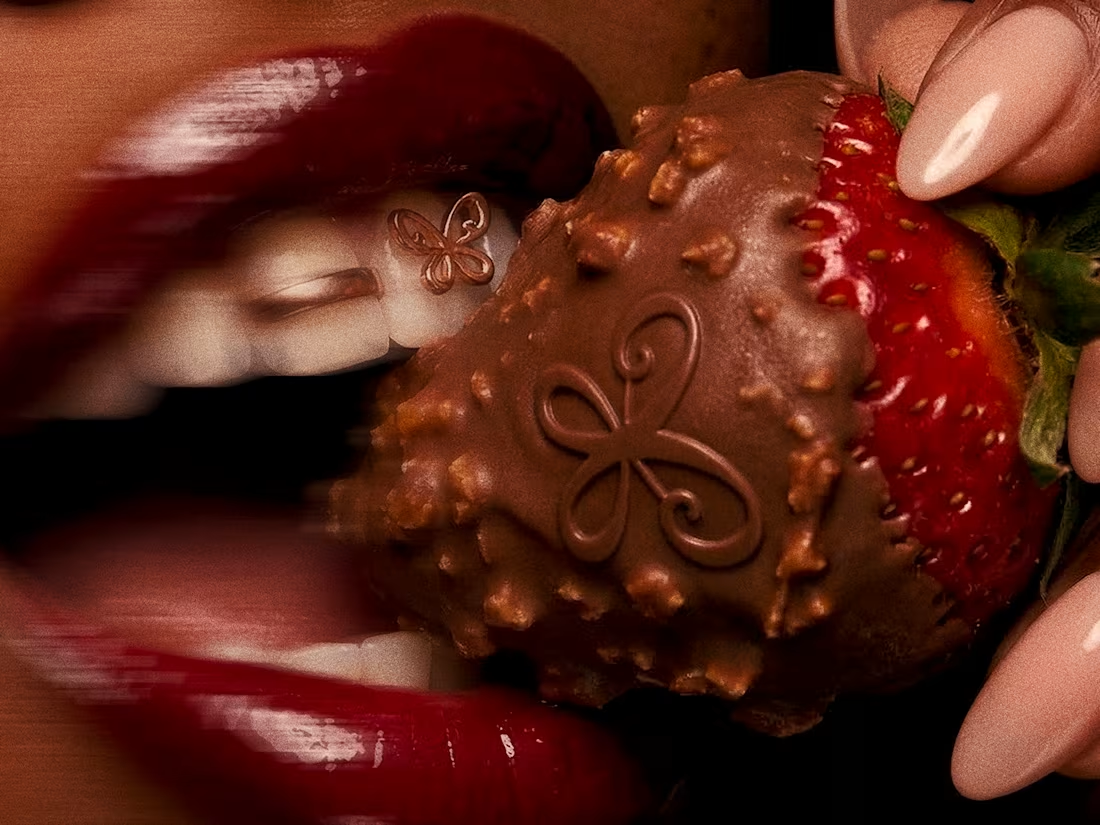
Brand Identity Design for Scarlet Society
1
8
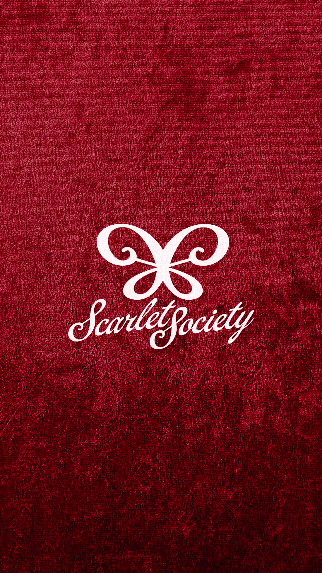
Introduction a new branding project I did recently, sooo in love with it already.
Scarlet Society is a modern dessert brand built around chocolate-covered strawberries, reimagined as a premium and indulgent experience.
#brandingproject #brandconcept #packagingdesign #dessertbranding #brandidentitydesign 🍓
4
6
513
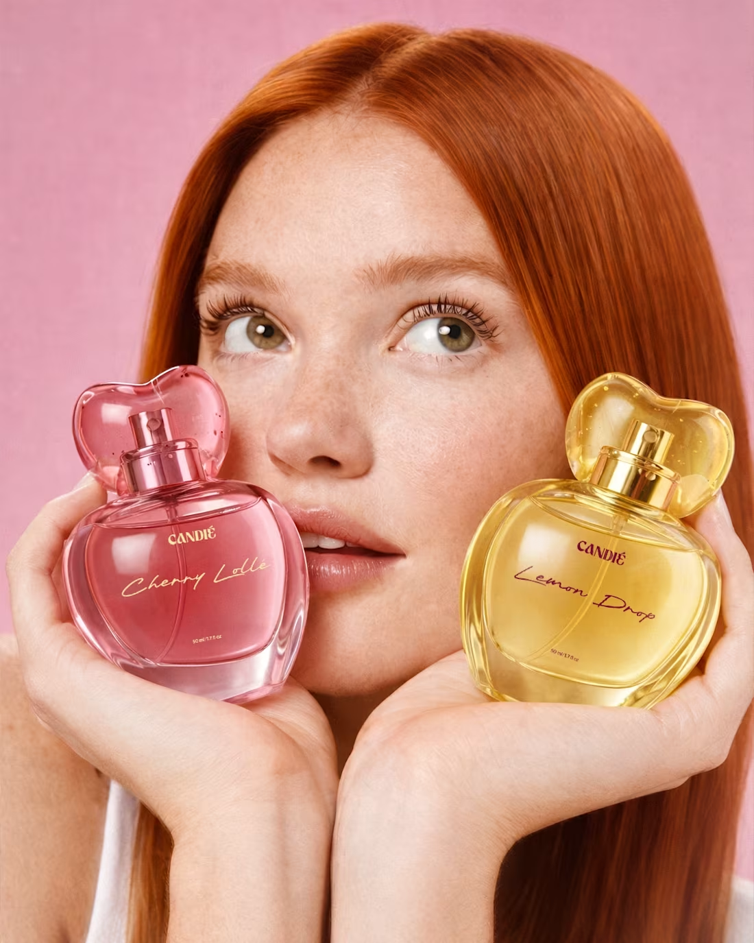
Candié Fragrance Brand Design
2
12
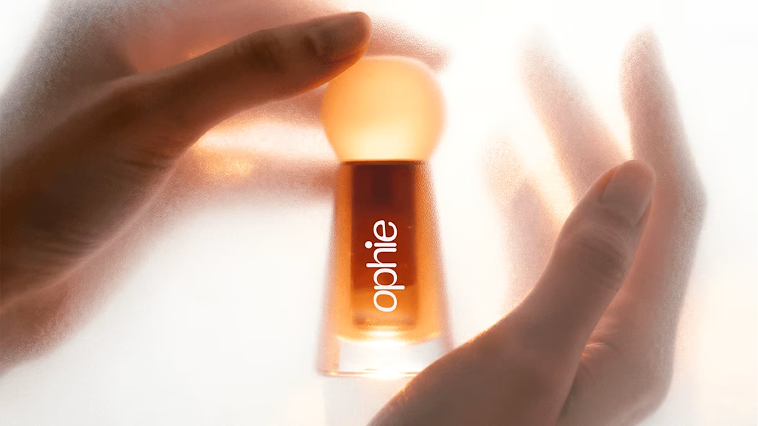
Ophie Lip Oil Brand Identity
0
6
1
0
10
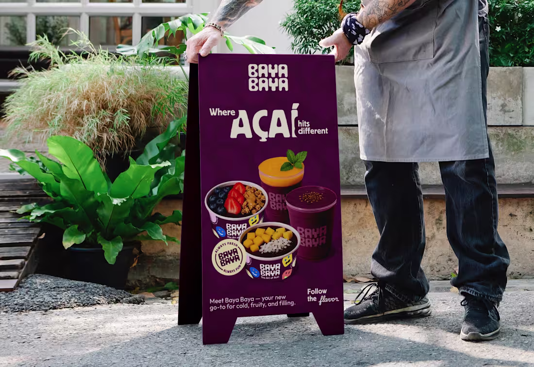
Baya Baya Açaí Shop Branding
2
5
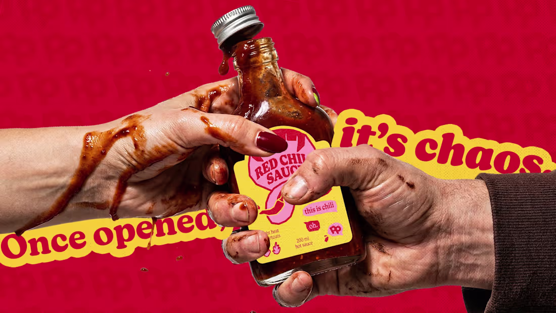
Peppa Please | Hot Sauce Brand | Branding & Packaging
2
22