Peak — SaaS Logo & Brand Identity

Yalcin Web


Peak — SaaS Brand Identity & Logo
Brand identity for Peak, an all-in-one website builder for WordPress that I design and build. A four-letter mark, a warm paper-and-ember palette and one system that runs from the favicon to the packaging.
Logo with shader
Overview
Peak is an all-in-one website builder for WordPress: a visual builder, a GSAP motion engine, a CMS and a design system in one plugin. It is made for designers and studios who want the live site to look exactly like the design, without stitching five plugins together.
I’m building Peak, so I designed its brand as well. The brief I gave myself was short: it should feel like a design tool, not like another WordPress plugin. Calm enough to work in for hours, sharp enough to sit next to the tools designers already love.
Role: Founder, brand and product design
Year: 2026
Tool: Figma
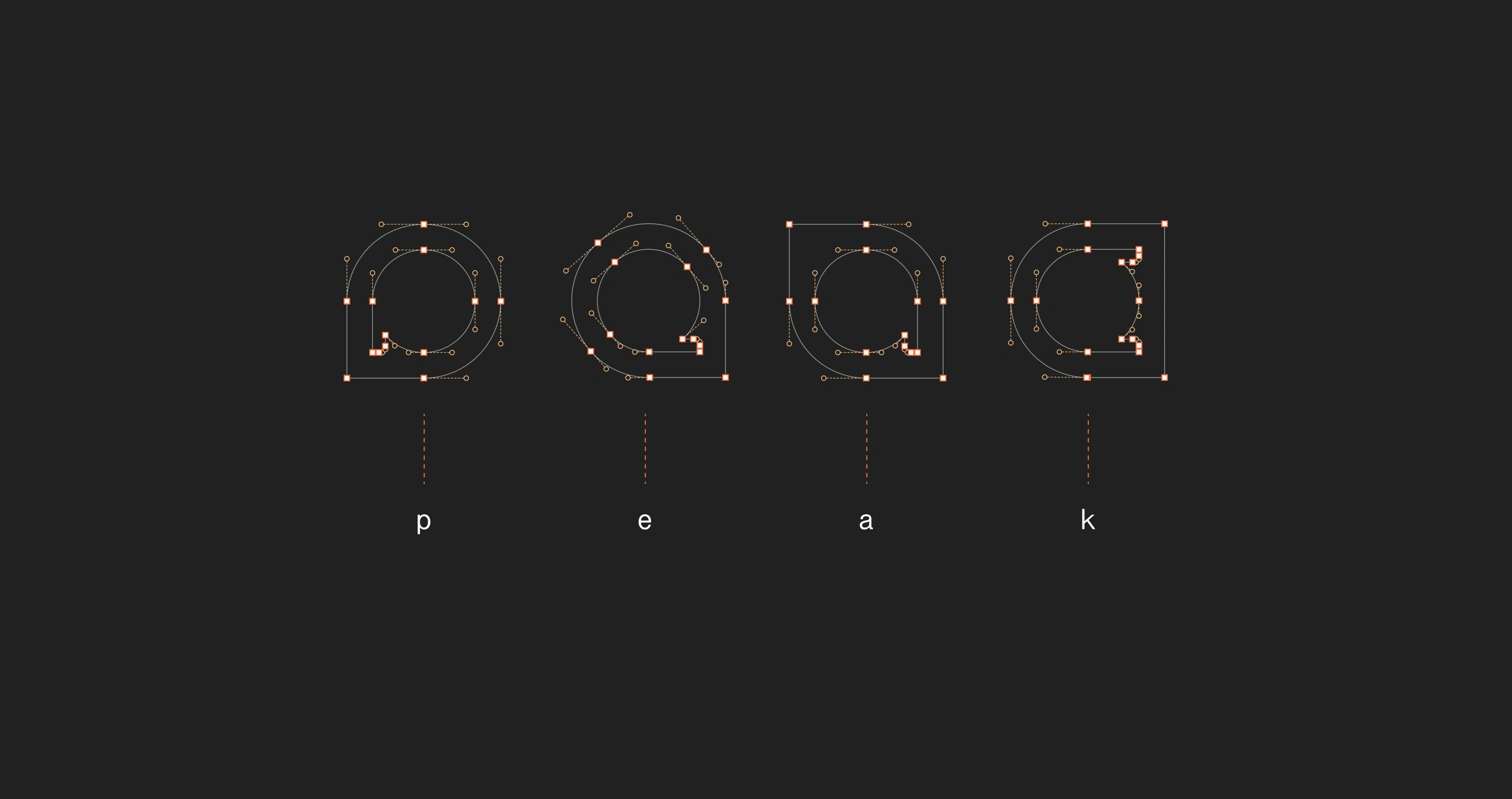
Letter Construction
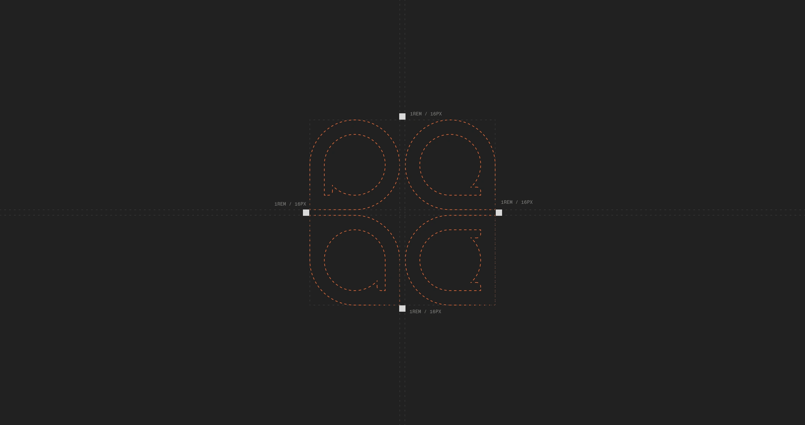
Spacings
The mark
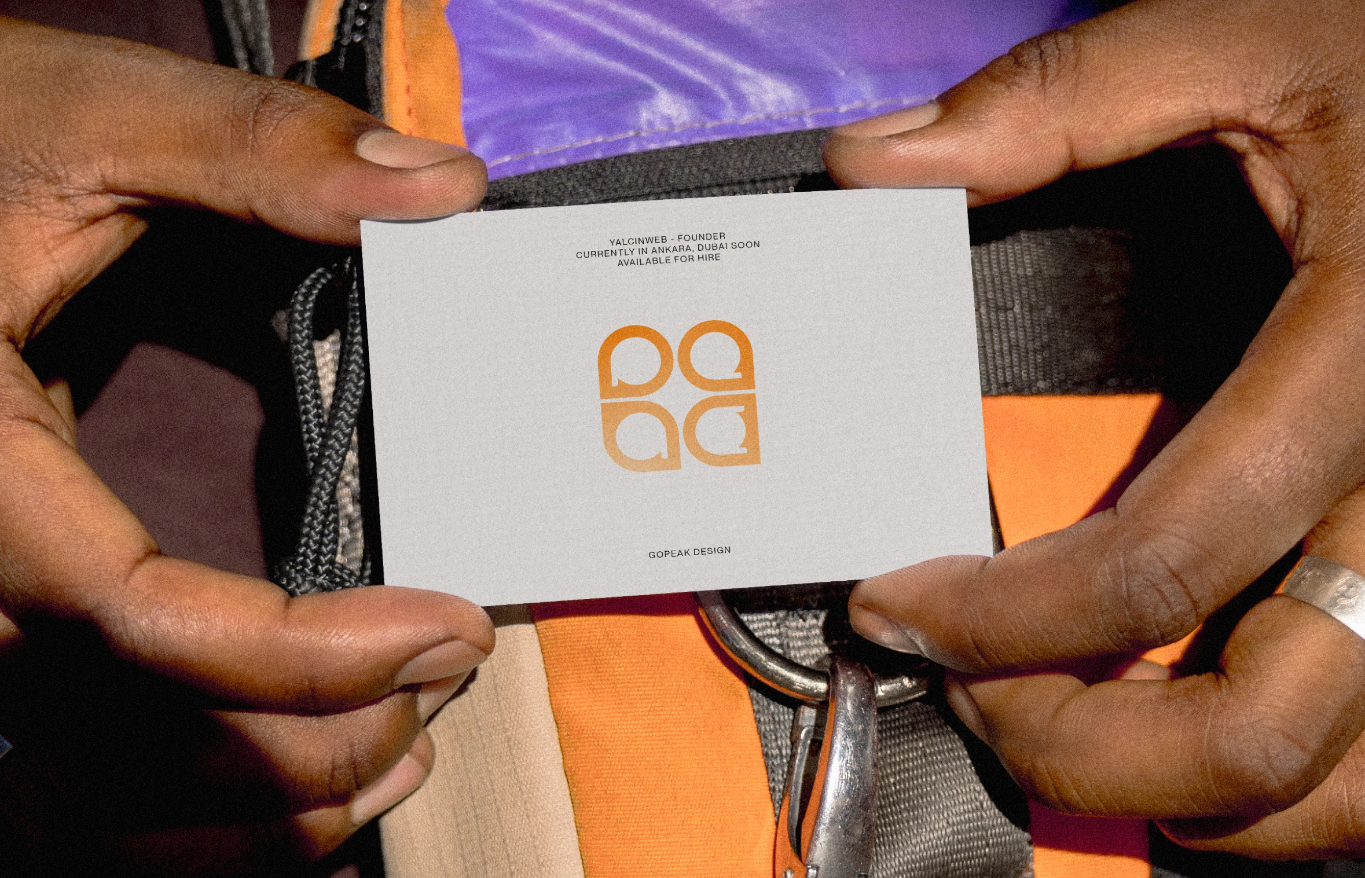
The logo is the name itself. Four lowercase letters, p, e, a and k, stacked two by two into a square.
A square made of four parts is also how Peak works: pages are built from blocks, and blocks from smaller blocks. Up close the mark reads as a word. From a distance it becomes a single building block.
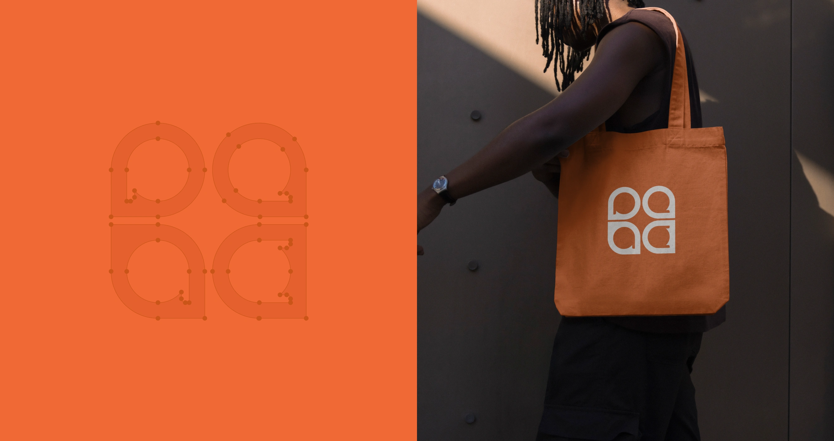
On Product
Color Palette
Colour
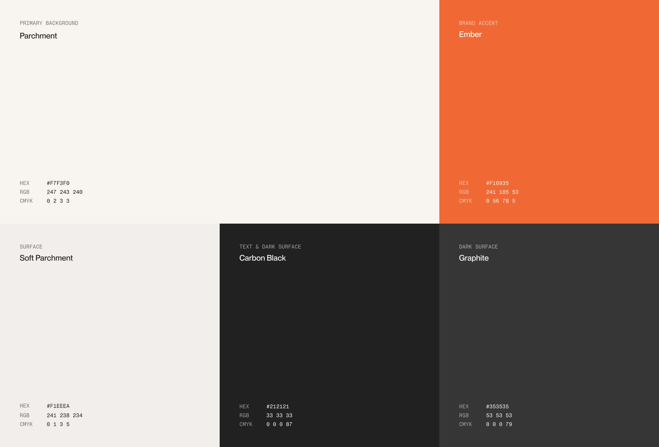
The palette starts from paper, not from pure white. Parchment (#F7F3F0) and Soft Parchment (#F1EEEA) are warm off-whites that stay easy on the eyes during long sessions in the builder. Carbon Black (#212121) and Graphite (#353535) carry the text, the dark surfaces and whatever is active on screen.
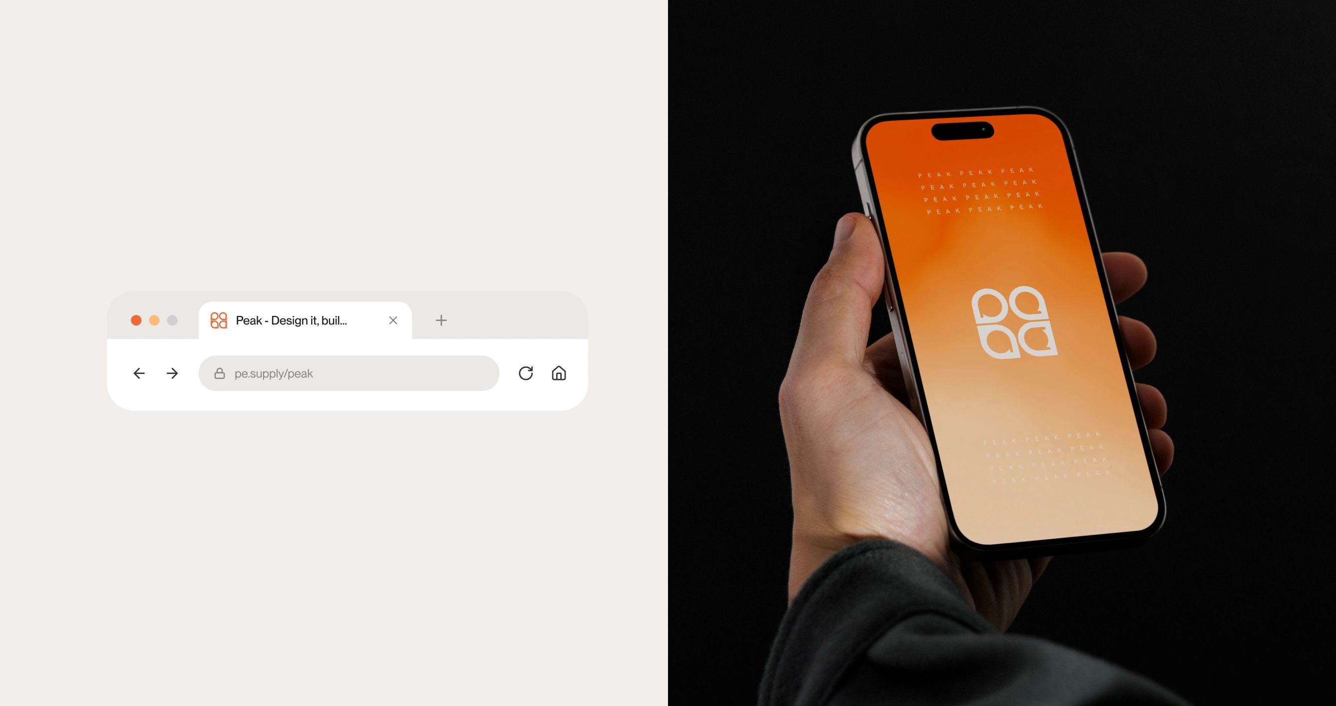
Ember (#F16935) is the one loud colour, and it is used like a signal: a live dot, a notification, the single thing that needs your attention. For bigger brand moments it melts into a soft apricot gradient, as on the cover and the phone screen.
Business Card
Browser addresbar & phone mockup
Typography
Typography
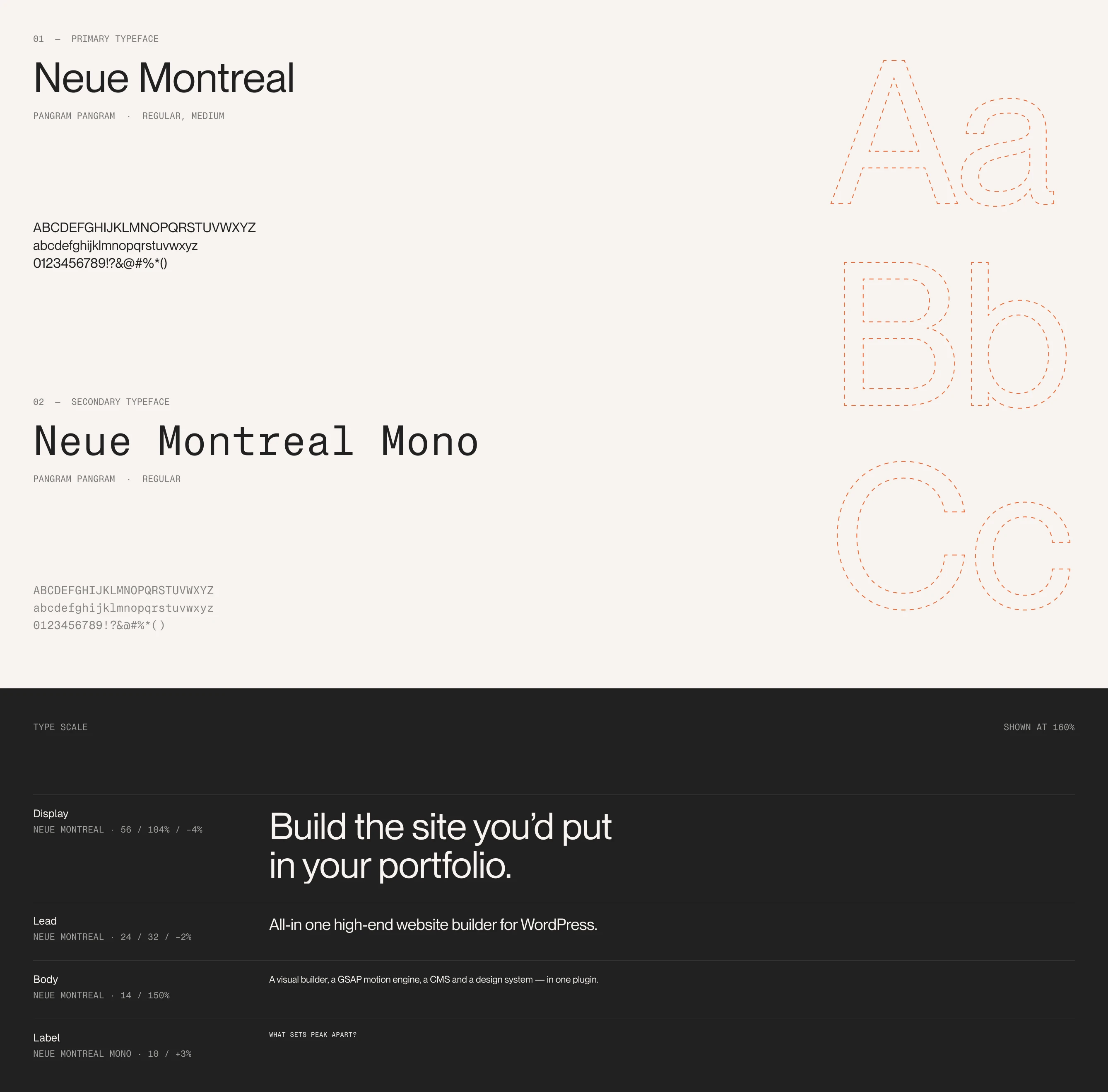
Neue Montreal by Pangram Pangram is the voice of the brand: neutral, a little warm and tight at large sizes. Two weights, Regular and Medium, cover everything from headlines to the interface.
Neue Montreal Mono takes the labels: hex codes, measurements and small captions that read like a spec sheet. It is a quiet nod to the people Peak is for, designers who also care about what happens in the code. The scale is kept to four steps: Display, Lead, Body and Label.
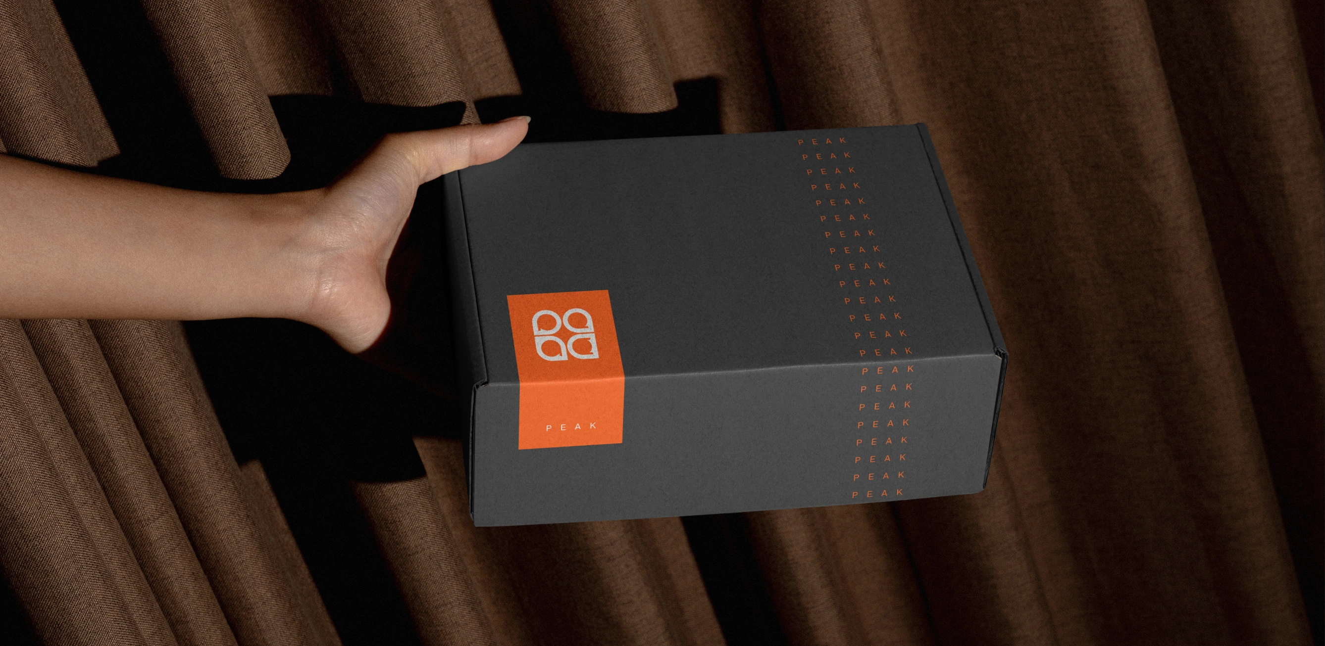
Package Design
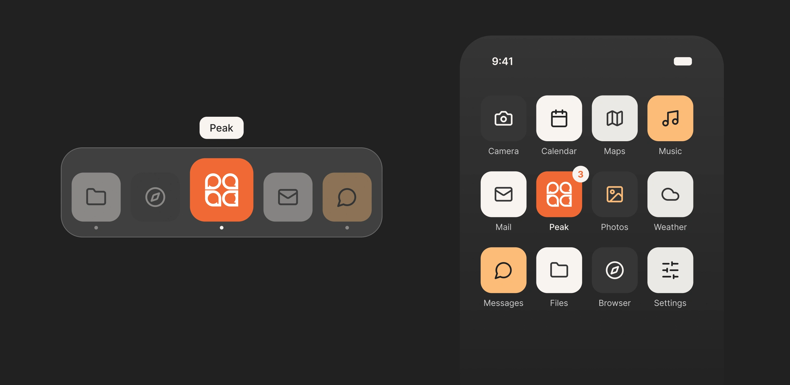
App Icons
In the product
The identity doesn’t stop at marketing. The same mark, colours and type run through the product itself: the WordPress admin menu, the editor’s loading screen, the store listing and the social profile. One system, from the first post someone sees to the moment they open the editor.
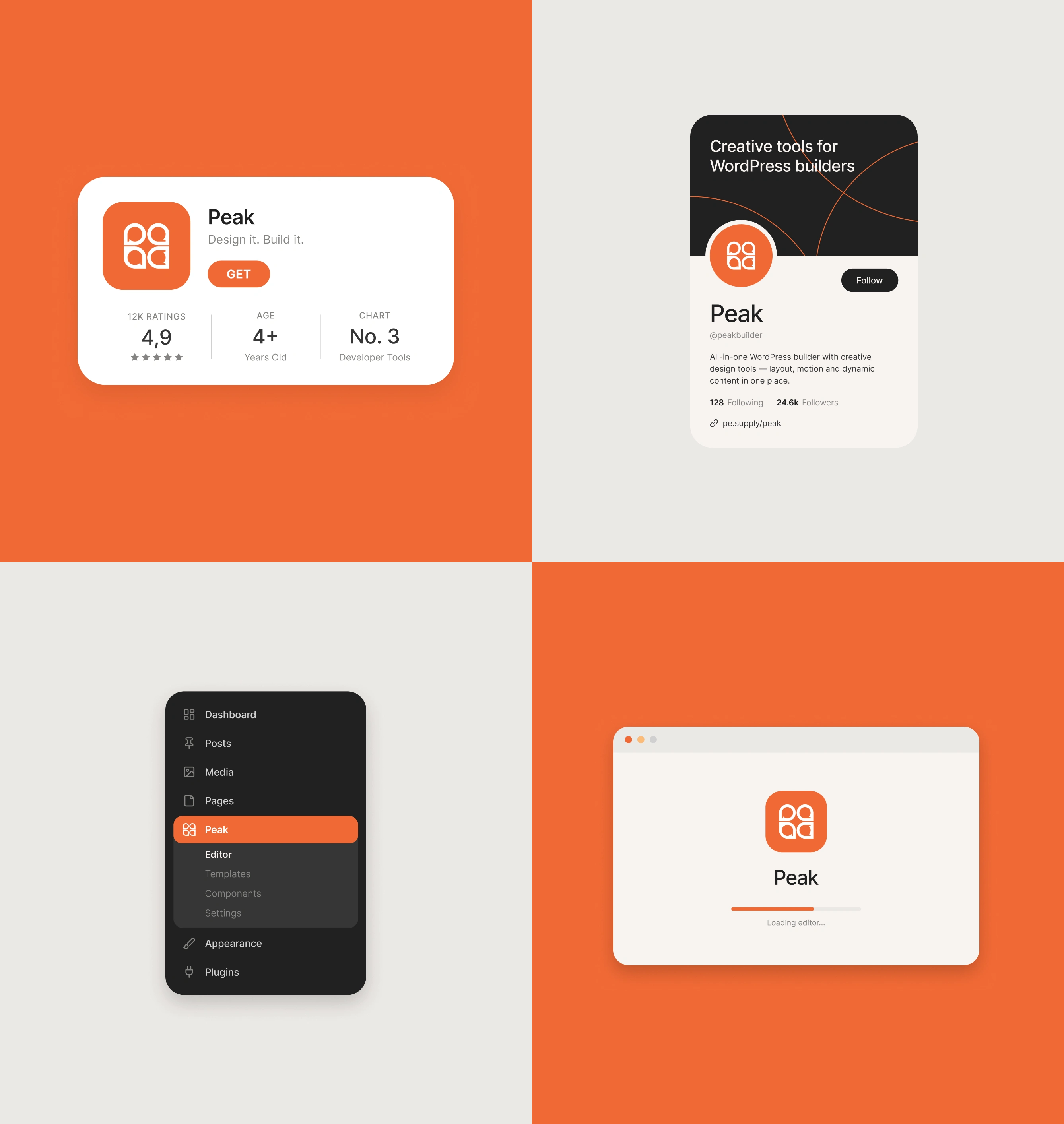
Product
Peak launches soon.
Join the waitlist and try the live demo at gopeak.design.
Need a brand or a website built with this level of care?
I’m available for hire.
yalcin@pethemes.com
Like this project
Posted Oct 14, 2026
Brand identity for Peak, an all-in-one website builder for WordPress that I design and build. A four-letter mark, a warm-ember palette and one system that runs.
Likes
3
Views
5
Timeline
Oct 1, 2026 - Oct 13, 2026
Clients
PeThemes