The network for creativity
Join 1.25M professional creatives like you
Connect with clients, get discovered, and run your business 100% commission-free
Creatives on Contra have earned over $150M and we are just getting started
Back to feedPost
Taste Test
The previous poll on this preloader had exactly 50-50 results between Horizontal gallery and Circle intro. Now I'm continuing with 2 other options. Which one is better? Check the live preview here
19 voted
53%
17 voted
47%
36 votes
Closed


Team mosaic!!

Thank you!! A lot of people choose the Mosaic🎉

Nice work, Celia. The mosaic approach gives the team a strong visual identity without making everything feel too uniform.
We work across SaaS, AI, mobile, and web development at M TECHUB LLC. If you ever need a technical partner to turn design concepts into full production products, happy to collaborate.

Leaning Mosaic, feels like a stronger first impression for a preloader. Funny that the last one split exactly 50/50 though
Yesss make it harder to make a choice😂 btw followed you, lets connect!

Thank you for the feedback!!

On No, I am in dilemma!!
And the previous poll also have 50-50 results, make it harder to choose😂
Go with your heart selection , you won't be wrong!!

Mosaic is unique I like it ❤️❤️
Thank you for the feedback!!!
Pardon Bella❤️

Thank you for the feedback!!

wowww love itt
Thank youuu!!

Mosaic
Thank you for the feedback!!

I think I made it a tie again lol sorry but soft sheet looks more appealing to me 🤔🙂
Haha now just have 1 different vote😂

Mosaic all day.. The tile reveal looks super clean but you could try letting the text fade in right as the tiles lock into place so it feels more connected.
Do you mean the texts on the hero? it can be customize on the native Framer, what i sell here just the preloader. but thank you for the feeback!

A 50-50 split last time is wild. Curious which way this round goes. Nice work on the preloader!
The Mosaic is the winner!
The network for creativity
Join 1.25M professional creatives like you
Connect with clients, get discovered, and run your business 100% commission-free
Creatives on Contra have earned over $150M and we are just getting started



Related posts

Which one do you think i should put as a FEATURED SECTION cover on linkedin? Help me decide!
1 voted
33%

2 voted
67%

3 votes
Closed


which one matches your headline better? thats usually the tiebreaker for featured covers

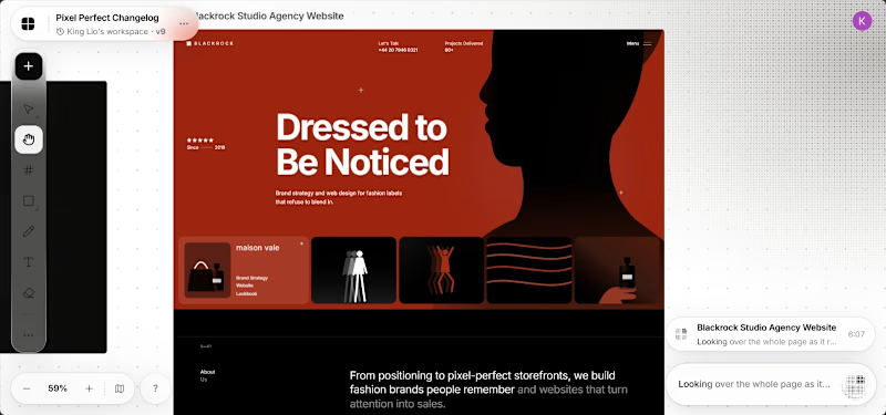
These designs were made by the AI in my upcoming design tool for designers.
I don't know which is better, help me decide.
For those wondering where the remaining designs are, I'll drop it in my next post.
2 voted
40%
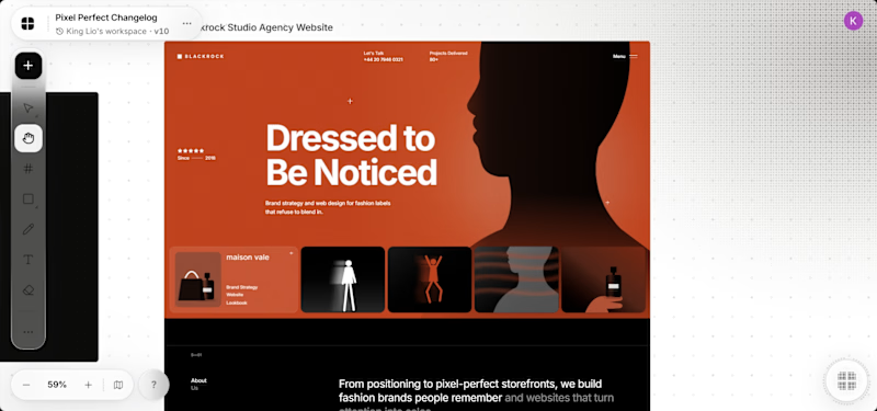
3 voted
60%
5 votes
Closed

It's the red one for me... Passed the message a lot better than the Orange


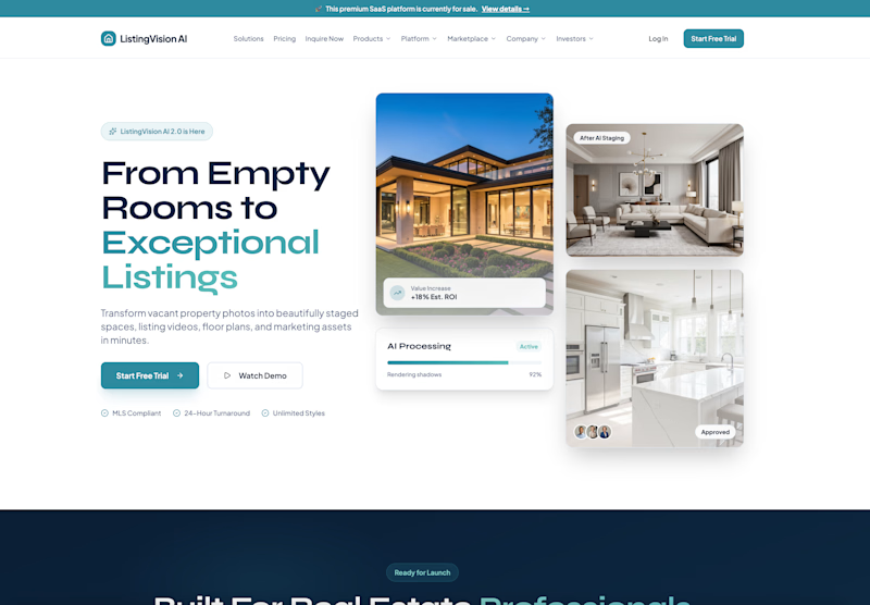
Which real estate homepage makes the stronger first impression?
ListingVision AI features a bright layout, teal accents, and property imagery to introduce its AI staging and listing tools.
San Diego Property Market pairs coastal photography with classic typography, neighborhood search, and market resources.
Which design feels more inviting and makes you want to explore further? Does the clean presentation of ListingVision AI catch your attention, or do you prefer the location-focused experience of San Diego Property Market?
Vote for your favorite and share what influenced your choice: imagery, colors, typography, layout, or calls to action.
#WebDesign #RealEstateMarketing #AIWebsites #UIUXDesign #TransformedDesign


3 voted
43%
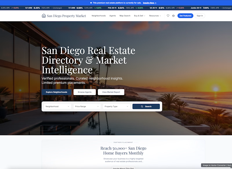
4 voted
57%
7 votes
Closed

ListingVision AI. One clear primary button and the staged before/after right in the hero, while San Diego asks you to choose between three equal buttons and a search bar before you know why.