The network for creativity
Join 1.25M professional creatives like you
Connect with clients, get discovered, and run your business 100% commission-free
Creatives on Contra have earned over $150M and we are just getting started
Back to feedPost
Taste Test

🌿 Design Poll: Which hero makes a stronger first impression?
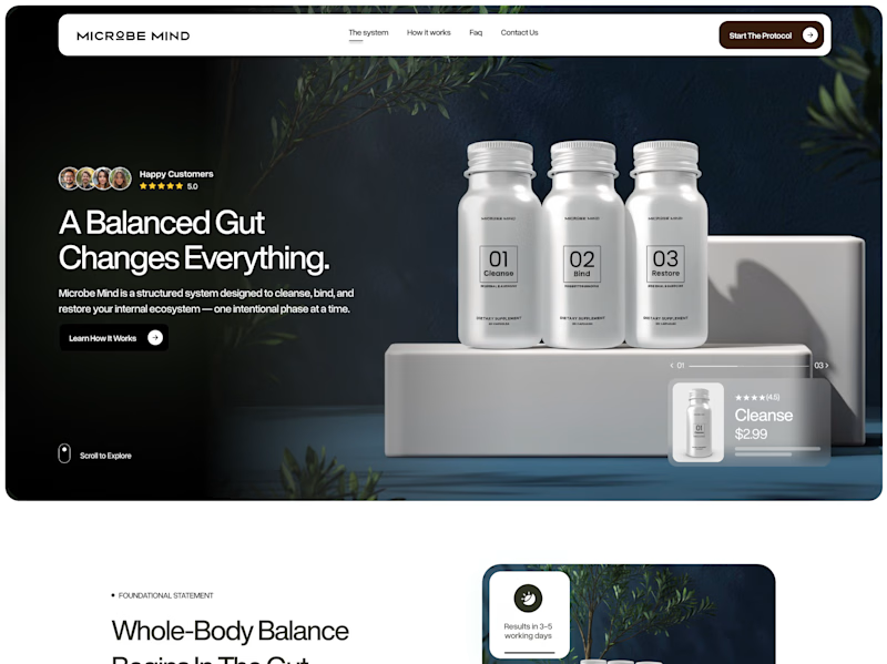
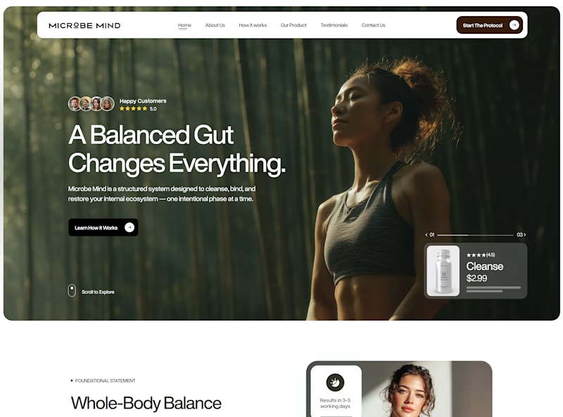
I explored two creative directions for the same gut health brand, each designed to communicate trust, wellness, and premium quality in a different way.
🧴 Option A puts the product front and center, highlighting the system and creating a clean, premium feel.
🌱 Option B leads with a lifestyle image, focusing on emotion, connection, and the transformation behind the product.
Both communicate the same message, but they create very different first impressions.
👇 Which one would you choose, and why?
💬 Is it the product-first approach or the human-first experience that wins your vote?
Poll Options:
🧴 Option A – Product First
🌱 Option B – Lifestyle First
21 voted
24%
65 voted
76%
86 votes
Closed

Definitely version A

I think smiley humans generally tends to win on conversion oriented designs! I don't have the evidence but heard that anecdotally

Option B


I might be wrong, but I think option B sells benefits. Meanwhile, option A is more of a product showcase, to me. Apart from that, personally I prefer there is a figure who greets customers in the hero. Gives the impression that I am not communicating with a machine. This is great work! I like this!

Option B


Option B for me


Option A goes well


Product first 🥇


Impressive design !


Option b

Option B feels calm and welcoming; Option A is very direct but in this case a bit too direct

Going for option B

Option B 🌱

would love to see the whole web, sick work!

I like the hero in Option B more

B! the serenity shown speaks volumes.


Option B


Option B for me

Option B for sure

B for me. It creates a stronger emotional connection and sells the outcome, not just the product.

Option B You asked why? My answer: To whom the product??

Will go for Option A

I prefer Option B. It feels cleaner, more refined, and creates a stronger first impression for me.
I like how Option A puts the product front and center, but the CTA didn't catch my attention right away. I also found the product card a bit easy to overlook.

Option A

Clean & Creative Work 😍

Option B - for me because it shows a human who's clearly impacted by the product vs just a generic product shot

Option B winning makes sense for gut health specifically, people are buying a feeling of vitality more than a supplement stack. Option A would probably do better for a more clinical brand where the product itself needs to build the trust.
The network for creativity
Join 1.25M professional creatives like you
Connect with clients, get discovered, and run your business 100% commission-free
Creatives on Contra have earned over $150M and we are just getting started
Related posts



Tamer amazing work

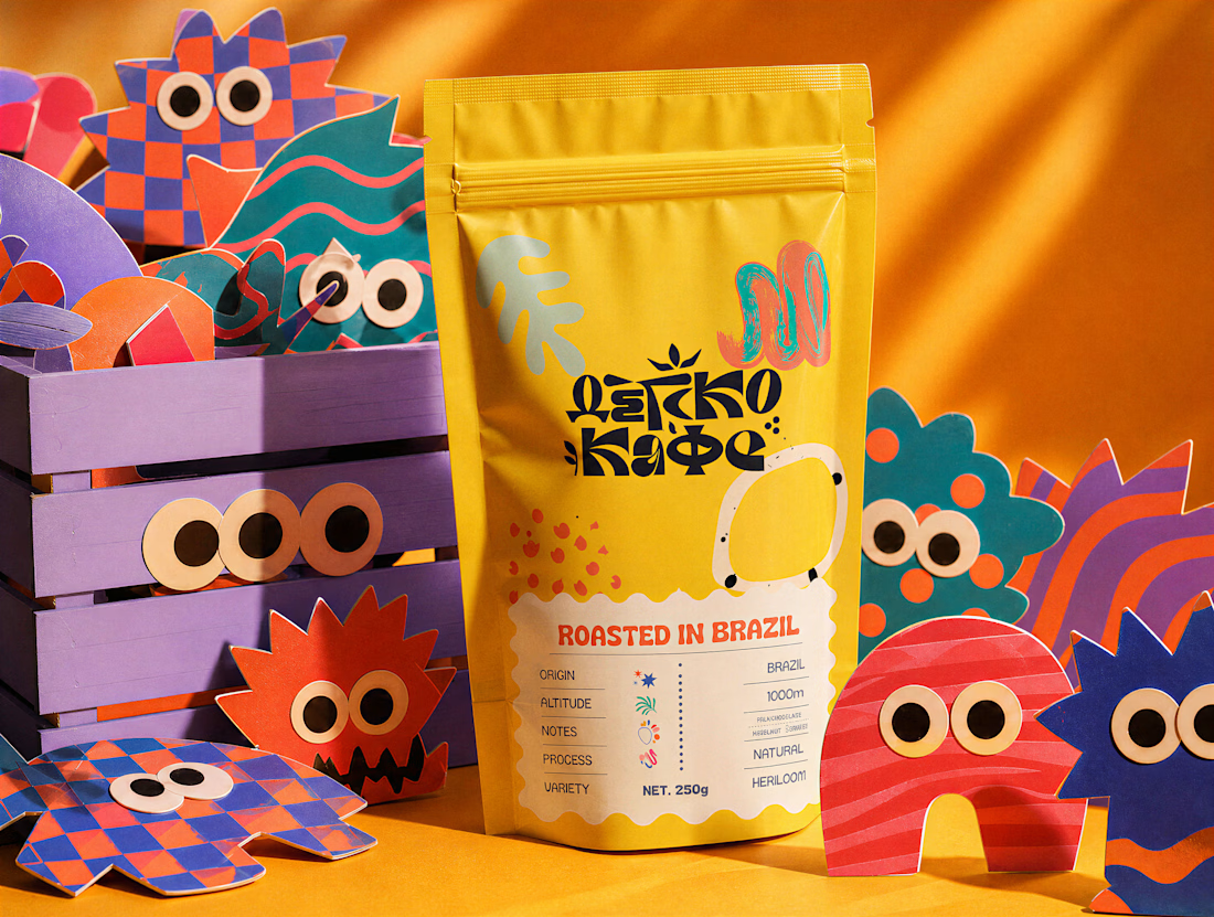
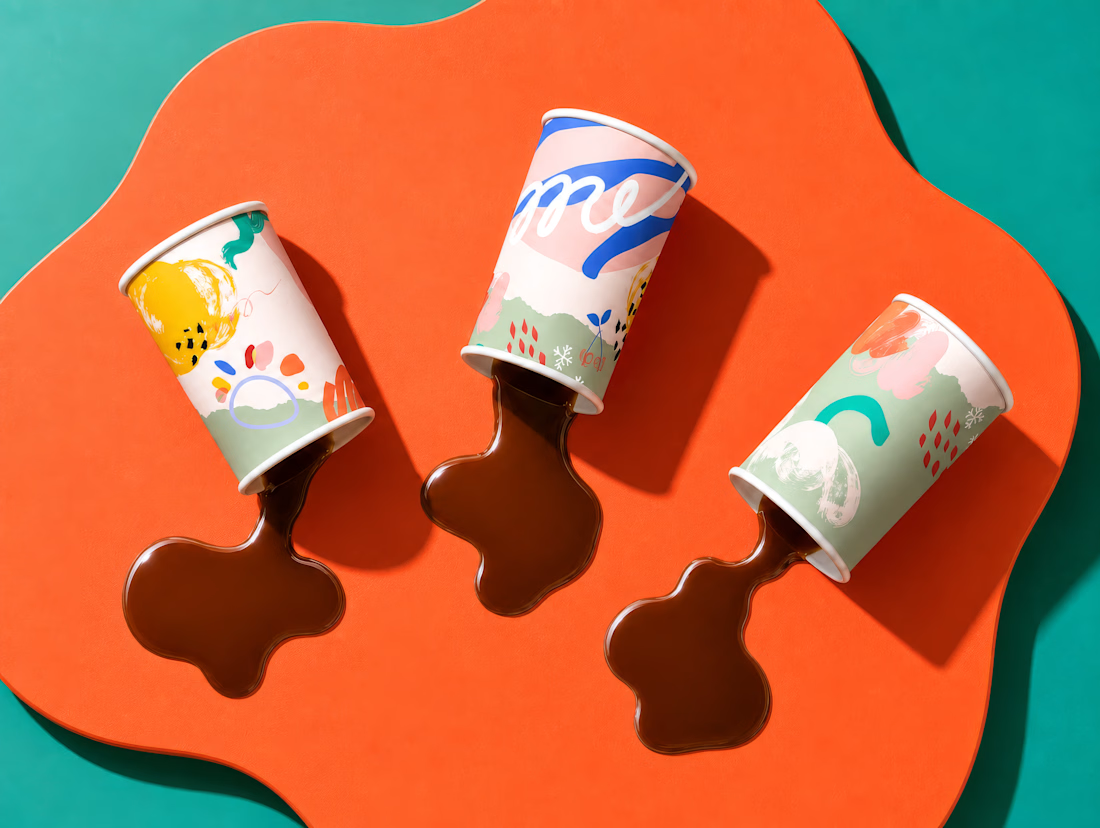
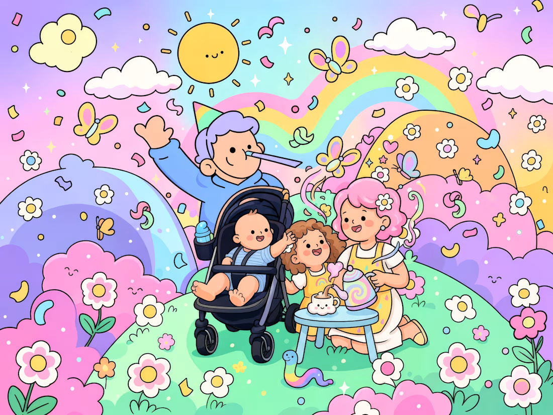
*Humanizing an AI Kid's Coffee Brand*
For this challenge, I developed a complete brand identity for a fictional kid's coffee brand (Детско Кафе- In Cyrillic alphabet as my primary script, I felt it would be a unique decision), documenting every stage of the creative process from exploration to execution. Using Envato as my primary creative toolkit, I explored multiple directions across logo design, visual identity, custom graphics and patterns, AI-assisted imagery, music and sound generation, packaging design, and a short animated brand story inspired by authentic photos from our family trips, transformed into playful doodle illustrations.
Throughout the project, I intentionally highlight the moments where human intuition made the difference, rejecting stronger looking but weaker concepts, redesigning typography and composition, solving real-world print and packaging challenges, building a cohesive visual system, and shaping a brand personality that feels playful, memorable, and emotionally authentic.
This isn't the story of what AI helped create, it's the story of the decisions that only a designer could make.



This is exactly how anything related to kids should be!!! I mean add some colours guys

MIDDAY | Visual Identity System
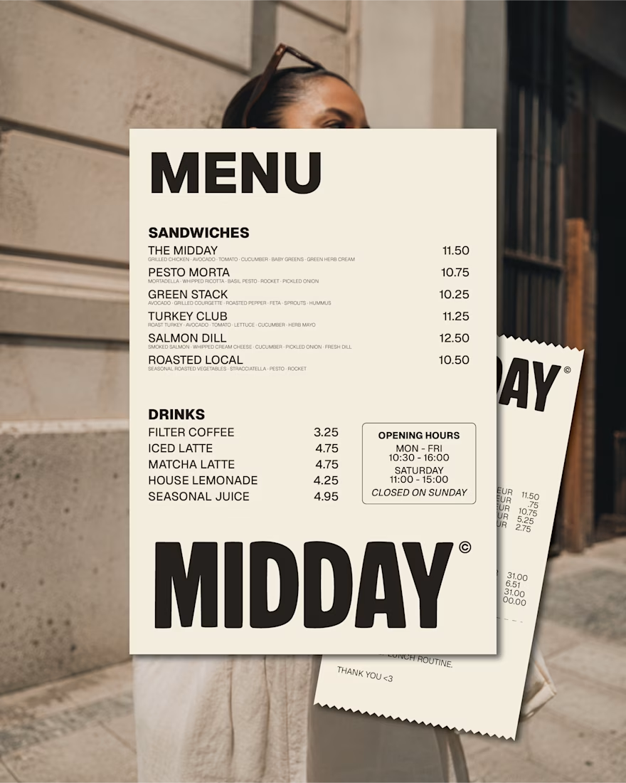
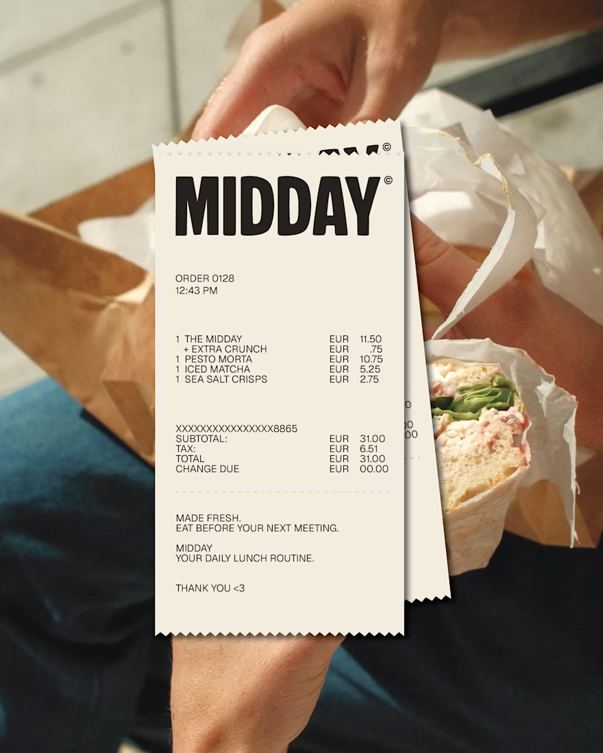
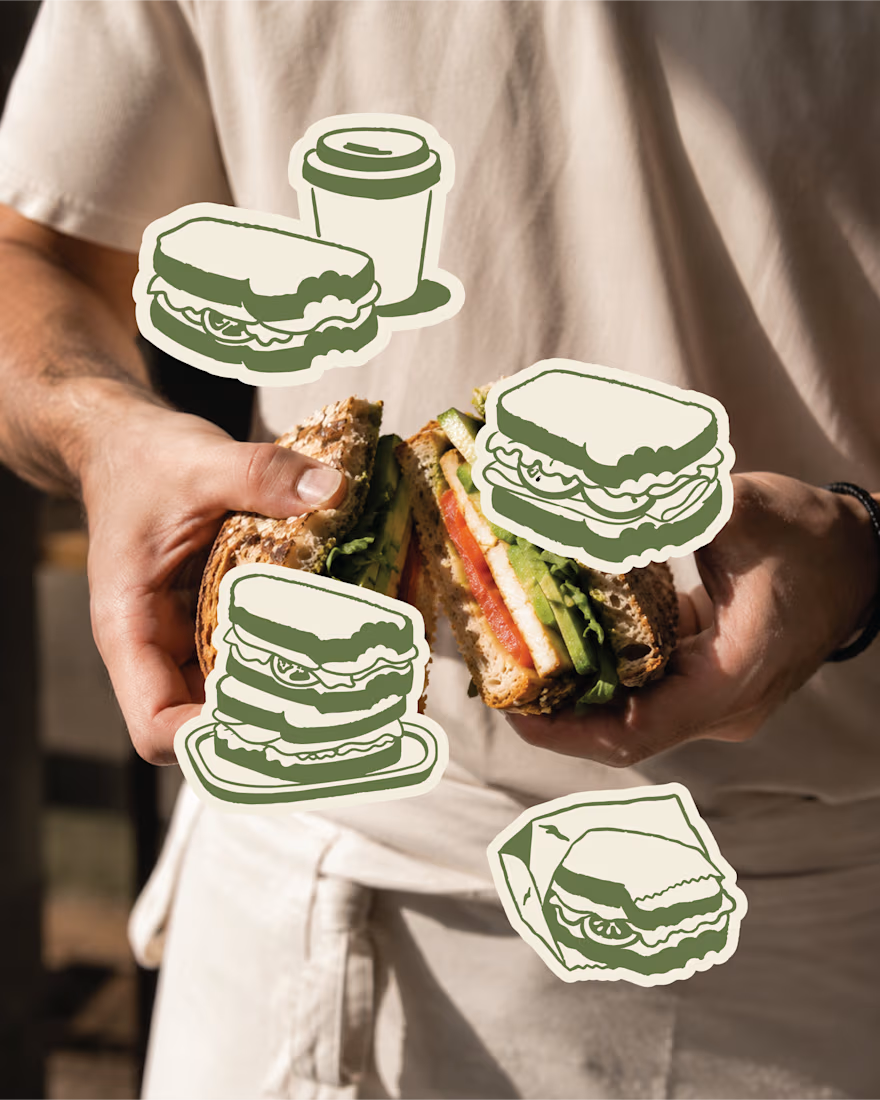
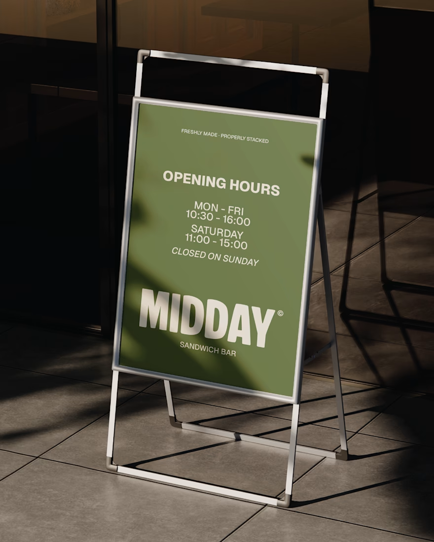
The MIDDAY identity was designed to work hardest in the everyday touchpoints, from menus and receipts to signage and takeaway moments.
A compact colour palette, oversized typography and loose illustrated assets keep the brand recognisable while giving it enough flexibility to feel relaxed, playful and human.
A system made for real lunch breaks, not just polished mockups.
Last part before the case study on this personal project.
It may only exist in mockups for now, but the brand is ready whenever someone wants to make it real.
brandingbrandingassetsvisualidentityBrand DesignLogo DesignVisual DesignAdobe IllustratorAdobe PhotoshopFigma


This deserves more than just liking, this deserves to be featured! 🏆 The cohesive branding assets are perfect for translating into a premium website.











Trending

Claude
Claude has entered the design space. How are you using Claude Design?

Contra University
Learn from expert creatives how to earn more using next-gen AI tools.
creativeaiflow
Creative AI workflows are evolving. What tools do you use, and what are their strengths and weaknesses?
freelancerlife
Freelancer life is wins, pivots, and everything in between. What’s yours right now?