The network for creativity
Join 1.25M professional creatives like you
Connect with clients, get discovered, and run your business 100% commission-free
Creatives on Contra have earned over $150M and we are just getting started
Back to feedPost

Veloré: Luxury Watch Brand Identity & Campaign (Concept)
I created Veloré as a self-initiated concept project to show how I build a complete brand from logo to campaign. The brief was "quiet luxury": dark obsidian tones, champagne gold accents, brushed steel textures and a crowned "V" monogram.
What I designed:
Brand identity: logo, color palette, typography system and moodboard
Campaign visuals: launch poster, collection poster, and Instagram Story and feed ads
Website landing page hero
Luxury packaging: watch box, warranty card, manual and gift bag
Tools: Canva, Adobe Photoshop, Adobe Illustrator, and AI tools for concept and image generation, refined and art-directed by me.
Looking for luxury, fashion or e-commerce brands that need a consistent, premium look across social, ads and packaging. Message me to talk about your brand.
Short captions for each image
Moodboard and color palette: Where every brand starts: colors, mood and material direction.
Typography sheet: Cinzel for headings, Montserrat for body text.
Textures and materials (both versions): Brushed steel, smoky velvet and sapphire crystal.
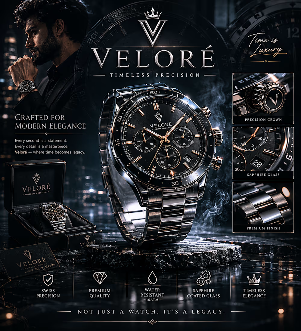
Collection poster: Four watches, one identity.
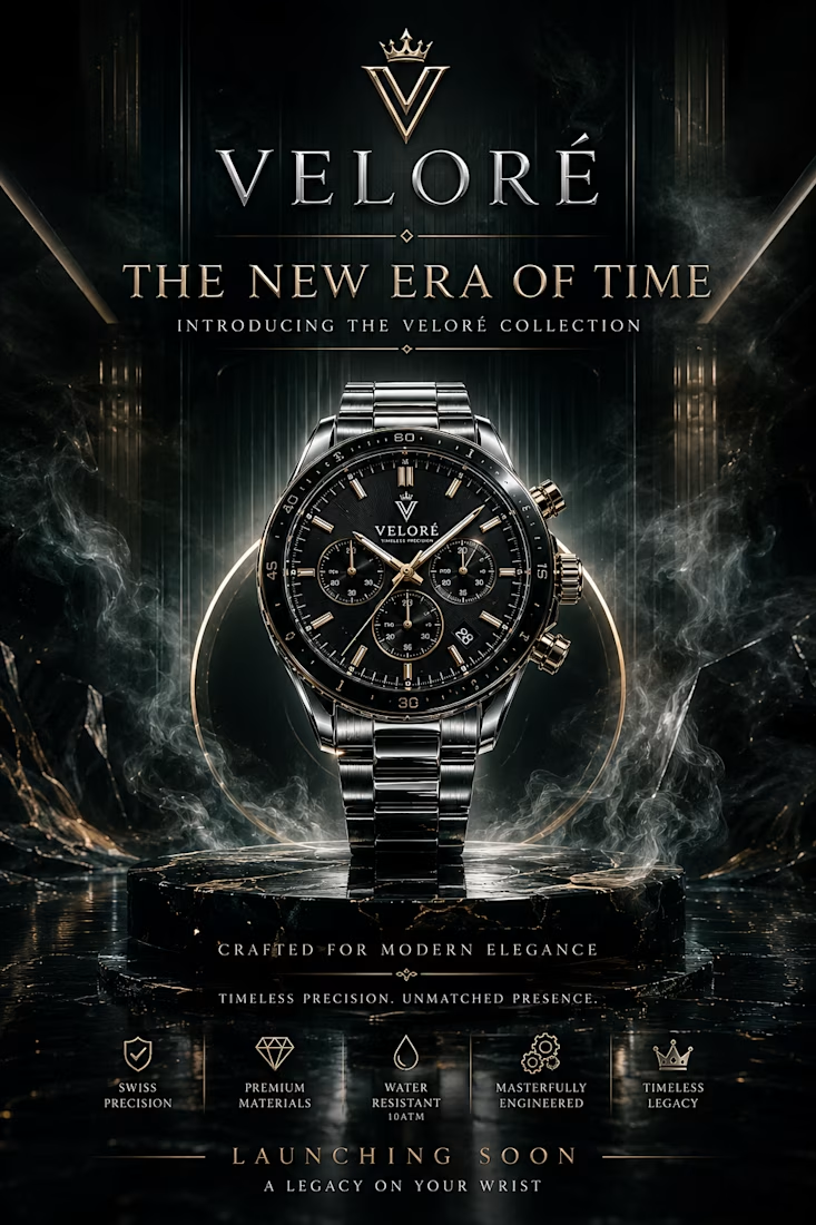
Launch poster: "The New Era of Time," a teaser campaign.
Instagram Story ad: Built for thumb-stopping, with a swipe-up call to action.
Landing page hero: Website header with the brand's dark marble world.
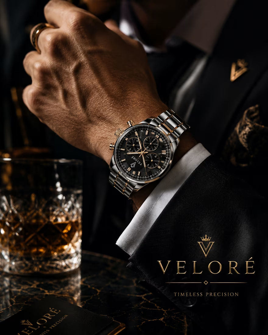
Lifestyle shot with the watch on a wrist: Luxury lifestyle campaign visual.
Packaging: Box, warranty card, manual and bag, designed as a full unboxing set.
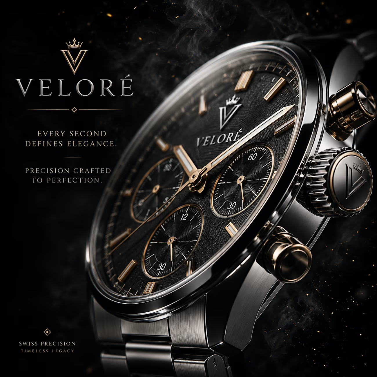
Square ads: Feed creative for Instagram.
#LuxuryBranding #LuxuryDesign #WatchDesign #LuxuryWatch #WatchBrand #QuietLuxury #DarkAesthetic #GoldAndBlack



Cinzel carries a lot of voice on its own, so for a quiet-luxury brief the restraint ends up having to come from spacing and crop rather than the type. Did you test a neutral grotesk at headline level at any point, or was the heritage read the goal from the start?
The network for creativity
Join 1.25M professional creatives like you
Connect with clients, get discovered, and run your business 100% commission-free
Creatives on Contra have earned over $150M and we are just getting started
Challenges
View all


Related posts


Great work.

Bold, without a doubt. The “Safe” direction feels polished, but the “Bold” approach has more personality, stronger visual tension, and a much better chance of stopping the scroll. It feels more distinctive and memorable while still communicating the skincare message clearly.

Safe or bold, which one actually makes you stop scrolling? 🤔
Sans: the serif, tight tracking, one accent color playbook every skincare brand is running right now.
Bold: the same idea, redesigned with attitude. 💅
25 voted
32%
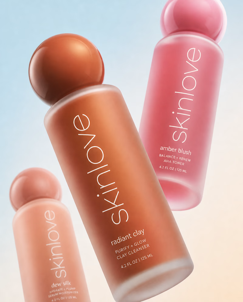
53 voted
68%
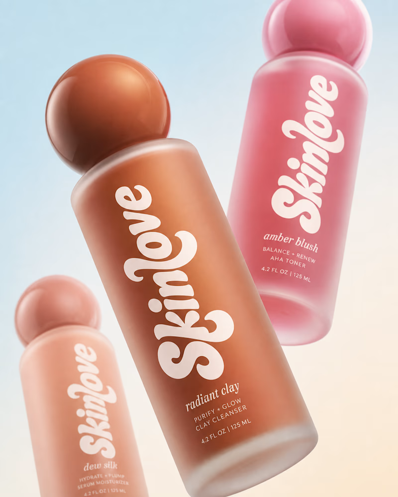
78 votes
Closed


BOLD is better

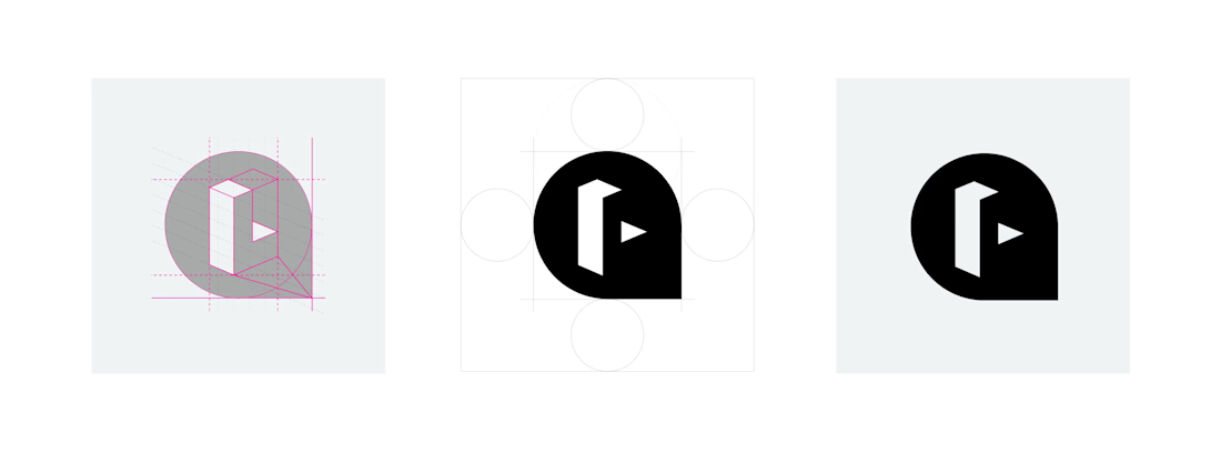
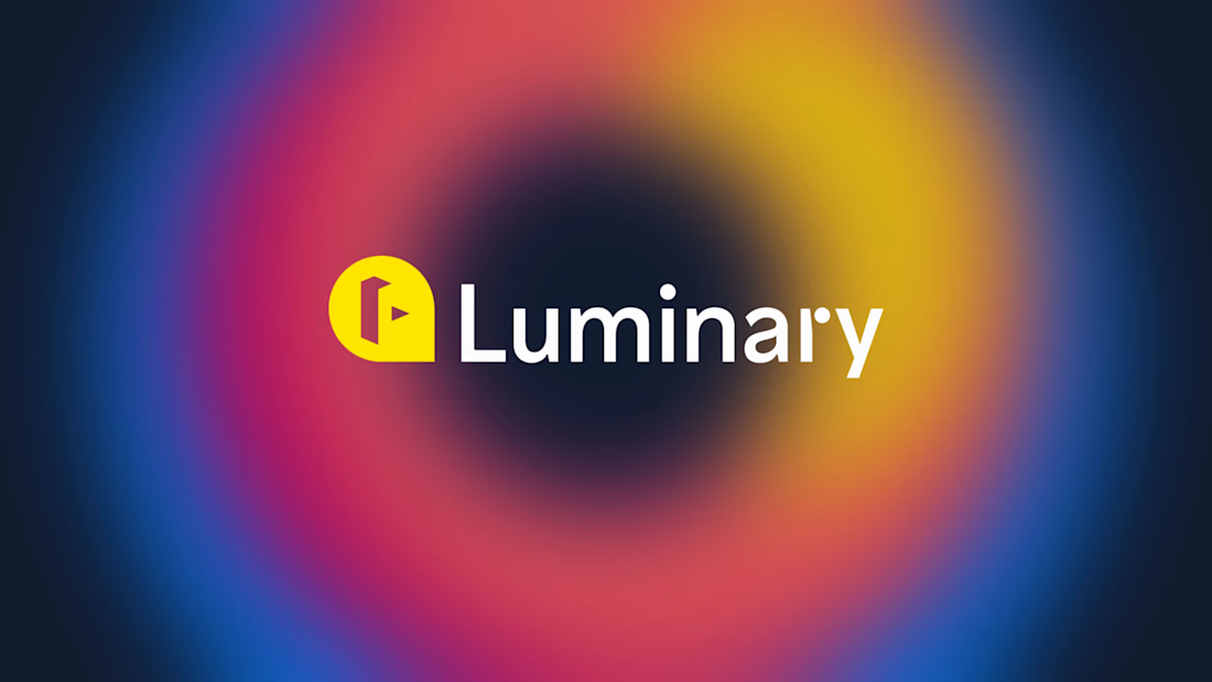
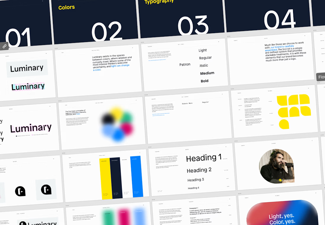
The Luminary brand needed a refresh – brand equity was lacking, and while the company hurdled staffing changes, much of the original branding had been nearly wiped away.
Soon after joining, it was clear that the design team would need some guidelines to lean up against to uphold quality and consistency in the brand.



Amazing work!