The network for creativity
Join 1.25M professional creatives like you
Connect with clients, get discovered, and run your business 100% commission-free
Creatives on Contra have earned over $150M and we are just getting started
Back to feedPost

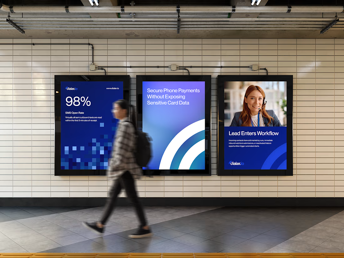
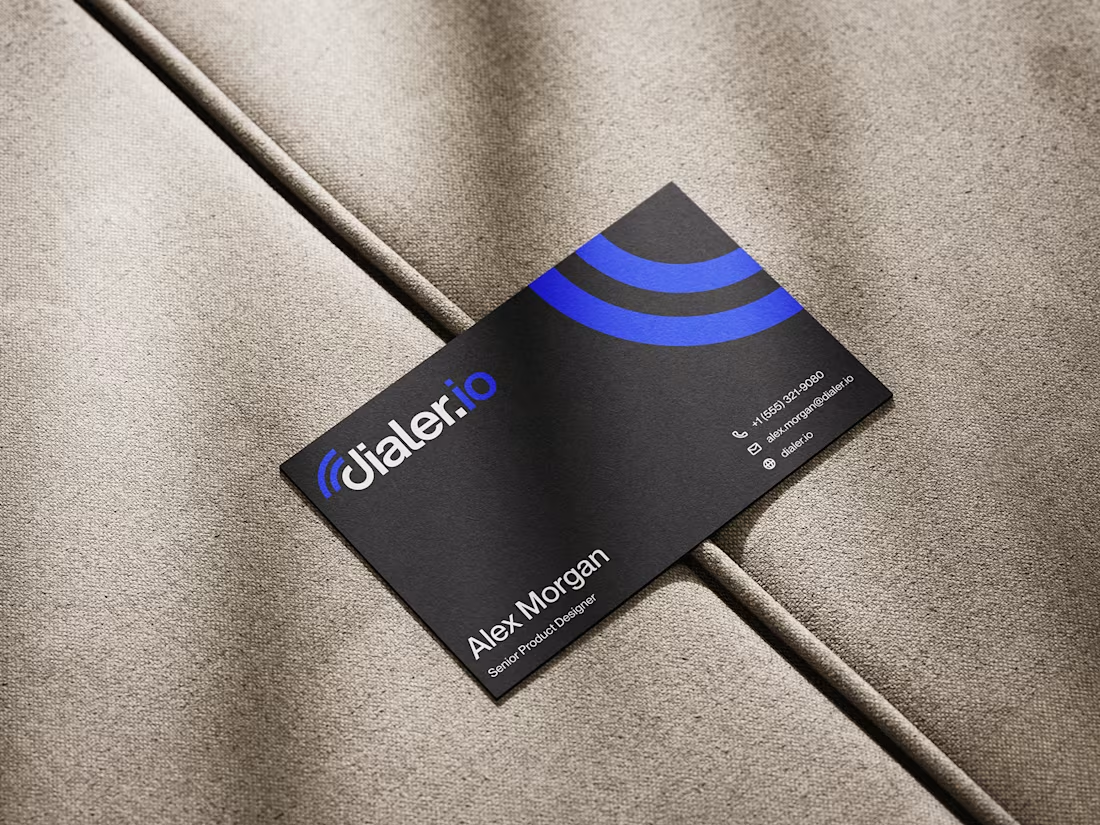
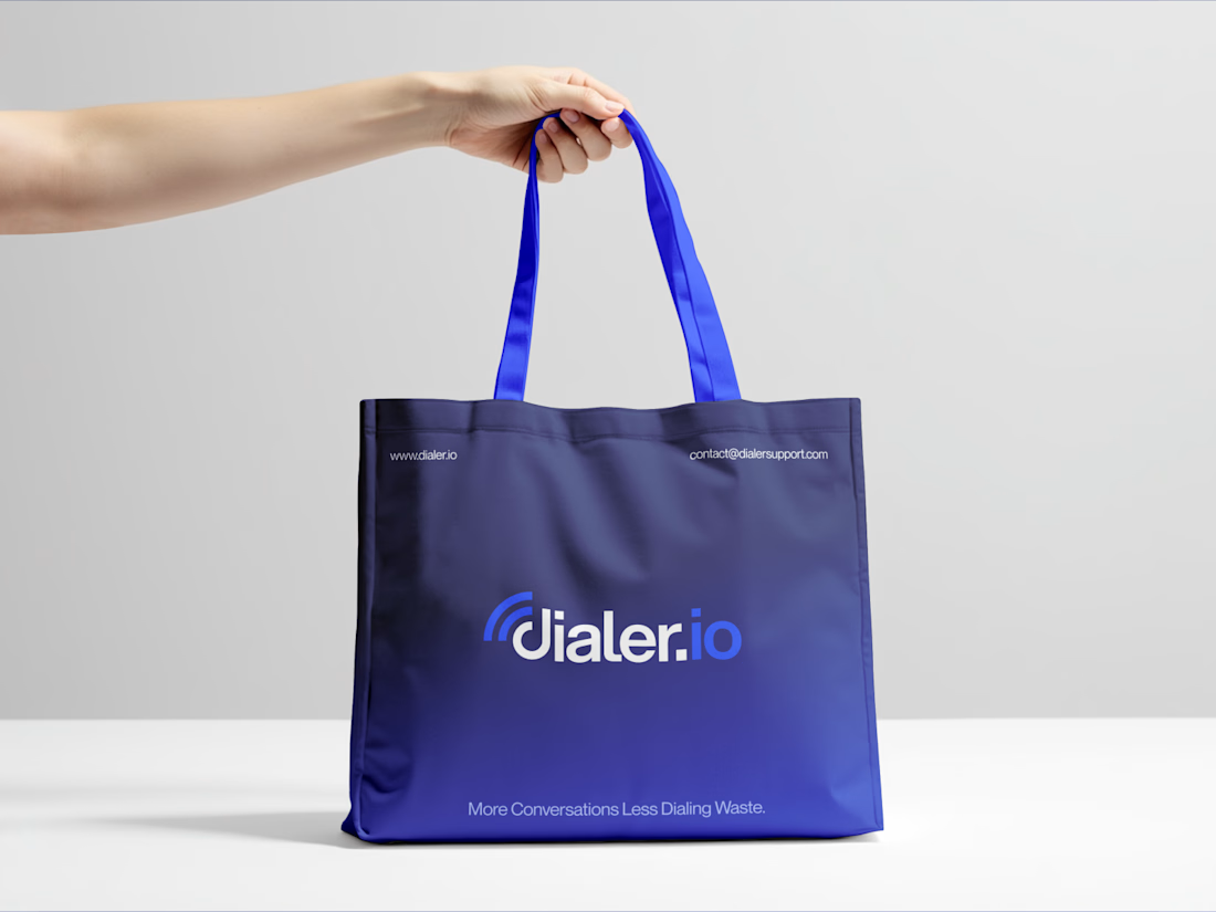

lookin' good!
Thank you

I love the color
Thank you

Seeing the mark actually up on a digital billboard next to a tote bag mockup makes the whole system feel tested rather than theoretical. Did the blue need any adjusting once you saw it at that outdoor scale?
Not really.

This work is outstanding :)
Thanks

Great work.
Thanks

Nice visuals! 👏👏
The network for creativity
Join 1.25M professional creatives like you
Connect with clients, get discovered, and run your business 100% commission-free
Creatives on Contra have earned over $150M and we are just getting started









Related posts

HuroPay Branding for Fintech
We built its identity to feel the same way: fast, clear and human.
Need a branding? DM Now...
#branding #brandidentity #logo




Clean and confident work! The green gradient with the mark feels very modern for fintech - trustworthy but not boring. The app screens look really polished. Curious how you landed on this mark, does it represent growth / movement?

Today I’m sharing something a bit different from packaging. This is the brand identity I designed for ALVA Industries, a Norwegian company developing electric motor technology.
I wanted it to feel modern and clear, but not too cold or impersonal. It’s a technical field, of course, but I think there’s still room for some character.
What do you think?

Incredible branding kit 🔥🔥🔥🔥
Great job Roberto❤️❤️