The network for creativity
Join 1.25M professional creatives like you
Connect with clients, get discovered, and run your business 100% commission-free
Creatives on Contra have earned over $150M and we are just getting started
Back to feedPost
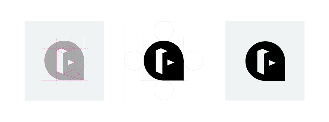
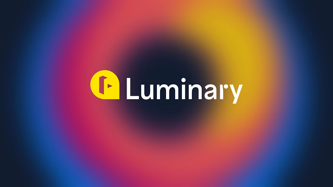
The Luminary brand needed a refresh – brand equity was lacking, and while the company hurdled staffing changes, much of the original branding had been nearly wiped away.
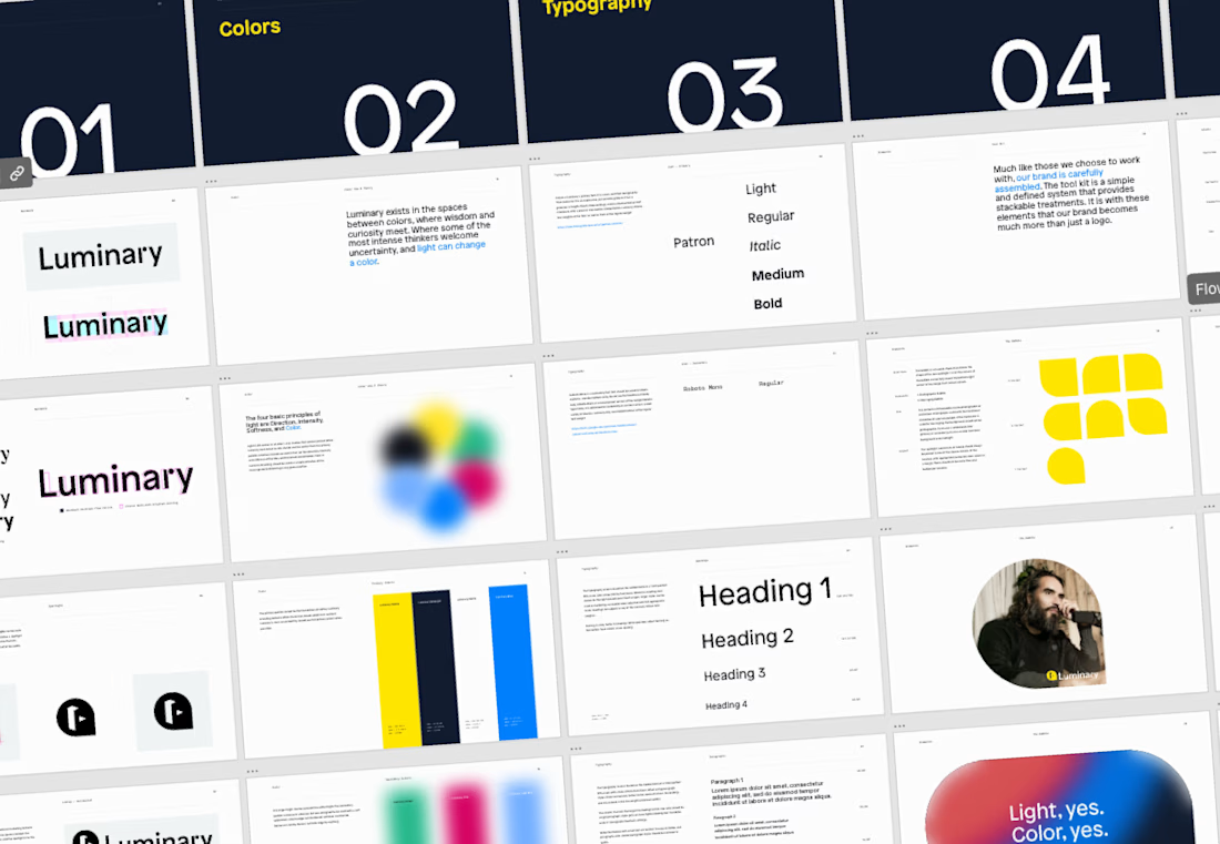
Soon after joining, it was clear that the design team would need some guidelines to lean up against to uphold quality and consistency in the brand.



Amazing work!

Thanks, Brella!

Building guidelines after a staffing shake-up is a different job than building them at launch, you're reverse engineering consistency instead of setting it. What was the biggest gap you found between what people assumed the brand was and what actually still existed?
Absolutely. It's another dimension – trying to thread the needle of creating something usable and dynamic (and don't forget, delightful, memorable, relatable...) while also staying true to the tone and purpose of the company and the years of recognizability.
In this case, the...

The refresh feels thoughtful because it rebuilds the system, not just the surface—especially the move from the blurred color field into the structured guidelines. Nice balance of equity and momentum.
Thank you, Rohan!

Numbering the guideline pages like that makes them feel like something people will actually reference instead of a PDF that gets opened once and forgotten. How did you get buy-in from the rest of the team to actually follow the new rules after everything had been so loose for a while?
Thanks, Diego. A big part of the job is building the system in a way that it is usable and modular enough to work in any number of situations. That's the part that can get hazy very quickly if teams aren't all on the same page.
Any time I work with a team of designers, I think...
"Holes will emerge, and the designers that find them fill them" is the real test of whether a system is modular or just looks that way on paper. What happens when two people patch the same gap differently before anyone notices the overlap, is there a review step for that or does it sort itself out?
There has to be communication around any gaps. Having two designers find the same gap and work on it simultaneously even without that communication barrier has never happened in my experience. But I think you're right, it's the true test of the system.


Stepping into a brand with staffing turnover and building guidelines from what's left is a different job than starting from a blank page. The glow treatment on the wordmark is a smart way to give an otherwise simple lockup some ownable texture. How much of the original mark did you end up keeping versus rebuilding from scratch?
Totally. Starting fresh feels a lot more free, but it does mean there are some things to define that may already exist when you're working on a redesign. In this case, we knew the talent we work with, and the caliper of our content. The branding didn't match. The original mark...

Super cool logo Leaenn! 🙌
Thanks, Tan!

Excellent work

Good Work!

it's cool, Leeann

Really nice refresh. The new identity feels much more cohesive, and the motion brings the brand to life. 🚀
The network for creativity
Join 1.25M professional creatives like you
Connect with clients, get discovered, and run your business 100% commission-free
Creatives on Contra have earned over $150M and we are just getting started









Related posts

Figma Football
An unofficial football concept inspired by Figma and its visual language.
The ball was created using a custom 3D generator I built in ChatGPT, with animated interface icons and graphics developed with Claude.
Part design experiment, part exploration of how custom AI-powered tools can become part of the creative process.


The interface icons translate surprisingly well into a football identity.

FOCUS — Creative Portfolio & Digital Art Website 🌸✨
A visually expressive website concept for a creative portfolio, built around digital art, bold imagery, and visual storytelling
The design combines vibrant pink tones, soft gradients, experimental typography, and immersive photography to create a distinctive editorial experience
Special attention was given to:
• Bold editorial hero composition
• Vibrant pink and dark color palette
• Experimental typography and visual details
• Immersive photography and digital artwork
• Creative project gallery and navigation
• Responsive mobile experience
• Clean layouts with a strong visual identity
The result is an expressive digital experience that puts creativity, emotion, and visual storytelling at the center of every screen 💗
Looking to create a standout portfolio or website for a creative brand? Let’s connect 🚀

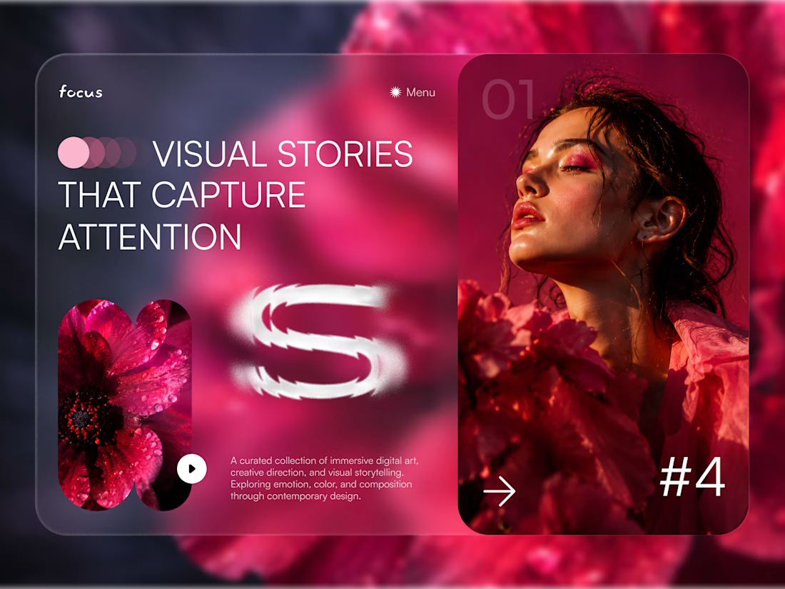
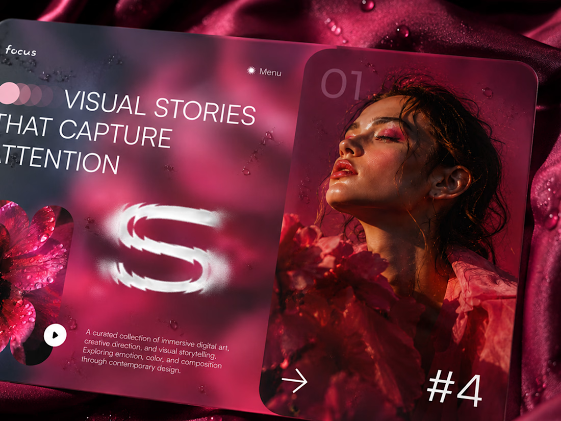
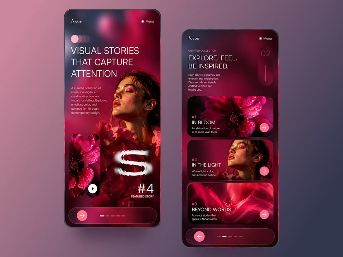

The vibrant pink against the dark palette gives this such a bold editorial feel. The experimental typography is the star here.

Ripple: book an Influencer the way you'd book a hotel 💧
Working with Influencer is still messy: DMs that go nowhere, rates you have to chase, contracts over email, and paying upfront with no guarantee.
Ripple puts the whole deal in one place:
• Discover Influencers matched to your Brand campaign, with real stats and a clear rate card
• Send a request and negotiate terms in chat
• Approve a proposal that both sides can see, line by line
• Sign once and it's binding for both sides
• Pay by phase, held in escrow until the work is approved
From "who should we work with?" to "booked" in minutes.
#ProductDesign #UIUX #CreatorEconomy #MobileApp #ConceptDesign

This is such a needed concept, Praveen! 👏 The influencer booking process is honestly a nightmare right now. Love how you simplified it like booking a hotel - super clear positioning. The design in the video looks clean too! 💧