The network for creativity
Join 1.25M professional creatives like you
Connect with clients, get discovered, and run your business 100% commission-free
Creatives on Contra have earned over $150M and we are just getting started
Back to feedPost
Taste Test

Safe or bold, which one actually makes you stop scrolling? 🤔
Sans: the serif, tight tracking, one accent color playbook every skincare brand is running right now.
Bold: the same idea, redesigned with attitude. 💅
25 voted
32%
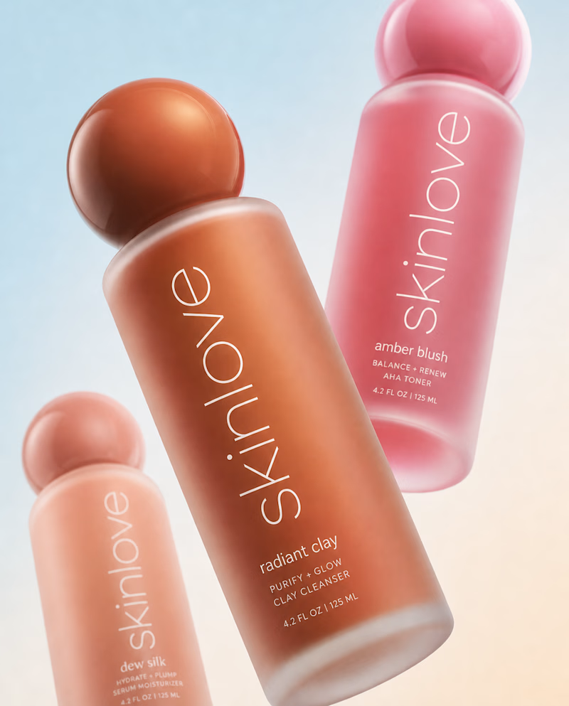
53 voted
68%
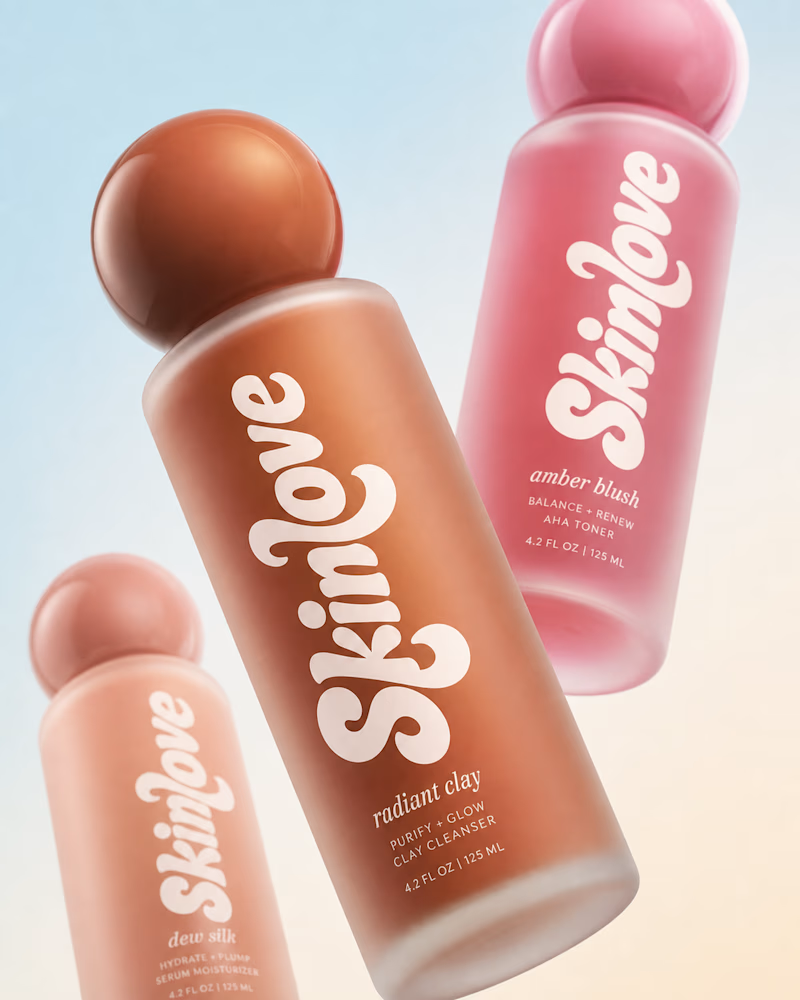
78 votes
Closed

I like both, but I see them targeting different audiences. The first feels more premium, sophisticated and mature. The second feels younger, more playful and more aligned with a teen or Gen Z audience.
Well that could be true! Such great insight, thank you!

Nice work

The sans is elegant, but the bold really got me. It works perfectly with the glass surface and the round lid, making the whole design feel fun and eye-catching.
I like what you are saying, thank you!

Definitely bold! That redesigned typography adds so much personality and immediately stops the scroll. Safe just gets lost in the feed these days.
I agree!

bold definitely stops the scroll, sans finds me inclined to mistake it for another brand's product.

Definitely bold!😍


the white type on the pink bottle pops.


Nice work🔥👏👏

Bolder got my vote

sans feel more premium than bold

Wow bold🔥

I would go with the bold that looks much better


Nice😍

Bold

Bold is better

Bold looks better

The style of the bold feel more energetic and gives me a better feeling than the sans one and I believe it matches the brand identity
Thank you!

Absolutely amazing work, well done!

Sans wins!

I liked the product with the bold font. But I also liked the elegant one; it looks sophisticated.


Bold

Anita I personally like bold one 🔥

really awesome

I'll prefer Sans for its premium look.. Bold looks Trendy though!!
😍

The Bold made me stop scrolling, but the Sans looks more high-end and is definitely something I'd consider buying.
Interesting, thank you!

Ofc Bold. This is striking


both are so well done honestly, but bold has that extra confidence.


I prefer bold to sans

Bold 👍
The network for creativity
Join 1.25M professional creatives like you
Connect with clients, get discovered, and run your business 100% commission-free
Creatives on Contra have earned over $150M and we are just getting started








Related posts


Finally landed on a version the client is happy with.
Which 'A' letter do you think fits better?
27 voted
52%
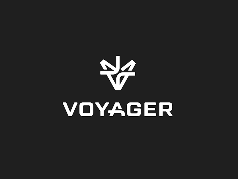
25 voted
48%
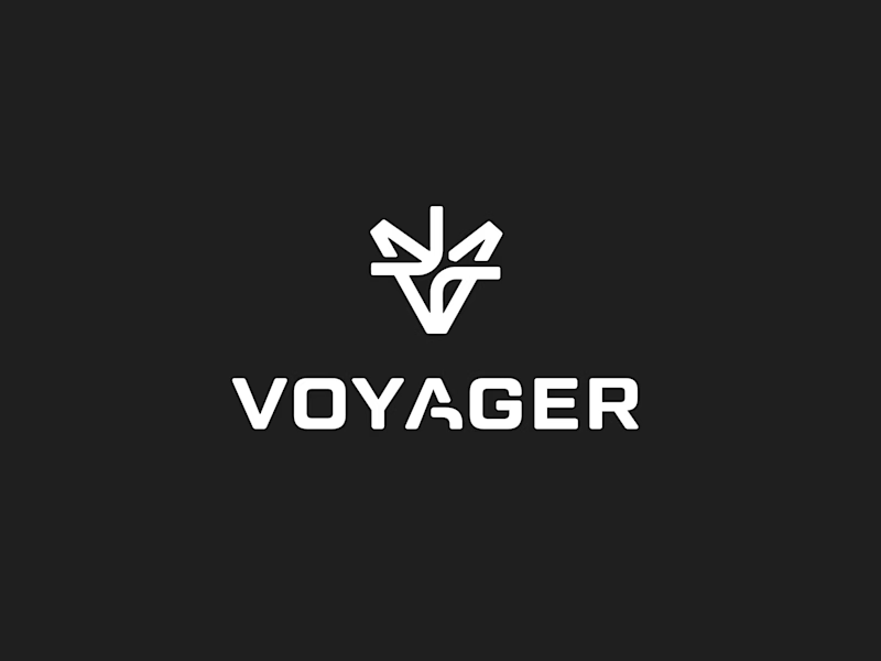
52 votes
Closed

I choose Short but I don't know the difference but the design is great congrats 🎉

Rhyen Lab: Brand Identity & Packaging for a Skincare Brand
Rhyen Lab is a skincare brand built around science-backed formulas and a sensorial, human approach to beauty. The challenge was to create an identity that feels clinical enough to be trusted, yet warm and expressive enough to stand out in a crowded market.
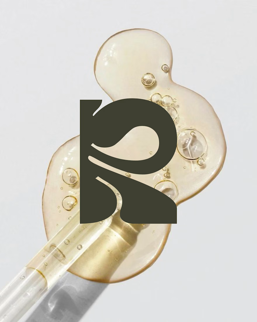
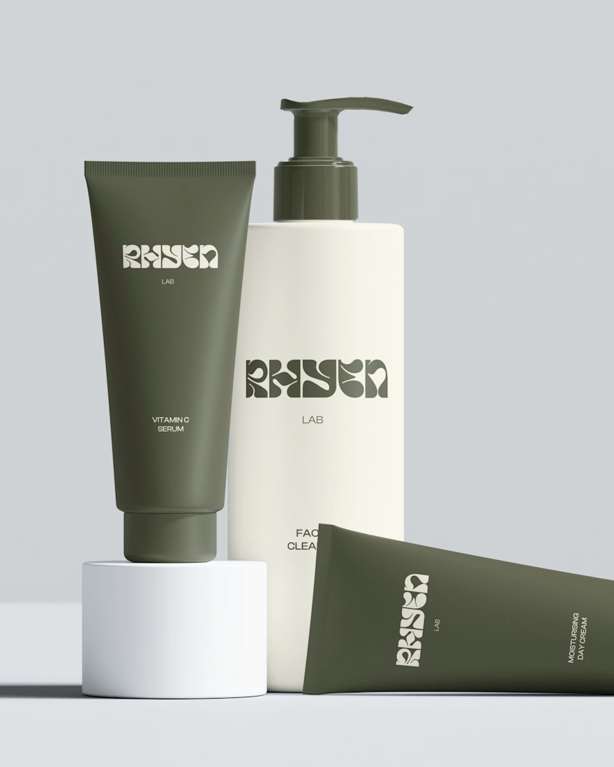
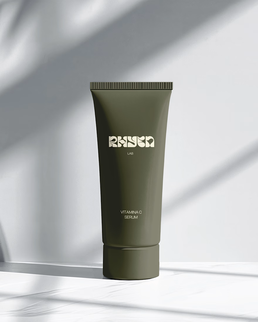
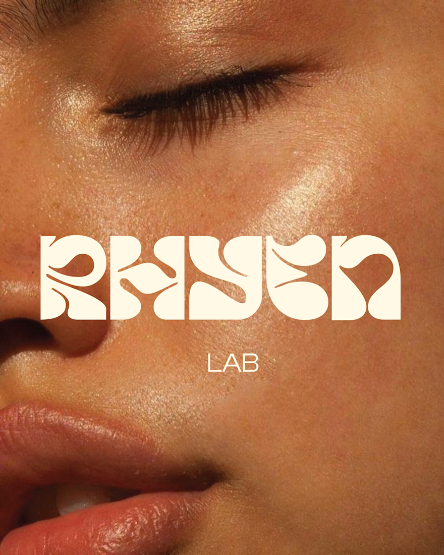
I designed a custom wordmark with fluid, organic letterforms that echo the texture of serums and oils, paired with a bold monogram “R” for compact applications. A palette of deep olive green and soft cream keeps the brand grounded, natural and premium, while macro photography of skin and product textures reinforces the sensorial tone.
The system was applied across packaging for the Vitamin C Serum, Facial Cleanser and Moisturising Day Cream, ensuring consistency across tubes and bottles.
Deliverables: Logo & monogram · Visual identity · Color palette · Packaging design · Art direction




Same ending, different run-up. 1seconds or 2 for this Pletor.ai promo. What do you think?
27 voted
48%
29 voted
52%
56 votes
Closed
Number 2 looks more stunning