The network for creativity
Join 1.25M professional creatives like you
Connect with clients, get discovered, and run your business 100% commission-free
Creatives on Contra have earned over $150M and we are just getting started
Back to feedPost

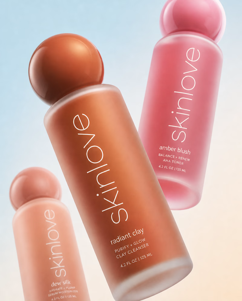
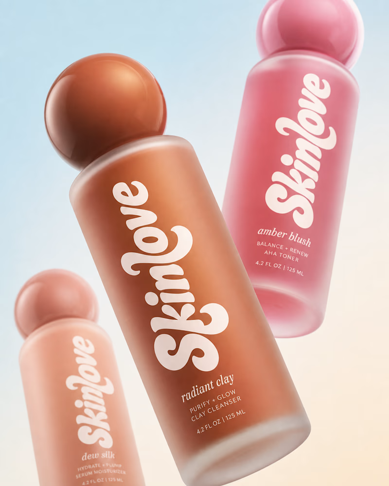
Bold, without a doubt. The “Safe” direction feels polished, but the “Bold” approach has more personality, stronger visual tension, and a much better chance of stopping the scroll. It feels more distinctive and memorable while still communicating the skincare message clearly.

Safe or bold, which one actually makes you stop scrolling? 🤔
Sans: the serif, tight tracking, one accent color playbook every skincare brand is running right now.
Bold: the same idea, redesigned with attitude. 💅
25 voted
32%
53 voted
68%
78 votes
Closed

The bolder direction really earns its edge—the diagonal bottle composition and warm contrast give the skincare story a memorable focal point without losing clarity. The way the type wraps around the pack also makes the concept feel ready for motion.

Love both!

Good work


BOLD is better

The scroll-stopping argument is what gets me too, the sans playbook is so overused in skincare right now that bold almost wins by default. Curious whether the tension held up the same way on mobile, or did bold need more breathing room at small sizes?

Bold was always going to win. Safe plays it too close to every other skincare brand out there right now.


Bold always,,, better visibility and branding

This is great

Bold look real


The bold is the best I like it

Sans is 🔥

looks cool


There are really two different audiences.

Bold is so eye-catching and has so much personality! I LOVE IT
The network for creativity
Join 1.25M professional creatives like you
Connect with clients, get discovered, and run your business 100% commission-free
Creatives on Contra have earned over $150M and we are just getting started


Related posts

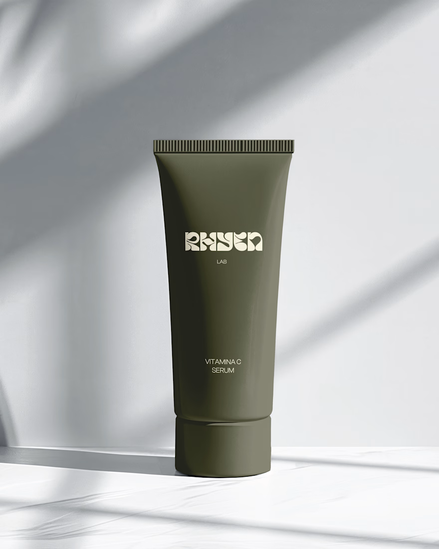
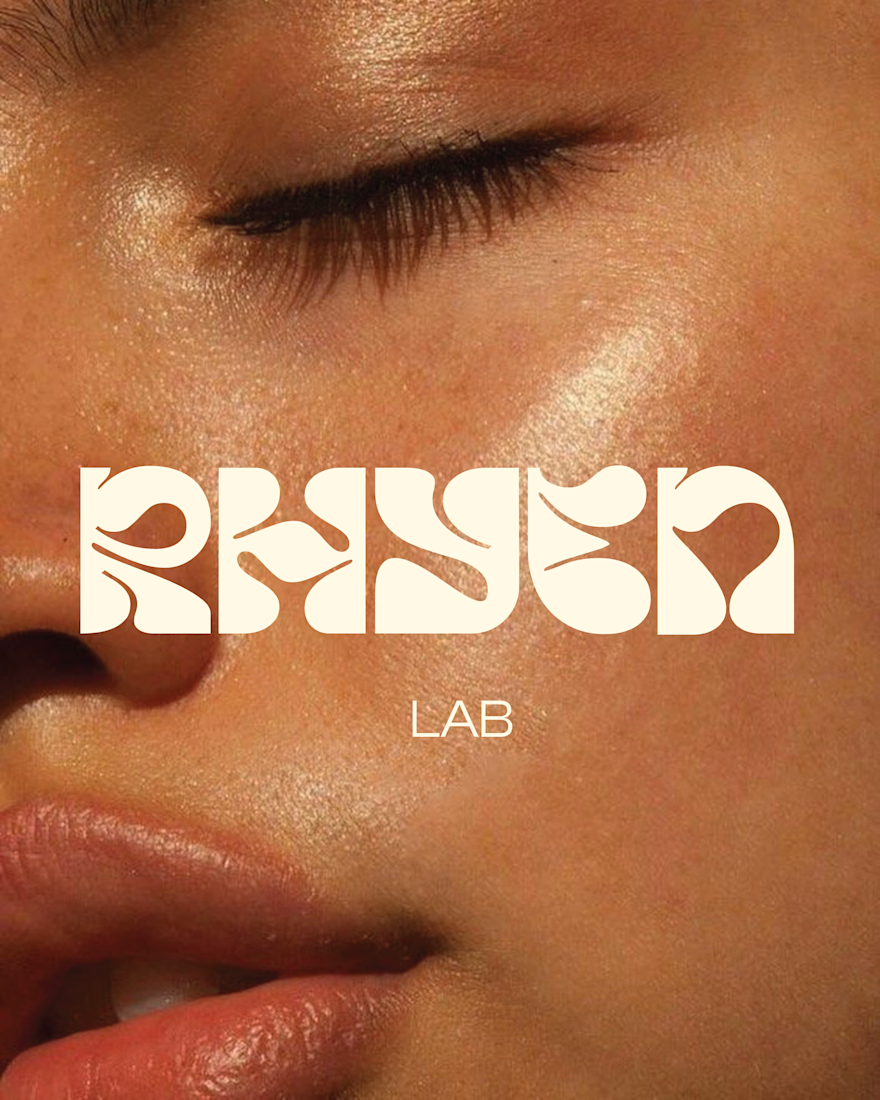
Rhyen Lab: Brand Identity & Packaging for a Skincare Brand
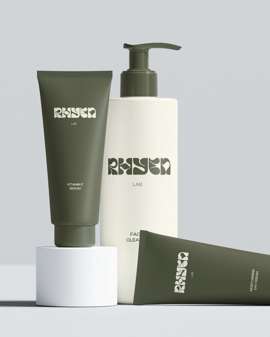
Rhyen Lab is a skincare brand built around science-backed formulas and a sensorial, human approach to beauty. The challenge was to create an identity that feels clinical enough to be trusted, yet warm and expressive enough to stand out in a crowded market.
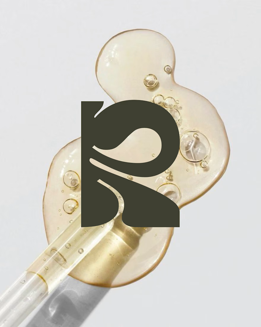
I designed a custom wordmark with fluid, organic letterforms that echo the texture of serums and oils, paired with a bold monogram “R” for compact applications. A palette of deep olive green and soft cream keeps the brand grounded, natural and premium, while macro photography of skin and product textures reinforces the sensorial tone.
The system was applied across packaging for the Vitamin C Serum, Facial Cleanser and Moisturising Day Cream, ensuring consistency across tubes and bottles.
Deliverables: Logo & monogram · Visual identity · Color palette · Packaging design · Art direction




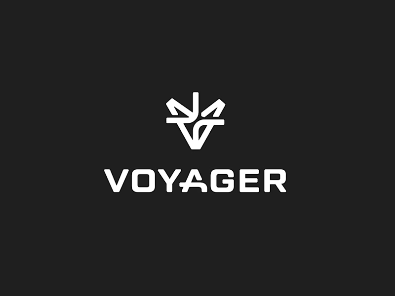
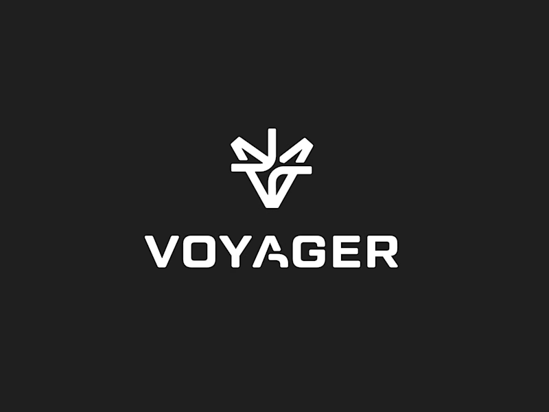
Finally landed on a version the client is happy with.
Which 'A' letter do you think fits better?
27 voted
52%
25 voted
48%
52 votes
Closed
I choose Short but I don't know the difference but the design is great congrats 🎉

Same ending, different run-up. 1seconds or 2 for this Pletor.ai promo. What do you think?
27 voted
48%
29 voted
52%
56 votes
Closed

Number 2 looks more stunning






