The network for creativity
Join 1.25M professional creatives like you
Connect with clients, get discovered, and run your business 100% commission-free
Creatives on Contra have earned over $150M and we are just getting started
Back to feedPost
Taste Test


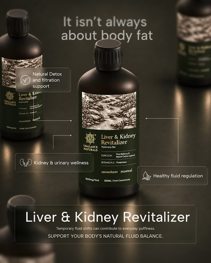
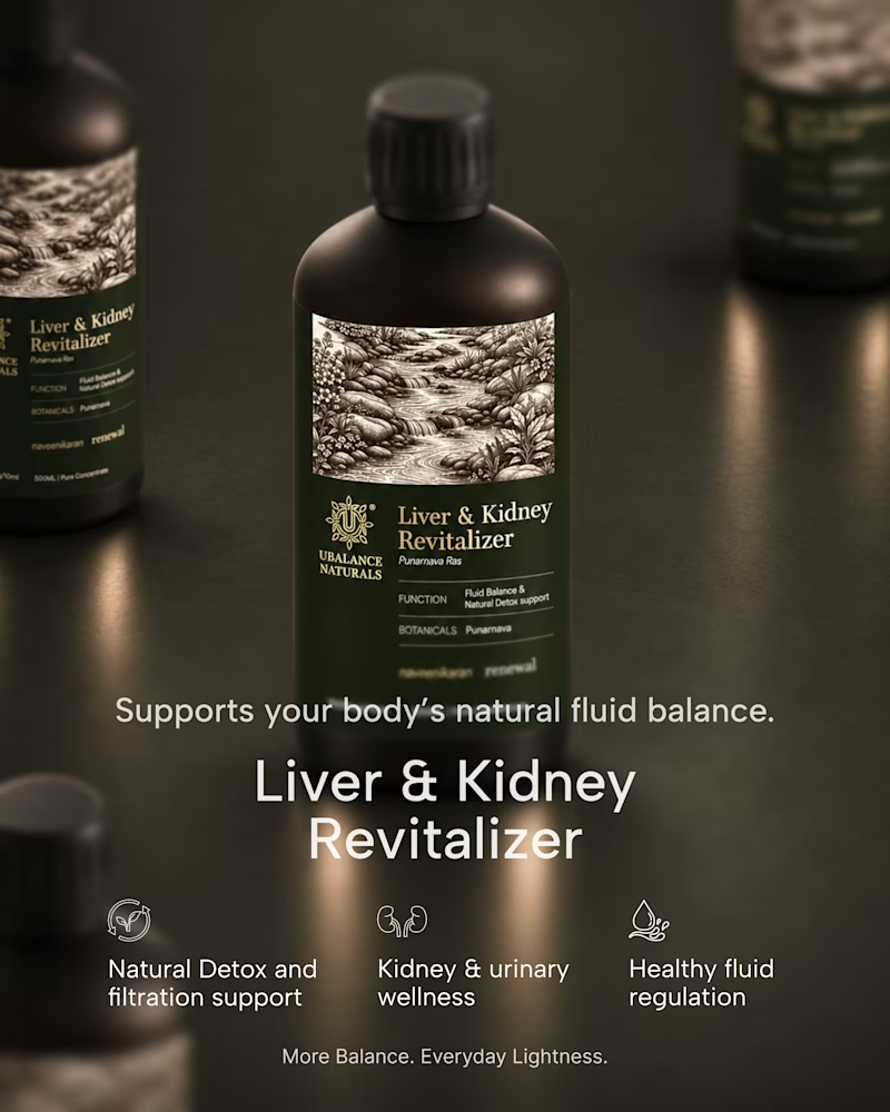
A quick exploration of two different directions for a wellness product ad.
One focuses on the product, while the other brings more attention to the product information.
These are early explorations, just to get a feel for the brand and its visual direction.
I’d love to hear your honest thoughts. Which direction feels more effective, and what would you improve?
2 votes
Ends in 1d


Info first!


Honest take: the information-first direction wins for me. "It isn't always about body fat" is a proper hook — it speaks to the actual worry behind the product, so it stops the scroll. The product-first shot is gorgeous, but it reads more like a product page image than an ad. One...
The network for creativity
Join 1.25M professional creatives like you
Connect with clients, get discovered, and run your business 100% commission-free
Creatives on Contra have earned over $150M and we are just getting started



Related posts

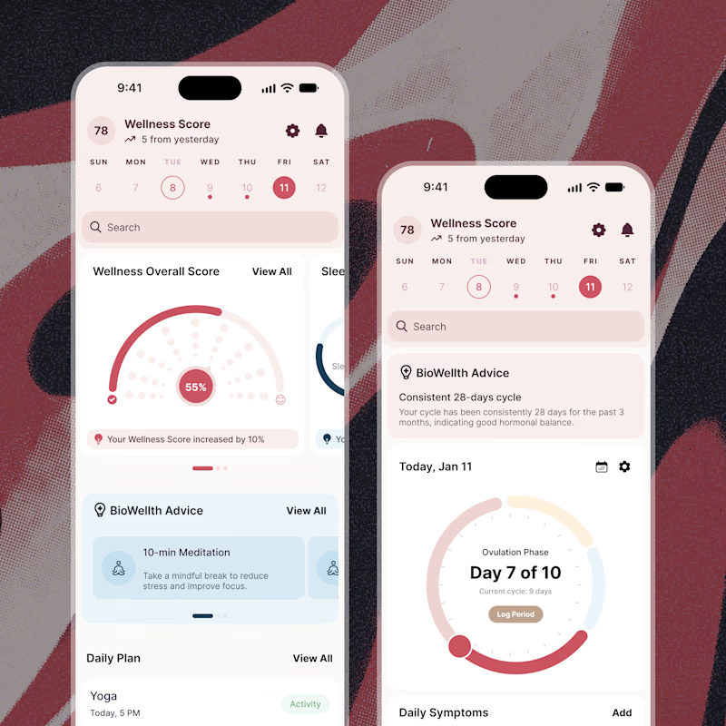
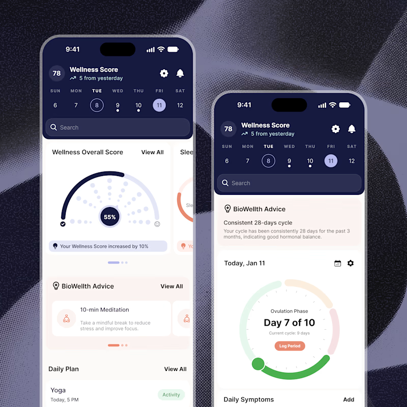
Exploring two color palette directions for a women’s health app. Which one feels right to you? 👀
32 voted
56%
25 voted
44%
57 votes
Closed

Both are amazing! The purple definitely has better contrast, but I’d still go with the berry one, purely a personal preference

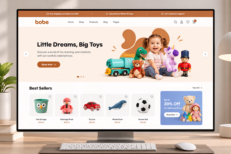
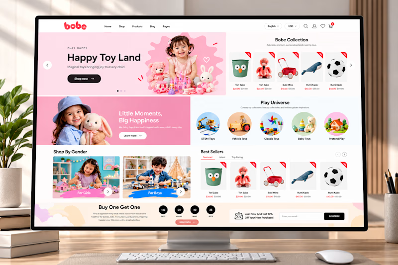
🎨 Which section makes the biggest impact on an eCommerce homepage?
I designed this playful toy store experience with a focus on product discovery, engaging visuals, and a seamless shopping journey.
But I'm curious about your opinion!
👇 If you were shopping on this website, which section would catch your attention first?
A. Hero Banner
B. Shop by Category
C. Best Sellers
D. Promotional Offers
Let's hear your thoughts! 👀
#ShopifyDesign #EcommerceDesign #UIUX #WebDesign
3 voted
60%
2 voted
40%
5 votes
Closed


Option 1 for me 💯

Exploring Brand assets. Which one feels good?
24 voted
80%
6 voted
20%
30 votes
Closed

stack is cool but linear is doing the job better :)