
Vinit Deshwal
Product & Brand Designer blending visual craft with UX logic
New to Contra
Vinit is ready for their next project!
What if self-reflection didn’t have to become another note, list, or graph?
What if it could become a body?
For the Google Stitch Challenge, I built Holon: a living self-portrait made from meaning particles.
In Holon, the user writes something true. The reflection is parsed for...
Stitch's speed-to-quality ratio is getting good.
It used to be a toy, but watching the multi-agent workflows spin up 10+ coherent screens in real-time makes it a genuinely great starting point for quick inspiration.
It removes the blank-page problem almost instantly.
Seeing agents...
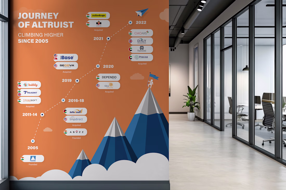
Milestone timeline wall I designed. 17 years of growth. 10+ acquisitions across 4 countries. All of that information had to fit on a single wall in their head office corridor, and still be readable from 10 feet away.
The tricky part with timeline designs like this is managing...
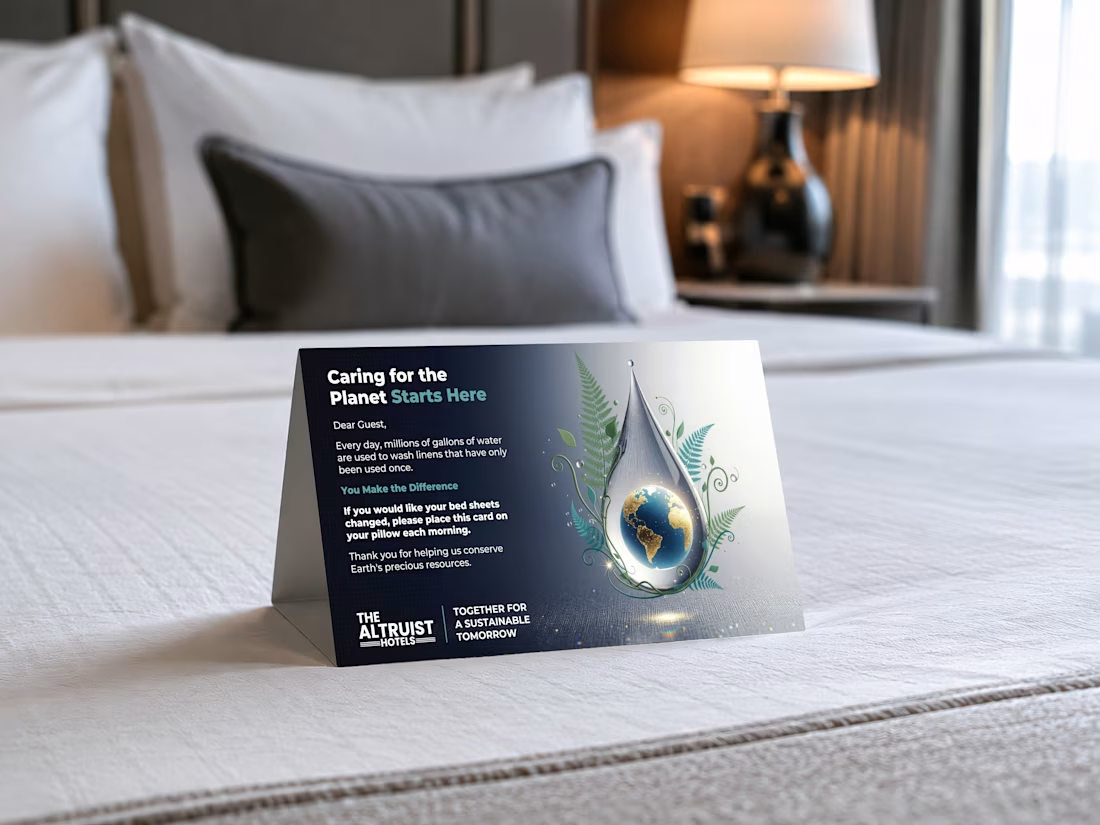
Designed this tent card for a hotel chain running 13+ properties. Thousands of guests interact with this card every month.
You've probably seen them in hotel rooms. Placed on your bed, asking you to reuse your sheets. Most of them look like they were made in Word.
I wanted to...
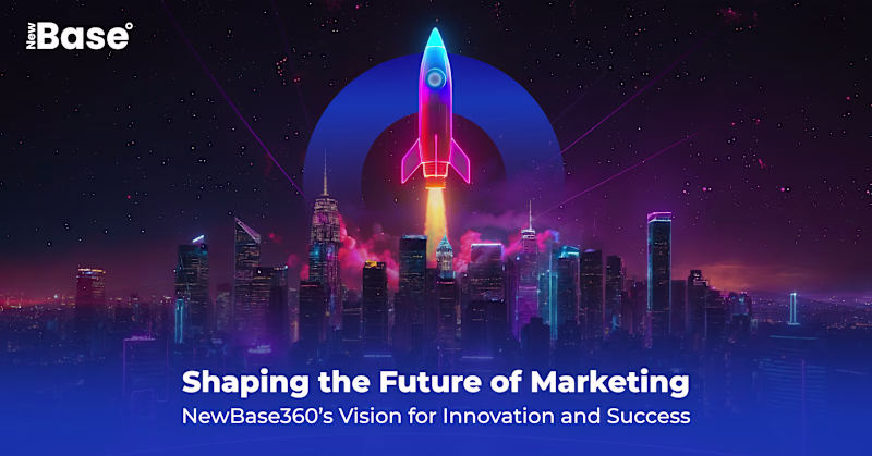
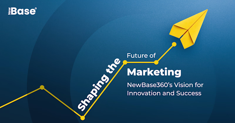
Which direction converts?
Both solve the same brief. But they solve it using completely different visual logic.
Option A bets on cinematic depth. Layered composition, neon lighting, atmospheric tension. It's designed to make you feel something before you read anything.
Option B...
3 voted
75%
1 voted
25%
4 votes
Closed