
Vinit Deshwal
Product & Brand Designer blending visual craft with UX logic
New to Contra
Vinit is ready for their next project!
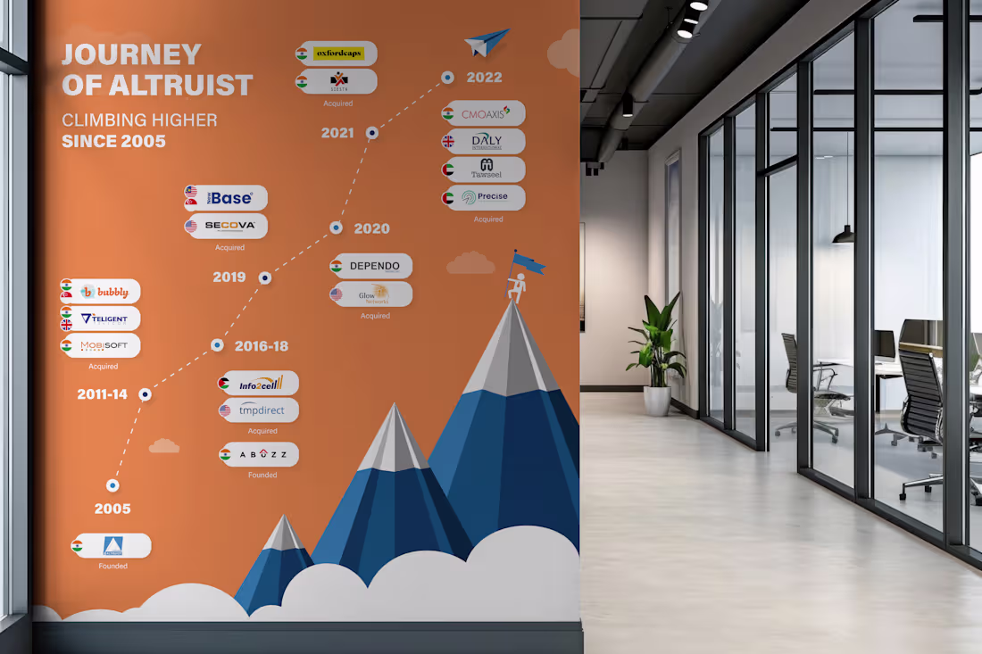
Milestone timeline wall I designed. 17 years of growth. 10+ acquisitions across 4 countries. All of that information had to fit on a single wall in their head office corridor, and still be readable from 10 feet away.
The tricky part with timeline designs like this is managing density.
You have 15+ logos, country flags, acquisition labels, and year markers. If you just list them linearly it becomes a spreadsheet on a wall. Nobody reads that.
So I built it around a mountain progression. Each peak represents a growth phase. The timeline flows bottom-to-top instead of left-to-right, which naturally maps to the "climbing higher" narrative. The clouds separate the visual layers so the density doesn't overwhelm.
Designed for large-format print. This sits in their main office corridor.
2
82
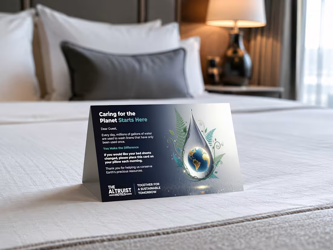
Designed this tent card for a hotel chain running 13+ properties. Thousands of guests interact with this card every month.
You've probably seen them in hotel rooms. Placed on your bed, asking you to reuse your sheets. Most of them look like they were made in Word.
I wanted to actually put thought into it.
The globe sitting inside a water droplet was the concept I pushed for. It does the storytelling without making the guest read a wall of text. The botanical elements tie the sustainability message in visually.
The interesting part about designing for physical spaces is that you can't A/B test it like a landing page.
It either works the first time someone picks it up, or it doesn't. So the hierarchy has to be tight. Headline first, visual second, action last.
4
3
126
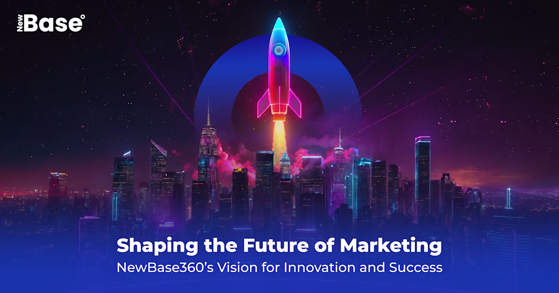
Every pixel in this composition has a reason.
This is a marketing visual I built. A lot of people might see the final image and assume it's one generated output. It's not. It's manually created with layers, each one placed and blended with a specific visual hierarchy in mind.
➜ The rocket sits on its own layer with independent glow and shadow controls
➜ The cityscape is a separate depth plane with its own color grading
➜ The smoke interaction between the two is hand-masked
➜ The background gradient is tuned to push the focal point exactly where the eye needs to land first
➜ And the blue ring, signature element that defines the brand
None of this is random. You are deciding what the viewer sees first, second, and third.
AI can generate a rocket over a city in 30 seconds.
What it can't do is tell you why the rocket needs to sit 15% above of center, or why the smoke opacity drops at exactly that rate.
That thinking is the craft.
1
86
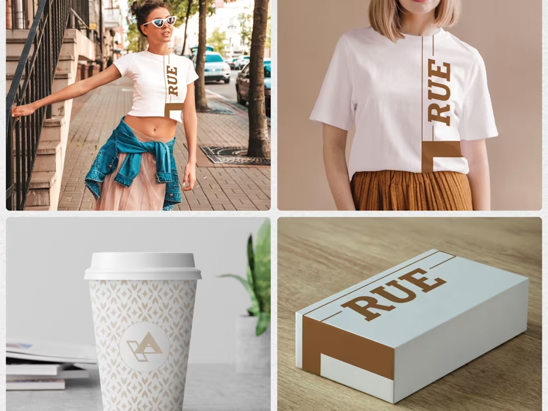
Modern Brand Identity Design - Digital & Print Materials
1
13
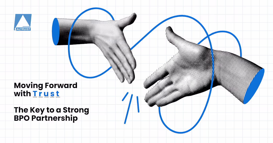
This one got really good feedback from the client.
The brief was about trust and long-term partnerships, so I wanted the visual to carry that message without needing a wall of text. The handshake felt like the right anchor, but I didn't want it to look like every other corporate handshake graphic out there. So I went with halftone illustration and those flowing lines to give it some energy.
Sometimes the simple concepts hit the hardest. Its all about figuring out the user experience at last.
2
346
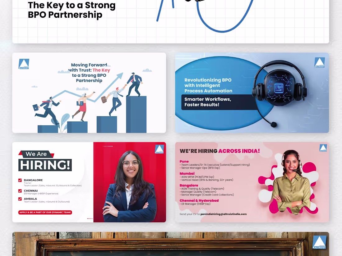
Brand Awareness and Recruitment Social Media for Global BPO
0
10
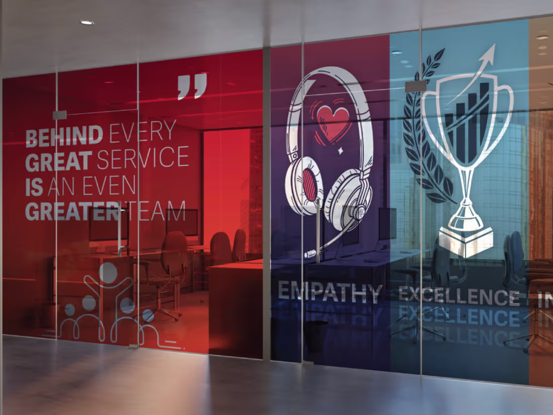
Corporate Office Branding - Wall & Signage
1
12
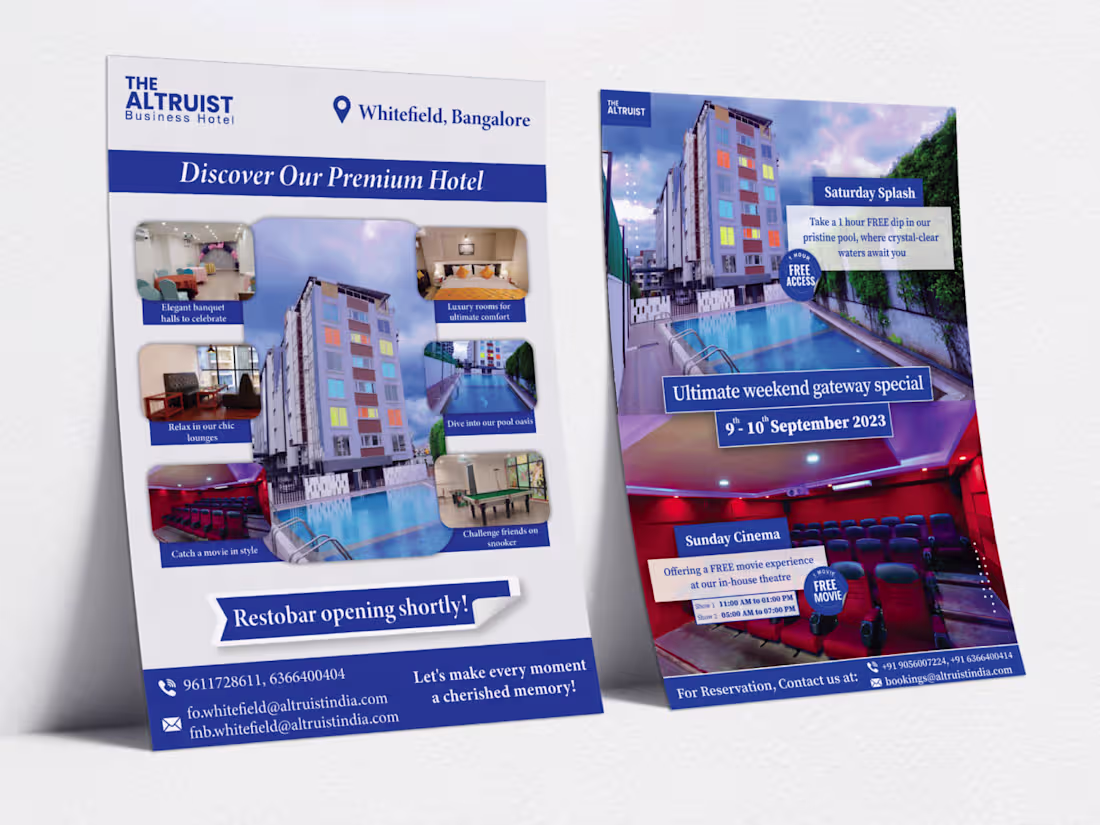
Branding and Marketing Collateral for a Hospitality Group
0
9
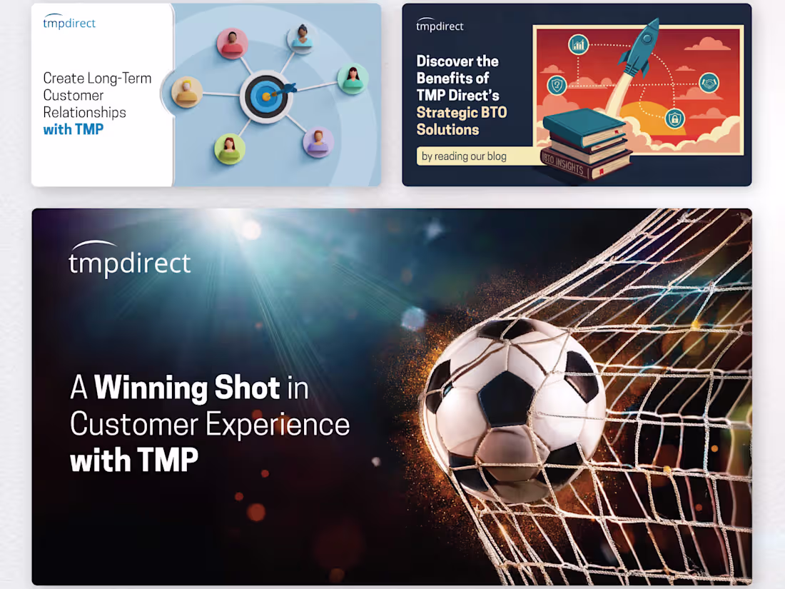
B2B LinkedIn Designs for US-based Customer Solutions Company
0
10