The network for creativity
Join 1.25M professional creatives like you
Connect with clients, get discovered, and run your business 100% commission-free
Creatives on Contra have earned over $150M and we are just getting started
Back to feedPost

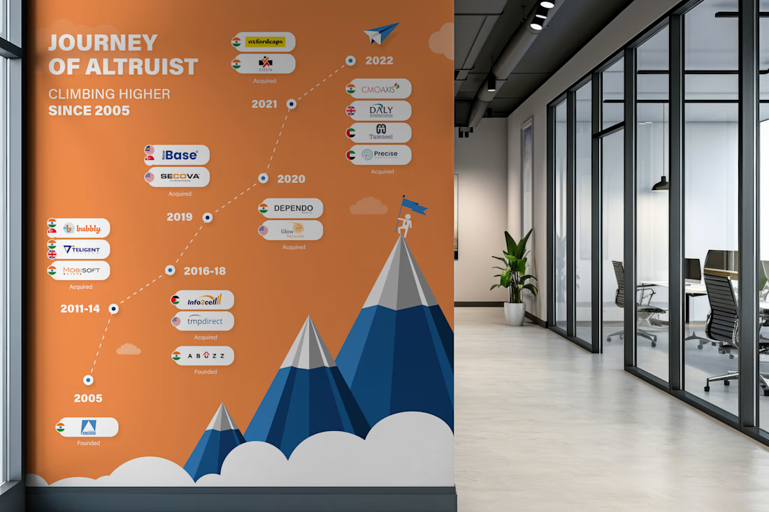
Milestone timeline wall I designed. 17 years of growth. 10+ acquisitions across 4 countries. All of that information had to fit on a single wall in their head office corridor, and still be readable from 10 feet away.
The tricky part with timeline designs like this is managing density.
You have 15+ logos, country flags, acquisition labels, and year markers. If you just list them linearly it becomes a spreadsheet on a wall. Nobody reads that.
So I built it around a mountain progression. Each peak represents a growth phase. The timeline flows bottom-to-top instead of left-to-right, which naturally maps to the "climbing higher" narrative. The clouds separate the visual layers so the density doesn't overwhelm.
Designed for large-format print. This sits in their main office corridor.


The network for creativity
Join 1.25M professional creatives like you
Connect with clients, get discovered, and run your business 100% commission-free
Creatives on Contra have earned over $150M and we are just getting started








Related posts

Bland is a choice.
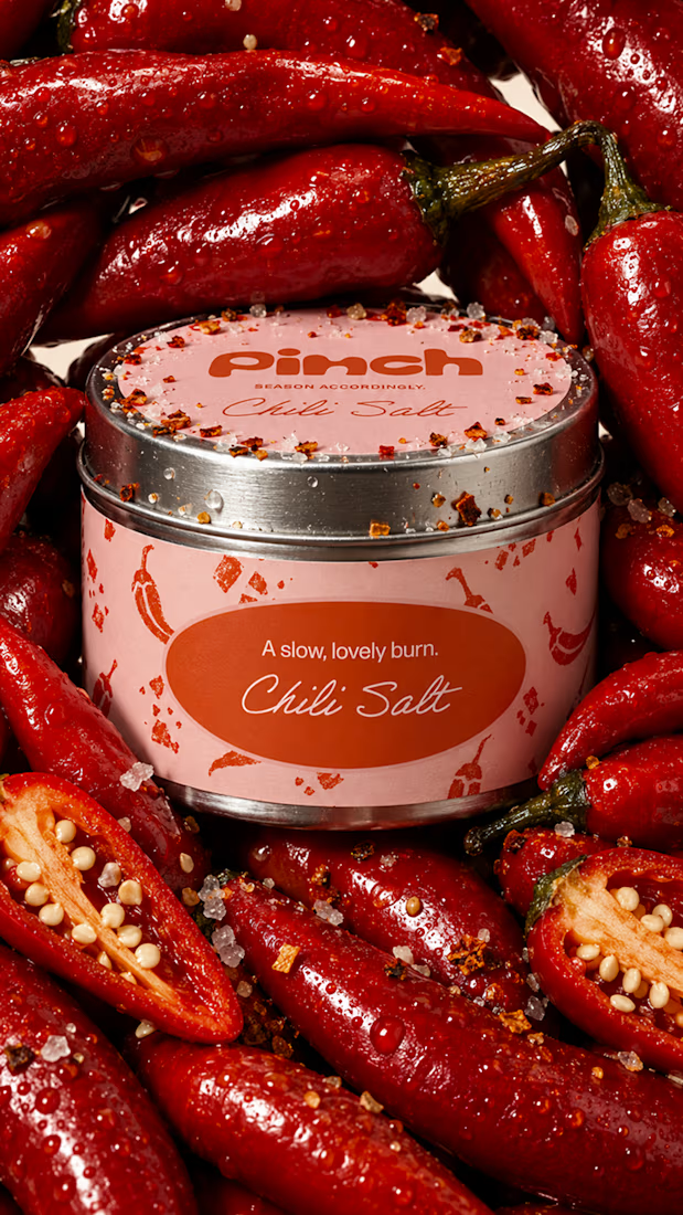
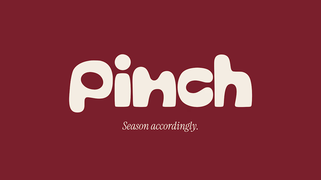
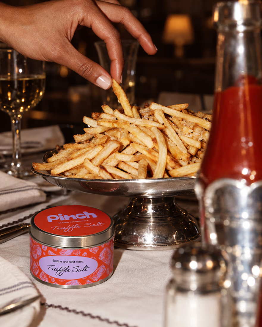
Pinch is a concept brand for a mid-high salt line made to live on the counter, not in the cupboard. Five flavors, five two-color tins, one refillable keepsake people leave next to the bar cart.
I built the full identity: wordmark, lid lockups, hand-stamped pattern system, tone of voice, and art direction.
More from the system coming soon.



Cool work 🔥


Which one grabs your attention and should be the main visual for a framer template thumbnail?

7 voted
50%
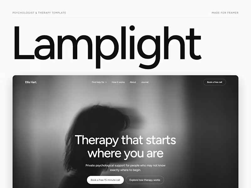
7 voted
50%
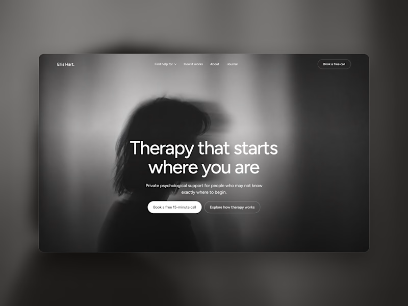
14 votes
Closed

Both works are great; it's hard to choose

I’m happy to share a new logo redesign! ✦
I had the opportunity to redesign this logo for a client from Cambodia, and the entire redesign was completed within a day.
What do you think of the new direction? Share your thoughts in the comments! 👇
10 voted
91%

1 voted
9%

11 votes
Closed

After is more professional ❤️