Built with Lummi

Brand identity, web design and campaign for an autonomous workflow engine Self-initiated concept project · Révolté · 2026
Overview
Sisyphus is a fictional autonomous workflow engine: software that sits on top of a company’s stack, spots repetitive operational loops and collapses them into background processes.
The product doesn’t exist. The brand does. I built it as a full-system exercise: naming logic, positioning, visual identity, a six-section landing page, an out-of-home campaign and a set of physical and digital applications. I then sat on it for a while, came back, and rebuilt the parts that weren’t earning their place.
The Challenge
Automation and workflow software tends to look the same: gradients, floating UI cards, a friendly robot, the word “productivity.” It promises speed but says nothing about the actual pain, which is the feeling of doing the same work again and again.
The brief I gave myself: build a brand for a category that has no face, and make the metaphor feel earned rather than clever.
The Idea
The myth of Sisyphus is the oldest picture of repetitive work: a man condemned to push a boulder uphill forever. Most brands that borrow it stop at the joke.
The turn that makes the brand work is a reframe. The answer to Sisyphus isn’t pushing harder or pushing faster. It’s changing the incline.
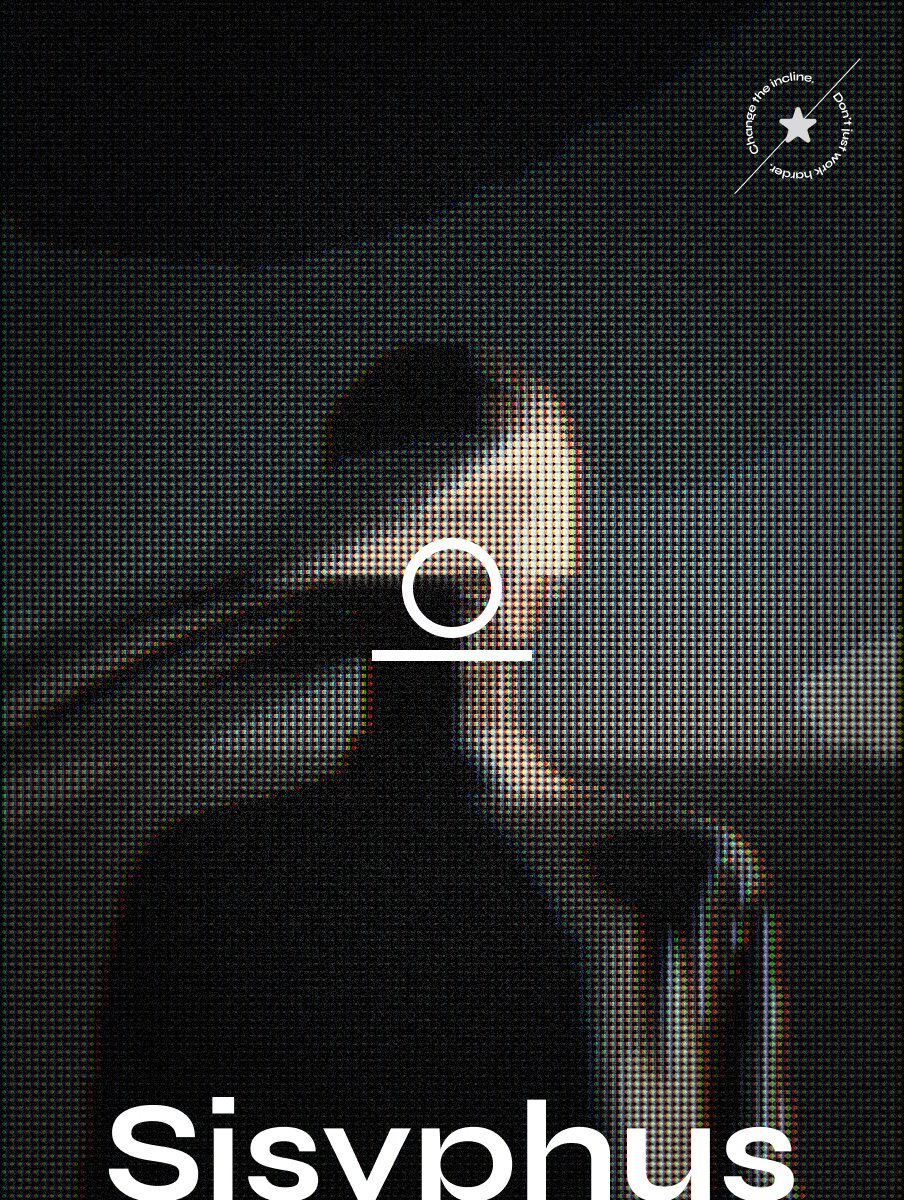
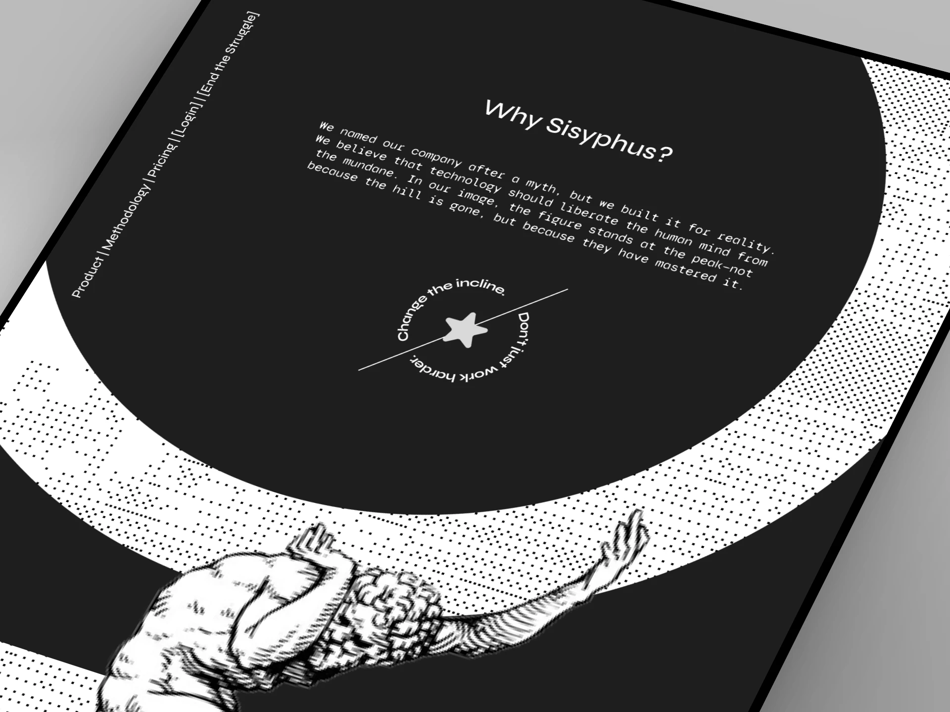
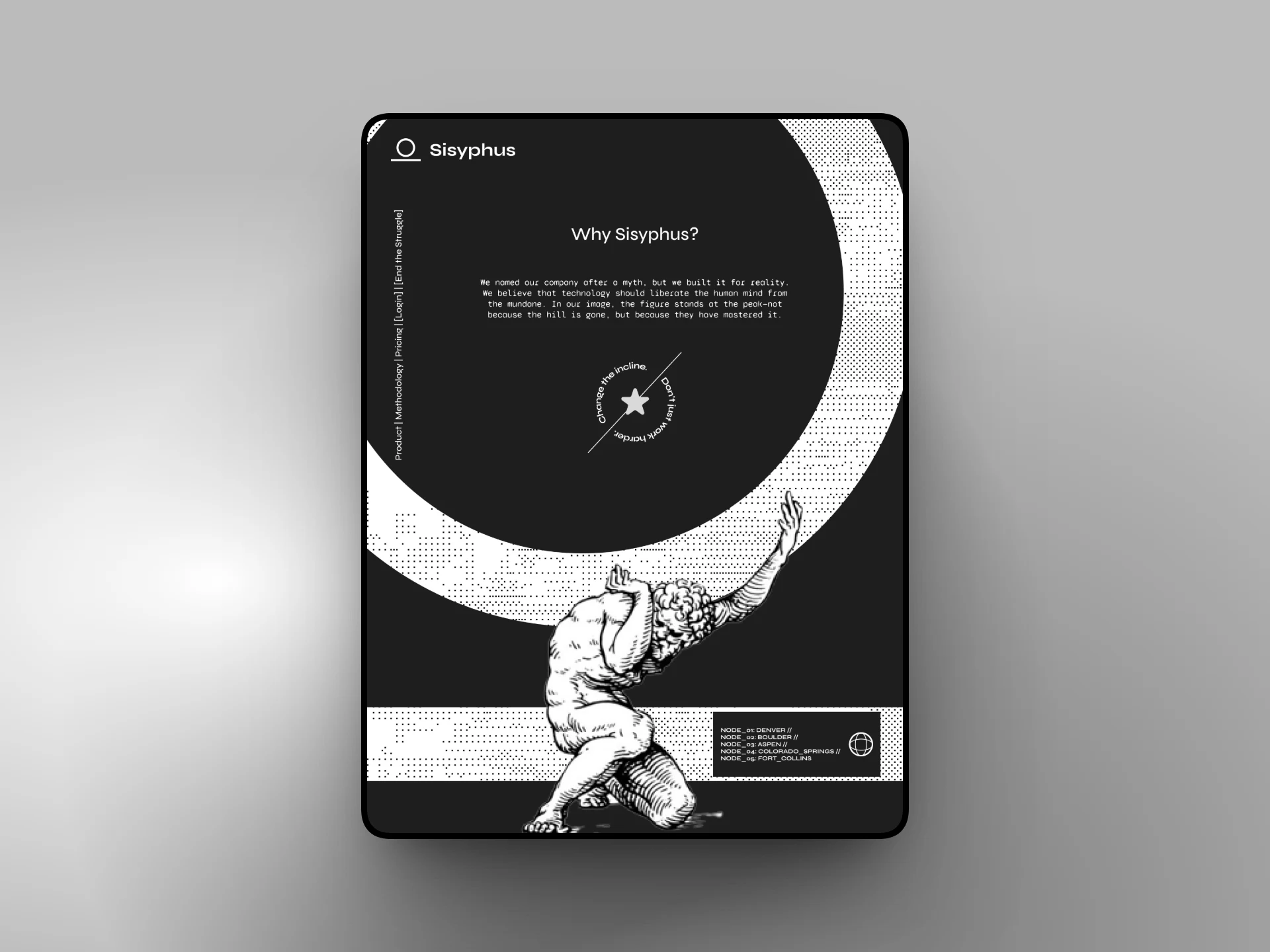
Change the incline. Don’t just work harder.
That line became the philosophy, and it explains the Colorado references in the system. The figure at the summit isn’t there because the hill disappeared. They’re there because they mastered it.
Strategy
Positioning: Sisyphus doesn’t make you faster at the climb. It rewrites the physics of the hill.
Three-part problem frame:
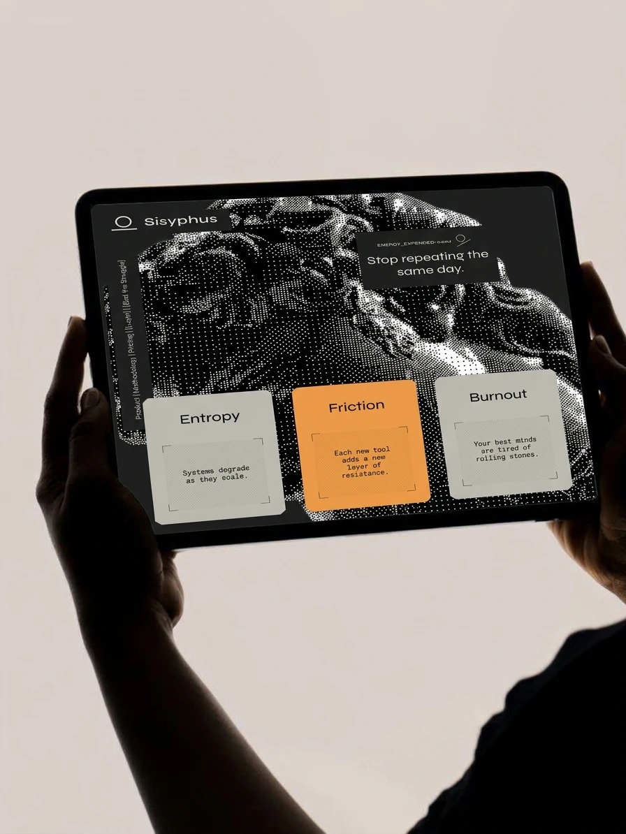
Entropy: systems degrade as they scale
Friction: each new tool adds a new layer of resistance
Burnout: your best minds are tired of rolling stones
Tone of voice: calm, declarative, slightly austere. Short sentences. Mythic language grounded in operational reality (“recursive loops,” “friction reduction,” “gravity offset”).
Key lines:
The Boulder. Without the Weight.
Stop repeating the same day.
Automate the Inevitable.
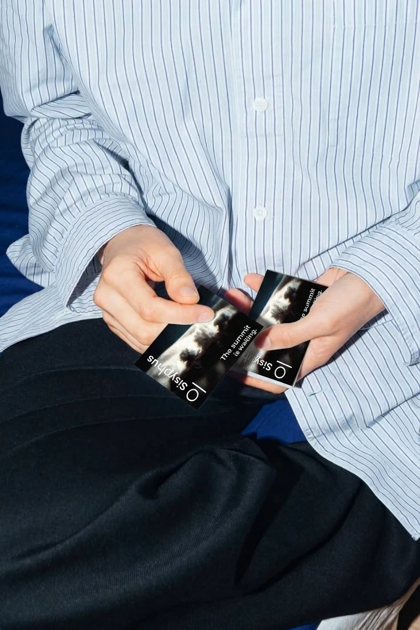
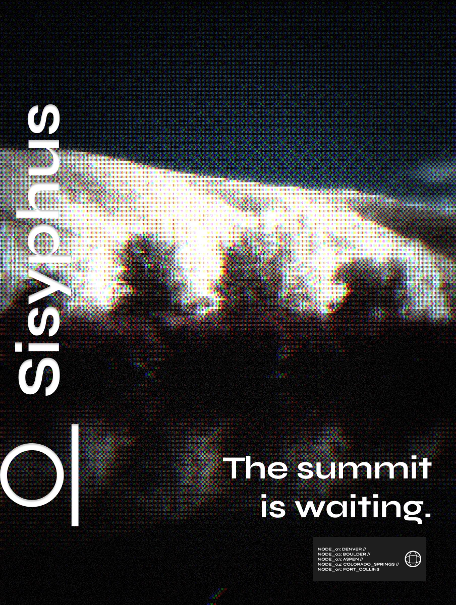
The summit is waiting.
Identity
The mark
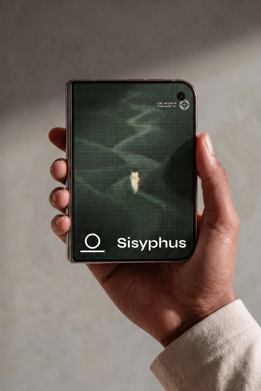
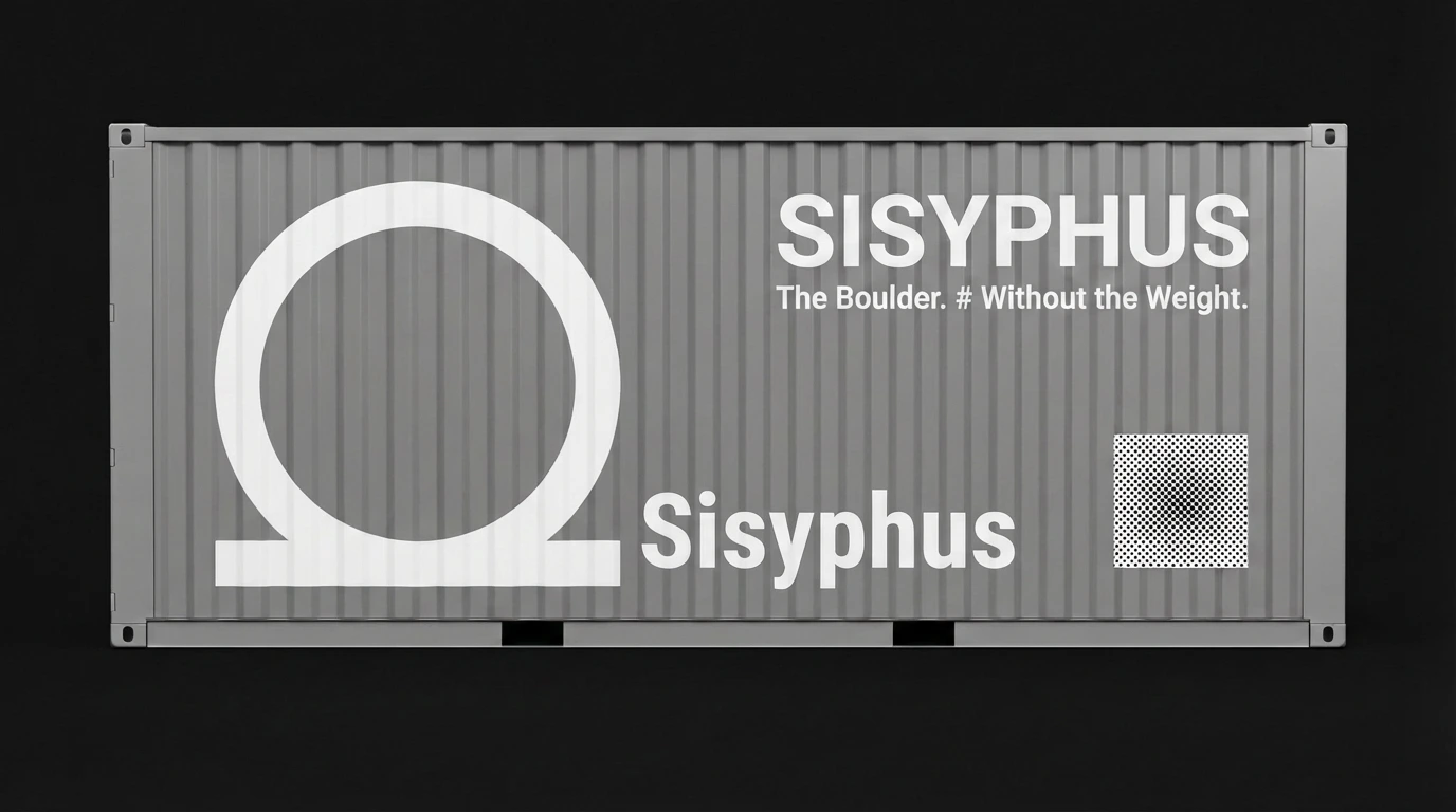
A circle resting on a flat line: a boulder on level ground. The hill is gone from the logo. It works at every scale, from favicon and pen engraving to a shipping container, and it flexes into a larger device on the website, where the boulder becomes a frame for content.
Halftone and dither as brand DNA
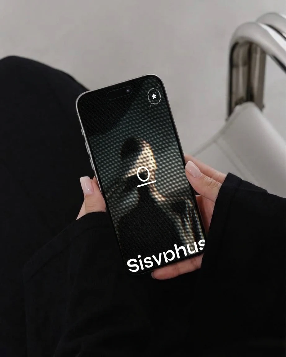
Every image is processed through halftone and dither: photography, engraving, figures, even the UI backgrounds. It reads as computation, as print, and as something between the two. It also unifies wildly different source imagery (red grass fields, engraved illustration, green hills, night crowds) into one world.
Two modes of the same system:
Monochrome halftone: structural, editorial, used on figures and illustration
RGB-separated dither: glitchy and atmospheric, used for campaign and out-of-home
Typography
A wide, geometric sans for headlines and the wordmark: confident, open, slightly futuristic
A monospace for body copy and system text: technical, honest, instrument-panel
Colour
A restrained palette that shifts by section rather than staying fixed: deep blue and field red in the hero, charcoal for the problem and philosophy sections, sage and forest green for the climb, with one recurring orange accent reserved for the single most important element in any view.
System language
A layer of fictional telemetry gives the product a sense of being alive without showing any UI:
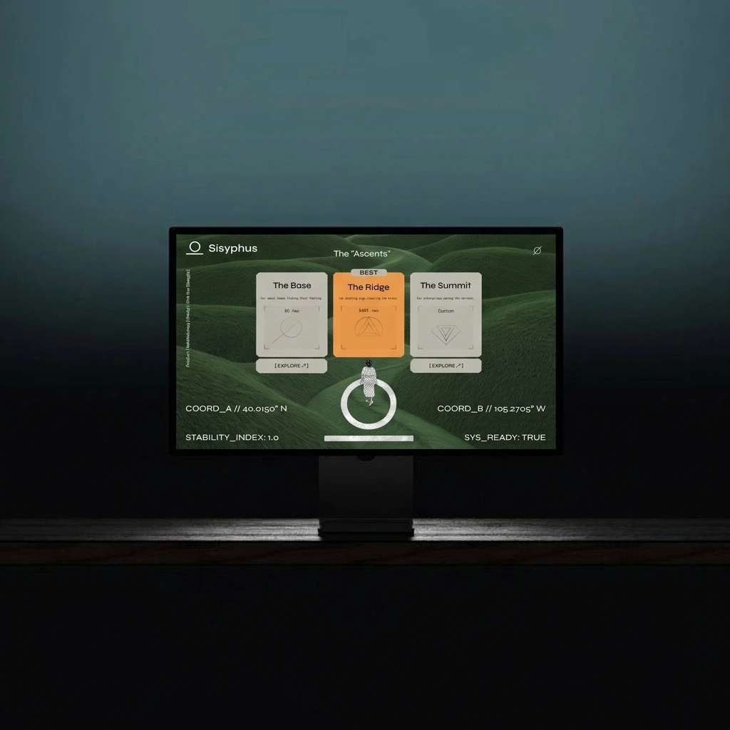
ENERGY_EXPENDED: 0.00J · GRAVITY_MODIFIER: ACTIVE · OBSERVATION_LOG // SUBJECT: SISYPHUS · STABILITY_INDEX: 1.0 · SYS_READY: TRUE
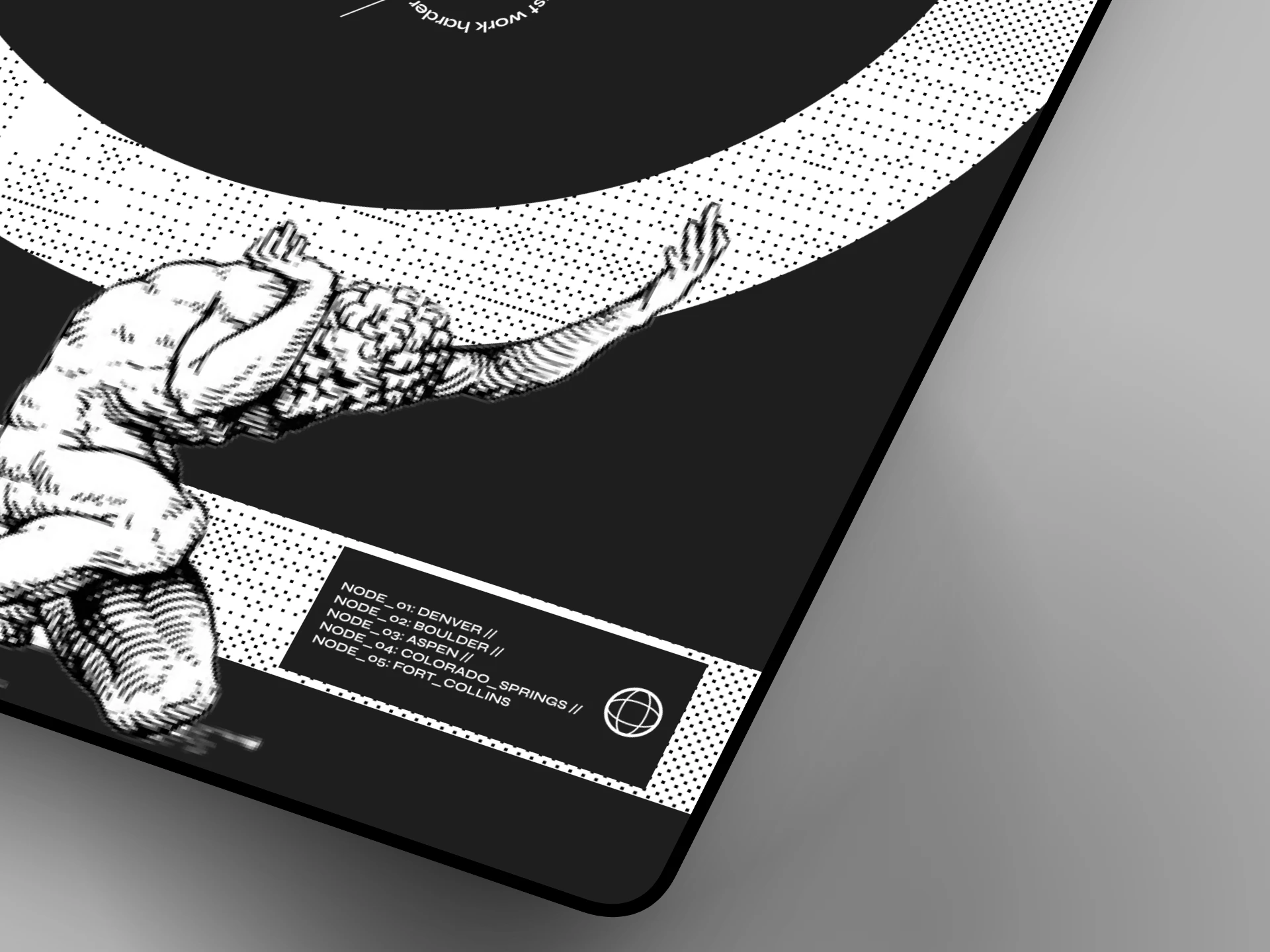
The coordinates are real places in Colorado: Boulder, and the high point of the state’s summit country. The five “nodes” (Denver, Boulder, Aspen, Colorado Springs, Fort Collins) give the brand a home territory.
Web Design
The landing page is a six-beat story, and each section changes mood on purpose.
Hero: The Boulder. Without the Weight. A veiled halftone figure stands in a red field under a hard blue sky, with “CONSTANT” running vertically through it. It’s meant to feel strange and slightly sacred. The vertical navigation is part of the composition, not a bar on top of it.
Problem: Stop repeating the same day. A dark, dense halftone figure behind three cards (Entropy, Friction, Burnout). Friction is highlighted in orange because it is the one that compounds.
Solution: Automate the Inevitable. A veiled, dithered figure emerging from darkness beside three capabilities: Recursive Intelligence, The Clarity Layer, Zero-Gravity Scaling. A ticker keeps the observation-log feeling.
Path: The Ascents. Pricing reframed as terrain: The Base, The Ridge, The Summit. Quiet green hills, a small figure and a ring, with system readouts at the corners.
Philosophy: Why Sisyphus? The only place the brand explains itself. A huge halftone boulder becomes the frame for a short manifesto, with the engraved figure holding it overhead.
Action: The summit is waiting. A short, low-pressure close with one orange call to action.

Light and dark alternate deliberately to control pacing. Dark sections carry weight and urgency. The green section is the one moment of relief.
Campaign: The Summit Is Waiting
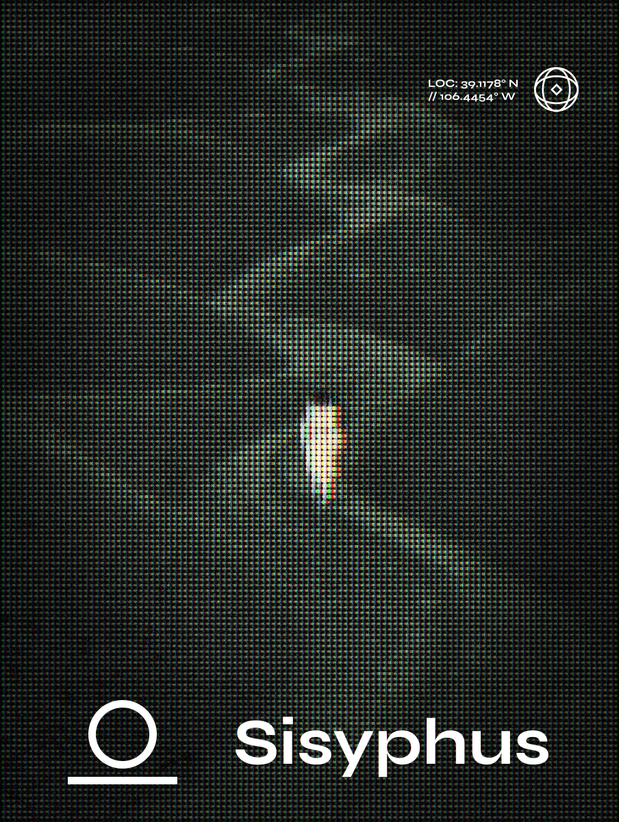
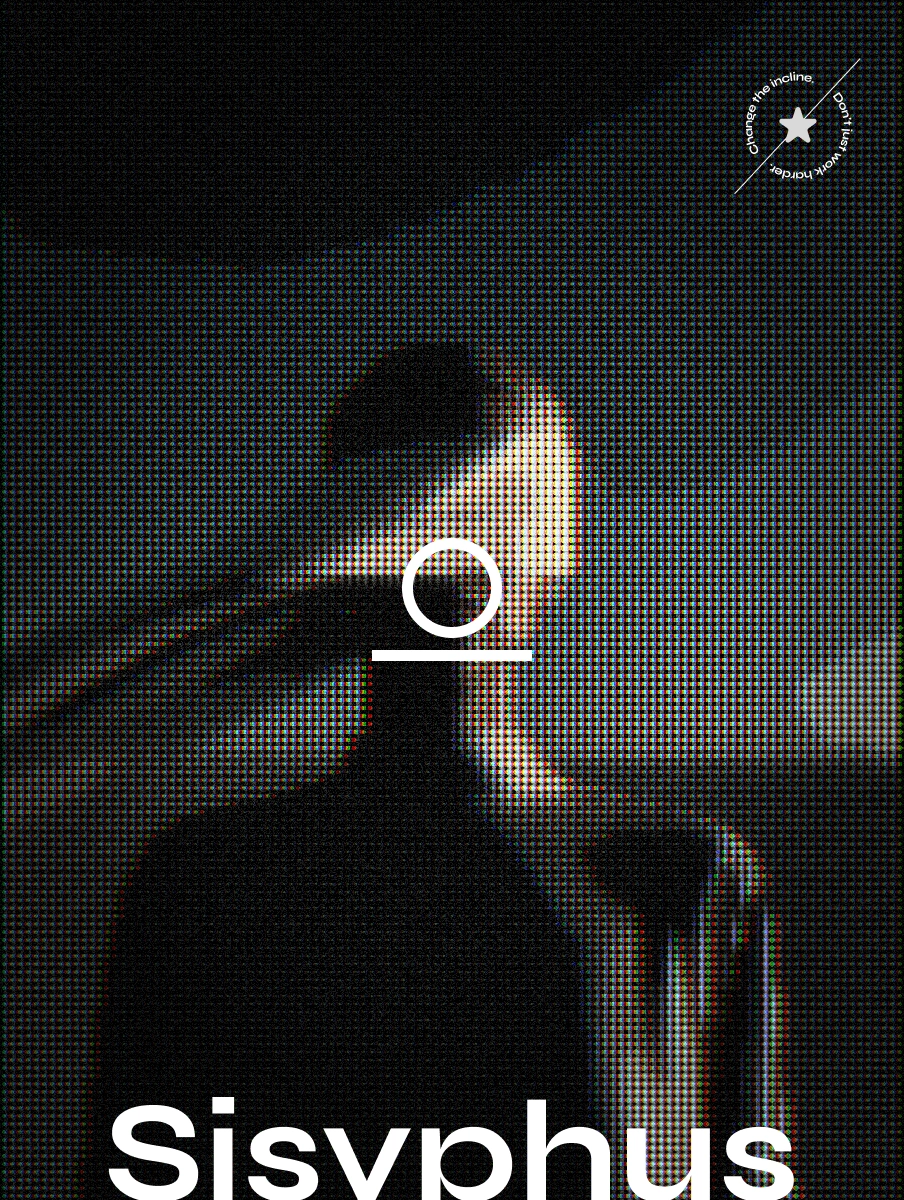
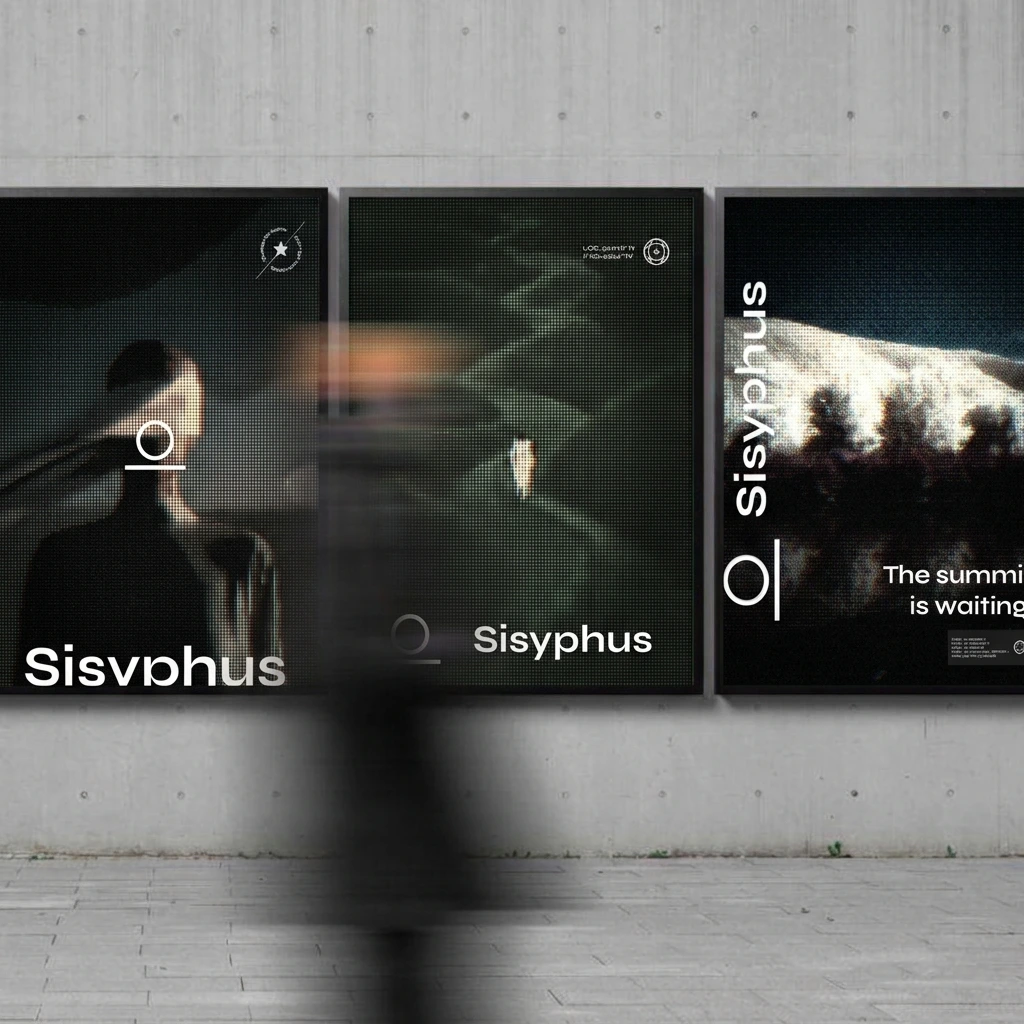
A series of posters and out-of-home layouts built from the same system:
Poster 01: a veiled figure, RGB-dithered, with the “Change the incline” roundel
Poster 02: a single glowing figure in a dark green field, with location coordinates
Poster 03: a silhouetted group at a bright ridgeline: “The summit is waiting.”
The same three layouts run across billboard, street furniture, wall installation, phone and tablet screens, and merchandise.
Applications
Red anorak with the figure printed through the fabric and “CONSTANT” down both sleeves
Black bomber with a “Digital Rights System” back print
Restricted-access badge and lanyard
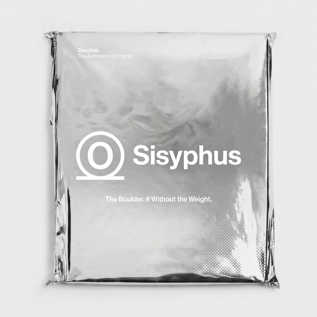
Coach jacket, foil mailer, shipping container livery
Event tickets (Sisyphus Congress)
Pen, bottle, tee, business cards
Phone, tablet, laptop and monitor presentations of the web design
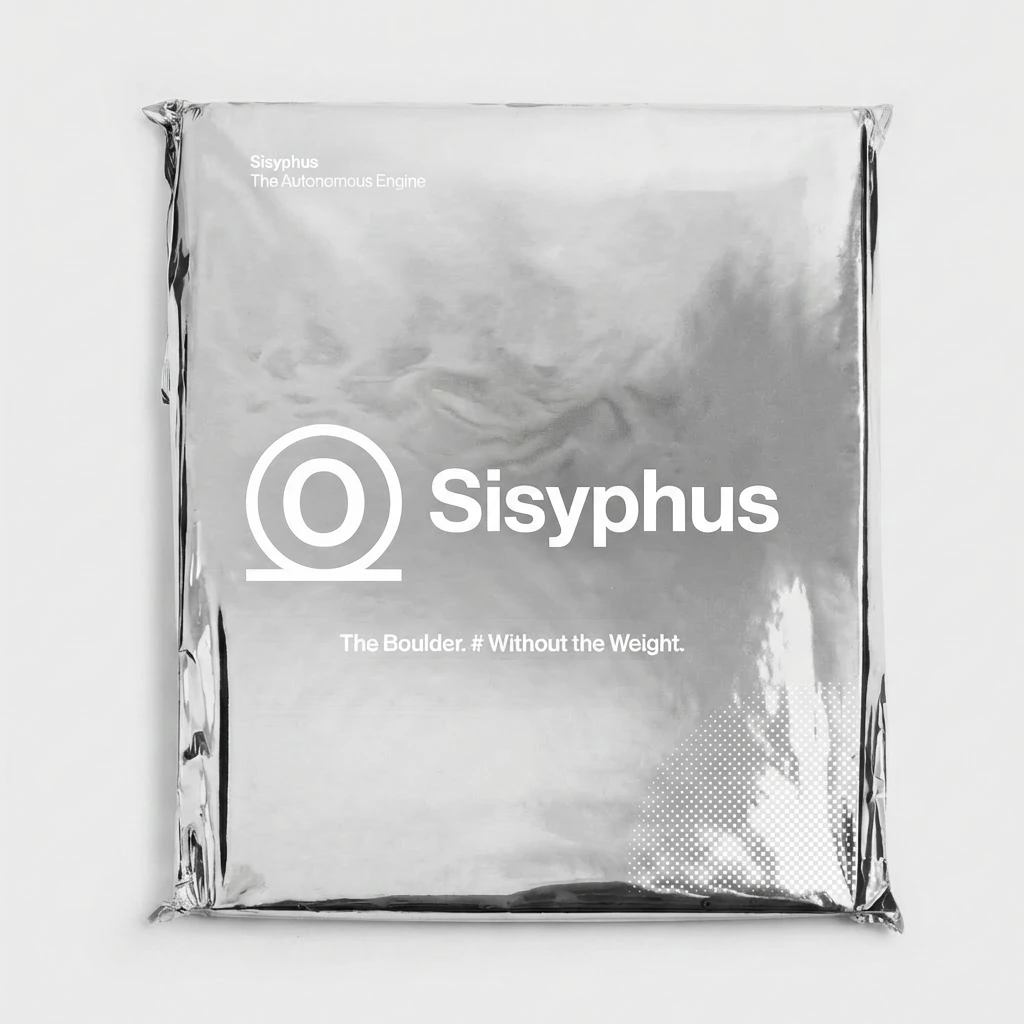
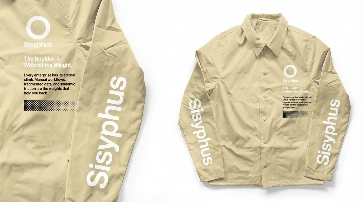
Presentation mockups use licensed templates. The identity, imagery treatment, copy and layouts are original.
Design Decisions
Robot or veiled figure? I designed section 3 both ways. The halftone robot was literal, readable and on message, and it looked like every other automation brand. The veiled figure made the section about the person rather than the machine, so it won.
Light or dark for section 3? The first version used a colourful wave background. It was beautiful and it undercut the message. Moving to a dark ground made the figure the only source of light and gave the section the urgency the copy needed.
Why alternate colour by section? A single palette across the whole page flattened the story. Letting each section have its own atmosphere while keeping type, grid, orange accent and halftone constant gave a sense of travel while keeping the system tight.
Reflection
Sisyphus started as an exercise in finding a face for a faceless category. What I learned is that the strongest brand decisions were subtractive: flattening the hill into the logo, replacing the robot with a human silhouette, cutting the page down to six beats.
The project is still a concept. There’s no product, no users and no data, so I can’t claim it converts. What it demonstrates is a way of working: starting from an idea, turning it into a system, and testing that system at every scale from a pen to a billboard.
Credits
Concept, identity, web design, art direction, copywriting: Révolté
Tools: Figma, Lummi, Lovart
Year: 2026
0 likes · 1 view · Nov 16, 2026
Sisyphus is a concept brand for an autonomous workflow engine, built around one idea: the answer to endless repetitive work isn’t pushing harder, it’s changing


