The network for creativity
Join 1.25M professional creatives like you
Connect with clients, get discovered, and run your business 100% commission-free
Creatives on Contra have earned over $150M and we are just getting started
Back to feedPost
What if self-reflection didn’t have to become another note, list, or graph?
What if it could become a body?
For the Google Stitch Challenge, I built Holon: a living self-portrait made from meaning particles.
In Holon, the user writes something true. The reflection is parsed for symbolic meaning: people, ambition, roots, craft, purpose, instinct, memory, and belonging.
Those meaningful fragments begin to glow.
Small particles appear around them. Each signal becomes a dot. And the dots assemble into a relaxed, breathing silhouette. The body then becomes the interface.
Users can explore regions like:
Heart — people, memories, belonging
Mind — goals, questions, ambition
Hands — craft, skills, making
Feet — places, roots, grounding
Core — instincts, tensions, purpose
Each dot can open into a private story. A dot is not just a marker — it is a piece of meaning.
What I built
Holon is an interactive prototype featuring:
A cinematic first-reflection onboarding flow
Phrase highlighting during meaning detection
Shader-driven particle body formation sequences using HTML canvas
A relaxed, gender-neutral breathing body made entirely from dots
Body regions with native hover states and zoom interactions
Dynamic routing where new reflections become new dots
Detailed dot-story surfaces
Built-in privacy controls
A presentation mode for sharing the macro-structure without exposing private details
The core interaction loop is:
write → signals → dots → body → zoom → story → return
How I used Stitch
I used Stitch as the foundation for the product’s visual and interaction system.
To ensure consistency, I started by importing a basic Figma wireframe alongside a design.md file. This gave the product a cohesive visual language from the beginning: dark cinematic space, glass surfaces, soft glow, Geist typography, particle body language, and a privacy-first tone.
Instead of generating the entire app in one pass, I worked screen-by-screen using in-place AI edits and streaming generations.
This allowed me to review each state, refine the prompt, and keep the layout connected to the previous screen. I used Stitch to explore and iterate on the essential states: empty canvas, meaning detection, body formation, region zoom, dot detail, and presentation mode.
For the most complex moments, Stitch helped me generate variations—especially for the meaning detection UI and the Heart zoom layout.
Once the essential screens were finalized, I exported the Stitch project, connected my codebase, and moved into Antigravity to harden the product logic: state transitions, symbolic routing, local persistence, and final Vercel deployment.
Stitch gave me the flawless visual foundation; the logic pass made the dots move, remember, and respond.
Feedback on Stitch
The strongest part of Stitch for me was how quickly it helped move from a complex, abstract product idea into a concrete visual system I could actually iterate on.
The screen-by-screen workflow, utilizing in-place edits, was especially useful. It allowed me to treat the product as a sequence of connected states instead of isolated screens, giving me the control I expect as a designer.
The seamless export process was also vital, as it provided a clean bridge from visual exploration into actual product hardening.
Holon is not a dashboard.
It is not a chatbot.
It is not a graph of notes.
It is an embodied meaning interface. A living body of meaning made from what the user carries.
Live link: https://tryholon.vercel.app/


@Contra HQ @Stitch by Google @Rustin Banks @Joshua Rowe @Dion Almaer
My direct video file upload stalled out in the final minute before the deadline. To ensure my submission was on time, I prioritized getting the live prototype URL and the written architecture for Holon submitted successfully.
You can watch the full 3-minute cinematic video...

Love the concept of the body becoming the interface. The focus on meaning, memory, and personal stories makes this feel more like an experience than a typical productivity or wellness app.
View my challenge entry:
https://on.contra.com/pnfJBQ
Would appreciate your feedback if you get a chance.

on.contra.com
Introducing Voya: Revolutionize Your Travel Planning Experience
Connect with next-gen talent and tools to get work underway. Hire more independents. Start more projects. Get more creative.
The network for creativity
Join 1.25M professional creatives like you
Connect with clients, get discovered, and run your business 100% commission-free
Creatives on Contra have earned over $150M and we are just getting started








Related posts

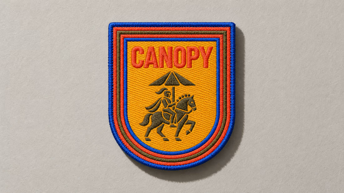
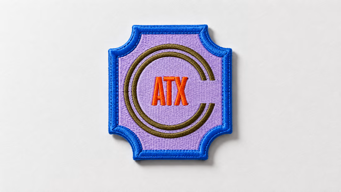
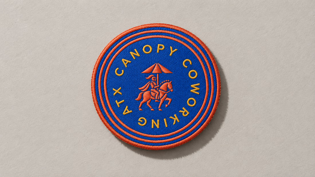
A little preview of something I’m working on.
These embroidered patches are a small part of a much larger brand system, but details like this matter. The challenge is making sure the identity still feels distinct and intentional when it moves from screen to something physical you can hold in your hand.
That’s where a strong brand system starts begins to prove itself. More soon :)

BEYOND THE VEIL ✨
What started as two simple fantasy scenes became a completely different world.
For this challenge, I wanted to create a cinematic transition where reality itself feels like it’s breaking apart before revealing another world.
Instead of manually building every layer, mask, distortion, and reveal, I directed invideo Editor’s AI agent to build the effect directly on my timeline. I could describe the look I wanted, let the agent handle the heavy lifting, then refine the result myself until it felt right.
That made the process way easier — I could focus more on the creative direction and less on the repetitive technical work.
From original forest → reality fracture → celestial world.
Built with invideo Editor. 🎬✨
invideo Editor is free to try
@Invideo @invideo.creators #invideoeditor


Wow🫨

More from ARDA®, a look at the desktop experience.
A, editorial approach to presenting architecture, built around typography, grid and imagery.


When u realize, there are websites with crazy animation but simple web like this has more conversations rate