The network for creativity
Join 1.25M professional creatives like you
Connect with clients, get discovered, and run your business 100% commission-free
Creatives on Contra have earned over $150M and we are just getting started
Back to feedPost
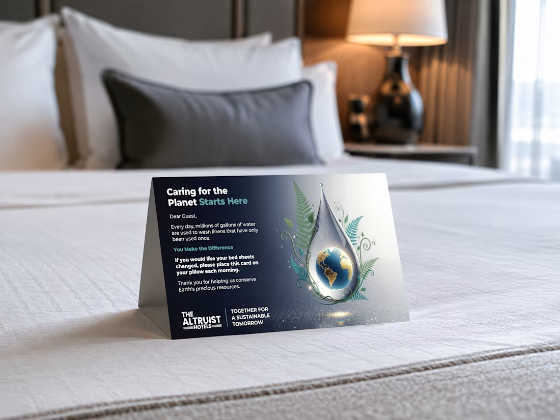
Designed this tent card for a hotel chain running 13+ properties. Thousands of guests interact with this card every month.
You've probably seen them in hotel rooms. Placed on your bed, asking you to reuse your sheets. Most of them look like they were made in Word.
I wanted to actually put thought into it.
The globe sitting inside a water droplet was the concept I pushed for. It does the storytelling without making the guest read a wall of text. The botanical elements tie the sustainability message in visually.
The interesting part about designing for physical spaces is that you can't A/B test it like a landing page.
It either works the first time someone picks it up, or it doesn't. So the hierarchy has to be tight. Headline first, visual second, action last.



Creative work

Thanks!

Love this!
Thank you!
The network for creativity
Join 1.25M professional creatives like you
Connect with clients, get discovered, and run your business 100% commission-free
Creatives on Contra have earned over $150M and we are just getting started








Related posts

NURV® now has a home on the web 🟠
Same cream canvas, same dot-matrix numerals, same single orange. Scroll it and nine dots in the margin fill up one by one.
Pool to plate to pill, nine scenes, one system.

A concept feed designed by Business Wifey Agency
The Project
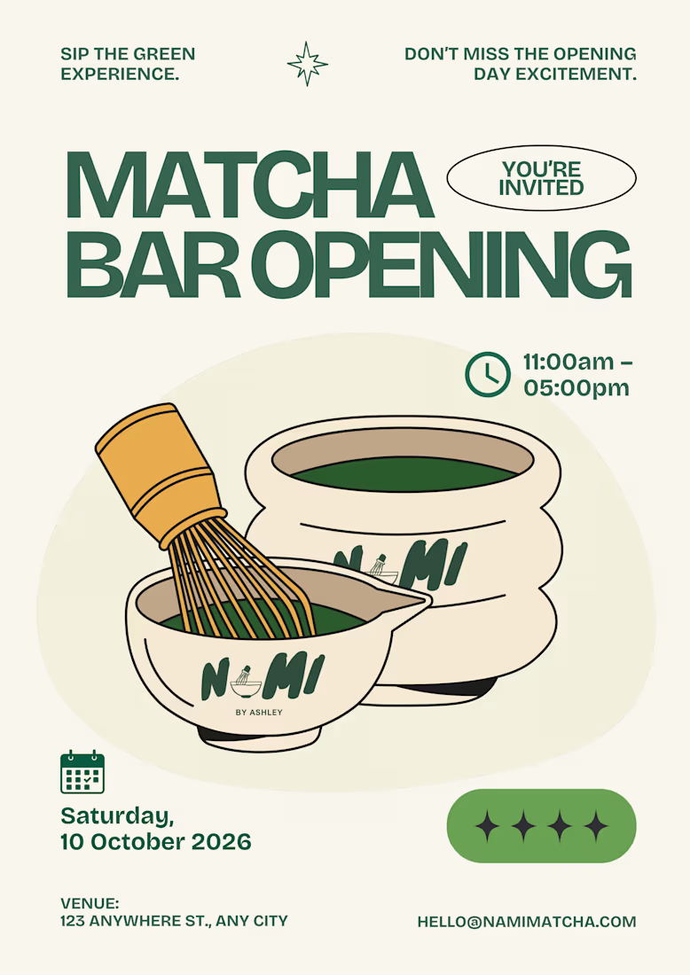
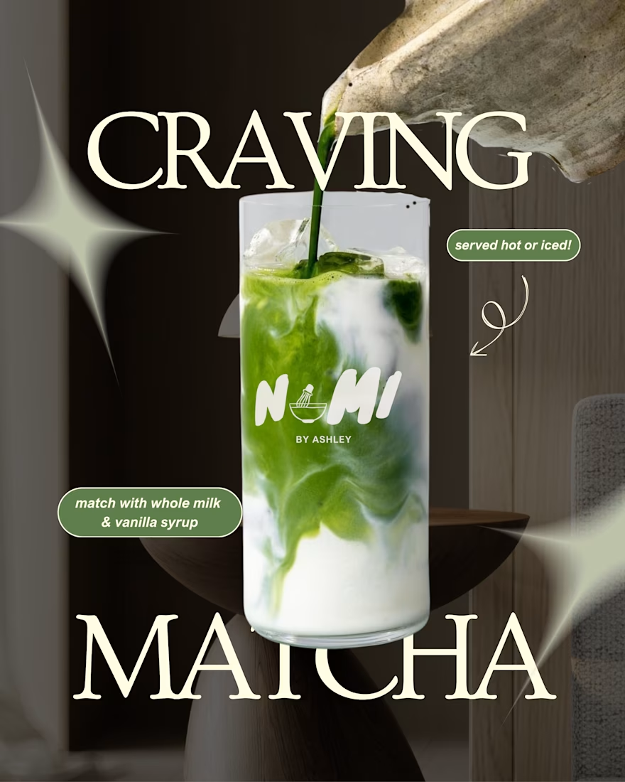
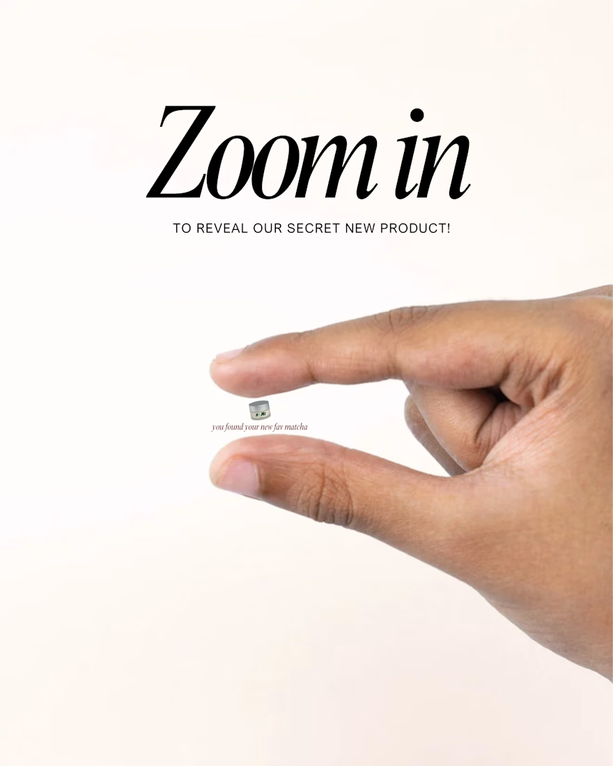
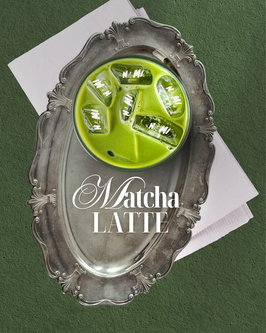
Nami Matcha is a matcha bar brand we fell in love with and couldn't resist designing for. This is not their official branding. This is BWA doing what we do best: taking a vibe, a product, and a personality, and turning it into a full visual identity that makes people stop and stare.
Because honestly - who doesn't love matcha?
What We Created
A complete social media design system built around Nami Matcha's playful yet premium aesthetic. Every post was designed to feel like the brand already existed, already had a loyal audience, and already knew exactly who it was talking to.
The feed covers every content pillar a beverage brand actually needs:
Product Content → Editorial-style drink photography posts with bold typography and on-brand copy that makes you want to order immediately.
Event & Launch Design → A full matcha bar opening poster and pop-up event flyer - the kind of content that makes people save the date and show up.
Engagement & Viral Content → "Born to / Forced to," "Take What You Need," "Matcha Mode: ON" - the kind of posts that get shared, saved, and commented on because they feel real, not promotional.
Promotional Posts → Buy 1 Get 1 offers and product deals designed to convert, not just perform.
Brand Storytelling → From the fuel gauge concept to the receipt mockup, every piece tells the Nami Matcha story in a way that feels completely native to the platform.
The Result
A 10-post feed that looks like a fully launched brand - cohesive, confident, and completely scroll-stopping. This is what BWA brings to every client: the ability to make a brand feel real before it even launches.
Note
This is a concept project created independently by Business Wifey Agency to showcase our design capabilities. Nami Matcha is not an official BWA client and this is not their confirmed brand identity - we simply loved the concept and built it out because great design doesn't wait for a brief.
Skills & Tools Used
Brand Design · Social Media Design · Content Strategy · Feed Curation · Typography · Visual Storytelling


Love how the whole feed feels like a real brand launch. The mix of product, promotional, and engagement content works really well.


NIIIIIICE