The network for creativity
Join 1.25M professional creatives like you
Connect with clients, get discovered, and run your business 100% commission-free
Creatives on Contra have earned over $150M and we are just getting started
Back to feedPost
Taste Test

Which direction converts?
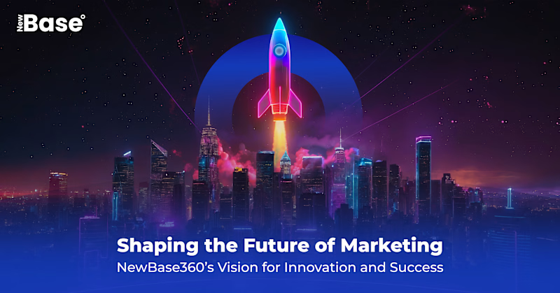
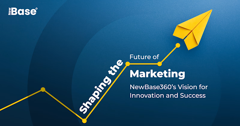
Both solve the same brief. But they solve it using completely different visual logic.
Option A bets on cinematic depth. Layered composition, neon lighting, atmospheric tension. It's designed to make you feel something before you read anything.
Option B bets on clarity. Minimal elements, directional motion, clean typography. It's designed to communicate the message instantly without any visual overhead.
Which one stops your scroll?
3 voted
75%
1 voted
25%
4 votes
Closed
The network for creativity
Join 1.25M professional creatives like you
Connect with clients, get discovered, and run your business 100% commission-free
Creatives on Contra have earned over $150M and we are just getting started








Related posts


For Vetti, a pet-health startup, our team made orange the signature colour and kept it out of the product’s data states.
Orange could carry the brand in a campaign. Inside the product, the colour attached to a score needed its own meaning. Using the same colour for recognition and an alert would ask someone to work out which job it was doing.
So the guidelines gave the data palette a separate role. Scores came with plain-language states, and the alert-copy rule was to state the observation, then give the next step.
Those decisions belong together. A calm sentence can be undermined by a colour treatment that suggests urgency.
If you’re reviewing an identity for a product, put a marketing layout beside a screen that communicates status. Ask what each colour means in each place.


This is beautiful work, and the orange colour choice was a good one, it really ties it all together ♥️

Bland is a choice.
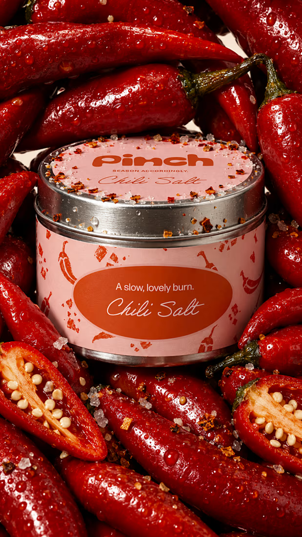
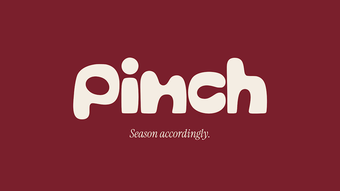
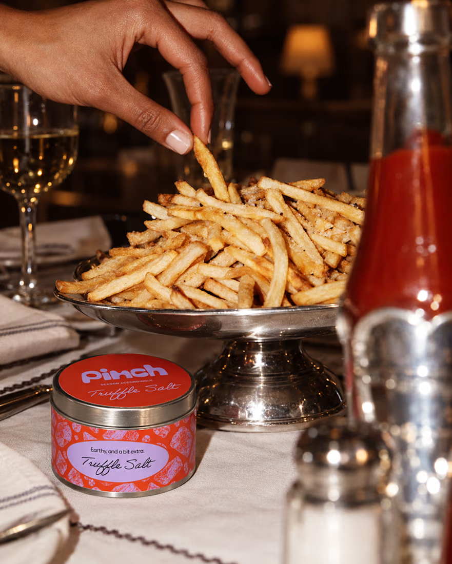
Pinch is a concept brand for a mid-high salt line made to live on the counter, not in the cupboard. Five flavors, five two-color tins, one refillable keepsake people leave next to the bar cart.
I built the full identity: wordmark, lid lockups, hand-stamped pattern system, tone of voice, and art direction.
More from the system coming soon.



Cool work 🔥


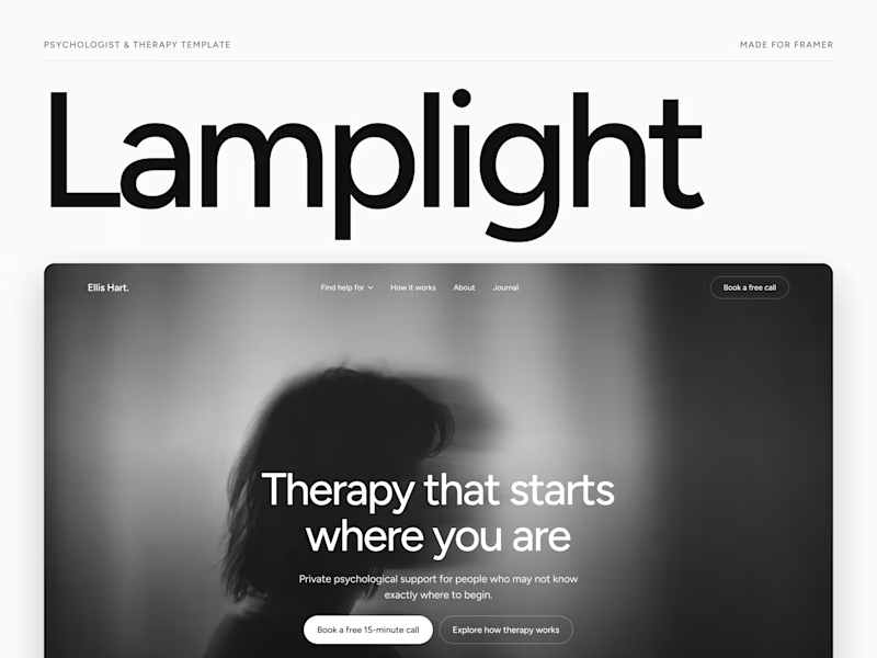
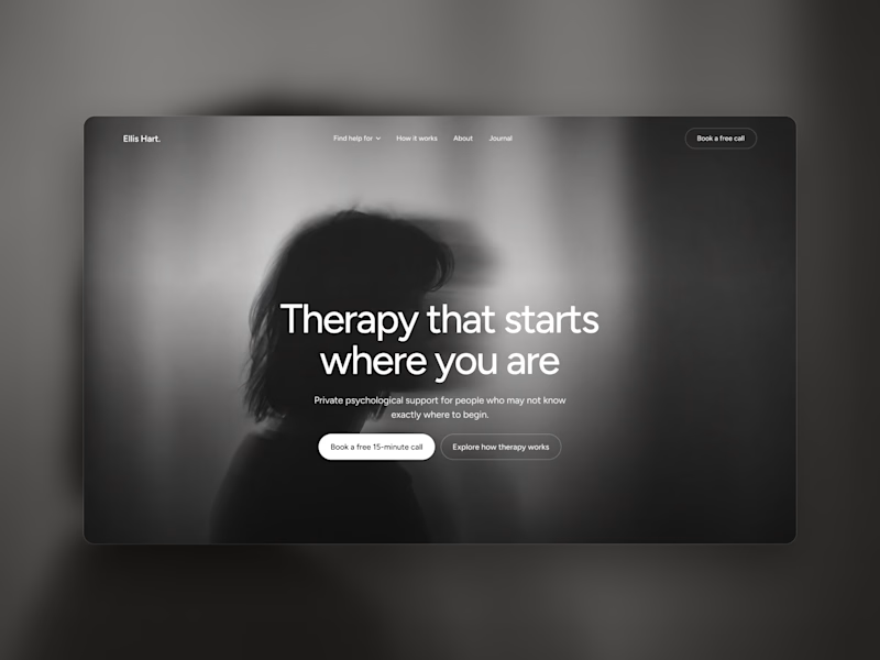
Which one grabs your attention and should be the main visual for a framer template thumbnail?

7 voted
50%
7 voted
50%
14 votes
Closed

Both works are great; it's hard to choose