
Umer Farooq
Graphic Designer | Logo Design & Brand Identity
- 62
- Followers


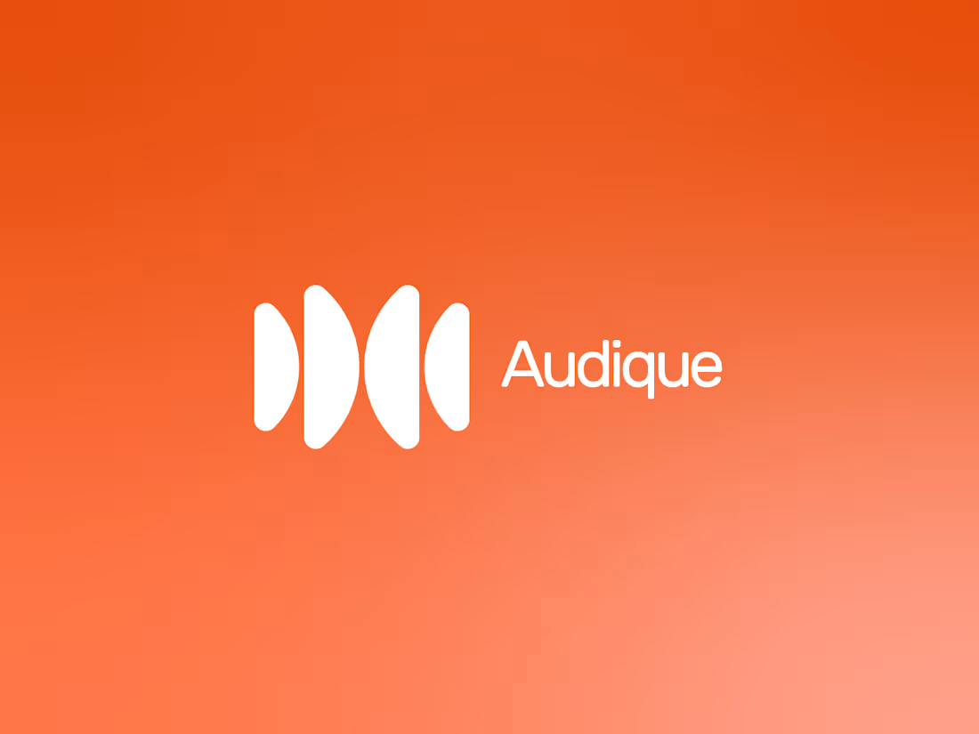
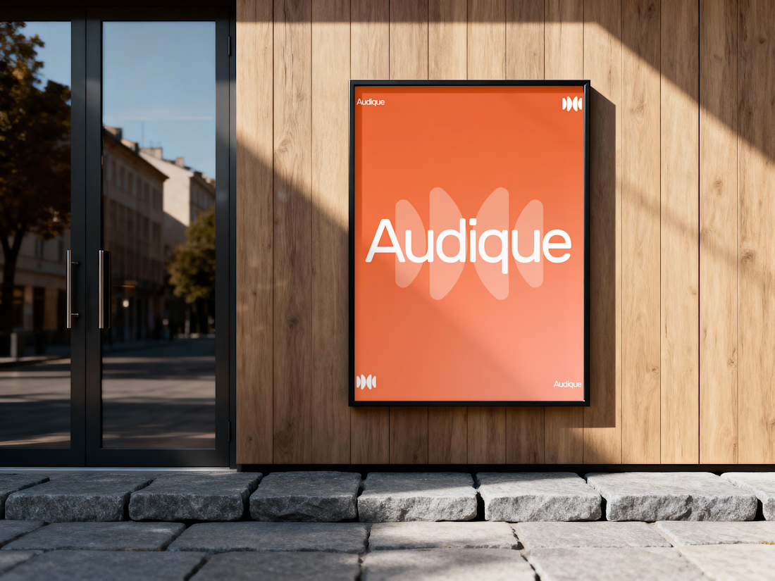
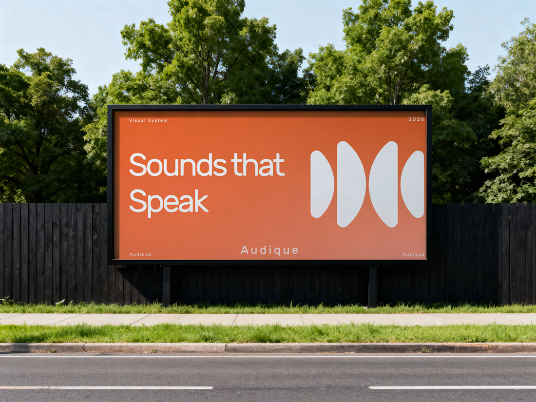
Recently, I had the opportunity to develop a logo and complete branding concept for AUDIQUE, a sound-focused brand.
The creative direction was built around simplicity, movement and the visual language of sound. I developed an abstract geometric symbol inspired by audio waves,...


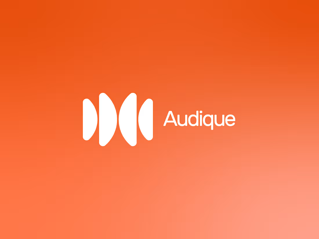
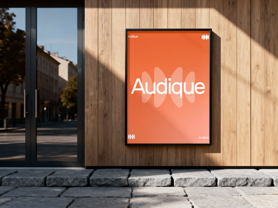
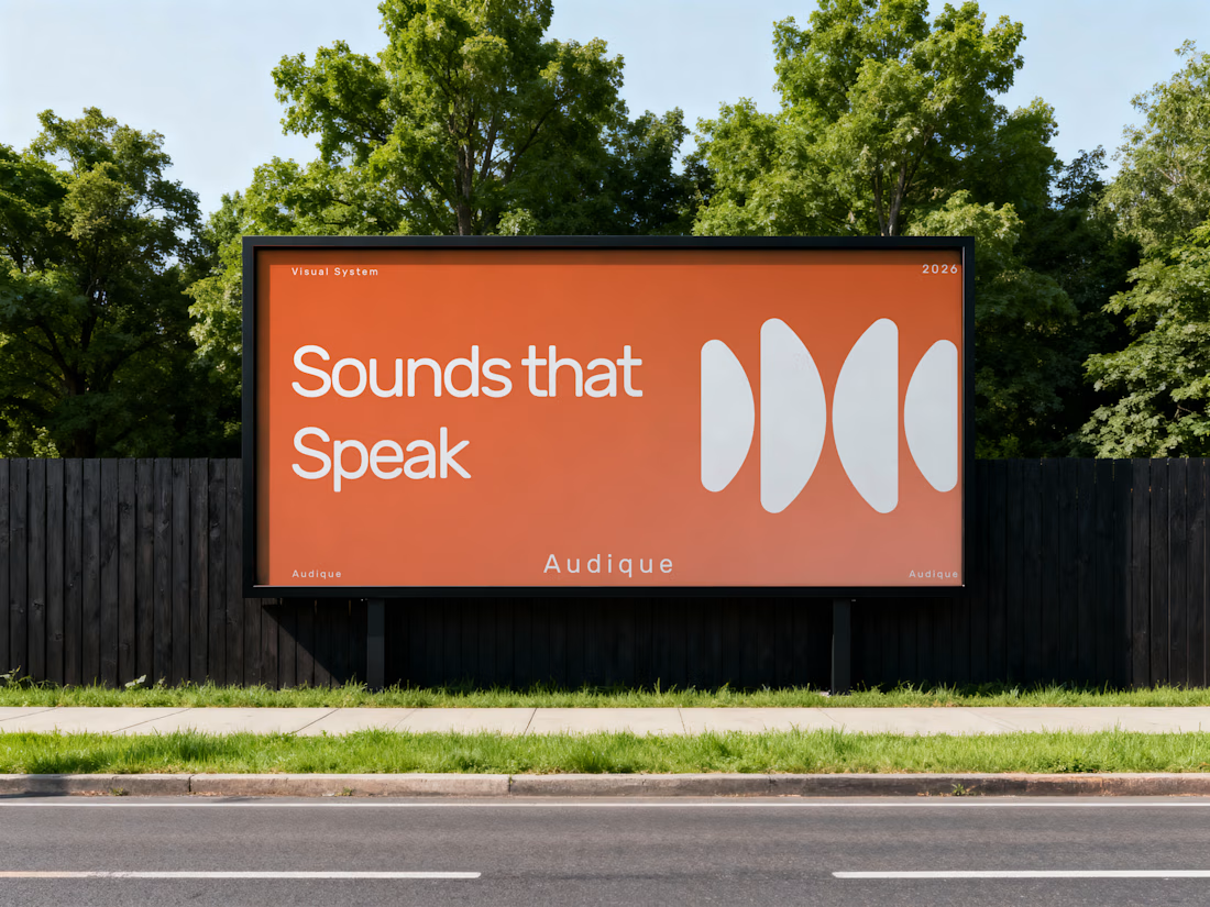
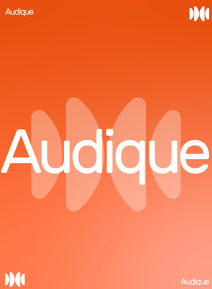
AUDIQUE — A Sound-Inspired Brand Identity.
Recently, I had the opportunity to develop a logo and complete branding concept for AUDIQUE, a sound-focused brand.
The creative direction was built around simplicity, movement and the visual language of sound. I developed an abstract...
Which one should I choose: the round one or the Sharp one?
4 voted
100%
0 voted
0%
4 votes
Closed
Rebranding WUP to Wetiq 🚀
A complete brand evolution for a real AI startup. The name evolved from WUP to Wetiq, the logo was redesigned, and the color palette was refined to elevate the brand’s overall identity and create a more modern, distinctive, and future-ready look.
A great...
What do you guys think? Which one do you think would be the best option? Honestly, my personal favorite is the first one, but I’d love to hear your thoughts and opinions too! Let me know which one you like the most.
2 voted
29%
5 voted
71%
7 votes
Closed