The network for creativity
Join 1.25M professional creatives like you
Connect with clients, get discovered, and run your business 100% commission-free
Creatives on Contra have earned over $150M and we are just getting started
Back to feedPost


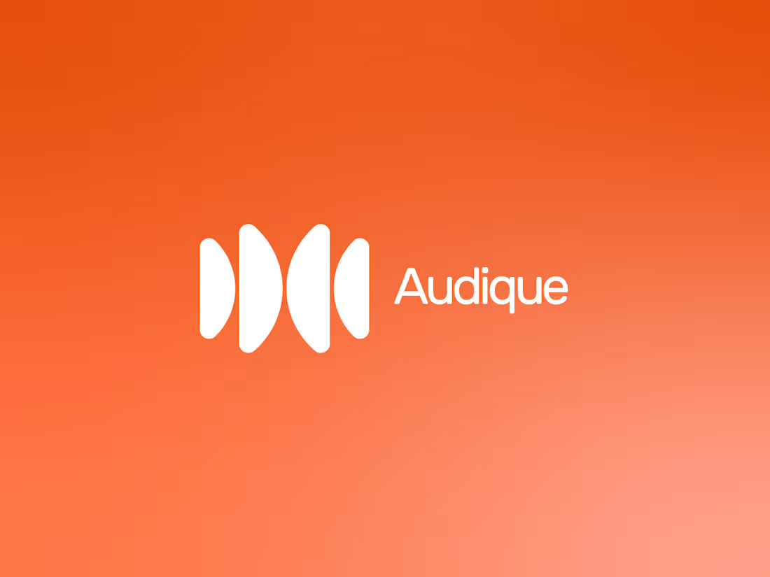
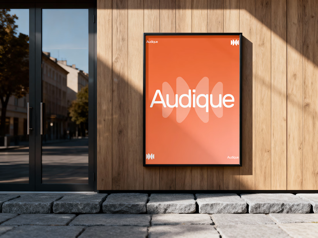
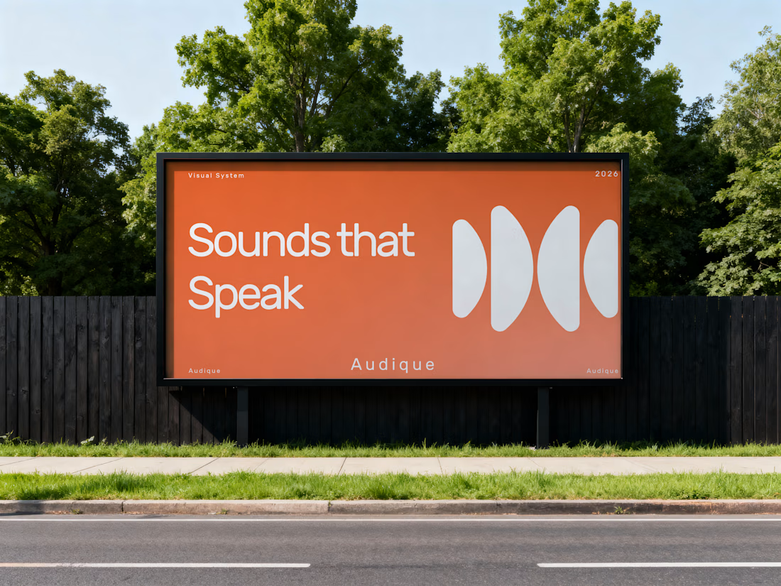
AUDIQUE — A Sound-Inspired Brand Identity.
Recently, I had the opportunity to develop a logo and complete branding concept for AUDIQUE, a sound-focused brand.
The creative direction was built around simplicity, movement and the visual language of sound. I developed an abstract geometric symbol inspired by audio waves, paired with clean rounded typography and a vibrant orange-to-coral colour palette.
The objective was to create an identity that feels modern, recognizable and versatile while maintaining a distinctive visual personality.
From the initial concept to the final visual direction, every element was designed to work together as one cohesive identity.
Looking for a logo designer who understands your vision?
I'd love to learn about your business, understand your goals and turn your ideas into a meaningful visual identity.
What do you think of this AUDIQUE concept? I'd love to hear your feedback!
For branding inquiries, feel free to send me a message.


The network for creativity
Join 1.25M professional creatives like you
Connect with clients, get discovered, and run your business 100% commission-free
Creatives on Contra have earned over $150M and we are just getting started



Related posts

Introducing the logo identity design for Golf Spirit, a golf-inspired lifestyle brand withholding the golf tradition and modern sophistication.
A self-initiated golf brand concept.
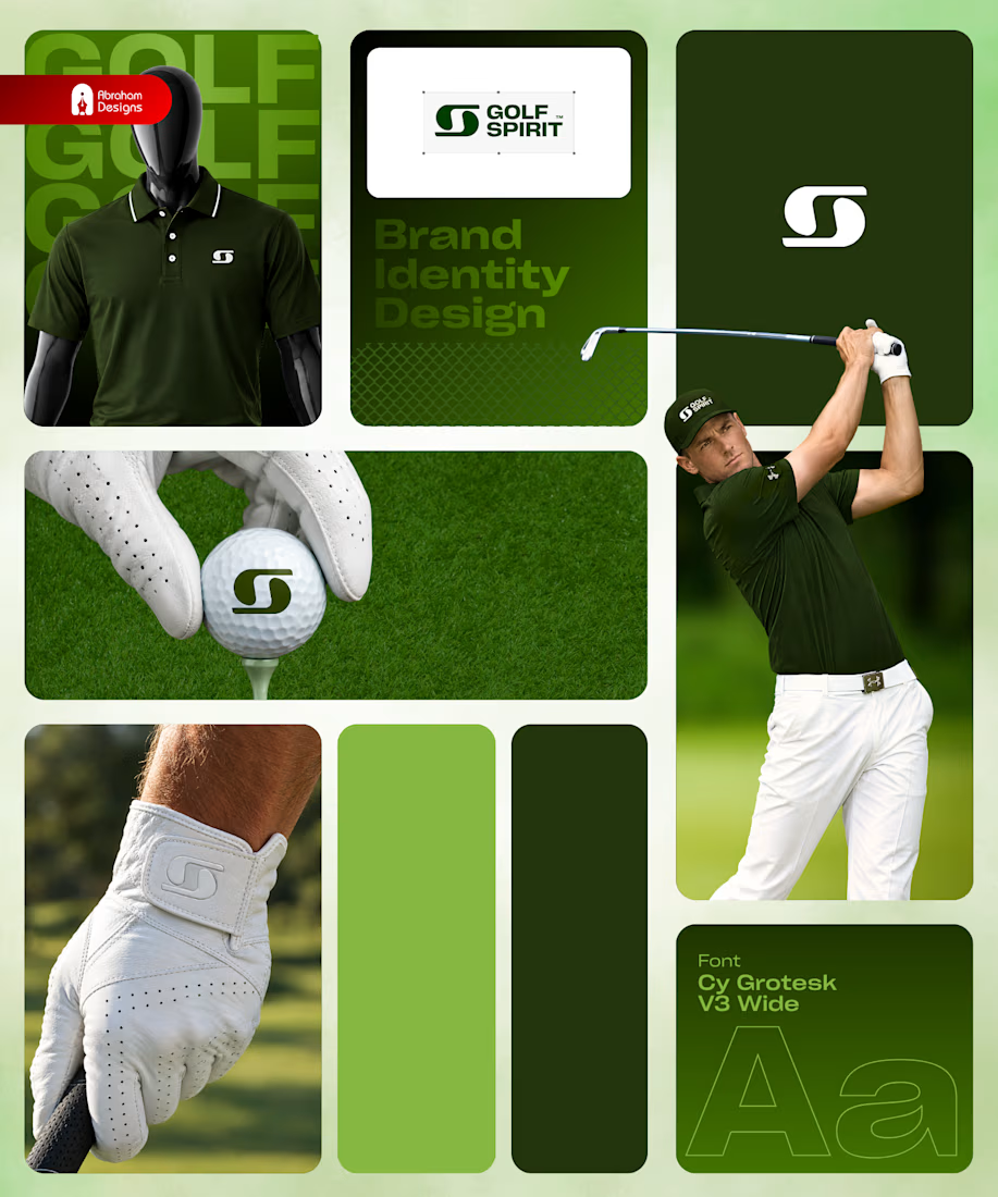
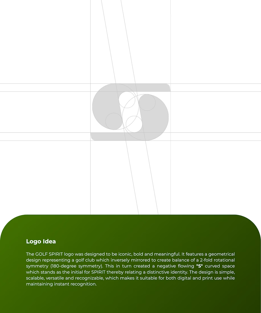
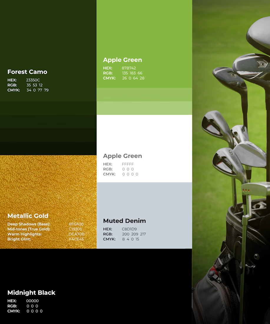
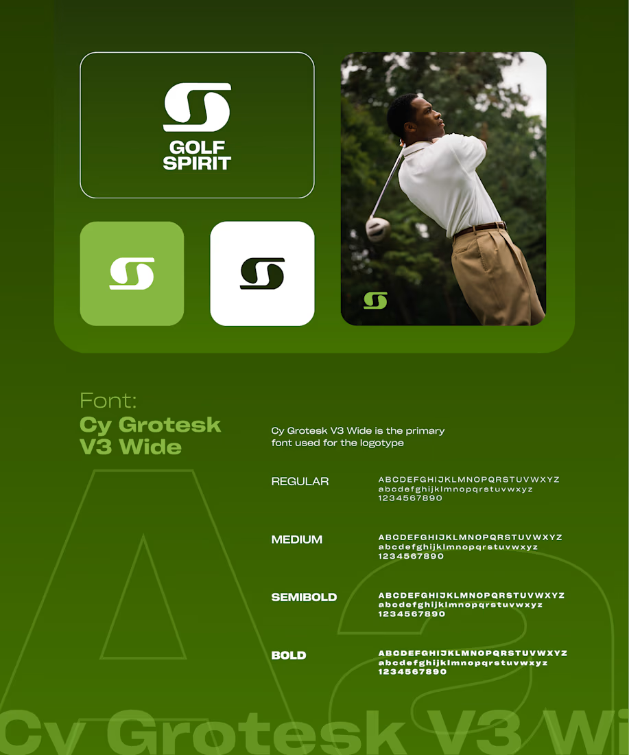

The apple green with muted denim and a small hit of metallic gold feels more country club than sportswear, which fits the lifestyle angle. Did the S mark come from the swing arc, or from the ball on the tee?


Great!!

Luxury logo for Dubai real estate brand.
I designed this AA monogram inspired by Islamic arch architecture.
Clean, premium look for high-end properties.
What you see:
Business card, building signage, 3D logo, villa flag mockups.
Made this for my portfolio - open for custom work.
Designed by Mirza Shehriyar
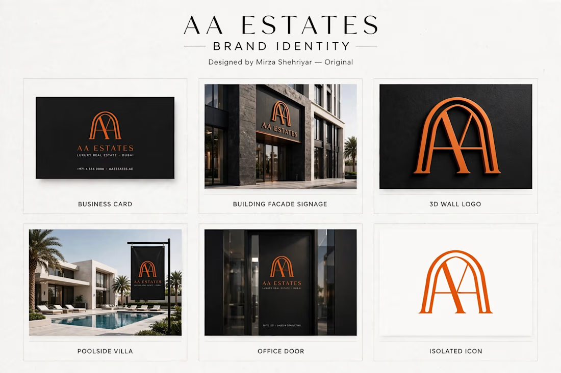


This is a very strong portfolio piece. The clean, minimal typography paired with that bold monogram creates a very sophisticated look. Great job on this.