

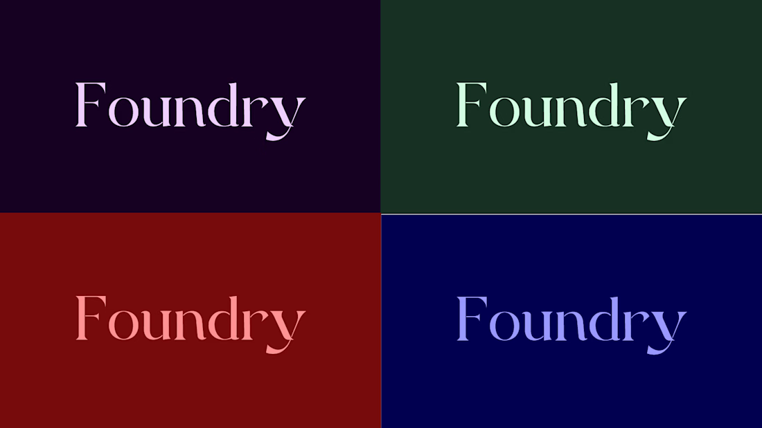
Working on a Typography and Color Variations, Letme know is it look good ? and i thought that it can be used as a main and primary logo after the full branding
Ahhh.... GPT Users

Ye le Jani tere wali post ke liye — Umer ki post pe comment karne ke liye:
I’d go with the first one too! The realistic photo on green background feels more trustworthy and professional for Contra, especially for client work. The illustrated one is cool and stylized but the...
What do you guys think? Which one do you think would be the best option? Honestly, my personal favorite is the first one, but I’d love to hear your thoughts and opinions too! Let me know which one you like the most.


7 votes
Ends in 22h
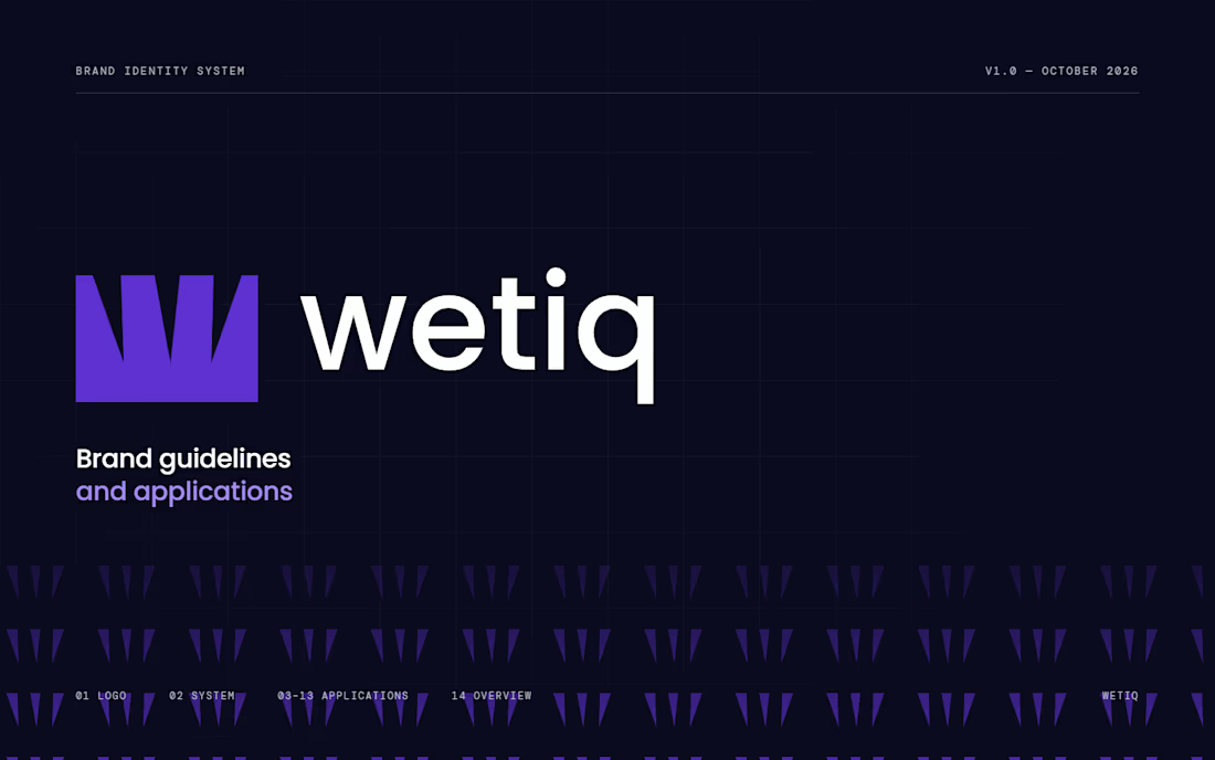
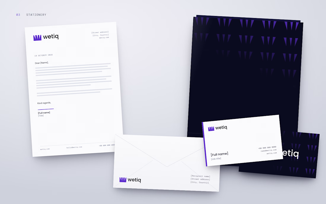
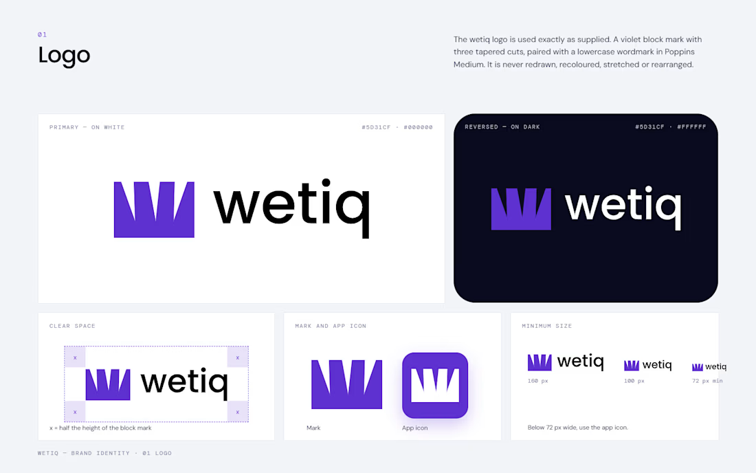
WETIQ — Brand Visual System
This project focuses on developing a complete visual system for WETIQ, transforming the existing logo into a cohesive and recognizable brand experience.
The goal was to establish a consistent visual language that communicates innovation, precision, and...


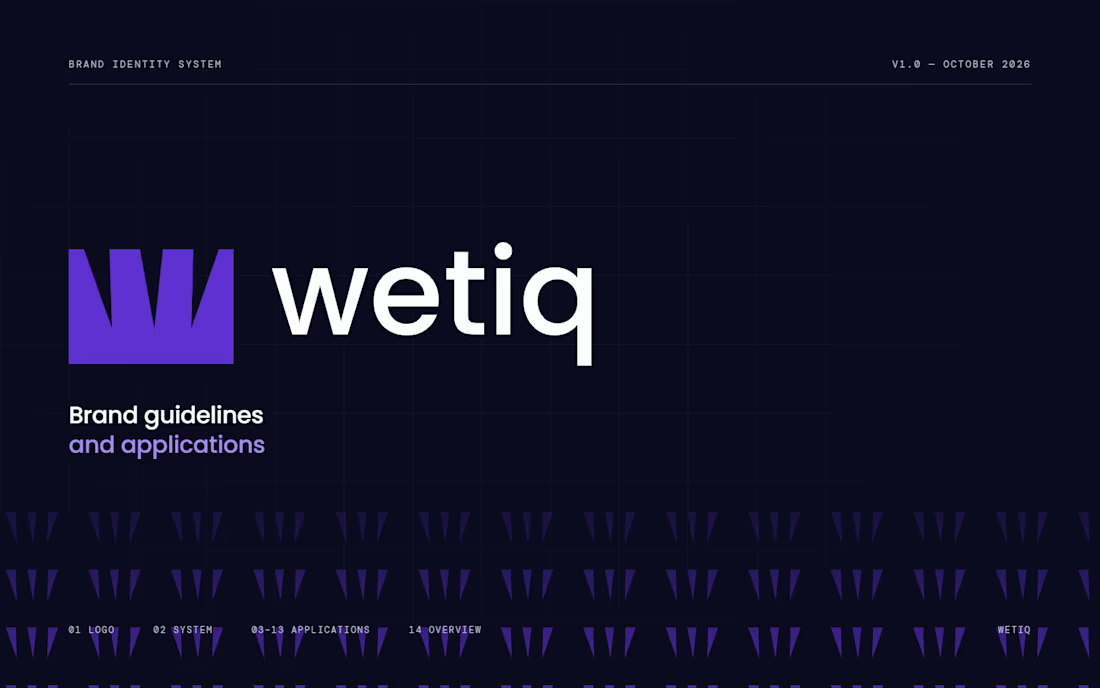
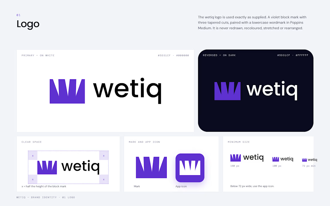
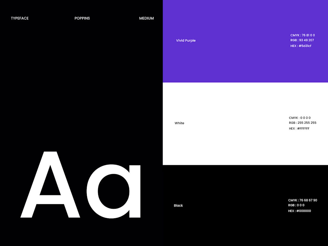
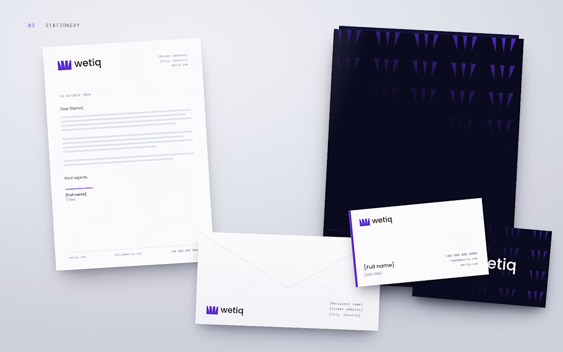
WETIQ — Brand Visual SystemThis project focuses on developing a complete visual system for WETIQ, transforming the existing logo into a cohesive and recognizable brand experience.
The goal was to establish a consistent visual language that communicates innovation, precision, and...