
Umer Farooq
Graphic Designer | Logo Design & Brand Identity


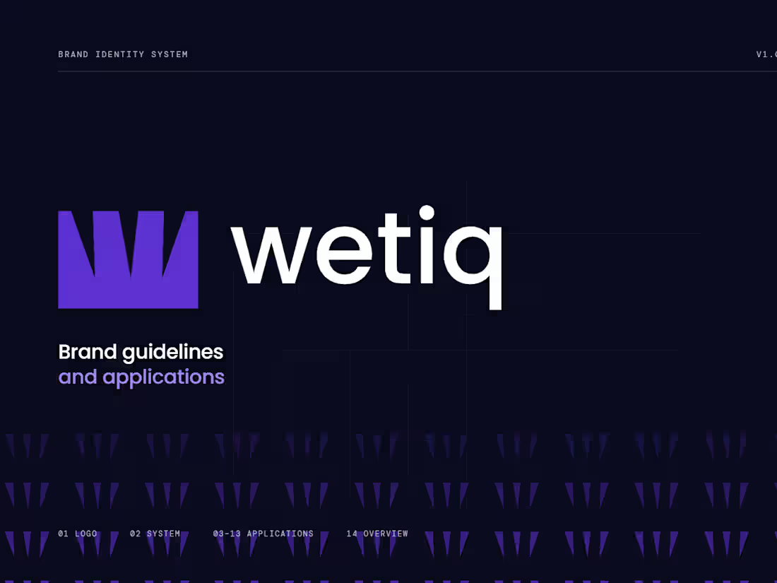
WETIQ — Brand Visual System
This project focuses on developing a complete visual system for WETIQ, transforming the existing logo into a cohesive and recognizable brand experience.
The goal was to establish a consistent visual language that communicates innovation, precision, and modern technology through carefully considered design elements.
The project explores how a single logo can become the foundation of a broader identity system that works seamlessly across different applications.
A refined color palette was developed to create a strong visual presence, balancing dark, sophisticated tones with clean neutrals and subtle accent colors.
Typography plays an essential role in the system, bringing clarity, structure, and a contemporary feel to the brand's overall presentation.
Geometric compositions, structured layouts, and subtle digital-inspired graphics were introduced to reinforce the technological character of the identity.
The visual system was extended across stationery, including business cards, letterheads, envelopes, and other corporate materials, maintaining consistency throughout each application.
Digital applications were explored through website layouts, mobile interfaces, and branded screens, demonstrating how the identity could translate into modern digital environments.
Product packaging and branded merchandise were also incorporated to showcase the flexibility of the visual language across physical touchpoints.
Corporate signage, presentation materials, and communication assets further demonstrate how the identity can maintain a unified appearance across professional settings.
Realistic mockups were created to present the design in context, highlighting logo placement, material details, typography, and the relationship between each brand element.
The final outcome is a cohesive visual identity presentation that demonstrates the versatility of the WETIQ logo and establishes a consistent foundation for future brand applications.
0
97
WETIQ — Brand Visual SystemThis project focuses on developing a complete visual system for WETIQ, transforming the existing logo into a cohesive and recognizable brand experience.
The goal was to establish a consistent visual language that communicates innovation, precision, and modern technology through carefully considered design elements.
The project explores how a single logo can become the foundation of a broader identity system that works seamlessly across different applications.
A refined color palette was developed to create a strong visual presence, balancing dark, sophisticated tones with clean neutrals and subtle accent colors.
Typography plays an essential role in the system, bringing clarity, structure, and a contemporary feel to the brand's overall presentation.Geometric compositions, structured layouts, and subtle digital-inspired graphics were introduced to reinforce the technological character of the identity.
The visual system was extended across stationery, including business cards, letterheads, envelopes, and other corporate materials, maintaining consistency throughout each application.
Digital applications were explored through website layouts, mobile interfaces, and branded screens, demonstrating how the identity could translate into modern digital environments.
Product packaging and branded merchandise were also incorporated to showcase the flexibility of the visual language across physical touchpoints.
Corporate signage, presentation materials, and communication assets further demonstrate how the identity can maintain a unified appearance across professional settings.
Realistic mockups were created to present the design in context, highlighting logo placement, material details, typography, and the relationship between each brand element.
The final outcome is a cohesive visual identity presentation that demonstrates the versatility of the WETIQ logo and establishes a consistent foundation for future brand applications.
0
78
Fleur — Rooted in nature, made for life. 🌱
Inspired by the beauty of nature, Fleur brings together simplicity, elegance, and a timeless visual identity designed to feel natural and meaningful.
The goal was to create a brand that reflects the harmony between nature and everyday living, using thoughtful design choices to communicate freshness, warmth, and authenticity.
From the logo to the overall visual direction, every detail was carefully considered to create an identity that feels organic, refined, and memorable without unnecessary complexity.
Fleur represents more than just a name. It reflects a lifestyle inspired by nature, where simplicity meets beauty and every detail has a purpose.
A well-crafted brand identity doesn't just make a brand look good; it helps communicate its personality, values, and story through a consistent visual language.
Have a brand idea waiting to bloom? 🌿 Let's turn your vision into a distinctive brand identity. DM me to start your branding journey.
#BrandIdentity #LogoDesign #VisualIdentity
4
173
The Synq logo is built around a distinctive geometric “S” symbol, created through clean, precise forms that reflect connection, movement, and technology. The structured geometry gives the mark a modern and intelligent character, while its simplicity keeps it highly recognizable and versatile across digital platforms.
The Synq brand identity is designed to communicate innovation, connectivity, and forward-thinking technology. A minimal visual language, refined typography, and a focused color system create a clean and contemporary presence suitable for a modern tech company. The geometric “S” acts as the core visual element, providing a consistent foundation across digital products, social media, presentations, and other brand touchpoints.
6
4
380