The network for creativity
Join 1.25M professional creatives like you
Connect with clients, get discovered, and run your business 100% commission-free
Creatives on Contra have earned over $150M and we are just getting started
Back to feedPost
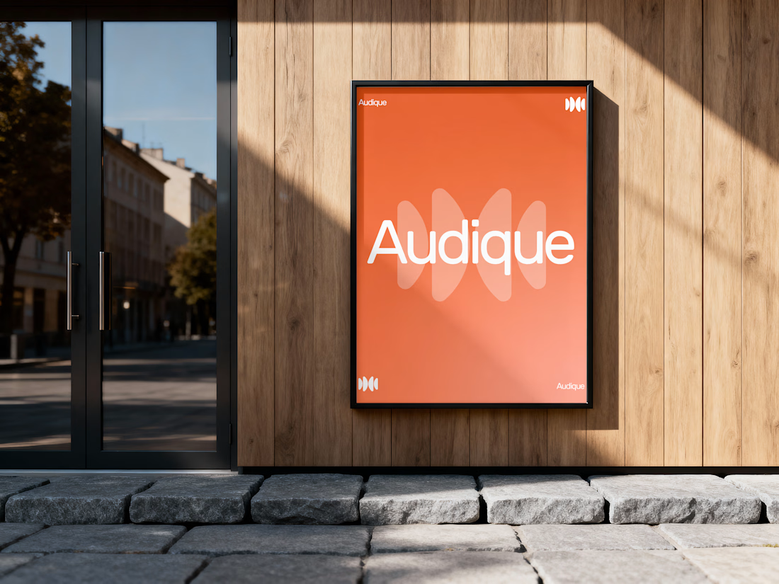
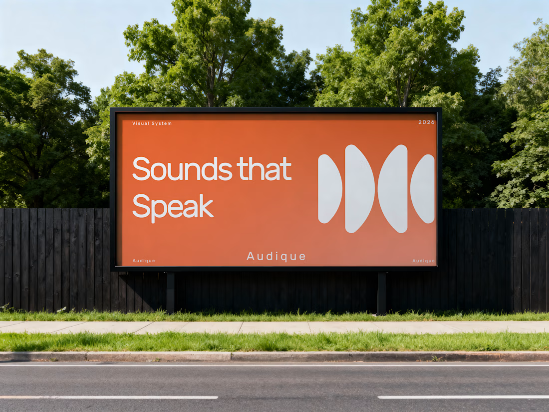
Recently, I had the opportunity to develop a logo and complete branding concept for AUDIQUE, a sound-focused brand.
The creative direction was built around simplicity, movement and the visual language of sound. I developed an abstract geometric symbol inspired by audio waves, paired with clean rounded typography and a vibrant orange-to-coral colour palette.
The objective was to create an identity that feels modern, recognizable and versatile while maintaining a distinctive visual personality.
From the initial concept to the final visual direction, every element was designed to work together as one cohesive identity.
Looking for a logo designer who understands your vision?
I'd love to learn about your business, understand your goals and turn your ideas into a meaningful visual identity.
What do you think of this AUDIQUE concept? I'd love to hear your feedback!
For branding inquiries, feel free to send me a message.



The audio wave abstraction is so smartly done! That warm terracotta/orange hue gives an audio brand a fresh, vibrant personality without falling into the typical neon tech look. Outstanding identity work, Umer


Thanks Kishan, your words mean a lot for me
The network for creativity
Join 1.25M professional creatives like you
Connect with clients, get discovered, and run your business 100% commission-free
Creatives on Contra have earned over $150M and we are just getting started



Related posts

AVYLO Skin Care Packaging Design

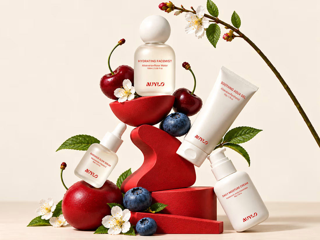

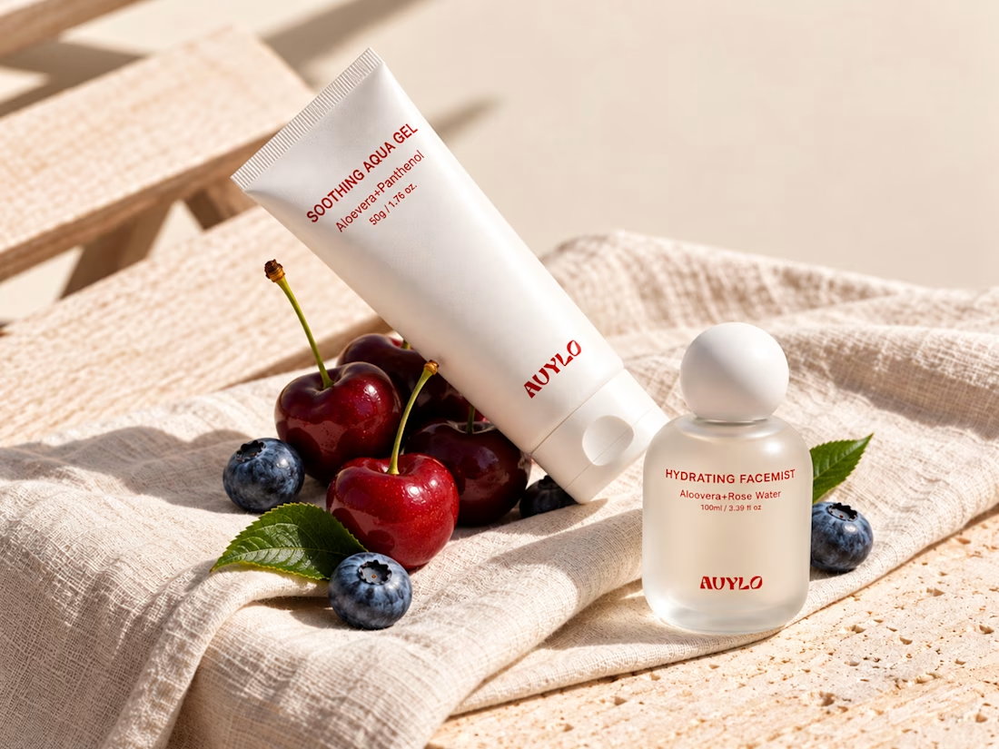

Good job


The little green dot moving through the grid is so satisfying

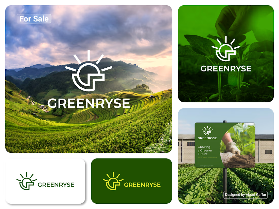
GREENRYSE – G Lettermark, Sun Logo Design, Sustainable Agriculture.
Introducing GREENRYSE, a modern logo concept inspired by nature, agriculture, and the power of growth. The symbol combines a geometric letter G with a rising sun, representing new beginnings, natural energy, and a brighter future for agriculture.
The presentation explores how the logo works across different backgrounds and applications, including agricultural landscapes, product imagery, and outdoor signage. Its clean geometric structure and fresh green color direction create a natural yet professional look.
Designed for agricultural companies, organic farming businesses, crop production, sustainable agriculture, and modern agritech ventures.
Stunning!