
Most e-commerce stores leave money in the cart.
Not because their products are wrong.
Because their cart experience is lazy.
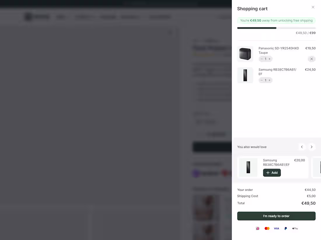
New research from Baymard Institute:
52% of shoppers will actively hunt for more items if they see they're close to free shipping.
Half your customers want to spend more.
They just need to see how close they are.
That's what a cart drawer with a dynamic progress bar does.
Takes about 2 hours to implement. Results show within days. Here's what it looks like.
The bar moves as they add items.
Shows exactly how much more to hit the threshold.
No guessing. No math. Just visual motivation.
23% will checkout anyway. Fine.
But 52% will add more to their order.
If your average order is €80...
Can push 52% of customers to add one more item at €20?
26
329
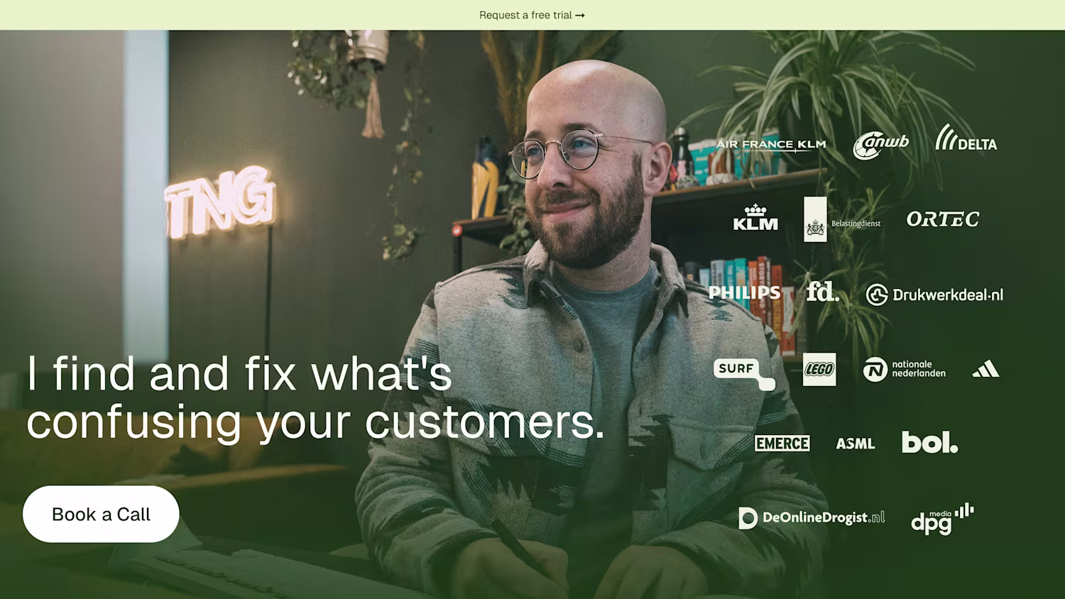
I guess you know all about the terrors of working on your own website right?
Well, last week I locked myself up. Outside the office. Away from home. To do what needed to be done.
And man, am I happy how it turned out!
3
25
371

Leifheit Product Page Redesign
0
20
I just wrapped up my first project using Instant.so (http://Instant.so) and I'm genuinely impressed. As someone who's been designing high-converting landing pages without wrestling with code, this was exactly what I needed.
What blew me away:
The editor is incredibly intuitive. Everything is customizable – and I mean everything. From the quantity selector to every single typography element, I had complete control over the design. No fighting with templates or settling for "close enough."
The best part? It felt natural. The kind of editor where you're building, not learning how to build.
If you're looking for a way to create beautiful, conversion-focused pages without the typical headaches, give Instant.so (http://Instant.so) a shot.
23
352
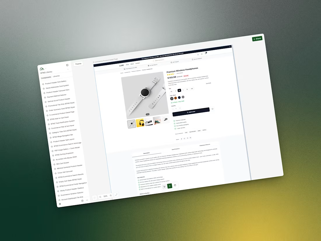
MagicPath Ecommerce Component Library
1
15
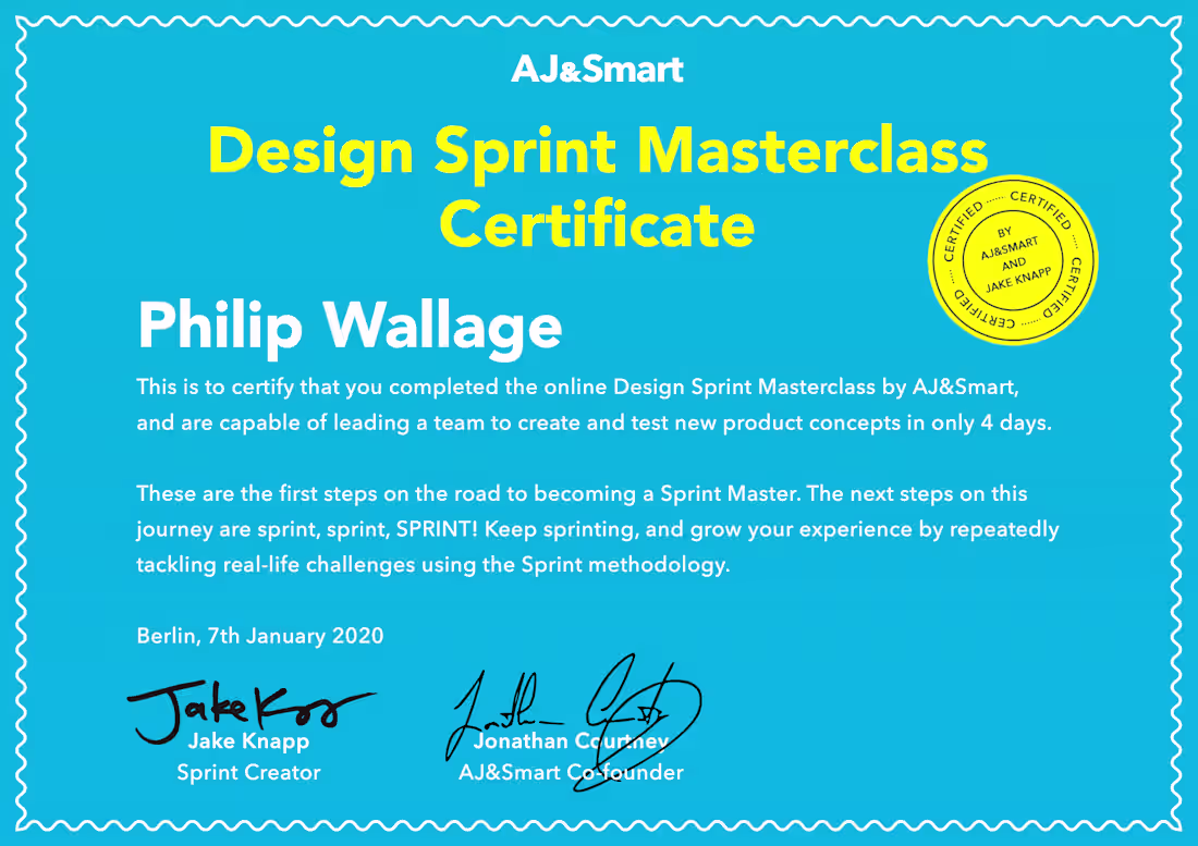
Almost 5 years since I got my Design Sprint Masterclass Certificate from AJ&Smart.
I've facilitated a little over a dozen sprints since then, and each one reinforced the same lesson:
Magic happens when you give people a structured process, achievable tasks, and permission to test their ideas with real users.
I've seen teams go from 6 months of indecision to a validated direction in 4 days. Founders realize their big idea needs a pivot after testing with just 5 users. Engineers and designers actually agreeing on something.
The sprint framework doesn't guarantee you'll love the answer. But it guarantees you'll GET an answer—fast.
If your team is stuck on a big decision or needs to move faster, let's talk.
1
13
263
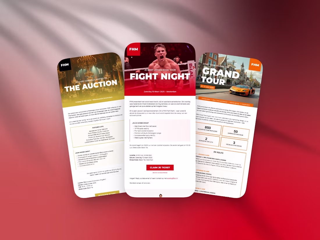
Now I usually don't do this but...
I've been in touch with FHM (a popular Dutch Online Magazine for men) and wanted to do more work for them.
So this weekend I permitted myself to have some fun.
I dove into AfterEffects and AI and made the following teaser.
The images and video are made with AI.
I even used AI to 'cut' the soundtrack into a custom shorter version.
1
22
287
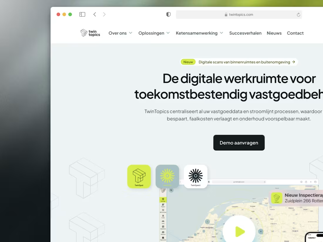
TwinTopics: Designing the Future of Real Estate Management
1
28
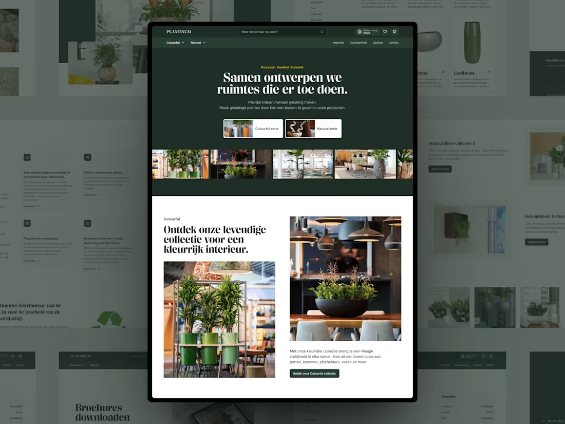
Creating Spaces that Matter. A Dutch Ecommerce project
1
93
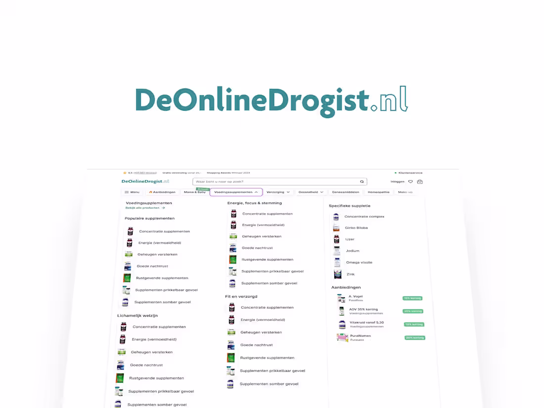
An Ecommerce Experience That Finally Makes Sense
1
35
Revamping the Design System for FD
0
47
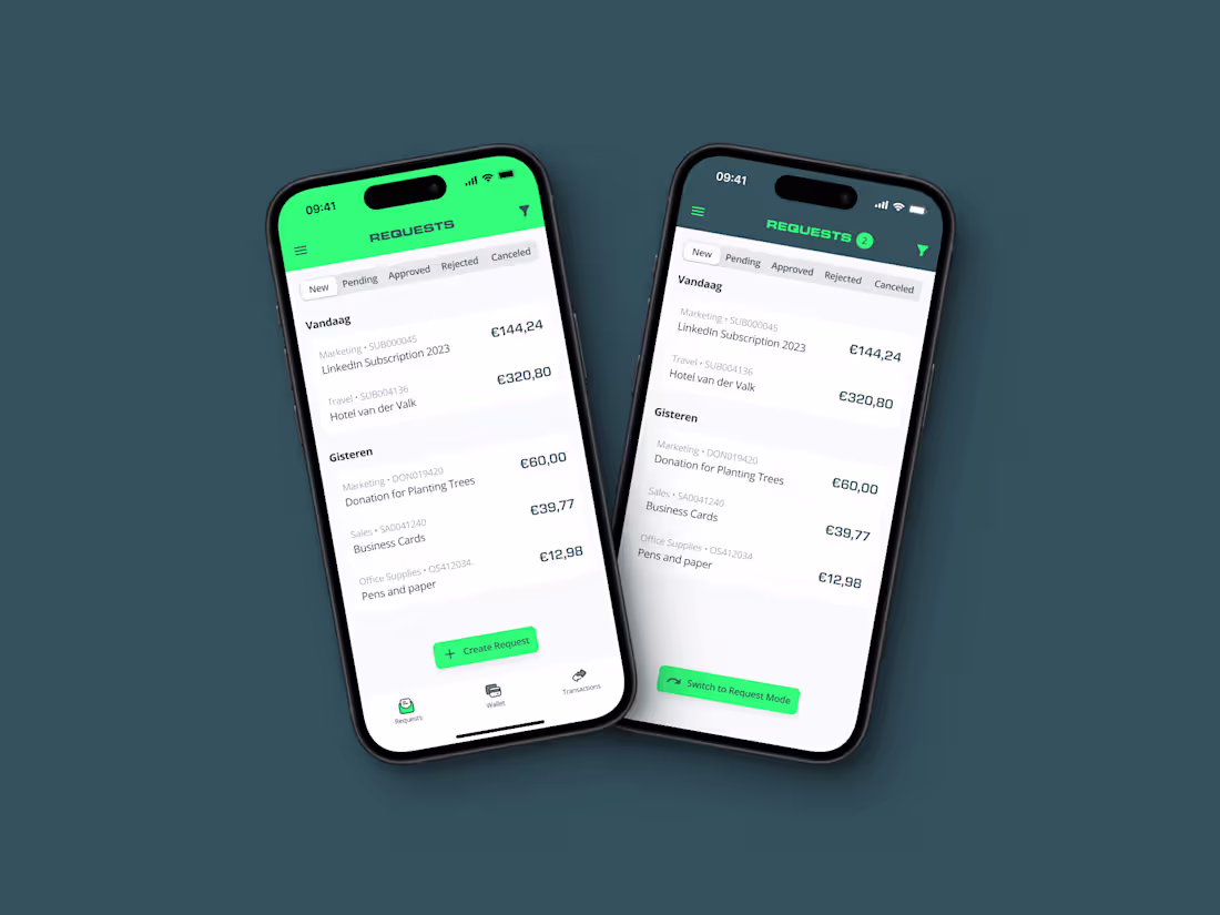
Getting "Employee Budgets & Finances" Right!
1
22
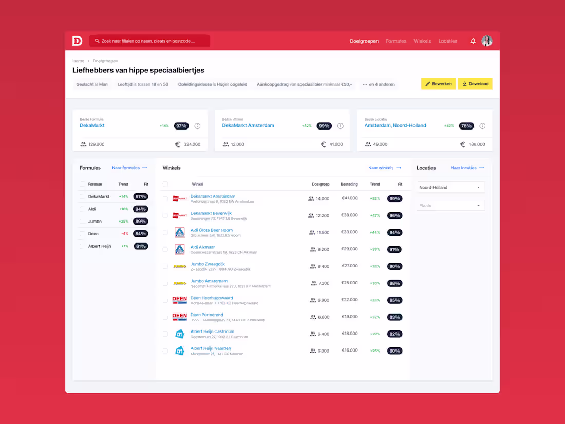
From Spreadsheet to Superpower: Turning Data into Retail Gold
0
25
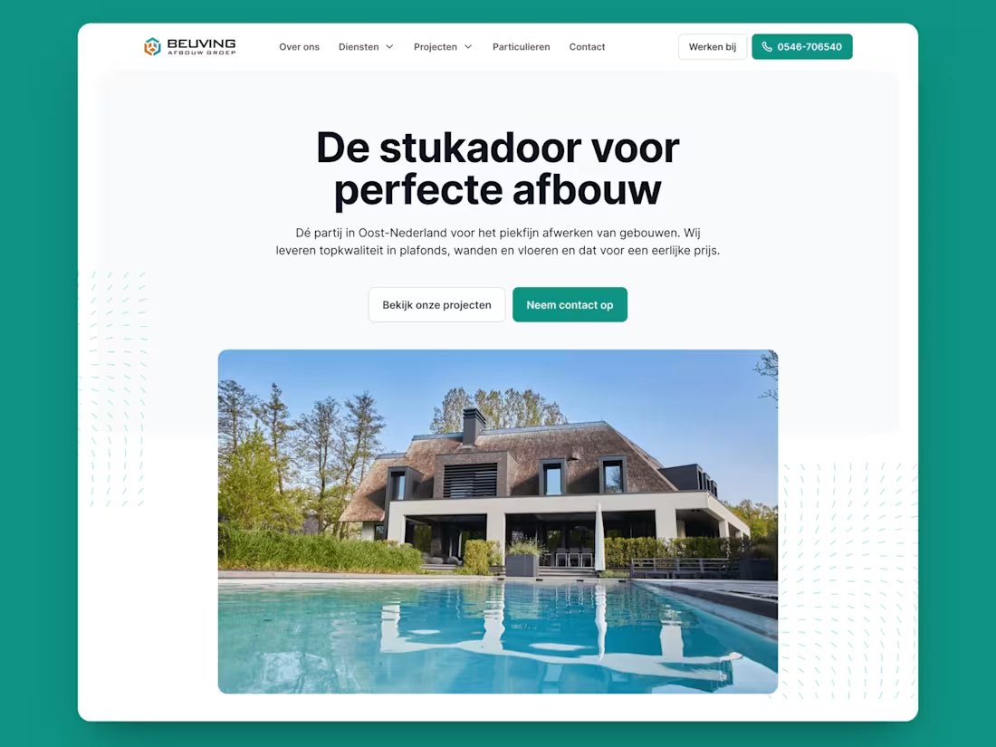
Redesign Dutch Construction Company
0
12
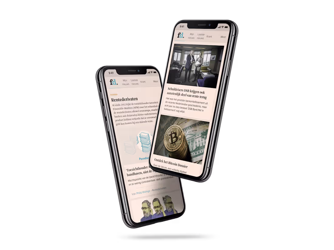
The UX behind the 100K Subscribers at the Financieele Dagblad
0
22
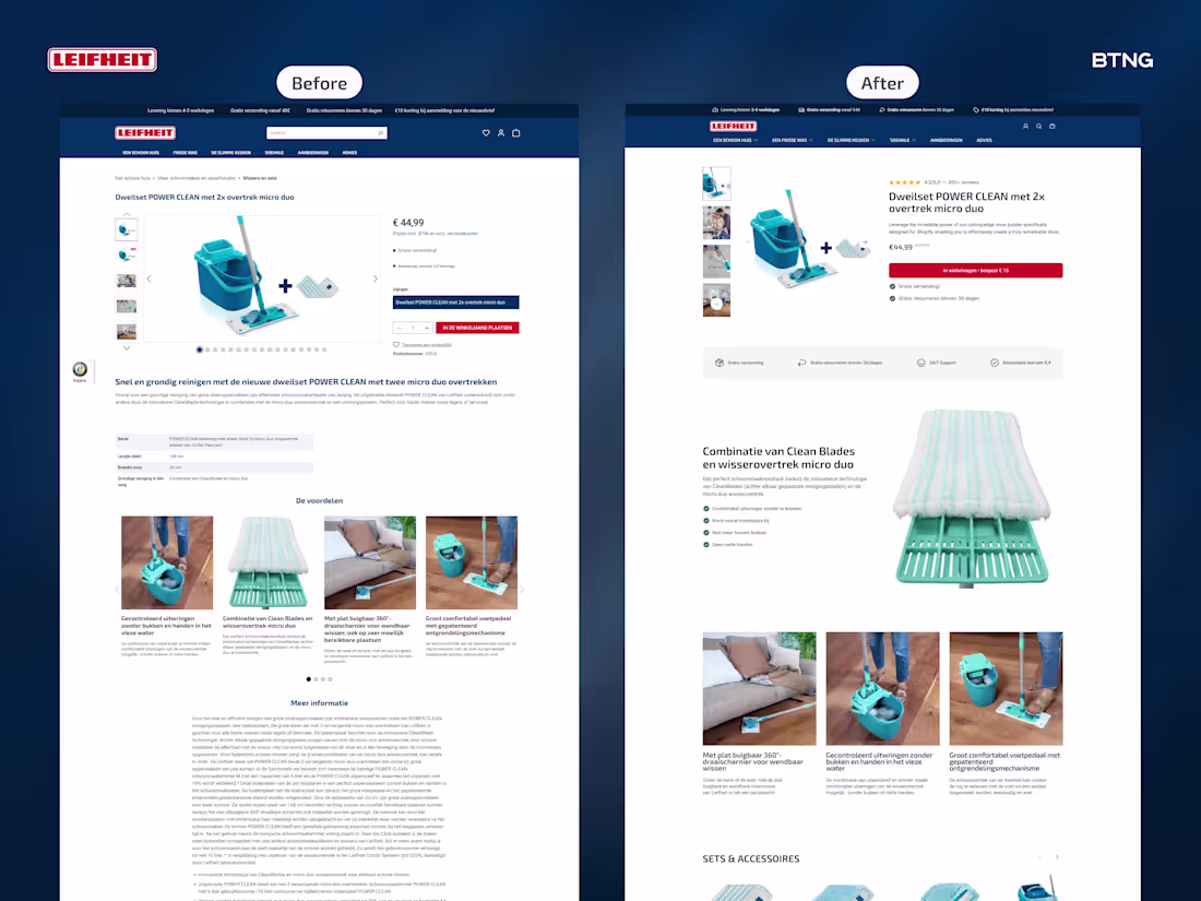
I redesigned Leifheit's product page. Then built it in Instant (link in comments).
Most product pages scatter info everywhere. Title here. Price there. Reviews floating.
What changed:
Product title was above the gallery. Everything felt disconnected.
I grouped critical info on the right. Title, reviews, price, add to cart, USPs. One clear block.
Specs are boring for a mop. Nobody cares about dimensions first.
Started with USP bar. Big zoom showing fibers and tech. Three benefit sections showing it in use.
Not what it is. What it does.
Result? Cleaner experience. (No pun intended.)
Scattered to structured. Specs to benefits. Product page to sales page.
What's one thing you'd test first on your product pages?
4
21
194