Creating Spaces that Matter. A Dutch Ecommerce project
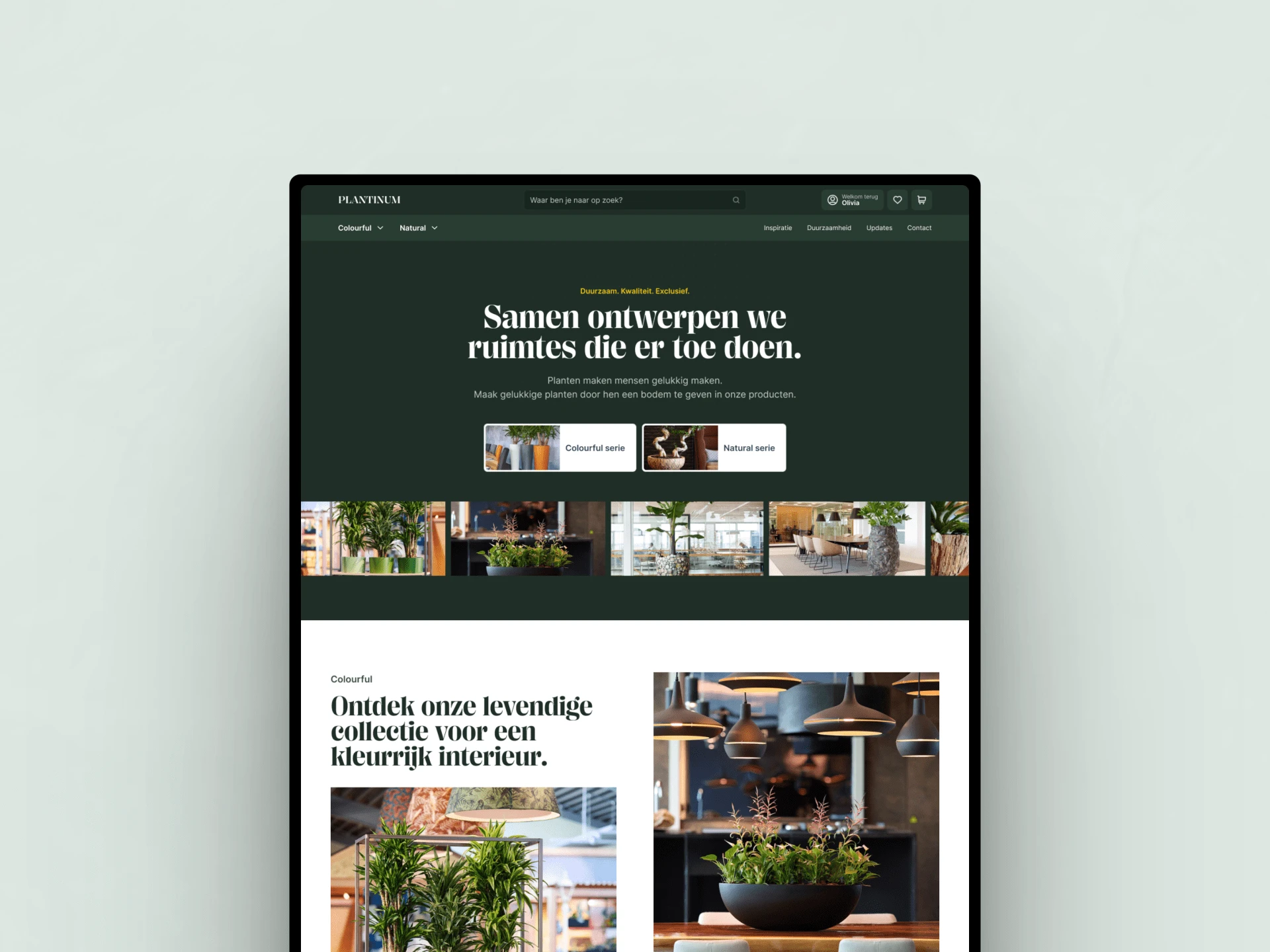
Creating Spaces that Matter
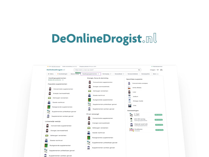
I was fortunate enough to be part of the team responsible for the new website for this amazing Dutch e-commerce company.
Our collective efforts, in collaboration with a front-end developer and a back-end developer, led to the successful realization of this project. I was entrusted with the crucial role of overseeing all design-related aspects.
I'll take you through a few of the steps before getting into all of the screens.
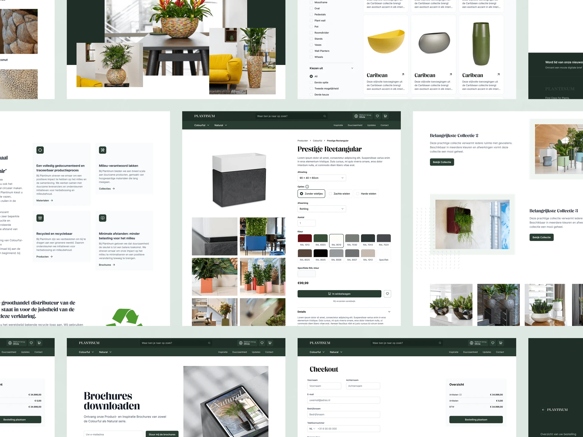
There will be screens!
From the sitemap to development-ready UI.
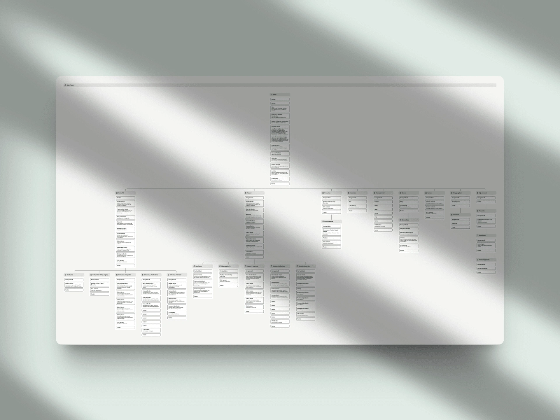
Replanning all the existing content, including redirects, to avoid 404s.
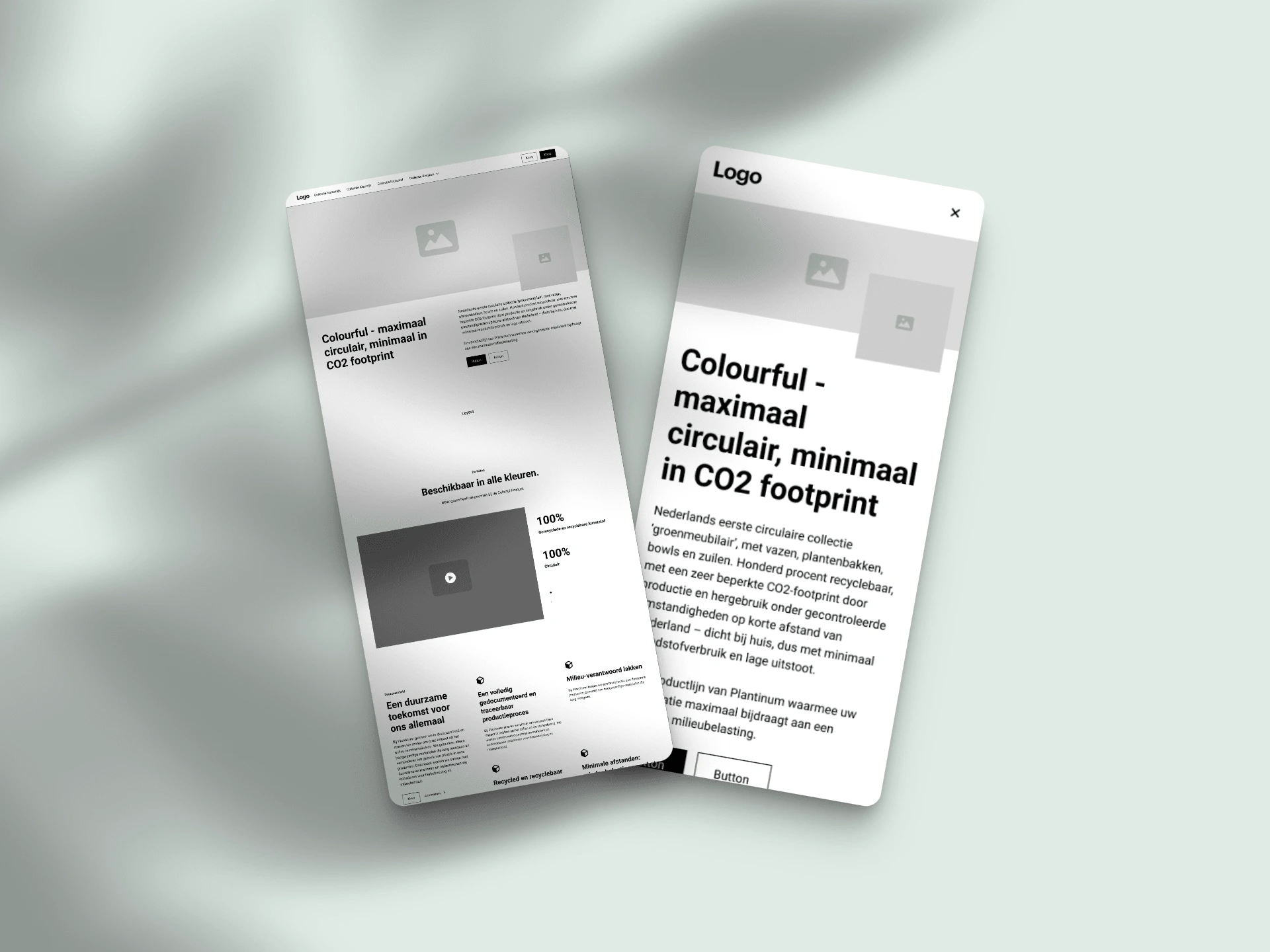
Wireframes for both desktop & mobile.
Preparing the Design System
I'm using the UntitledUI Design System as a starting point for all my projects. This gives me incredible speed. In only a day, I can prepare all the basic contents out of the box, allowing me to focus my energy on creativity and branding instead of creating 200 buttons.
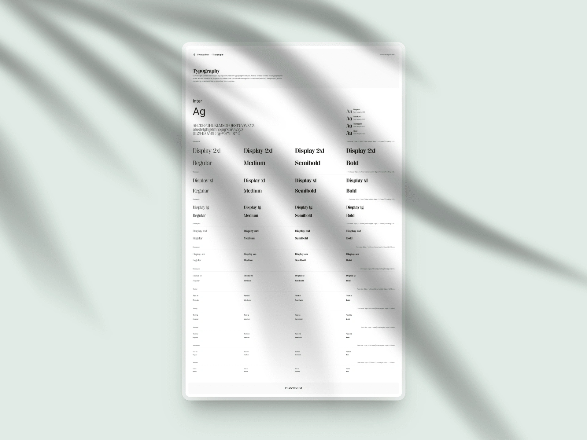
Beautiful typography helps me get even more excited about a project!
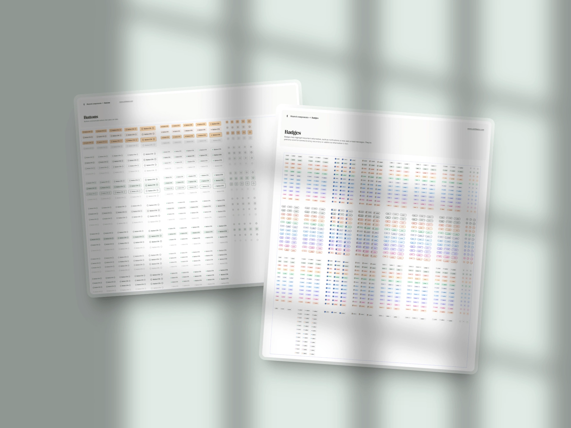
Can you imagine recreating this from scratch for every project? I can't.
Enough with the appetizers. Show me what you've got!
Alright, you asked for it!
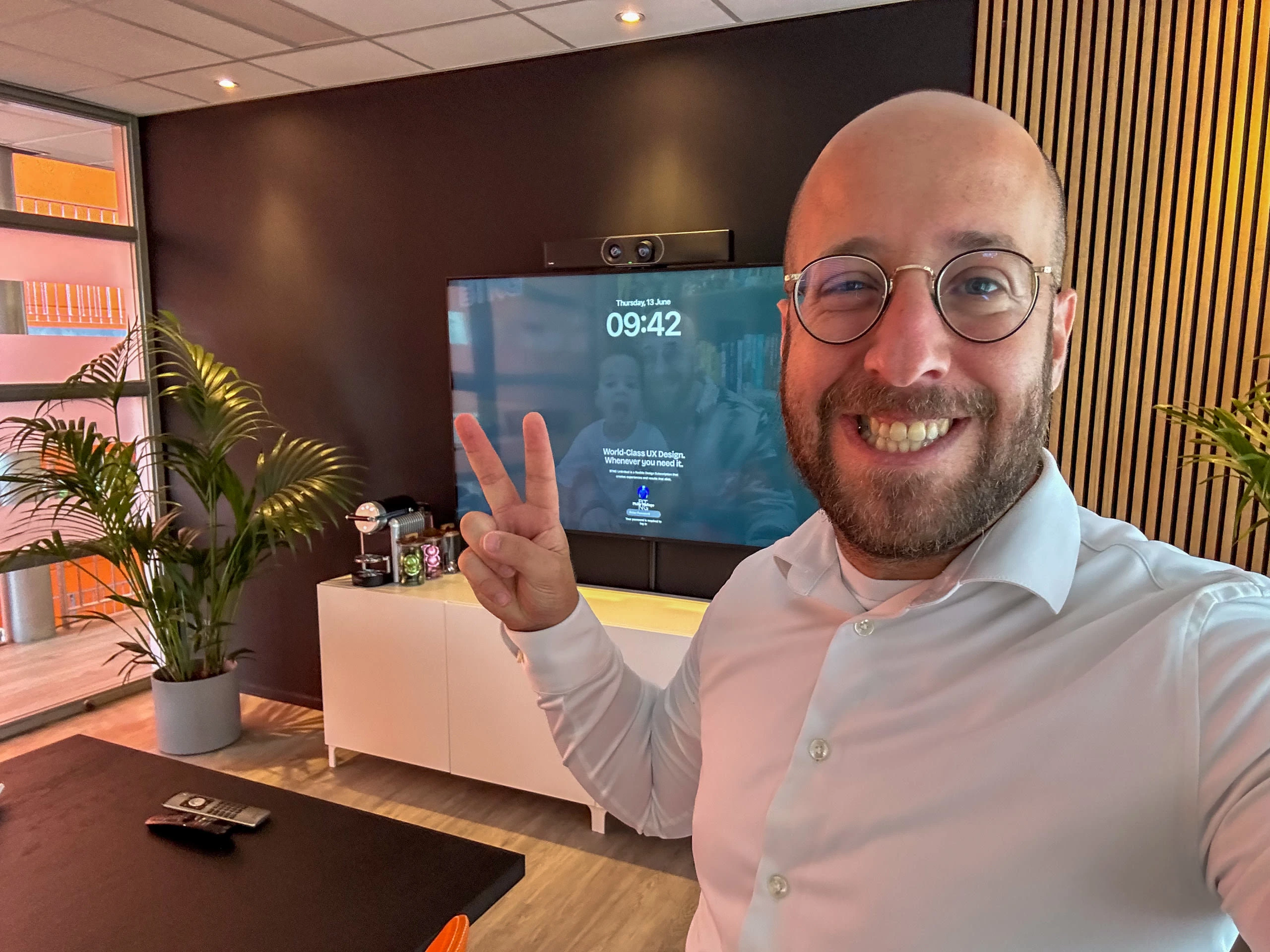
Me 5-minutes before presenting to the client.
Simplicity is about subtracting the obvious and adding the meaningful.
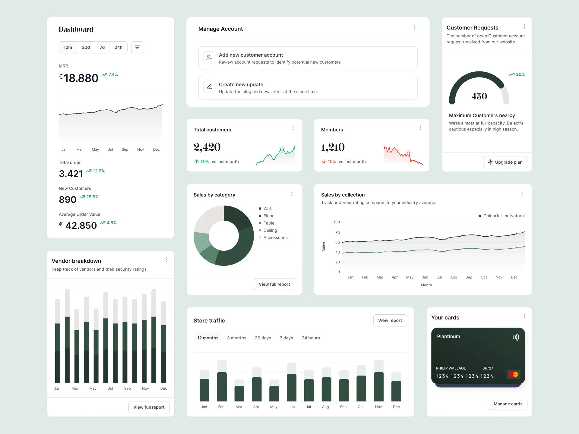
Translating the Brand to multiple widgets is a nice way to get a feel for the combination of typography and colors.
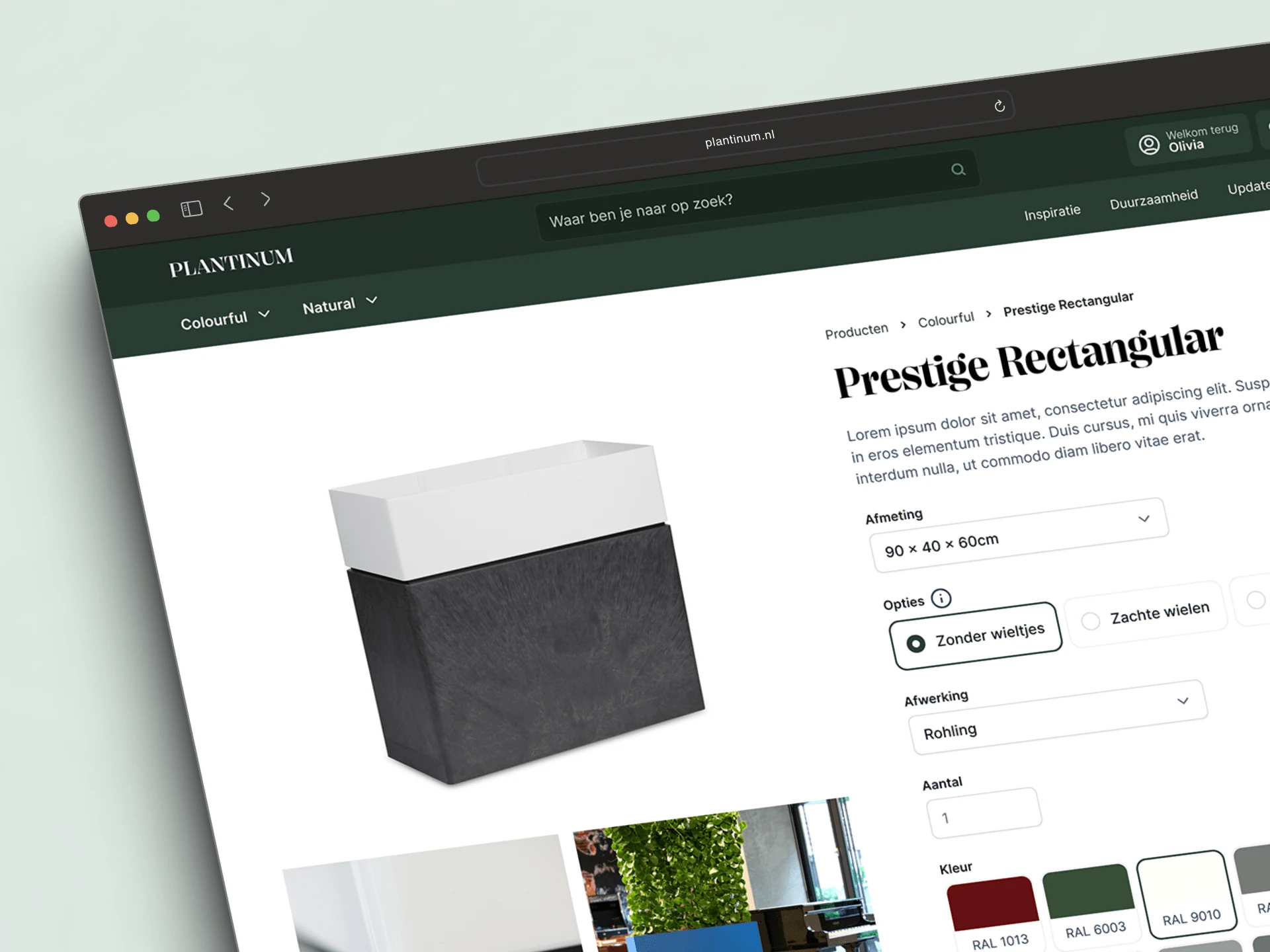
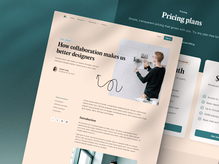
An impression of the product page
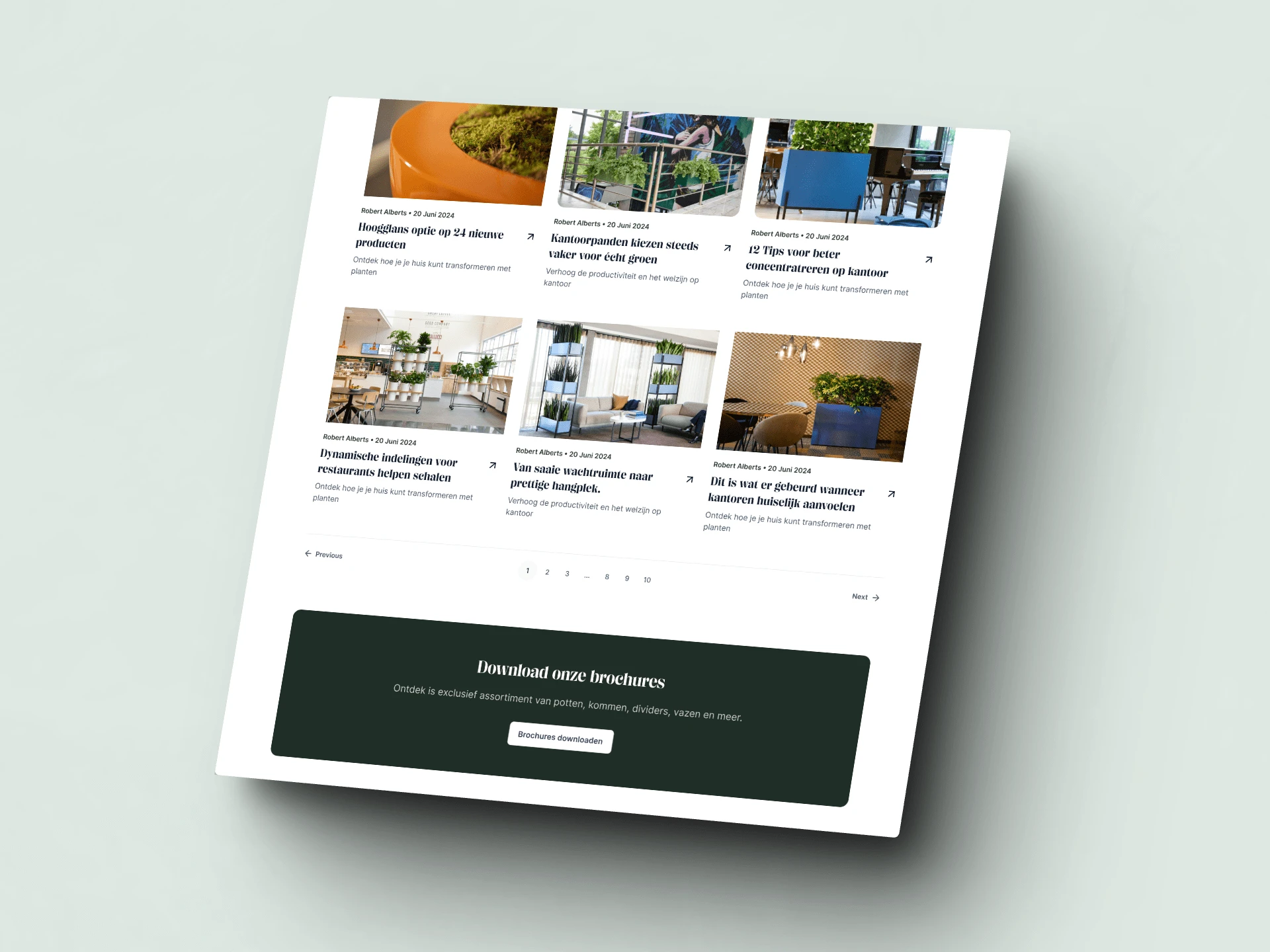
The "Updates" overview page with the Call-to-action footer.
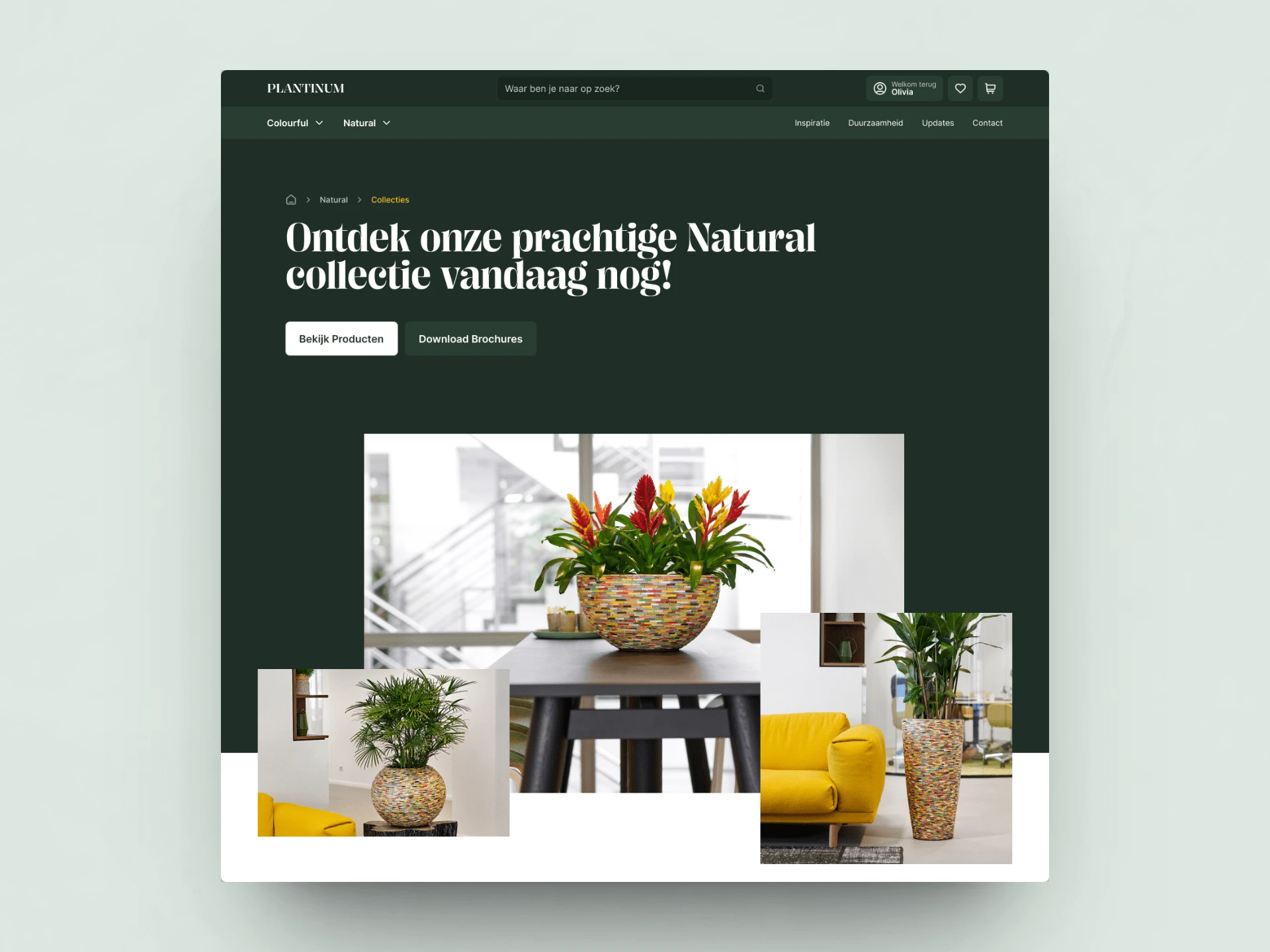
A hero section for a Series page.
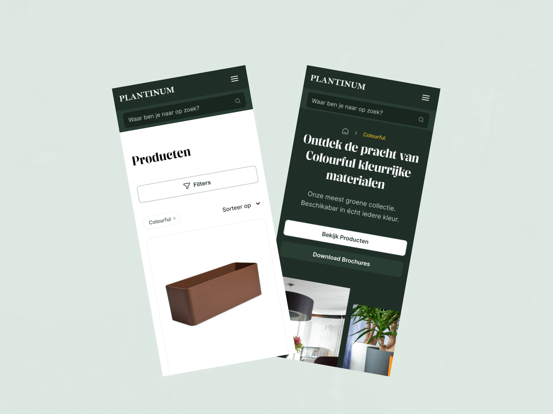
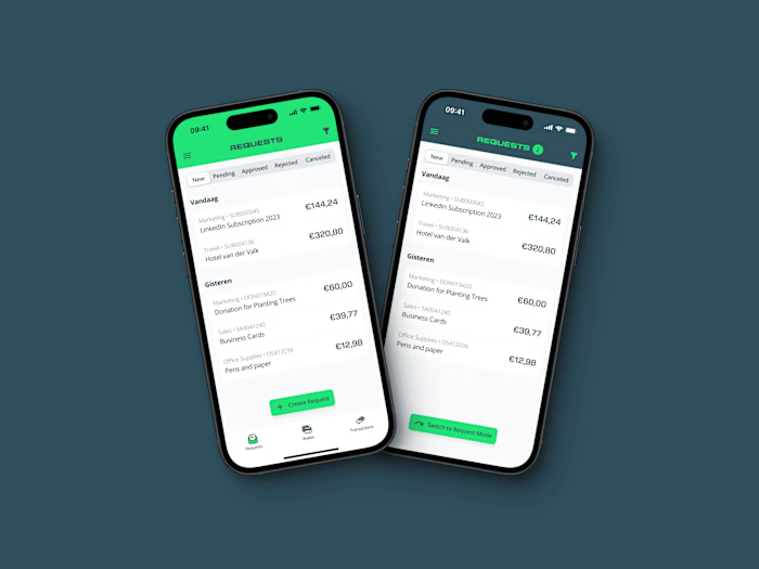
Some early version of the mobile design.
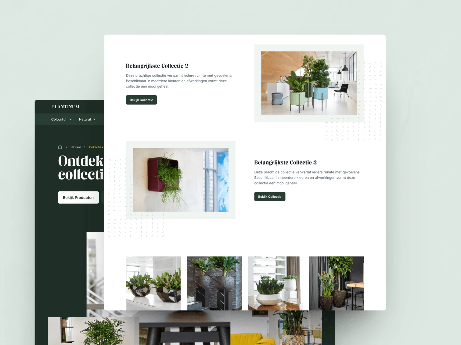
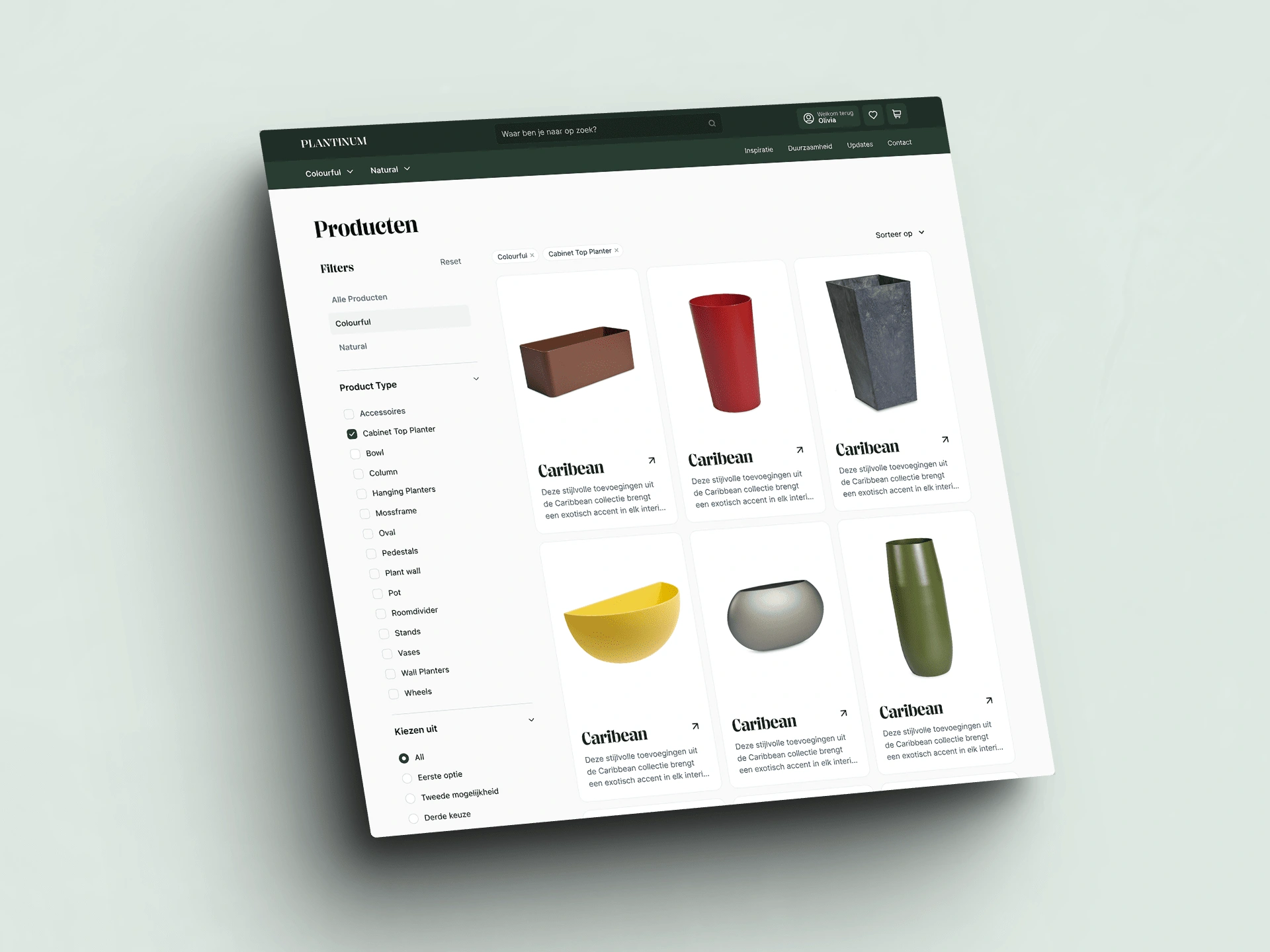
Finding the products you're looking for with the right filters.
Two versions of a checkout experience
When you've collected the products you're looking for, it's time to seal the deal. For this experience, I created two versions, which we'll be A/B testing to see what works for our audience. You're getting a glimpse in my kitchen today!
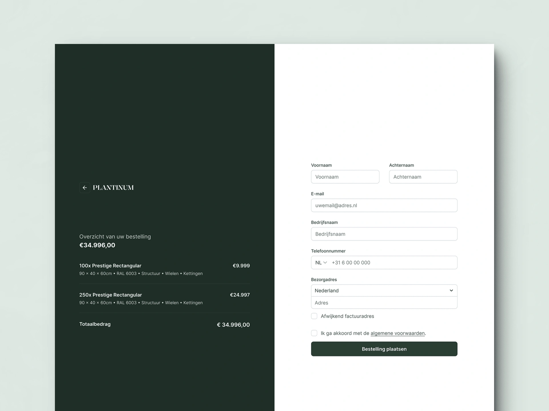
The Stripe look-a-like
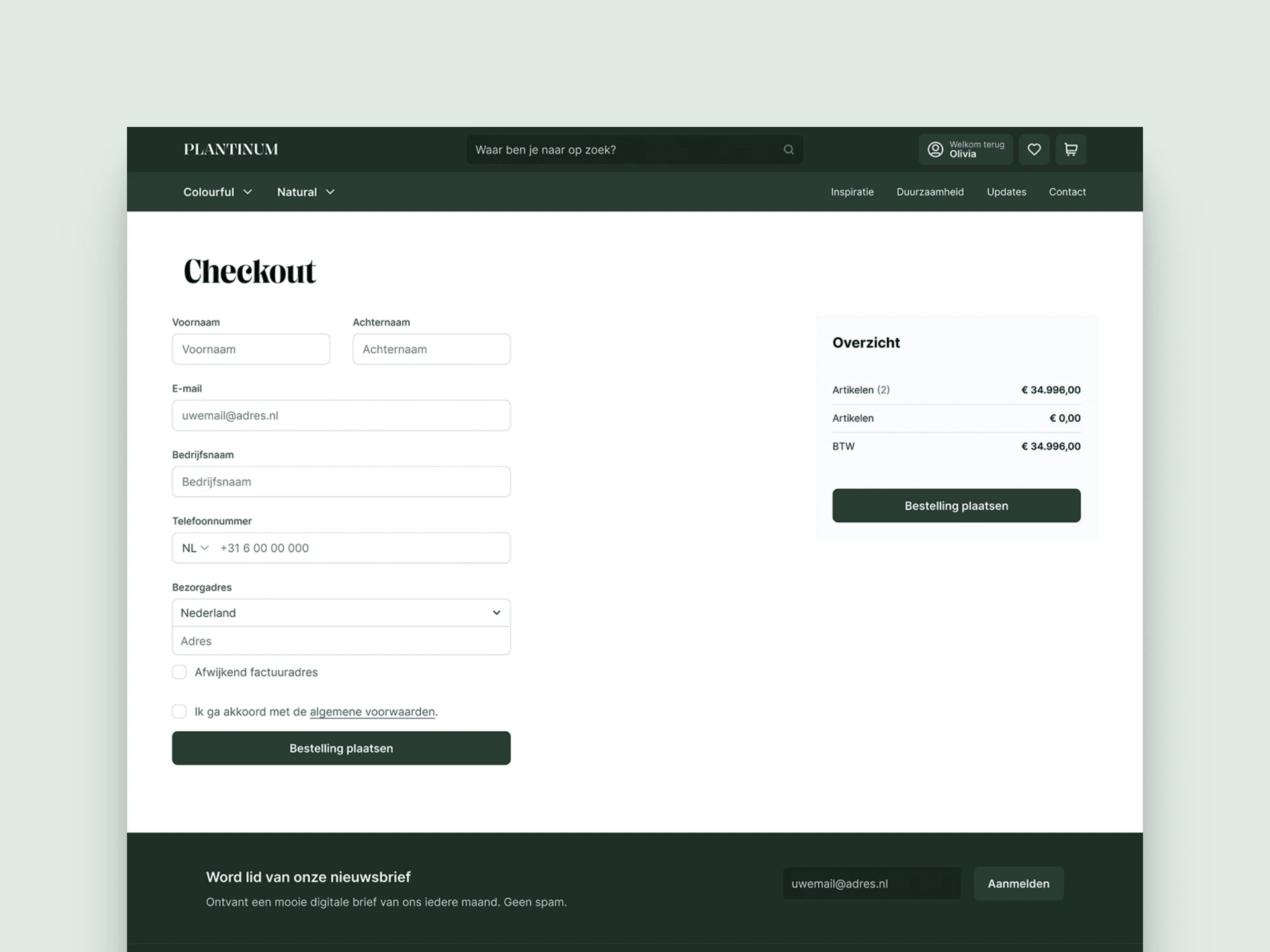
Perhaps a simpler version.
Which do you think will win?
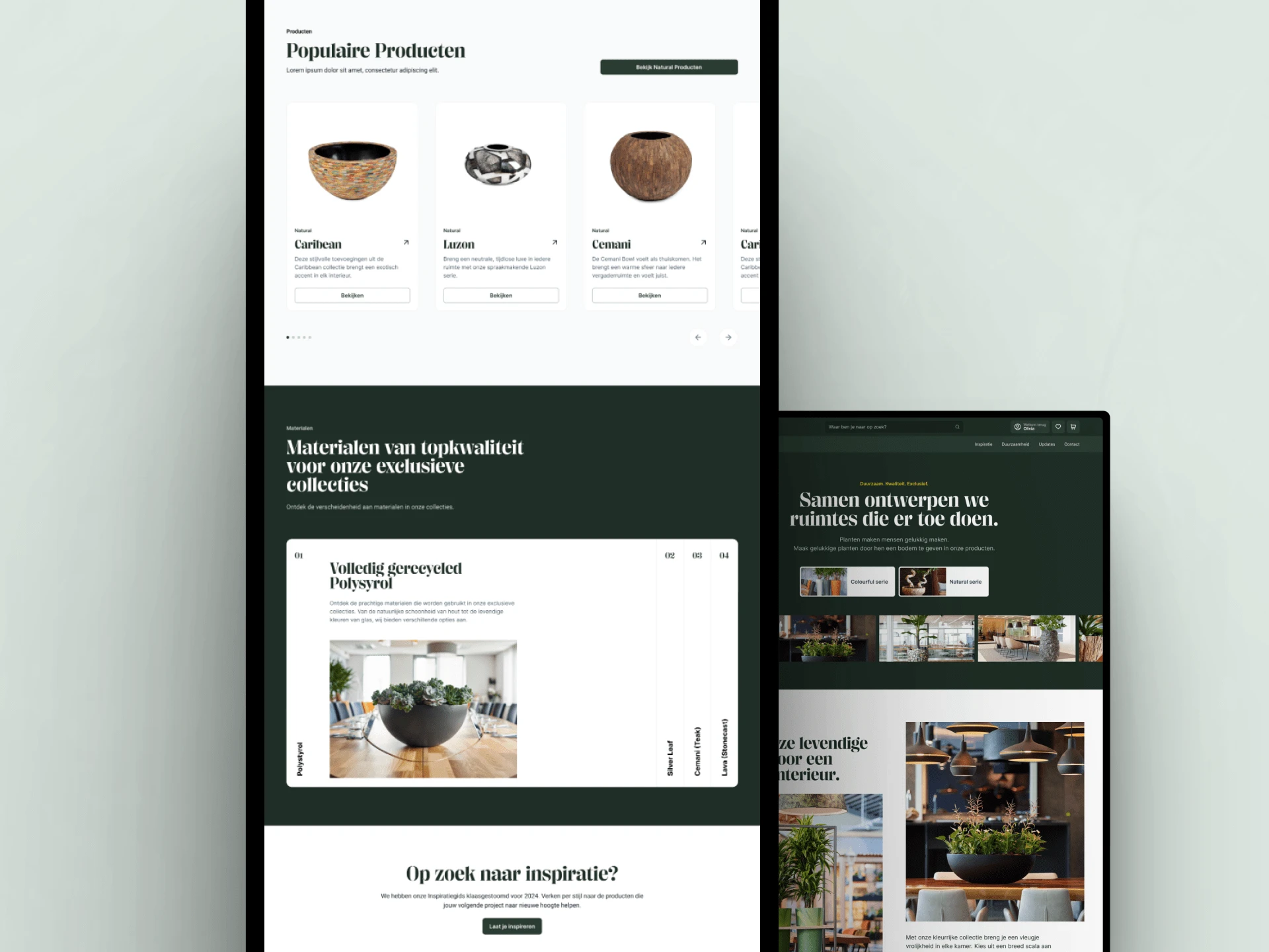
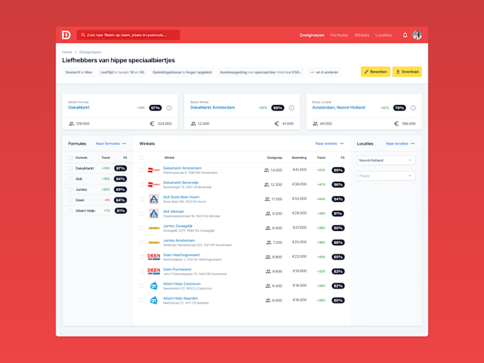
An impression of the page content.
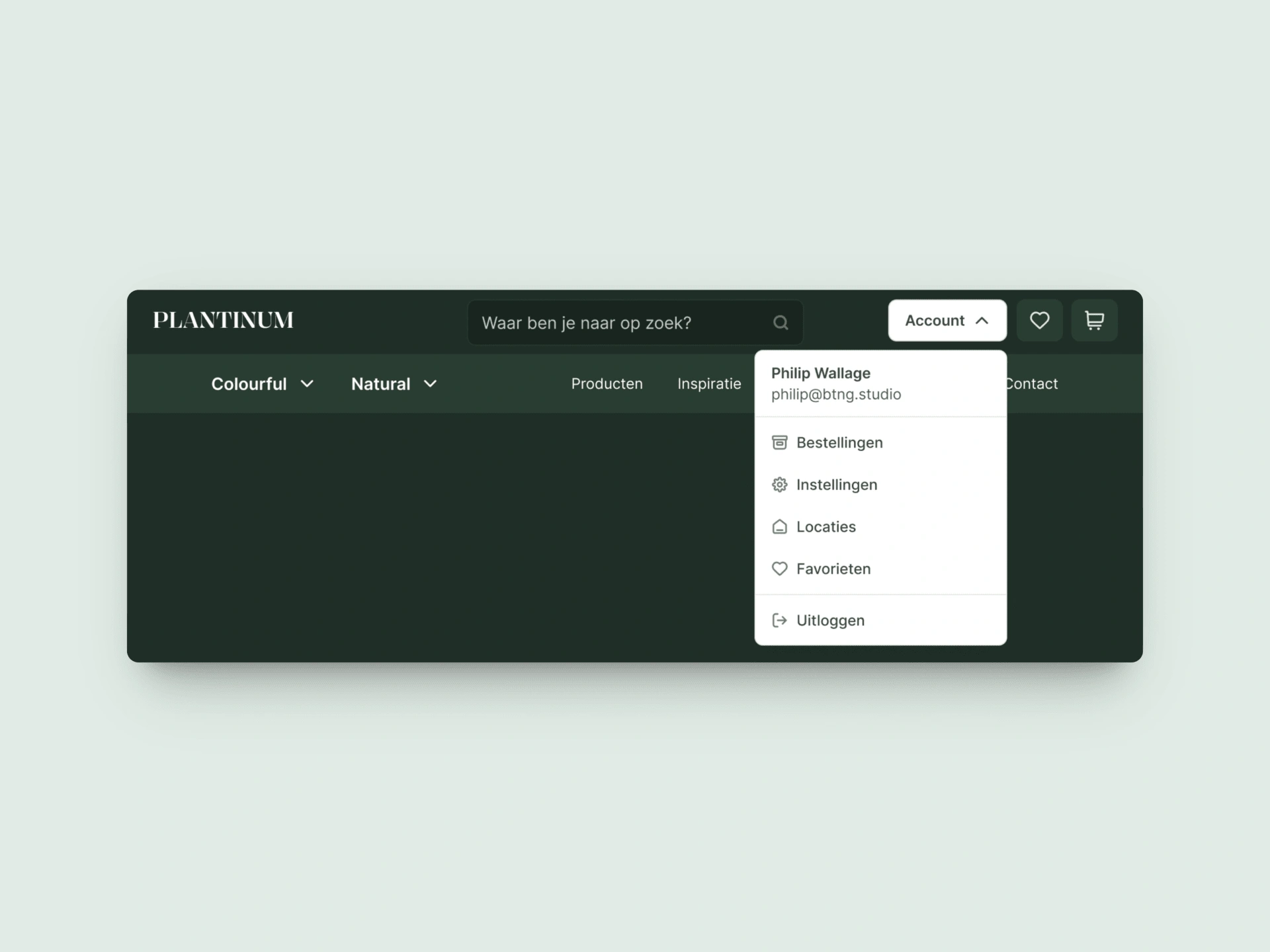
With a dark header, why not use a nice light contrasting dropdown?
So, what do you think? Feel free to send me a message to let me know. I'd love any feedback or constructive criticism.
Like this project
Posted Jun 14, 2024
Revamped a Dutch e-commerce site with sleek, user-centric designs. From sitemaps to stunning UI, I led the design, crafted a robust design system.
Likes
1
Views
92

