An Ecommerce Experience That Finally Makes Sense
Philip Wallage
De Online Drogist is one of the largest e-commerce platforms in the Netherlands. Despite their scale and success, their digital experience was cluttered, inconsistent, and weighed down by years of UX debt.
When I first opened the site, I couldn’t believe my eyes. So much low-hanging fruit. So many quick wins. The best part? They were already performing well, meaning there was nothing but upside.
That’s where I came in.
Scope & Setup
Through my BTNG Unlimited subscription, I worked closely with their in-house team. Weekly check-ins. Ongoing Figma access. Comments flowing in real-time. It was a fluid setup designed for fast iteration and sharp focus.
The first step? A full Baymard Institute-based UX audit.
It confirmed what they already suspected — and gave us the language and structure to fix it. Quickly. Properly.
Design Highlights
From an auto-rotating carousel no one waited for to static banners that deliver the message instantly.
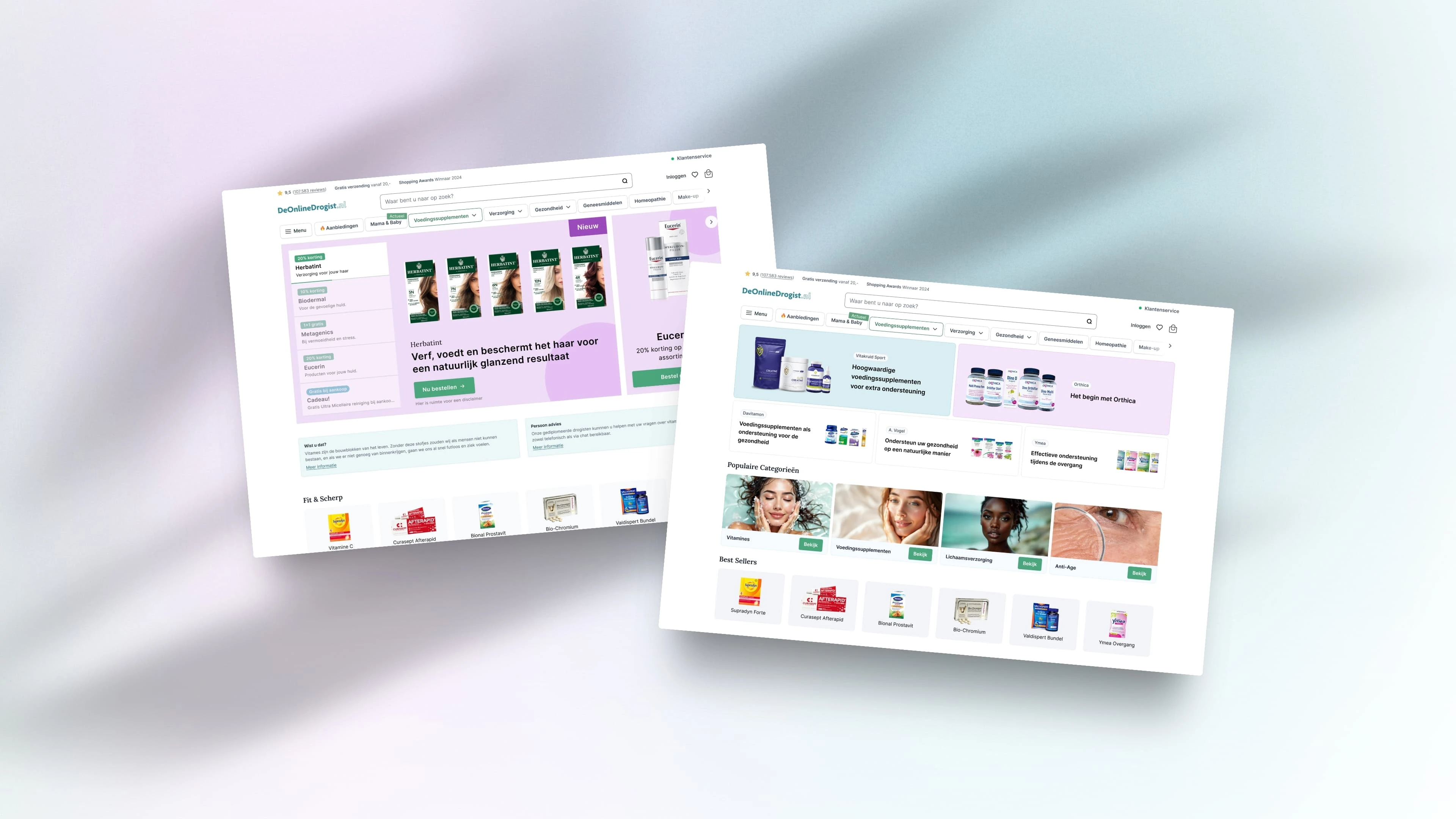
01. Homepage: Kill the Carousel
The old homepage had a slider. You know the kind:
Auto-rotates every few seconds
No pause on hover
No manual controls
Most users never even saw slide #3
According to Baymard #242D, this is a classic UX fail.
We replaced it with static banners. Always visible. Always relevant. No waiting. No nonsense.
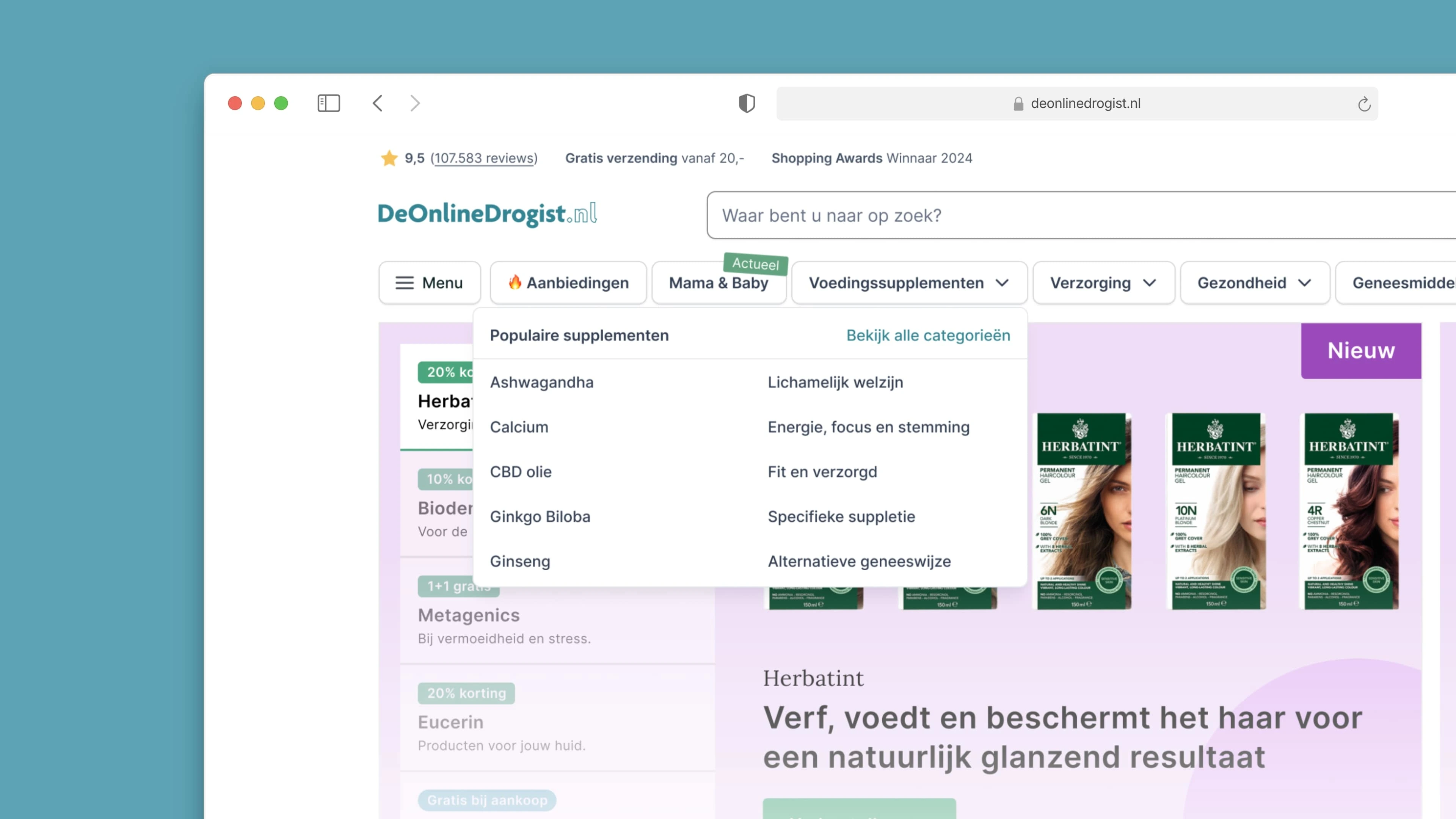
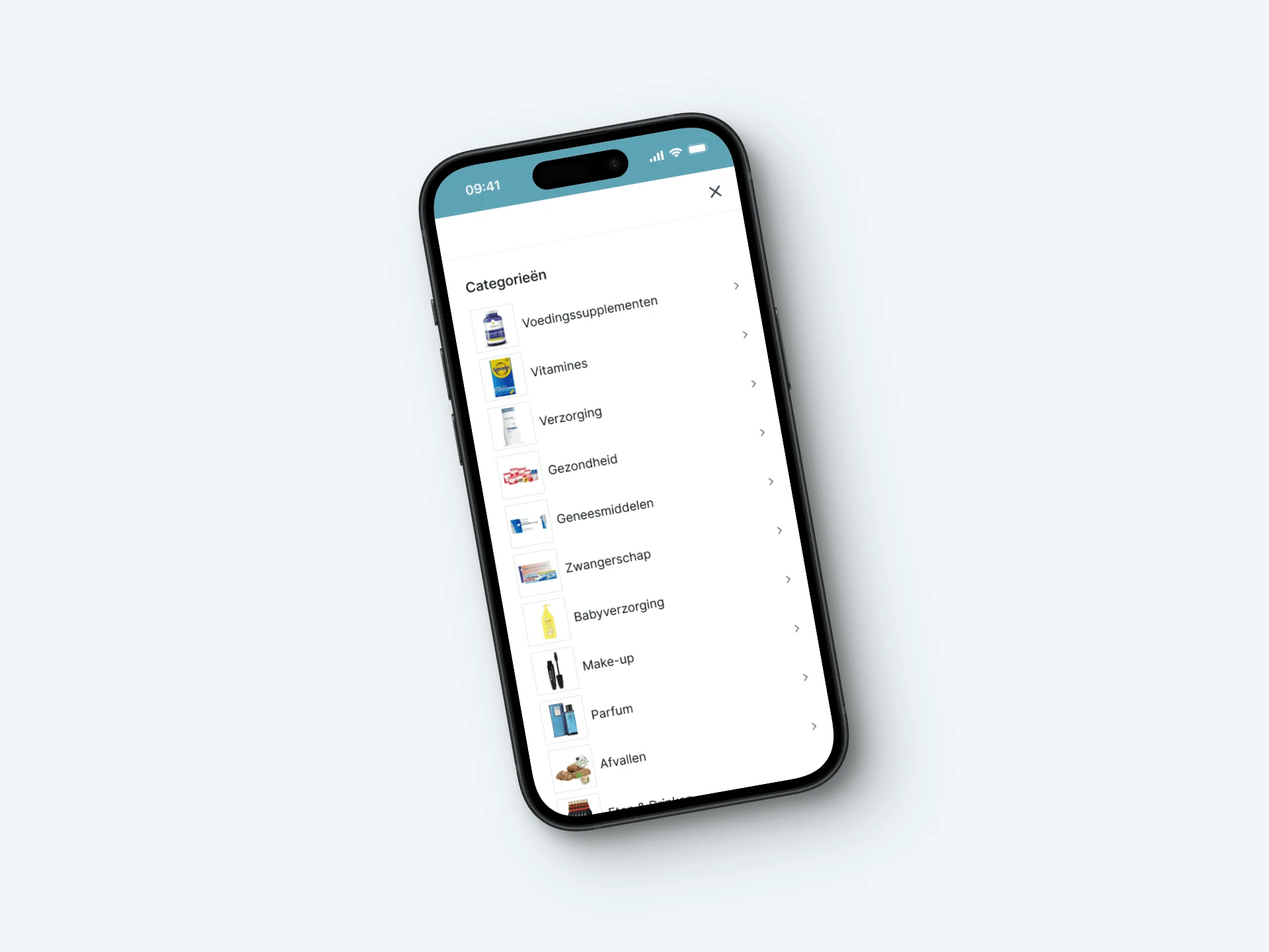
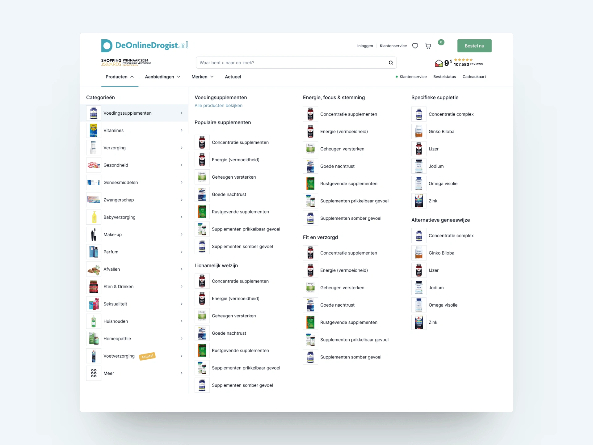
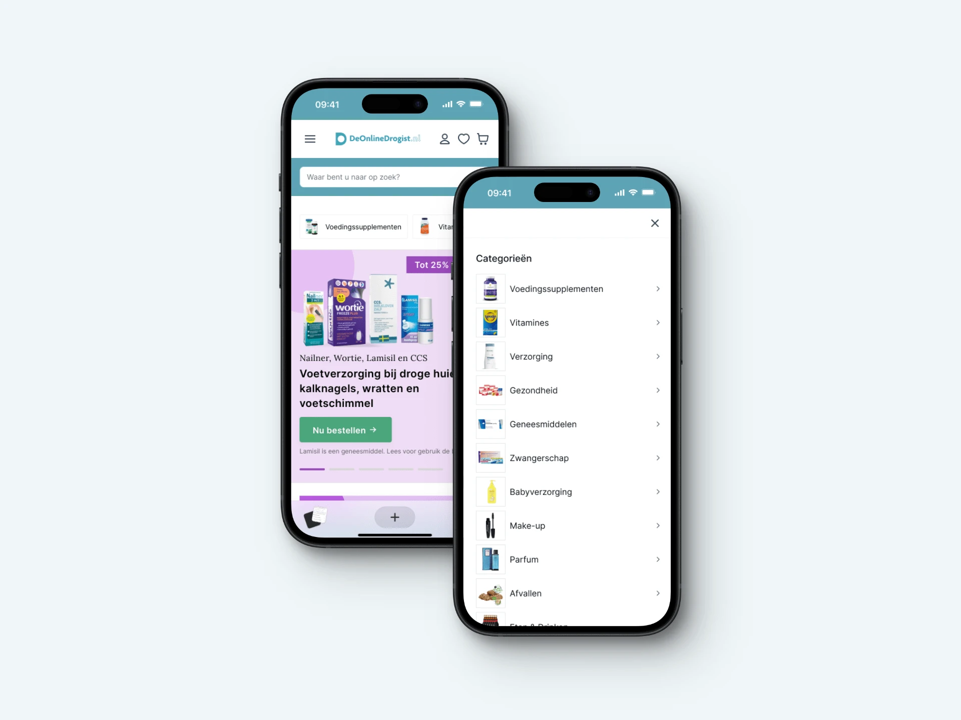
02. Navigation: A Realisation That Changed Everything
One of the biggest breakthroughs was redefining the difference between MAIN and SUB categories.
The old nav mashed everything together.
Our redesign added clarity, depth, and control:
Mega menu with dedicated zones for promotions, top categories, and deals
Clickable headers (Baymard #266D)
Filter logic cleaned up (Baymard #253D, #261D)
Clear visual hierarchy (Baymard #263D)
Now, users can scan, browse, or dive deep — without ever feeling lost.
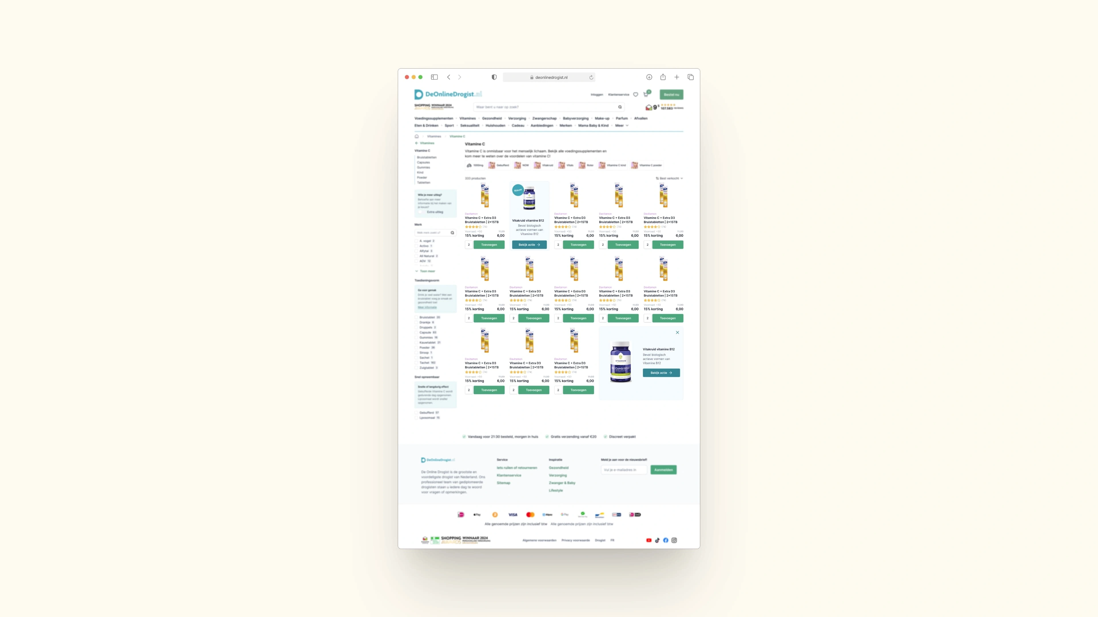
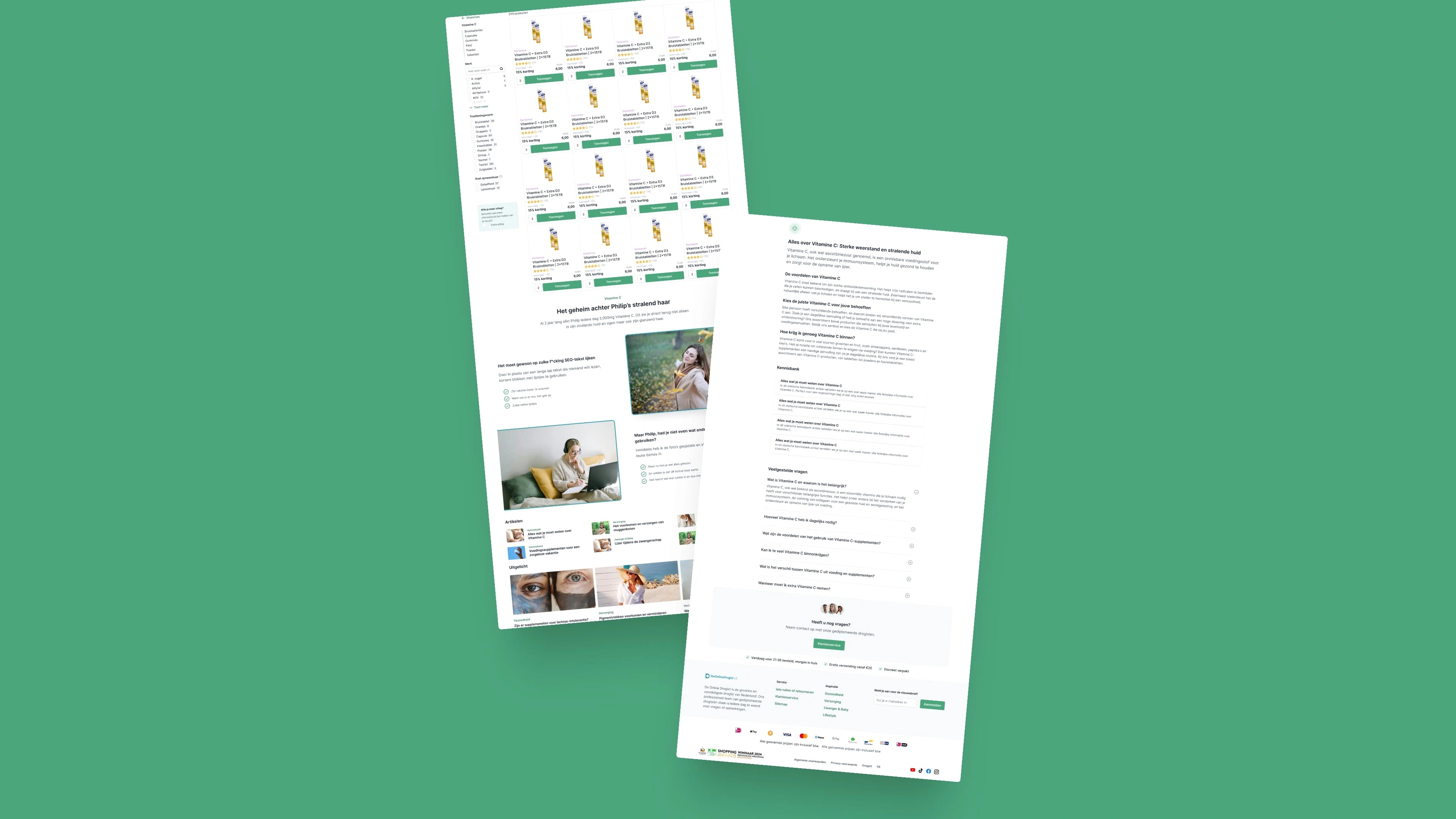
03. Sub-Category Page: Smarter Filters, SEO Juice & Product Highlights
This was due for an upgrade:
We introduced tooltips to explain filters
Allowed banners inside product listings
Added modular content blocks for SEO (FAQs, featured products, related reads)
Optimised spacing and layout — especially on mobile
Side-by-side, the difference is striking. Old design: chaotic. New design: calm, focused, and 100x more shoppable.
04. Blog Article Layout: Content Meets Commerce
We redesigned the article template to do more than just look good.
Now, whenever a product is mentioned in the copy, it shows up directly in the sidebar.
On desktop, the sidebar is sticky — always in view
Products are contextually linked — no need to scroll up or go hunting
Modular layout allows for rich formatting, tips, or cross-links
This bridges the gap between content and commerce. One of those small changes that makes a big difference.
05. Design System: Less Noise, More Flow
There was already a brand in place. Good news. But the execution?
Inconsistent spacing. Random margins. UI components that didn’t talk to each other.
So I gave the entire UI a polish pass:
Consistent sizing, spacing, paddings
Modular cards and floating layouts
Cohesive styles across banners, forms, and product displays
It’s not flashy. But it’s essential.
And in a platform this size, it creates calm where there used to be clutter.
06. Mobile: More Products, Less Scroll Fatigue
The mobile sub-category pages were suffering from spacing bloat.
In the old version, you’d scroll forever before hitting product #2.
I tightened everything up:
Clean typography
Compact filters
More products visible above the fold
Less friction, more flow
Side-by-side, it’s night and day.
Reflection
This wasn’t a full rebrand. It wasn’t a dramatic reinvention.
It was a long-overdue spring cleaning — rooted in best practices, design consistency, and common sense.
The result?
A cleaner, sharper, more intuitive experience across the board.
Less noise. More action. And finally, a UX that reflects the scale of the business behind it.
Like this project
Posted Jun 15, 2024
A top-50 webshop, redesigned with purpose. Clean visuals, sharper flows, and zero tolerance for bad UX.