QiVOTE - Making every vote count, instantly
Ishaq Tairou
QiVOTE - Making every vote count, instantly
A seamless online voting platform for events and competitions
Overview
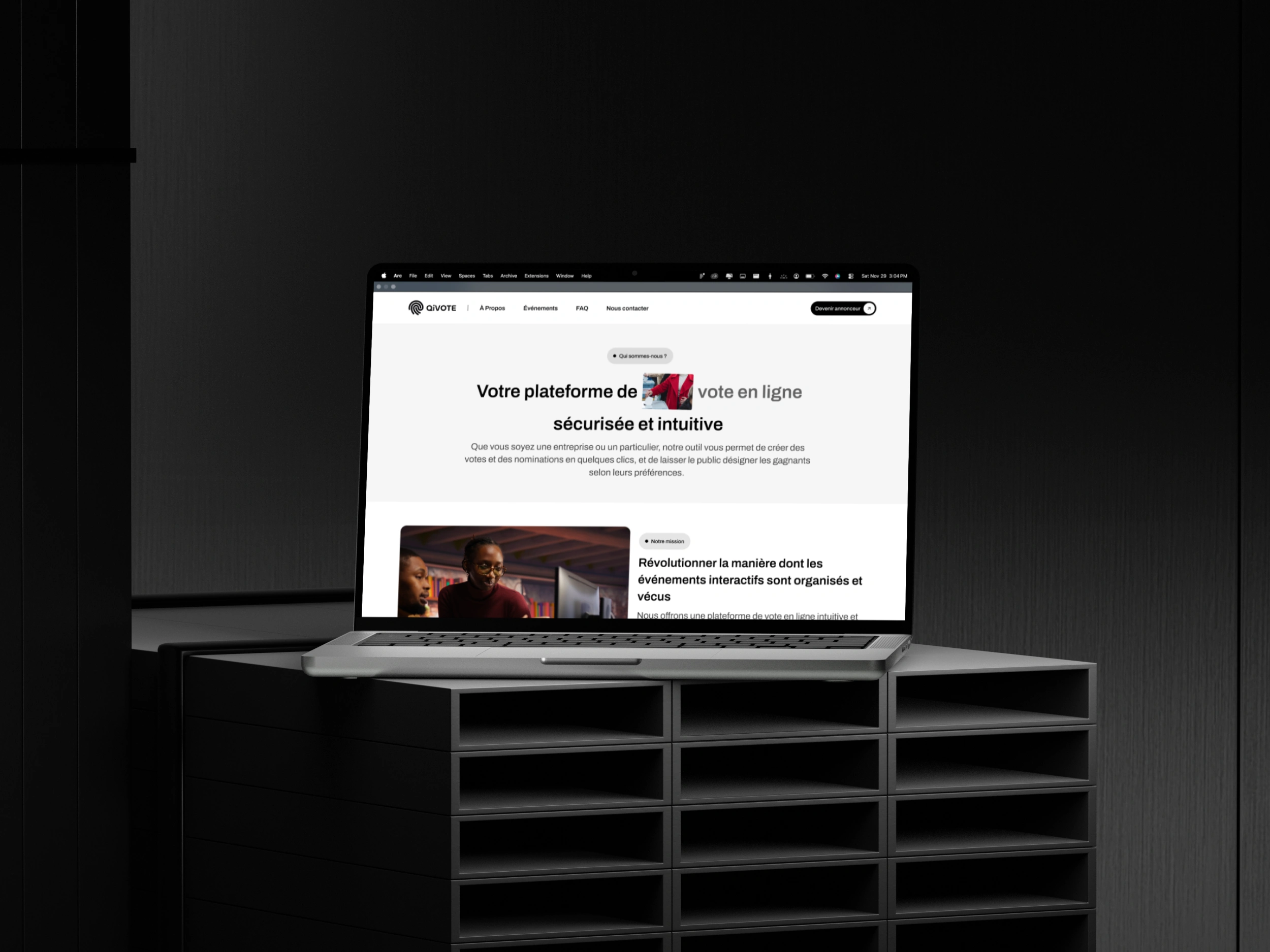
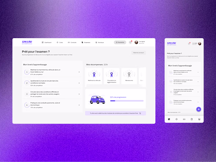
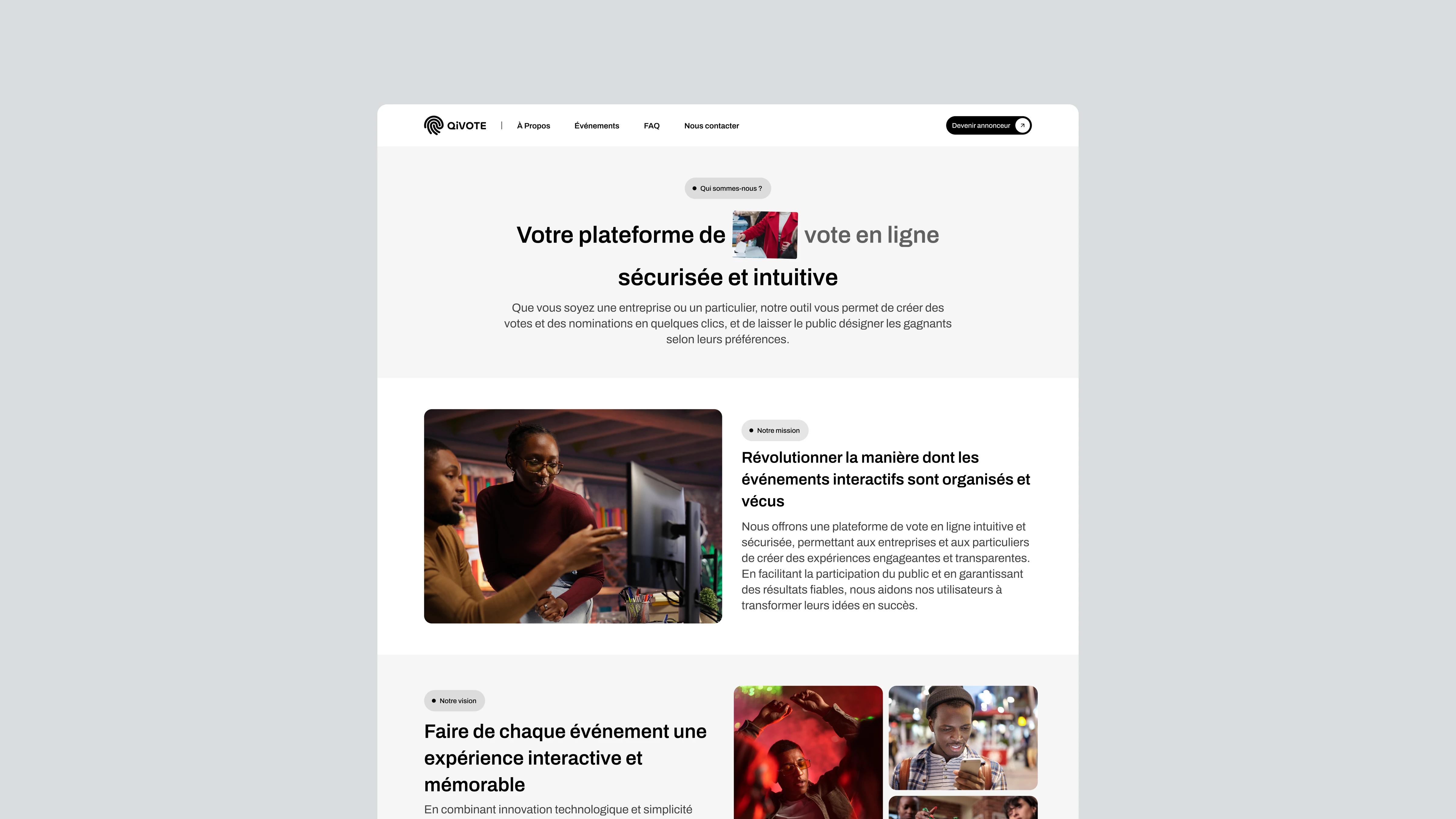
QiVOTE Interface
QiVOTE is a digital voting platform built to modernize how events, competitions and ceremonies collect and manage votes across West Africa. The existing platform had the right idea, it lacked the structure, clarity and visual identity to deliver on it.
I led the full redesign as UX/UI designer: product architecture, brand identity, design system and high-fidelity screens across three distinct user profiles. The challenge was building one coherent platform that felt effortless for three completely different types of users.
Understanding the challenge
Online voting sounds straightforward. In practice, for event organizers across West Africa, it's slow, manual and error-prone: sharing links, filtering duplicates, counting votes, exporting results. The friction is real and it happens at every step.
The existing platform understood the problem. The experience didn't solve it.
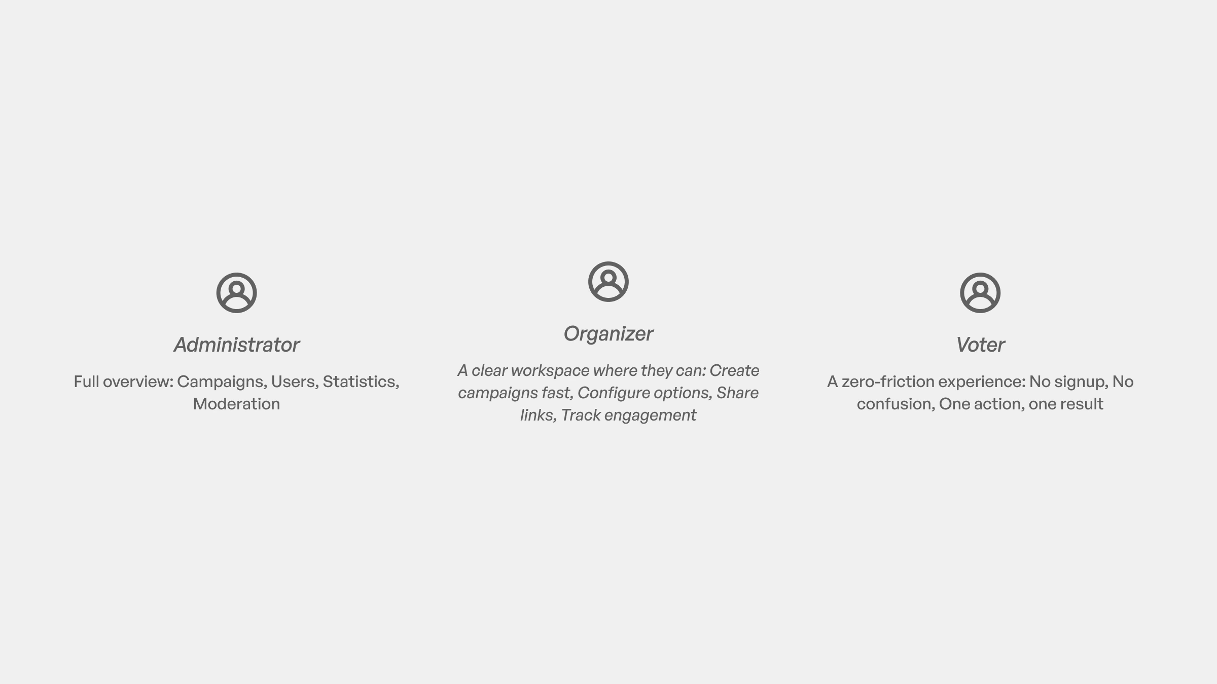
Three distinct users had three distinct needs. Organizers needed a faster, more controlled way to launch and manage voting campaigns. Participants needed an interaction so simple it required almost no thought. Administrators needed a secure, reliable system to supervise everything in real time.
The goal
One platform. Three experiences. Zero unnecessary effort.
Three user profiles, three different needs
Through workshops and analysis of the existing platform, I identified three core roles:
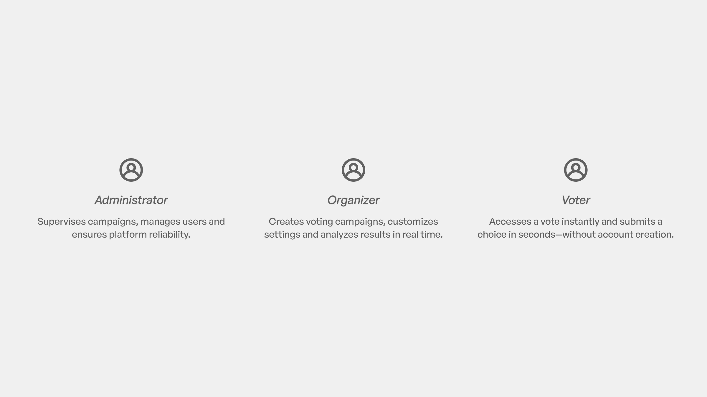
User profiles
Designing for this ecosystem required different flows and priorities, but with a single shared goal: remove unnecessary effort.
UX Foundations and Discovery
The discovery phase started with a deep immersion in the product and the market. I ran a UX audit of the existing platform, conducted competitive research across African and global voting tools, built personas for each of the three roles, and mapped the full range of platform needs and constraints.
UX foundations and discovery
One insight shaped the entire design direction: voting platforms almost always fall into one of two traps. Either they feel like enterprise software (cold, technical, intimidating) or they feel like a consumer app (fun but not trustworthy enough to handle real event results).
QiVOTE needed to sit precisely between those two extremes. Simple and energetic enough to feel accessible. Structured and reliable enough to earn trust from organizers and administrators managing real stakes.
Architecture and product structure
First site map exploration
With the discovery complete, I restructured the information architecture around one principle: design for goals and mental models, not for features.
Each role got its own flow built around what they actually need to accomplish.
The organizer flow is built around creation and control: launch a campaign, configure it, monitor it.
The voter flow is built around speed: arrive, vote, done. Every unnecessary step removed.
The admin flow is built around oversight: monitor campaigns, moderate activity, intervene when needed.
This separation meant each user type could navigate the platform with complete clarity, without ever feeling like they were operating a system designed for someone else.
Visual direction and brand identity
QiVOTE logo
Brand identity wasn't a deliverable added at the end. It was built in parallel with the UX foundations, because the visual language had to inform every interaction decision from the start.
QiVOTE needed personality without sacrificing credibility. The platform serves event organizers and competition administrators who need to trust what they're using. A generic tech aesthetic would have undermined that immediately.
The brand direction was built around four pillars: simple without being minimal, energetic and modern, aligned with event culture in West Africa, and lightweight enough to scale across mobile-first usage.
From there I developed moodboards, color and typography direction, logo application and visual accents, and an early style system that fed directly into the UI.
Design system and components
UI Kit
With the brand direction locked, I built a lightweight design system designed to scale with the platform as it grows.
The system covers buttons, typography and form patterns, color states across success, pending and inactive interactions, alert and confirmation components, and a responsive grid and spacing rules built for mobile-first usage.
Lightweight was an intentional choice. A platform serving event organizers across West Africa needs to load fast, work on varied devices and remain easy to maintain. Every component was built with that constraint in mind.
High-Fidelity UI Design
Users key features
With the system in place, I designed the high-fidelity screens across every critical surface of the platform.
The organizer dashboard gives a complete overview of active and past campaigns with immediate access to key actions. Campaign creation and customization walks organizers through setup in a structured, low-friction flow.
The voting interface is stripped to its essence, a participant should be able to vote in seconds without instructions. Result visualization and exports give organizers clear, shareable outputs the moment voting closes.
The admin management panel provides full visibility into campaign activity with the tools to moderate and intervene in real time.
Here's the full design preview:
The impact
The redesign delivered a platform that works for all three sides of the product simultaneously.
Organizers can now launch and manage campaigns through a structured flow that eliminates the manual steps that slowed them down before.
Voters interact with an interface reduced to its absolute minimum, no confusion, no unnecessary friction at the moment that matters most.
Administrators have full visibility and real-time control over every campaign running on the platform.
QiVOTE is now a product built for growth: consistent across roles, and aligned with the scale of events it was designed to serve.
Final Thoughts
QiVOTE was a multi-role design problem at its core. Three different users, three different mental models, one platform that had to serve all of them without compromise.
What made this project demanding was the constraint of simplicity under real complexity. A voter who hesitates is a voter who abandons. An organizer who gets confused is an organizer who loses trust in the product. Every design decision had to hold both of those realities at once.
The redesign proved that structure and personality aren't opposites. A platform can feel energetic and human while still being reliable enough to handle real event results at scale.
If you're building a platform that needs to serve multiple user types without making any of them feel like an afterthought, that's the kind of problem I solve.
Like this project
Posted Nov 30, 2025
QiVOTE is an online voting platform redesigned to simplify campaign creation, secure voting and real-time results for event organizers and participants.