SMONI - A smarter way to run and scale a driving school
Ishaq Tairou
SMONI - A smarter way to run and scale a driving school
Digitizing the driving school experience in France
Overview
Pre-existing branding
SMONI is a digital platform built to modernize the driving school experience in France. The system connects learners and certified instructors through two parallel dashboards, each designed around the specific responsibilities, workflows and mental models of its user.
I led the UX/UI design end to end: from product architecture and information design to the full UI system and high-fidelity screens across web and mobile. The challenge was managing a large and complex feature ecosystem while keeping both user experiences structured, predictable and easy to navigate.
Understanding the challenge
Learning to drive in France is inherently complex. Multiple services, documents, evaluations, regulations and ongoing interactions between learners, instructors and administrators, all happening simultaneously.
The brief was clear on what needed to work:
Learners needed visibility on their progress, lessons and payments.
Instructors needed simpler tools for scheduling, tracking and evaluation.
The platform had to support a large feature ecosystem across web and mobile. Everything had to feel structured, predictable and professional.
SMONI already had real market ambitions. This wasn't a redesign from scratch but a product that needed structure, coherence and the kind of UX foundation that could support serious scale.
UX Discovery and Foundations
UX Discovery
Before designing anything, I immersed myself in the operational reality of the French driving school system. The goal was to understand the product vision, the regulatory constraints, and the two very different users who would live inside this platform every day.
The discovery phase covered five activities: analysis of the technical requirements, UX benchmarking across French and international platforms, feature mapping and prioritization, persona definition for both learners and instructors, and key scenario mapping across planning, progression, certification and payments.
Persona 1
Persona 2
The output was a well-defined problem space and a shared understanding with the client. From there, the architecture had a real foundation to build on.
Structuring the product
The platform covers scheduling, contracts, certifications, payments, driving progression and instructor tools, all in one system. The risk was building something technically complete but cognitively exhausting.
The decision that shaped everything: design the information architecture around user responsibilities and mental models, not around features.
In practice this meant four principles drove every structural decision. Each user always sees what matters most to their role. Navigation adapts to profiles rather than exposing the full system. All actions follow predictable patterns so users build confidence quickly. Information is layered rather than crowded so complexity surfaces only when needed.
The result was an architecture that could hold a large feature ecosystem without making either user feel like they were operating enterprise software.
Designing two parallel user journeys
Building two full product experiences inside one platform required a clear separation of concerns from the start. The learner and the instructor have fundamentally different goals, different workflows and different definitions of a successful session.
Users core features
For the learner: booking lessons, tracking pedagogical progress, managing certifications and handling payments. For the instructor: managing their schedule, evaluating students, tracking individual progression and handling billing.
Product mapping
I mapped detailed flows for each role covering every core scenario. These flows weren't just documentation but the decisions that determined every screen, every component and every interaction that followed. Nothing was designed without a flow to justify it.
UI System and Design Language
With the architecture and flows defined, I built the UI system from scratch, designed to support two different user profiles, across web and mobile, at scale.
The system covers design tokens, typography and color usage, buttons, inputs and form logic, scheduling and card systems, status indicators and alerts, and data visualizations for progress tracking.
Every component was built with one constraint in mind: the system had to feel structured and professional without feeling heavy. A learner checking their progress before an exam and an instructor managing a full week of sessions are both under time pressure. The interface had to get out of their way.
High-fidelity design and platforms
SMONI Web app
With the system in place, I applied it across both environments: the full web application and the mobile responsive version.
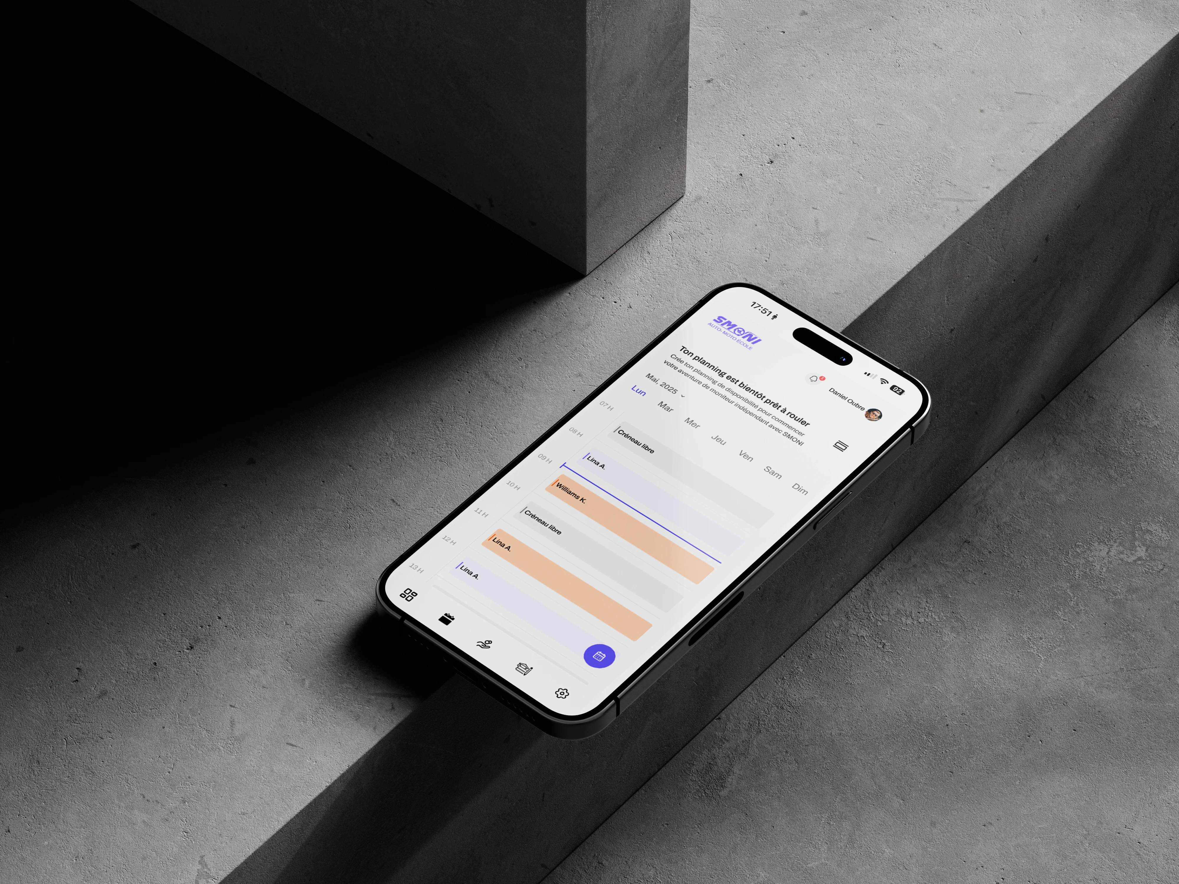
The critical screens covered six areas: booking and lesson management, pedagogical progress modules, certification and exam eligibility, billing and subscription management, instructor scheduling and evaluation tools, and profile, messages and onboarding.
Each screen had to work for two different users with two different contexts of use. A learner on mobile checking their next lesson. An instructor on desktop managing evaluations for a full roster of students. The same system, two completely different experiences, consistent without being identical.
SMONI web app responsive version
Here's the full design preview:
Final Thoughts
SMONI was one of the most structurally demanding projects I've worked on. Two user profiles, a large feature ecosystem, real regulatory constraints, and a client with serious market ambitions, all of it had to be resolved through design decisions made quickly and executed at a high standard.
Working with NerdX Technology sharpened something important: the ability to hold product quality under real pressure. Technical feasibility, business objectives, user experience and delivery speed don't always pull in the same direction. Knowing how to navigate that tension without compromising the work is a skill built on projects like this one.
The platform is more consistent, more scalable and better aligned with how driving schools actually operate. Scheduling, progress tracking and certification now flow through a unified system that works for both sides of the product.
If you're building a complex platform and need a designer who can bring structure to it from the ground up, that's the work I do.
Like this project
Posted Nov 29, 2025
Led UX/UI design for SMONI, enhancing driving school platform's user experience and scalability.
Likes
1
Views
8
Timeline
Apr 7, 2025 - Jun 17, 2025