ORUKA - Your training has never been this measurable
Ishaq Tairou
ORUKA - Your training has never been this measurable
A smart ring & app that helps gym rats train smarter.
Overview
Oruka smart ring
ORUKA is a connected smart ring and companion mobile app built for gym athletes who are done guessing their way through progress. The product tracks the right performance and recovery indicators, delivers personalized insights, and helps users make informed decisions every time they train.
I led this project end to end: field research, product strategy, UX/UI, brand identity, and industrial design direction in collaboration with a hardware specialist. Every decision was grounded in real data from real athletes.
Why ORUKA?
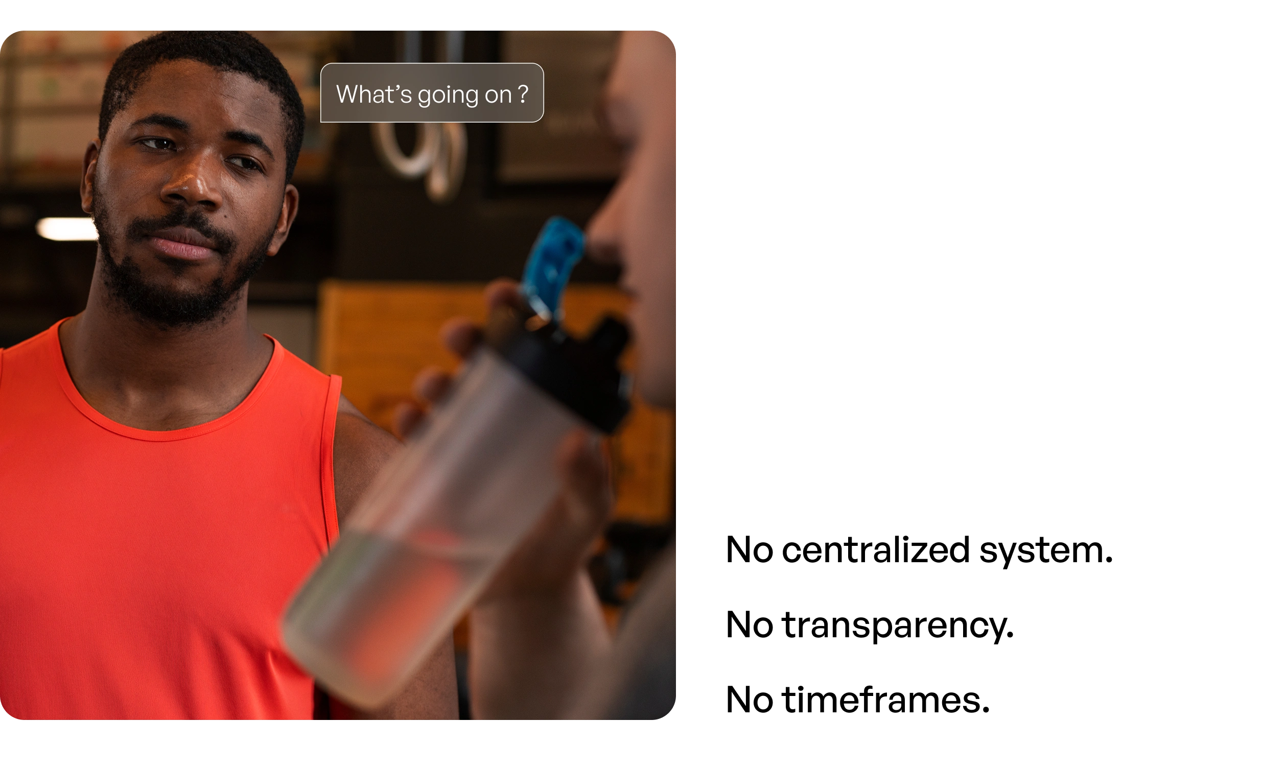
After several years of weight training, I hit the same wall most serious athletes face. You train consistently, eat right, push hard, but progress stalls. Strength, performance, motivation. Everything plateaus.
I realized the problem wasn't effort but the absence of the right data at the right moment.
When I had to choose a real-world challenge for a major design project, the answer was obvious. Not another gadget. Not another app chasing a fitness trend. A product built from ground-level insights, real athlete behaviors, and a rigorous research-driven process.
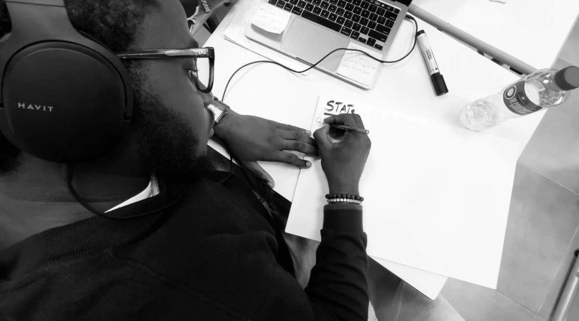
Phase 1 - Research and Problem definition
To understand the problem in depth, I went into the field before touching any design tool. Gyms, online communities, fitness circles and local sports networks. The goal was simple: understand the real context, without assumptions.
Summarizing the research results
The research program covered six activities:
Exploratory survey with 128 participants to map patterns at scale,
in-depth interviews with 10 gym athletes and certified coaches,
a one-week cultural probe with 5 participants keeping training diaries,
insight analysis and synthesis,
persona definition and journey mapping, and
a problem framing workshop with a structured decision matrix.
Participants profile
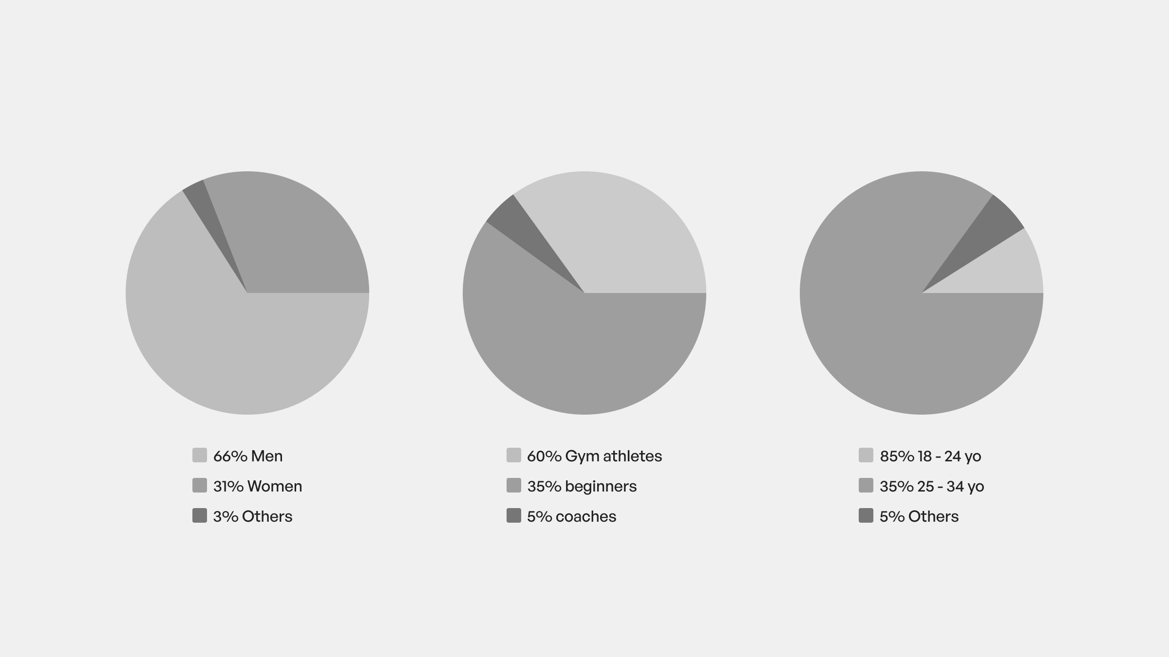
Participants profile
The participant mix was intentional: beginners, experienced athletes and coaches; to surface the full range of motivations, habits, frustrations and expectations across the ecosystem.
Key insights
Auto-edited diary for one-week cultural probe
Five patterns emerged consistently across every research activity.
1. Motivation is high, structure is low
Training plans are improvised, sessions are repetitive, and tracking is almost nonexistent. Athletes show up but have no system guiding their progress.
2. Everyone hits plateaus
94% of participants reported stagnation at some point. Only 8% felt genuinely satisfied with their results.
3. Recovery is massively overlooked
Sleep is insufficient, nutrition is inconsistent, and stress levels are high. Most athletes are training on top of unresolved fatigue.
4. Personalization is missing
The same generic programs, little adaptation to individual progress, and no relevant data to guide decisions.
5. Coaches lack tools
Many don't have the right systems to track clients or adjust programming based on real performance data.
The pattern was clear: these athletes weren't failing because of lack of effort. They were failing because the environment around them wasn't designed to help them succeed.
The problem wasn't motivation. It wasn't discipline. It wasn't even knowledge.
Problem statement
Athletes are committed, informed and showing up consistently, but the fitness environment around them lacks personalized guidance and actionable data. Plateaus exist because the tools available push people to train harder instead of smarter.
Phase 2 - Ideation and concept development
With the research synthesized, I moved into ideation. Three solution directions emerged from the analysis: improving coach training, raising awareness, and directly supporting gym users in their daily practice.
A first co-creation workshop helped narrow the focus. The support pathway offered the most direct impact on the core problem: giving athletes the personalized guidance and actionable data they were missing.
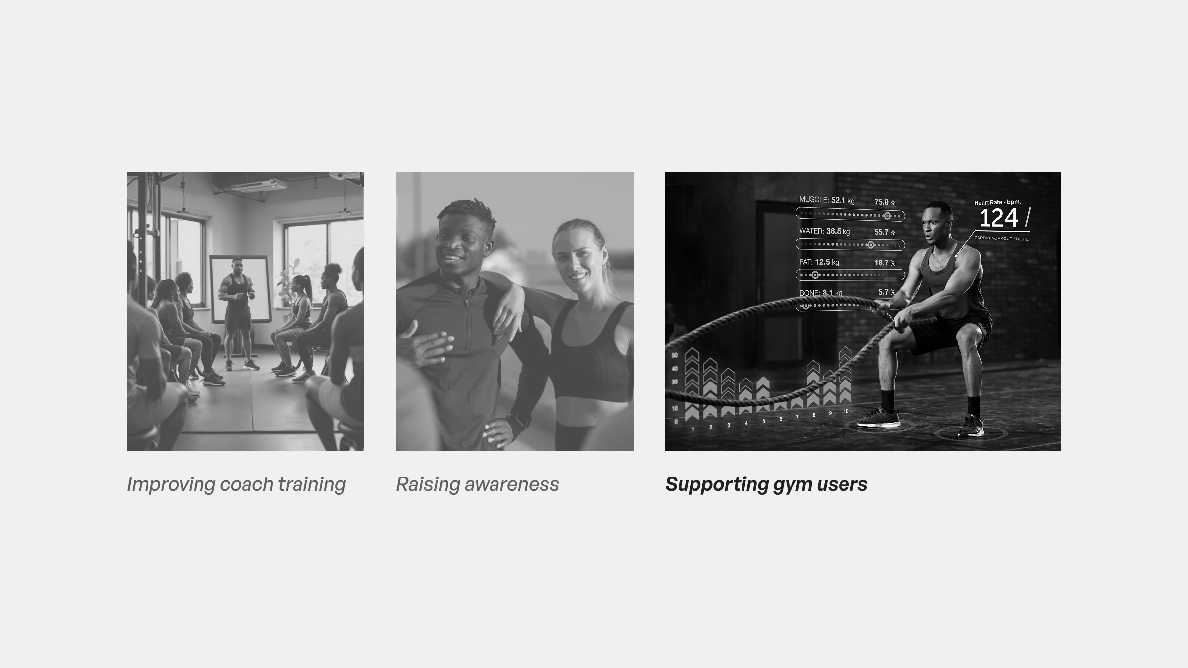
Initial solution directions
From there I developed three distinct concepts, each evaluated with the same rigorous framework: concept definition and core value proposition, competitive benchmark, moodboard and visual direction, SWOT analysis, and early user journeys.
ORUKA - a wearable and mobile platform tracking performance and recovery metrics with personalized recommendations.
IBOJU - an in-gym interactive screen surfacing tailored programs and syncing live with user profiles.
DIGI IT - a smart mirror with motion analysis and guided resistance workouts.
Each concept targeted a different part of the problem space. The evaluation criteria would determine which one had the strongest case.
Phase 3 - Validation workshop and decision
To select the most relevant direction, I ran a structured validation workshop with 20 participants recruited directly from the target ecosystem: gym athletes, certified coaches, beginners, and technical profiles.
Every participant received the full concept packages in advance. They came prepared, not just reactive.
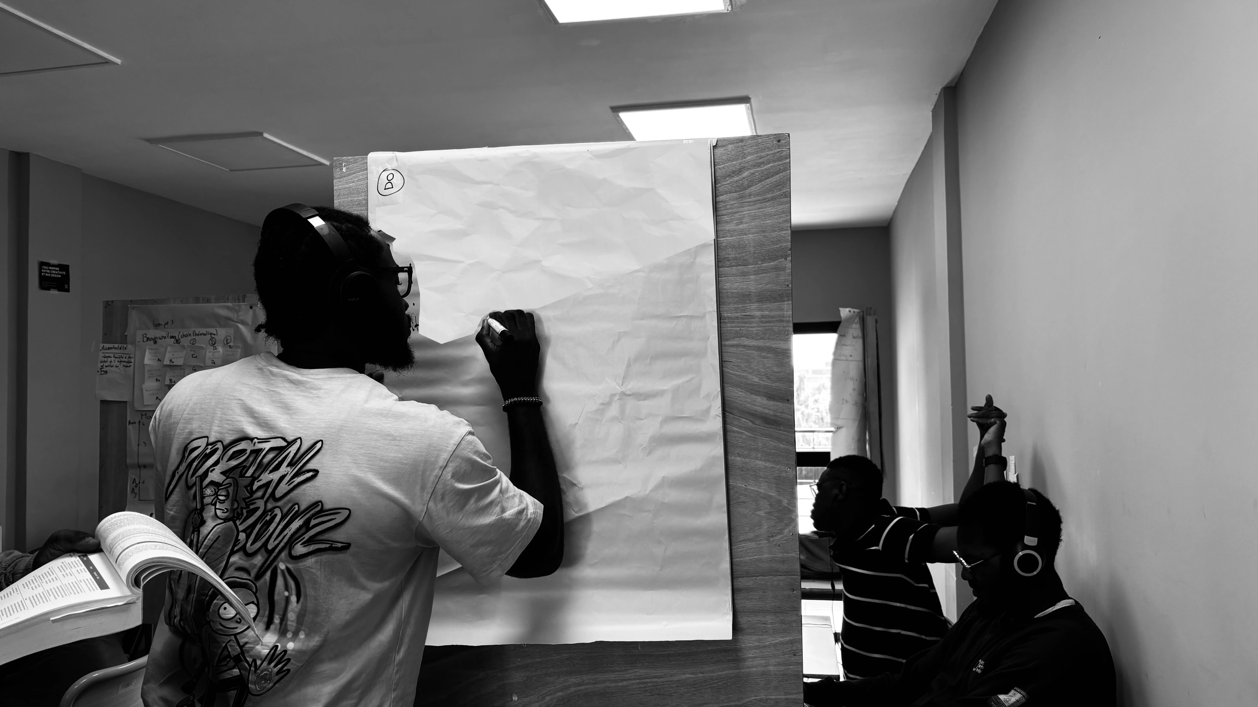
Validation workshop
During the session, each concept was evaluated against five criteria: feasibility, innovation potential, impact, long-term viability, and local relevance. Scores were captured through a structured matrix and complemented by open discussion.
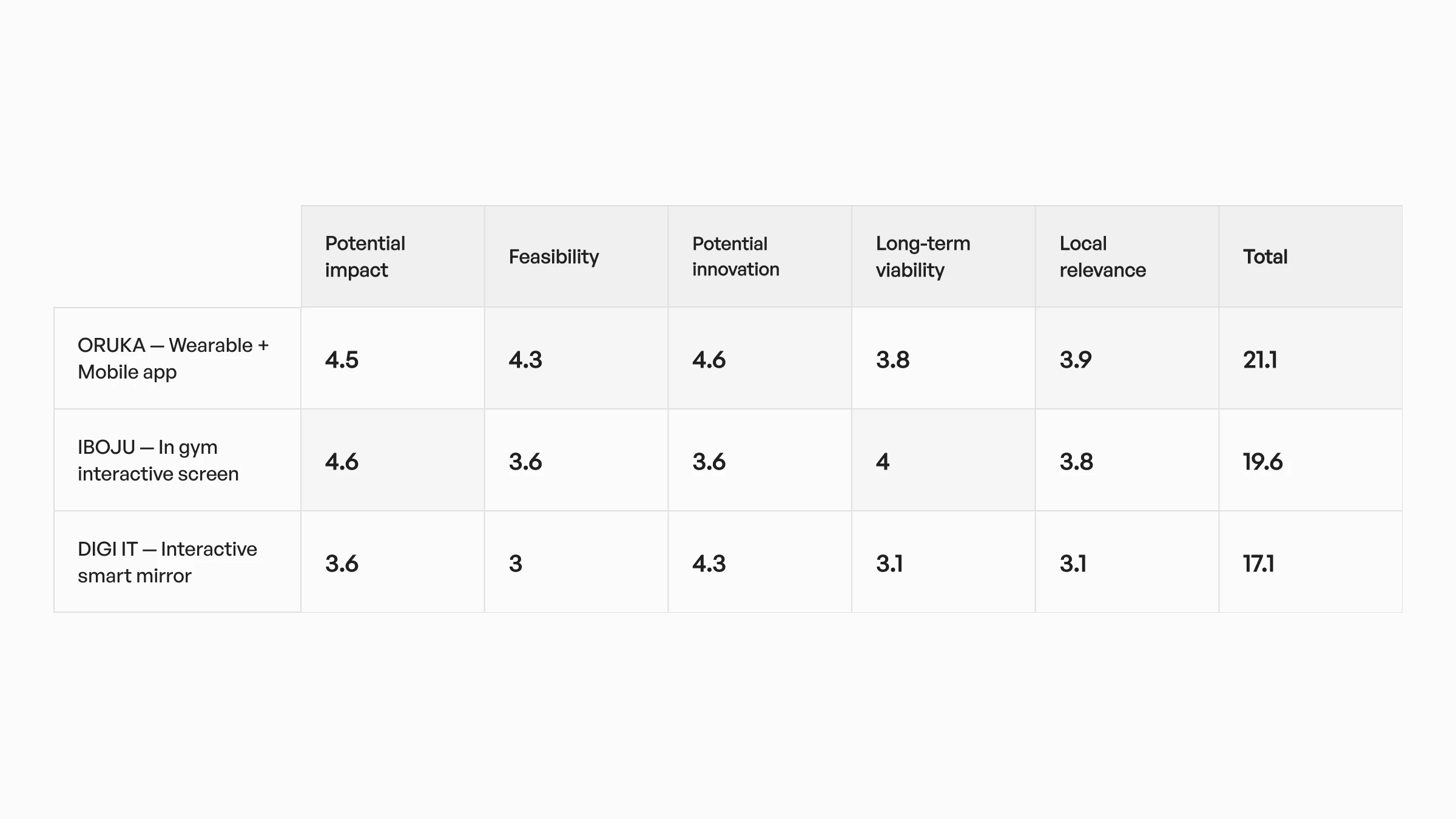
Scoring matrix results
The result was unambiguous. ORUKA ranked highest across every combined criterion. It offered the strongest balance between immediate user impact, technical feasibility, and long-term product potential.
But beyond validating the concept, the workshop surfaced something equally valuable: clear feature priorities and user expectations that became the foundation of the product roadmap. The decision wasn't just made but earned.
Bringing ORUKA to life
Validating ORUKA was one challenge. Building it was another.
The core problem was coherence. A smart ring and a mobile app are two fundamentally different design surfaces. One is physical, worn on the body, invisible in use. The other is a screen-based experience meant to make invisible data visible and actionable. Making them feel like one product required working on three tracks simultaneously: hardware design, digital product design, and brand definition.
I took full ownership of the product vision, UX/UI, and brand. For the physical ring, I collaborated closely with an industrial designer to ensure the hardware wasn't just aesthetically considered but grounded in real usability, comfort, and production constraints.
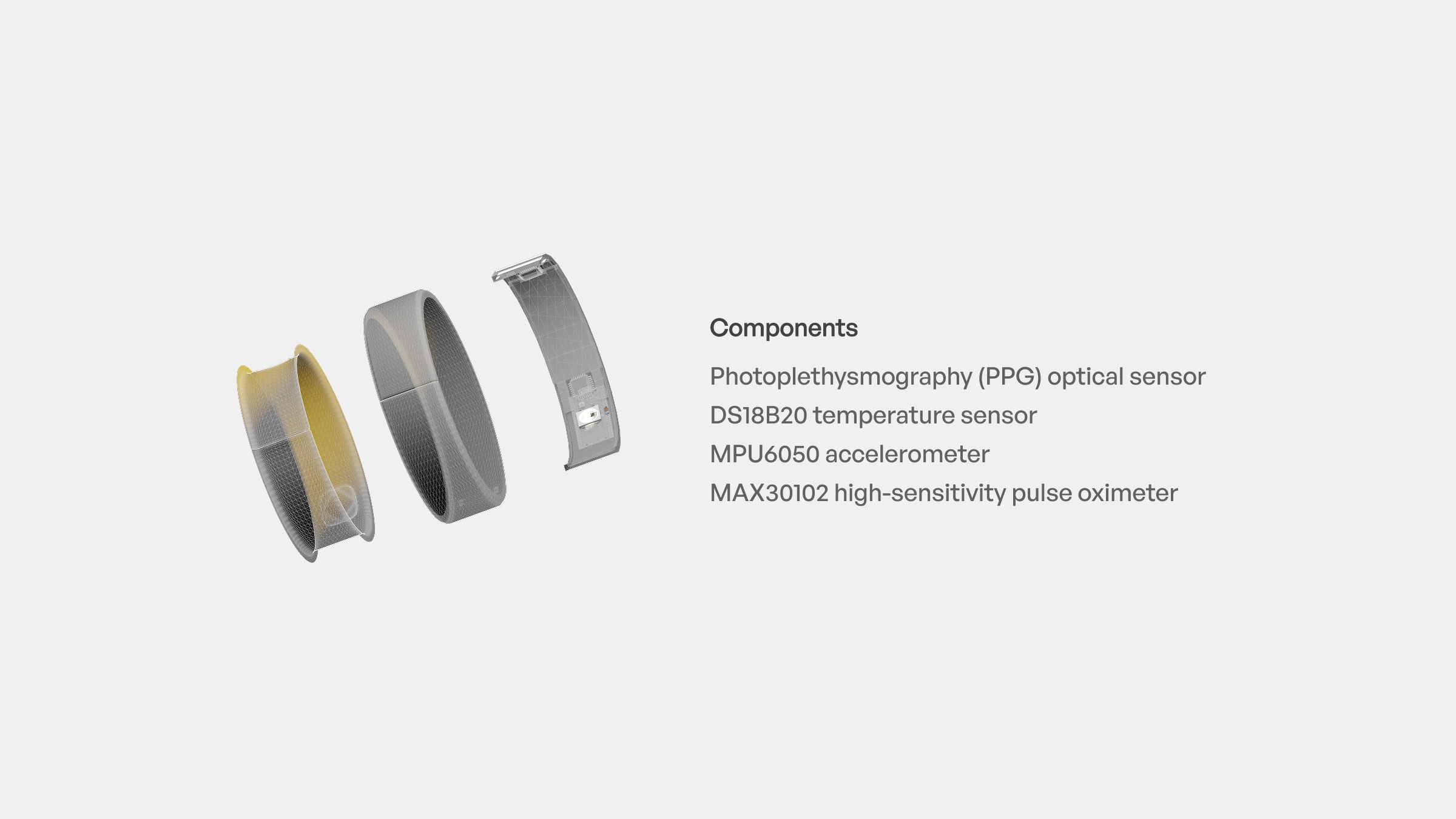
Ring core components
We co-built a technical specification document covering core functionality, sensor and component requirements, material research, ergonomic considerations, connectivity, and manufacturing feasibility.
ORUKA presentation - French
The ring and the app had to speak the same language before a single screen was designed.
UX and Product Strategy
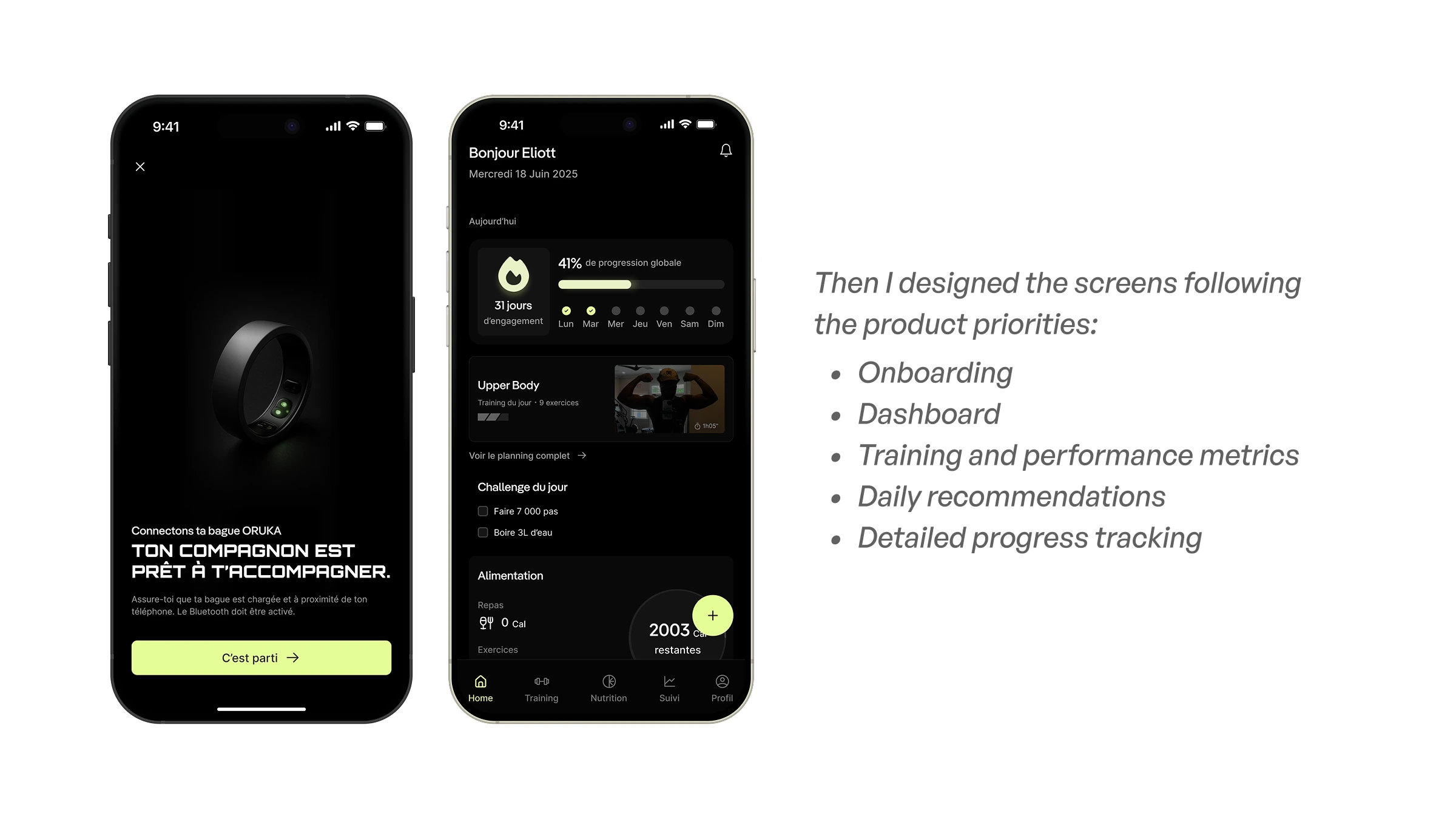
With the hardware direction locked, I turned to the digital experience with one guiding question: how do you make complex athletic data feel simple and actionable in the moment a user needs it most?
Mapping the experience
I updated the user journey to reflect the full arc from onboarding to habit formation, mapping every touchpoint across four critical flows: initial setup and onboarding, activity and performance tracking, personalized recommendations, and program evolution feedback loops.
Every flow was designed around the same constraint: reduce cognitive load at the moments that matter. A user checking their recovery score before a training session shouldn't have to think. A coach reviewing a client's progress shouldn't have to dig.
User flow
Wireframing and interaction design
From the journey maps I moved into detailed flows, then wireframes, exploring data visualization options, onboarding customization, coach follow-up scenarios, daily training and recovery checks, and notification & coaching triggers.
The wireframes were not decoration but decisions made visible.
First wireframes
Building the ORUKA brand
Before moving into high fidelity UI, I paused to build the brand. A deliberate choice.
A product like ORUKA lives on the body and in daily habits. The brand had to carry real weight: reliability for the athlete who trusts it with their data, clarity for the user checking in at 6am before a session, and forward motion for a product positioned at the intersection of performance and technology.
I worked through mission and positioning, vision and values, tone of voice, visual identity, and the full brand system and design language.
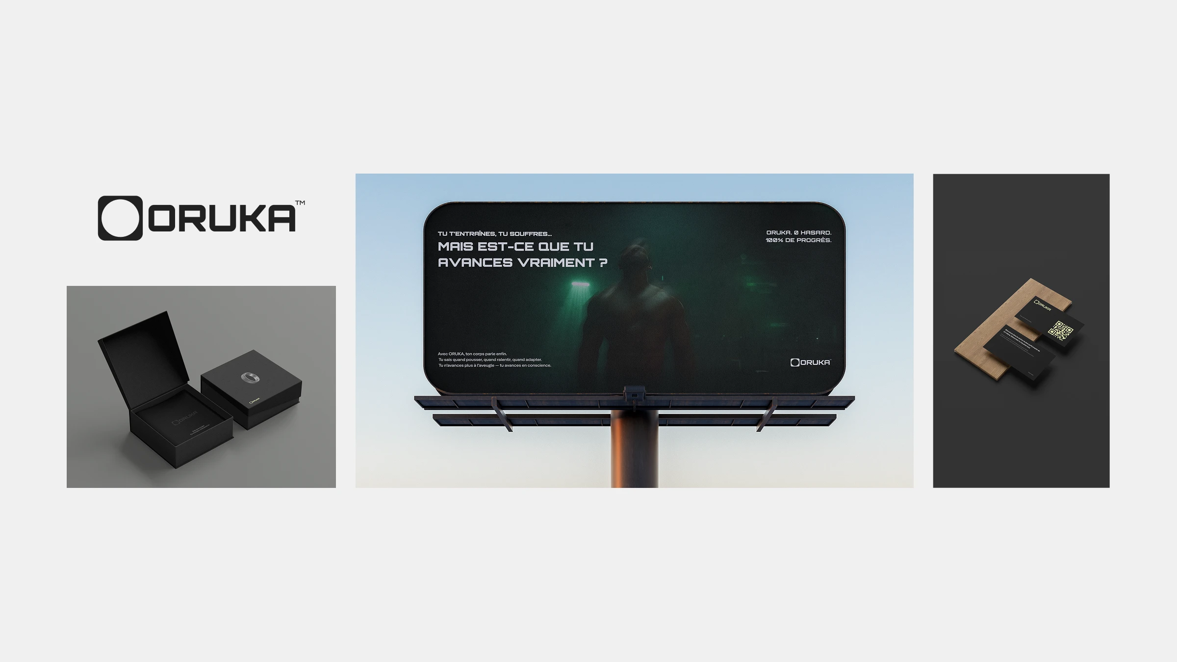
ORUKA Branding
The direction drew from high-performance sports culture, wearable tech aesthetics, and minimalist digital products. Every brand decision fed directly into the design system and UI that followed.
UI Design and Visual System
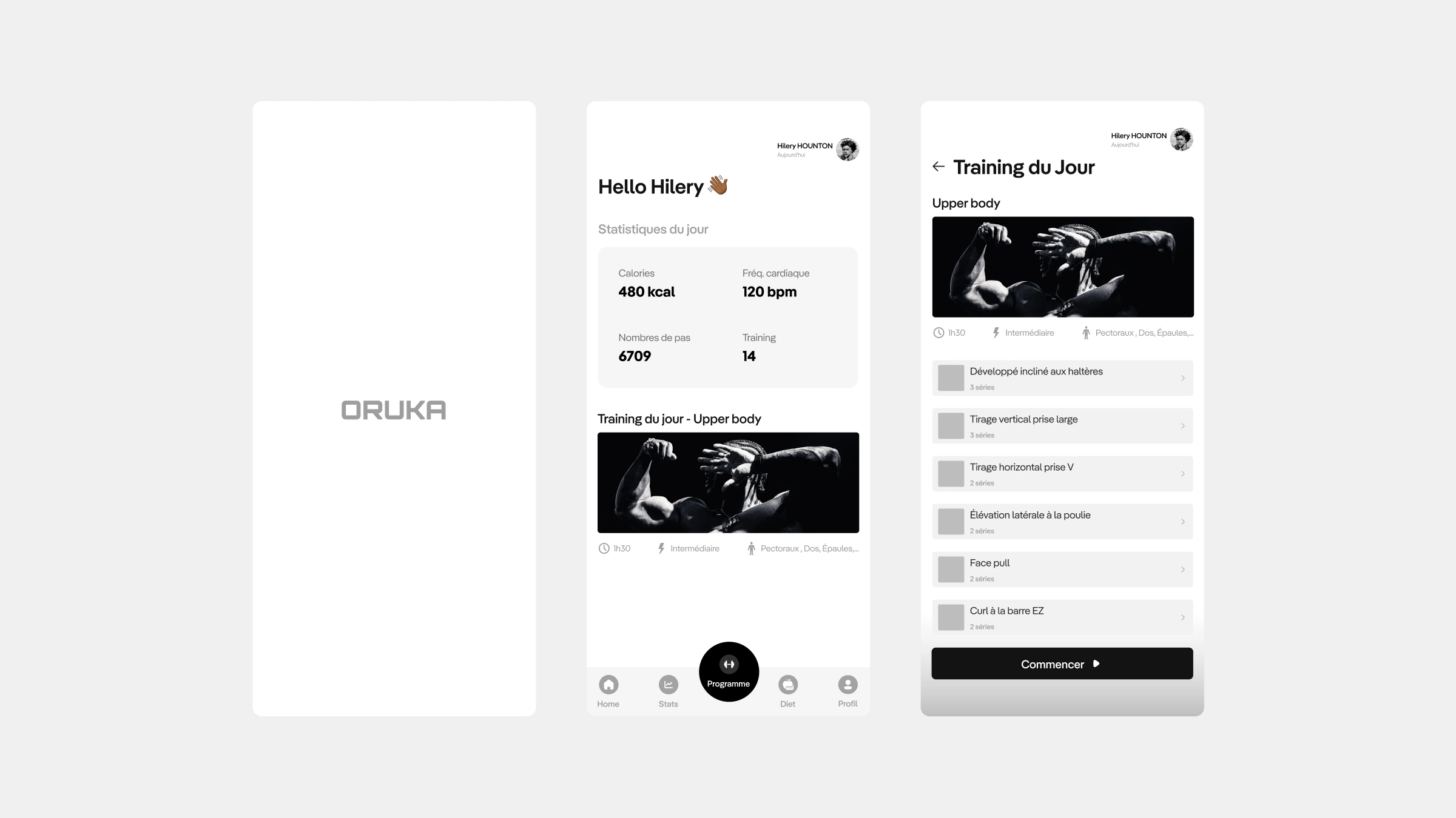
With the brand and UX foundations aligned, I moved into high fidelity UI design.
The visual direction had one priority: make complex athletic data feel immediately readable. A user glancing at their recovery score between sets has two seconds. The interface had to work in those two seconds.
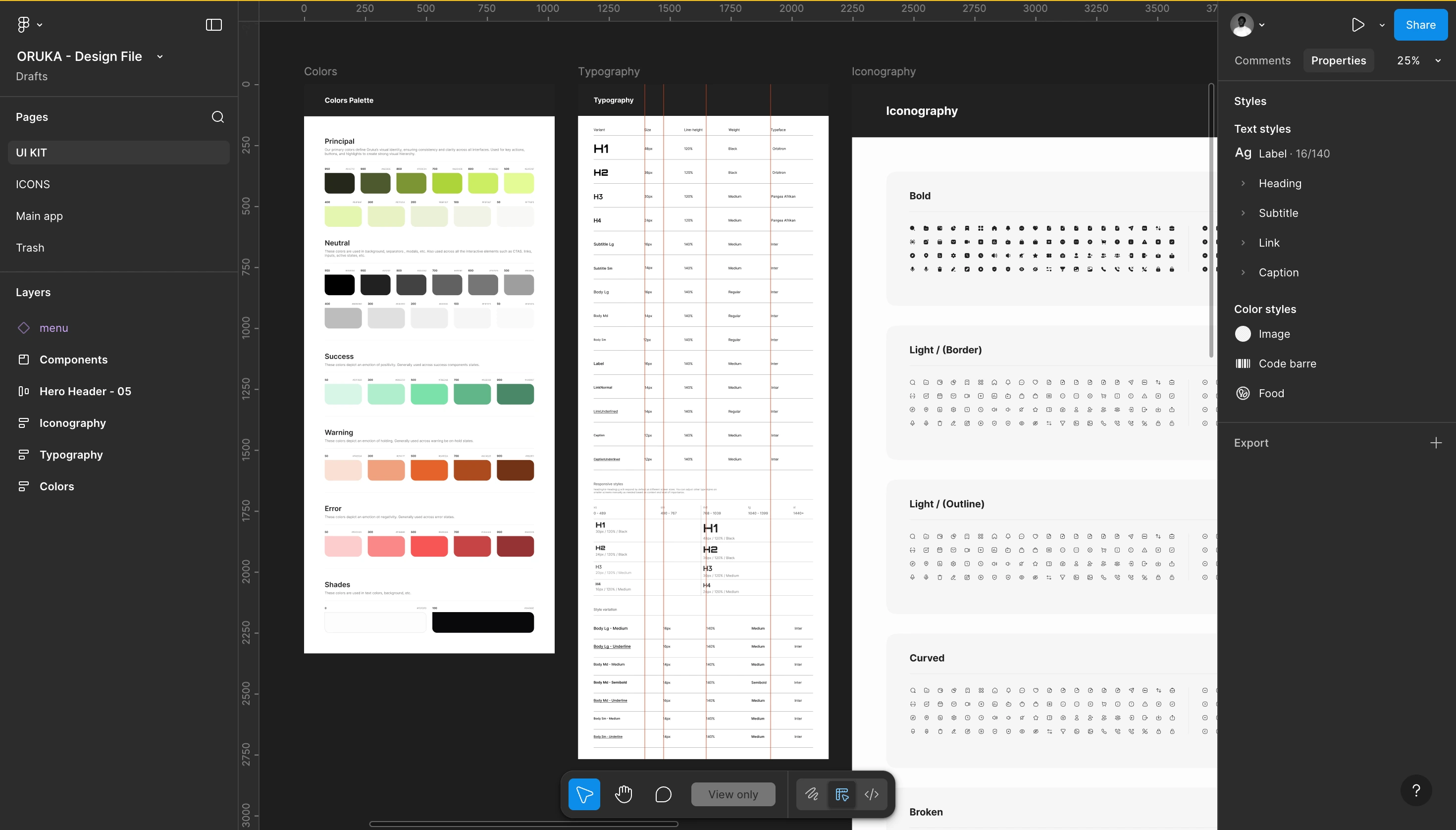
UI Kit
I built a scalable design system from the ground up covering color palette and variations, typography hierarchy, iconography, buttons, forms and interactive components, and data visualization patterns. Every component was designed to carry the same visual language across every screen and every state.
First UI exploration
The result was an interface that feels premium without feeling cold, and data-rich without feeling overwhelming. Performance information that athletes actually want to look at.
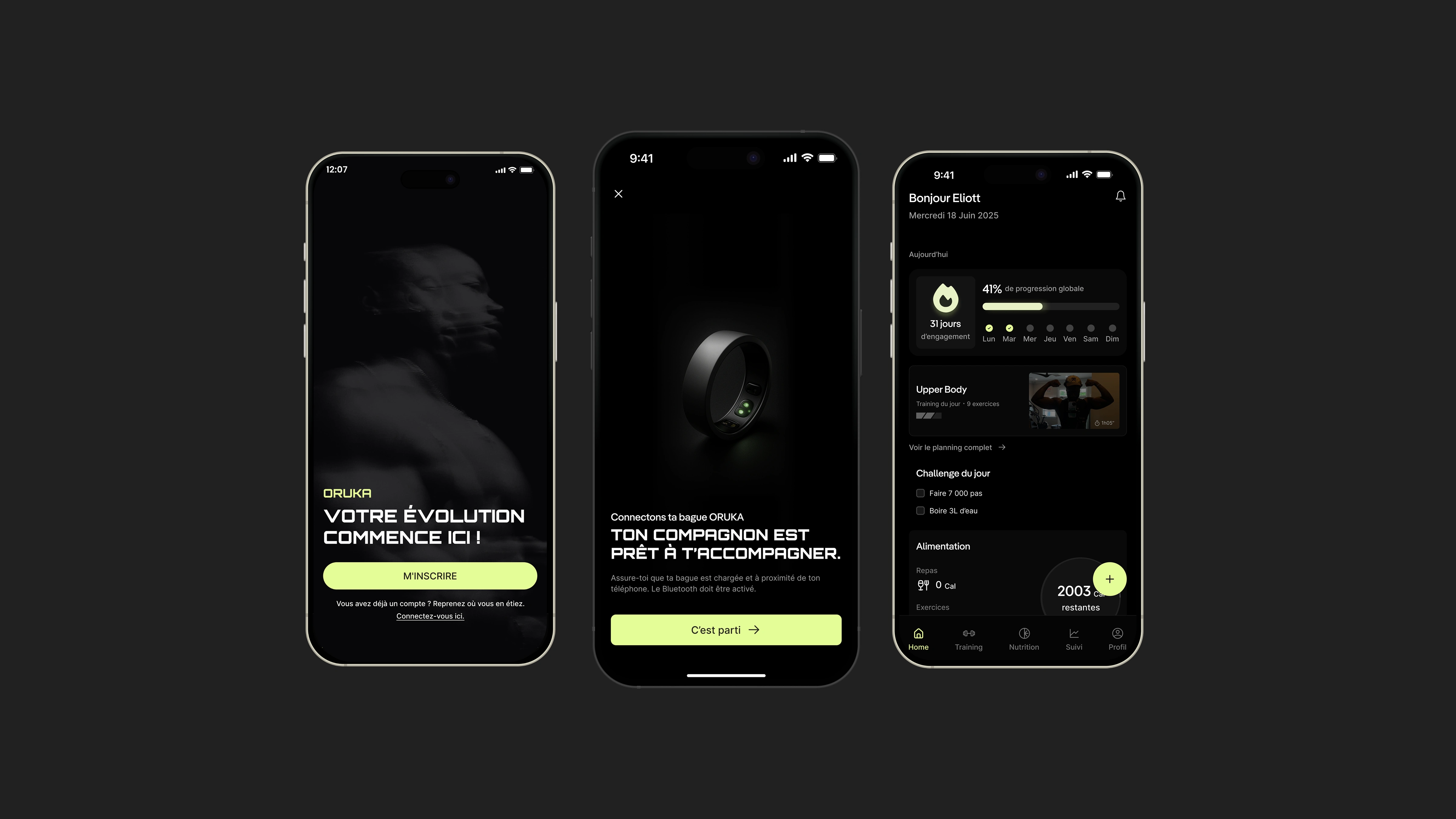
The Final product
Two pillars, one ecosystem
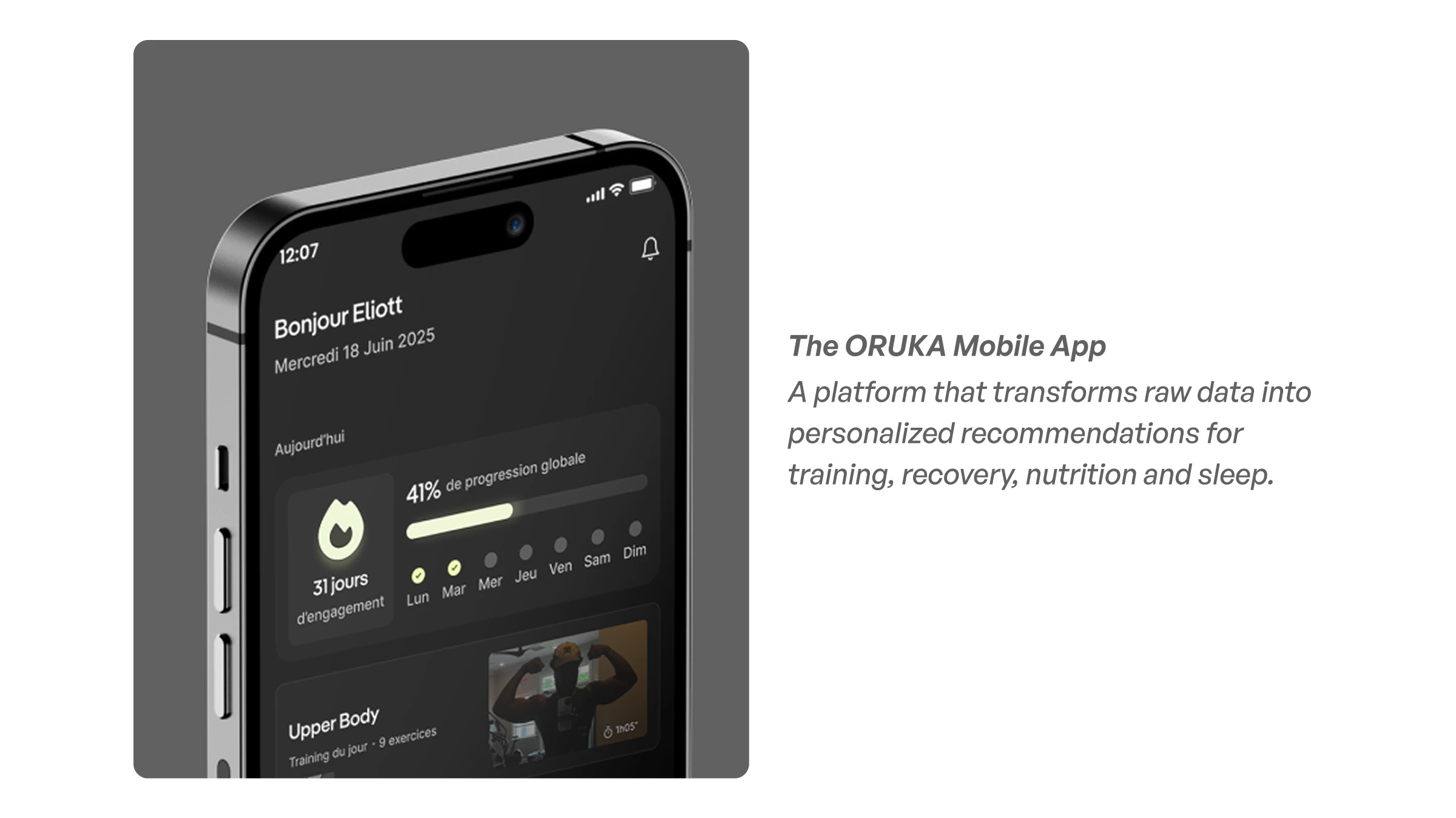
The ORUKA Mobile App
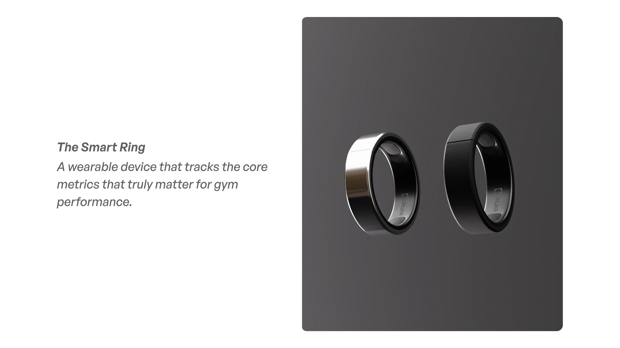
The Smart Ring
Here's the full design preview:
Final Thoughts
ORUKA pushed every part of my design practice at once: field research with real athletes, product strategy across hardware and software, brand creation from scratch, and end-to-end UX execution.
It also confirmed something I carry into every project: the best product decisions come from the field. The 128 survey responses, the cultural probes, the validation workshops, that's where ORUKA was really designed. The screens came after.
This product has a future. The market is real, the problem is validated, and the opportunity is significant. I'm actively exploring the right partnerships to take it further.
If you're building something that sits at the intersection of hardware, software, and human behavior, that's exactly the kind of challenge I work on.
Like this project
Posted Nov 29, 2025
ORUKA is a smart ring and fitness app that helps gym athletes track performance, analyze training data and break through workout plateaus.
Likes
1
Views
25
Timeline
Sep 16, 2024 - Jun 18, 2025