Drift - Designing for the financial reality most apps ignore.

Ishaq Tairou

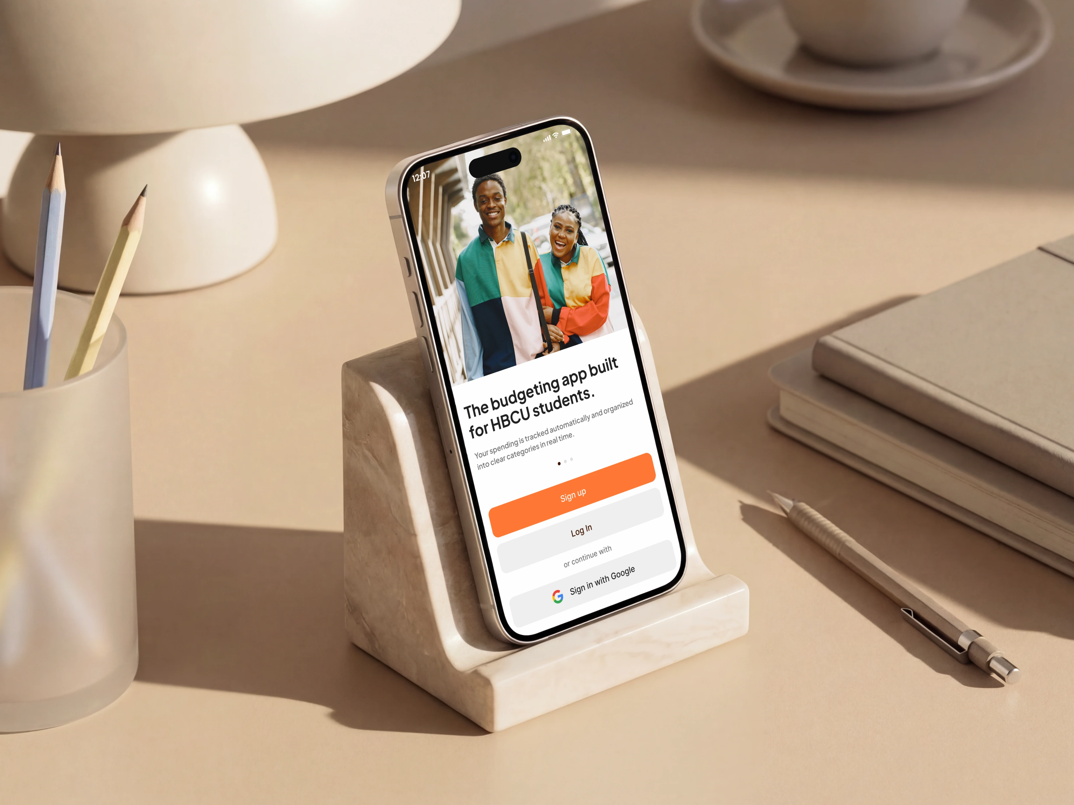
Drift - Designing for the financial reality most apps ignore.
A budgeting app built for HBCU students.
Overview
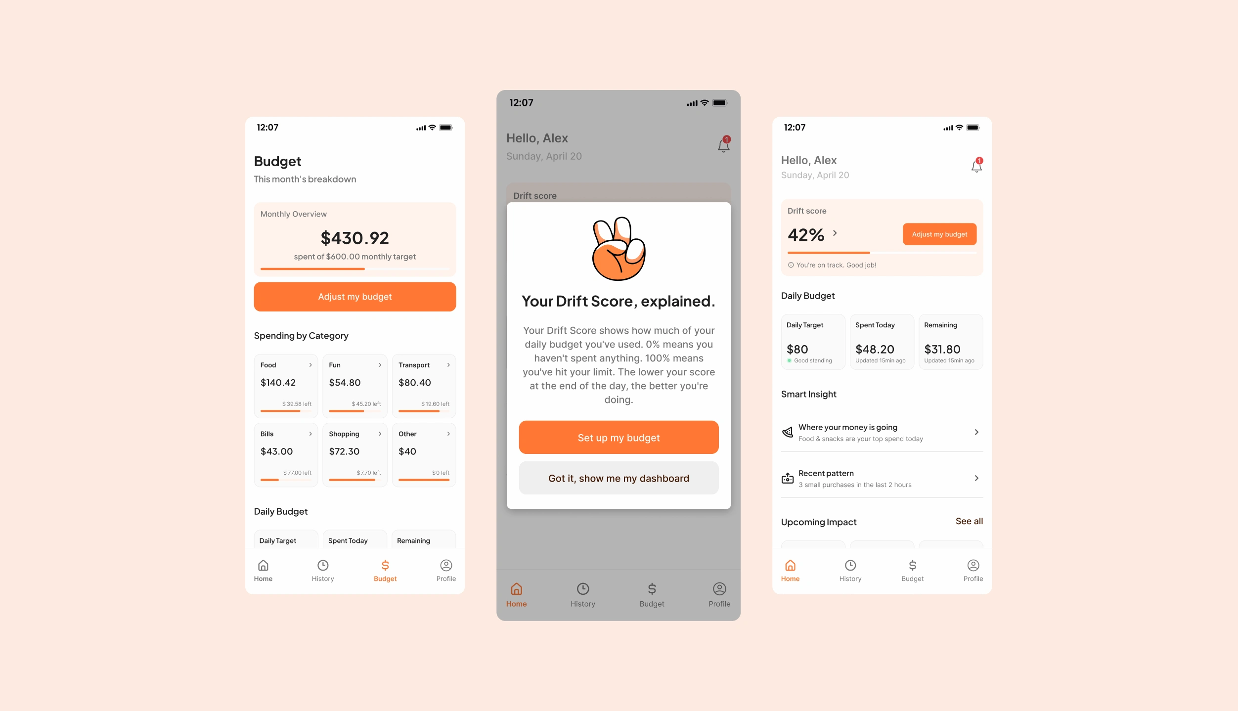
Screens Drift
I study at North Carolina Agricultural & Technical State University.
I see this problem every month, in the cafeteria, in the group chats, in the conversations people have when the month runs longer than the money.
Drift is a mobile budgeting app built specifically for HBCU students. Not adapted. Not adjusted. Built from scratch around how we actually live: irregular income, family transfers, financial aid that arrives in a lump sum and has to last.
I designed this project end to end. Research, analysis, user flows, wireframes, design system, branding, and all hi-fi screens in Figma.
Why this existed before I started designing

Before touching any design tool, I needed to understand whether the problem I felt around me was real at scale.
We surveyed 50+ NCAT students and ran 4 in-depth qualitative interviews. We analyzed 9 existing budgeting apps: YNAB, Mint, EveryDollar, Goodbudget, Rocket Money, and four others.
The numbers were unambiguous. 57% of NCAT students regularly run out of money before their next income arrives. 38% never start budgeting because setup is too hard. Only 8% use a dedicated budgeting app. The rest use nothing.
The interviews surfaced something the numbers couldn't. Three separate students, without any prompt, described the same need: a savings space their family couldn't access. Nobody asked about it. They brought it up on their own.
The competitive analysis told the rest of the story. YNAB assumes a stable monthly salary. EveryDollar is rigid. None of these tools were built for someone living on financial aid, family transfers, and a part-time job with irregular hours. The gap wasn't in the market. It was in the assumptions behind every product already in it.
Problem statement: NCAT students don't fail at budgeting because they lack discipline. They fail because the tools available were never designed for their financial reality.
The constraint that shaped everything
One sentence guided the entire design process.

Zero friction between install and first value.
A student who just received their financial aid deposit shouldn't spend 20 minutes configuring categories before the app is useful. That 38% who never start budgeting? Setup friction is why. Drift was designed against that number from day one.
User flows
Drift - User flows
With the research synthesized, I mapped the full product experience before drawing a single screen.
Four critical flows: onboarding, daily budget tracking, spending alerts, and category management. Every flow was designed around the same constraint: reduce the number of decisions a student has to make at the moment they're least equipped to make them. Someone checking their Drift Score between classes shouldn't have to think. Someone who just got an alert shouldn't have to dig.
The flows were tested against real usage patterns from the interviews. A student who gets paid irregularly doesn't budget the same way as someone with a biweekly paycheck. The flows had to reflect that.
Wireframes
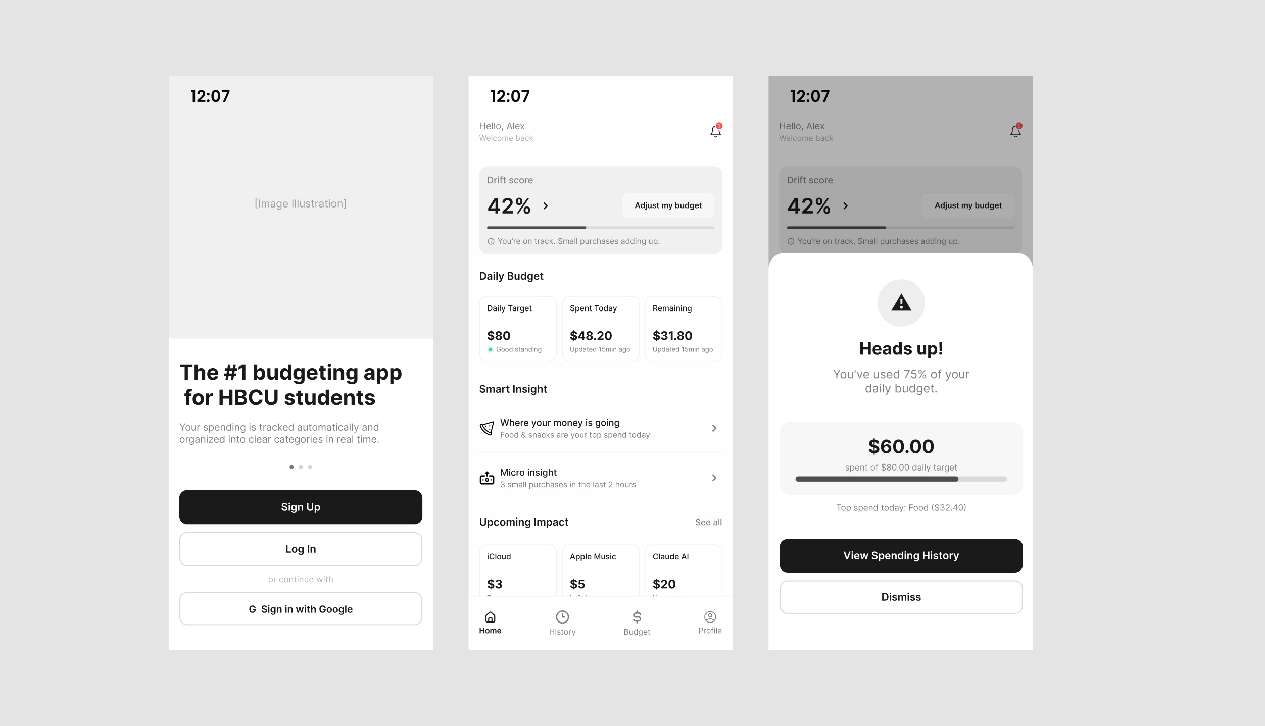
Drift - Wireframes
From the flows I moved into wireframes.
Every layout decision at this stage was a product decision. Where does the Drift Score live on the dashboard? How does a student understand what the number means without reading a manual? How many taps between opening the app and seeing where their money went?
The wireframes were the first version of every answer.
I explored multiple approaches for the data display, the onboarding sequence, and the alert states before settling on what made it into high fidelity. The budget category cards went through three layout iterations before the information hierarchy felt right.
Building the Drift brand
Before moving into high fidelity UI, I paused to build the brand. That pause was deliberate.
Logo Drift
A product like Drift lives in a student's pocket during some of their most stressful financial moments. The brand had to carry real weight: clarity when money is tight, reliability when the balance is lower than expected, and enough warmth to not feel like a punishment tool.
Drift - UI Kit
Primary color
#FF7733. Not orange as a trend. Orange as a signal: action, urgency, progress. It's the color of the Drift Score climbing, of a budget alert firing, of a CTA asking you to adjust. Dark background #1A1A1A. Surface #FAFAFA. Success state #7BE2AB, used sparingly so it means something when it appears.Typography: Plus Jakarta Sans for headings, Inter for body. WCAG 2.1 AA compliance throughout. 44px minimum tap targets on every interactive element, because a student checking their balance on the go deserves an interface that works with their thumb.
Every brand decision fed directly into the design system and the UI that followed.
The screens
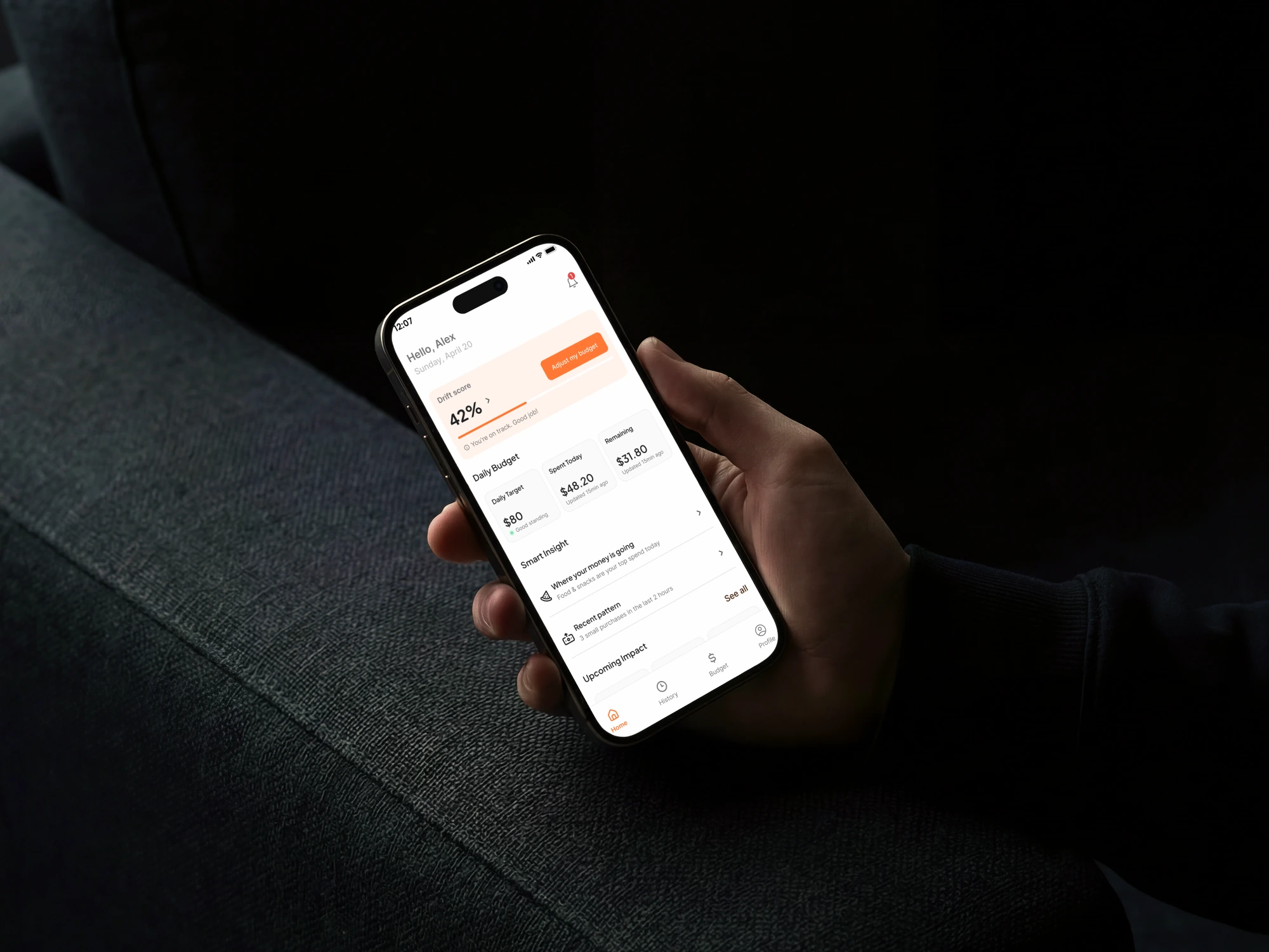
Drift Home page
With the brand and UX foundations locked, I moved into high fidelity.
The visual direction had one priority: make financial data feel immediately readable, not overwhelming. A student glancing at their Drift Score between classes has two seconds. The interface had to work in those two seconds.
Onboarding was the first screen problem and the most critical one. Five steps, under two minutes. Phone number, verification, password, basic profile, bank connection via Plaid. No manual category setup. No budget configuration before seeing anything useful. The student connects their bank and the app immediately starts making sense of their spending.
The Drift Score sits at the top of the dashboard, large, with one line of context beneath it. 0% means the day just started. 100% means the limit is reached. Low score at end of day means the student is on track. That's the entire mechanic, readable in two seconds. After usability testing we added a first-launch pop-up explaining the score. Participants understood the number but not what it meant. One iteration, problem solved.
Spending by Category shows six categories, each with amount spent, amount remaining, and a progress bar scaled to the actual budget allocated. The bar communicates before the number is read. Food at 78% of budget looks visually different from Bills at 36%. That visual difference is the point.
Budget alerts fire at 75% and 100% of daily budget. The 75% alert is a heads up. The 100% alert is a stop. The copy at both states is firm without being punishing, because a student who overspent on food doesn't need an aggressive warning. They need clarity and a direction forward.
Usability testing caught one real navigation issue: the Budget tab wasn't found independently by participants. Fix: a highlight on the tab on first visit. One change. One test case closed.
Every high-priority functional requirement covered.
Here's the full design preview:
What this project confirmed
Two things.
The first I already believed going in: the best design decisions come from the field. The Savings Lock feature exists because three people independently described needing it without being asked. That feature doesn't exist without those interviews.
The second surprised me: designing around financial stress requires a different kind of attention. Not just to the interface, but to the tone of every word in it. A student checking their balance at 11pm with $12 left until next week isn't looking for a design moment. They're looking for something that tells them the truth without making them feel worse about it.
Drift started as a class project. The more I worked on it, the more it felt like something that should actually exist.
If you're building a product for an audience that existing tools have ignored, that's exactly the kind of challenge I work on.
Like this project
Posted Jun 15, 2026
Designed a budgeting app for HBCU students handling irregular incomes.
Likes
1
Views
13