PAYIX - Redesigning trust for west African payments
Ishaq Tairou
1 collaborator
PAYIX
Redesigning trust for west African payments
Overview
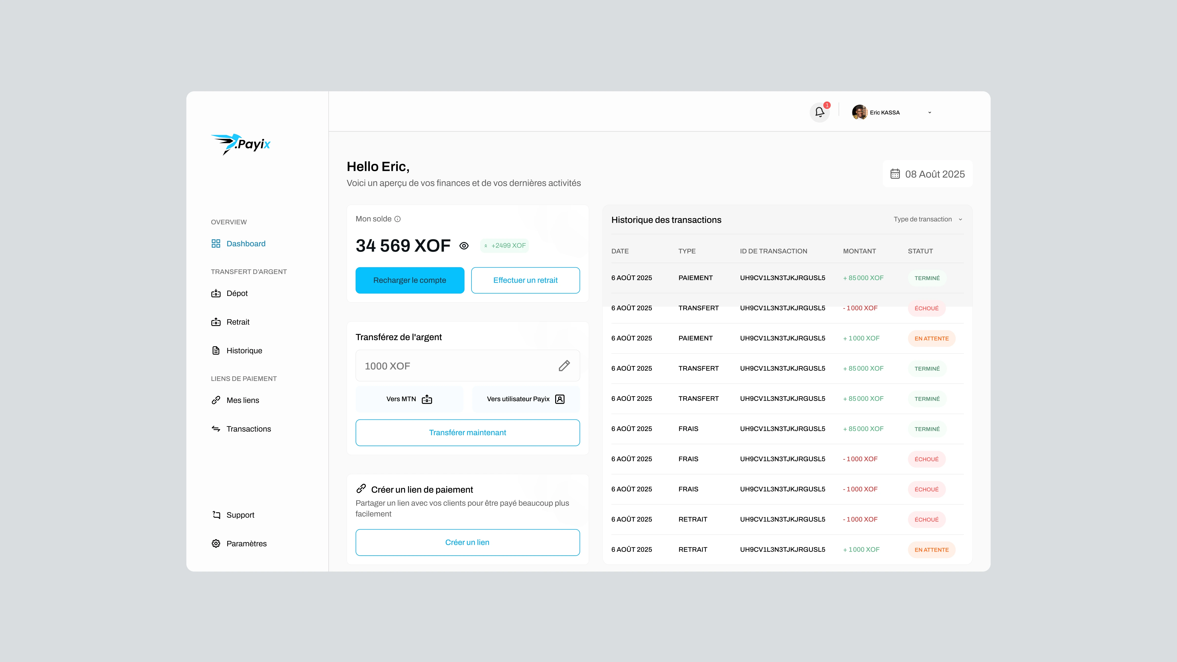
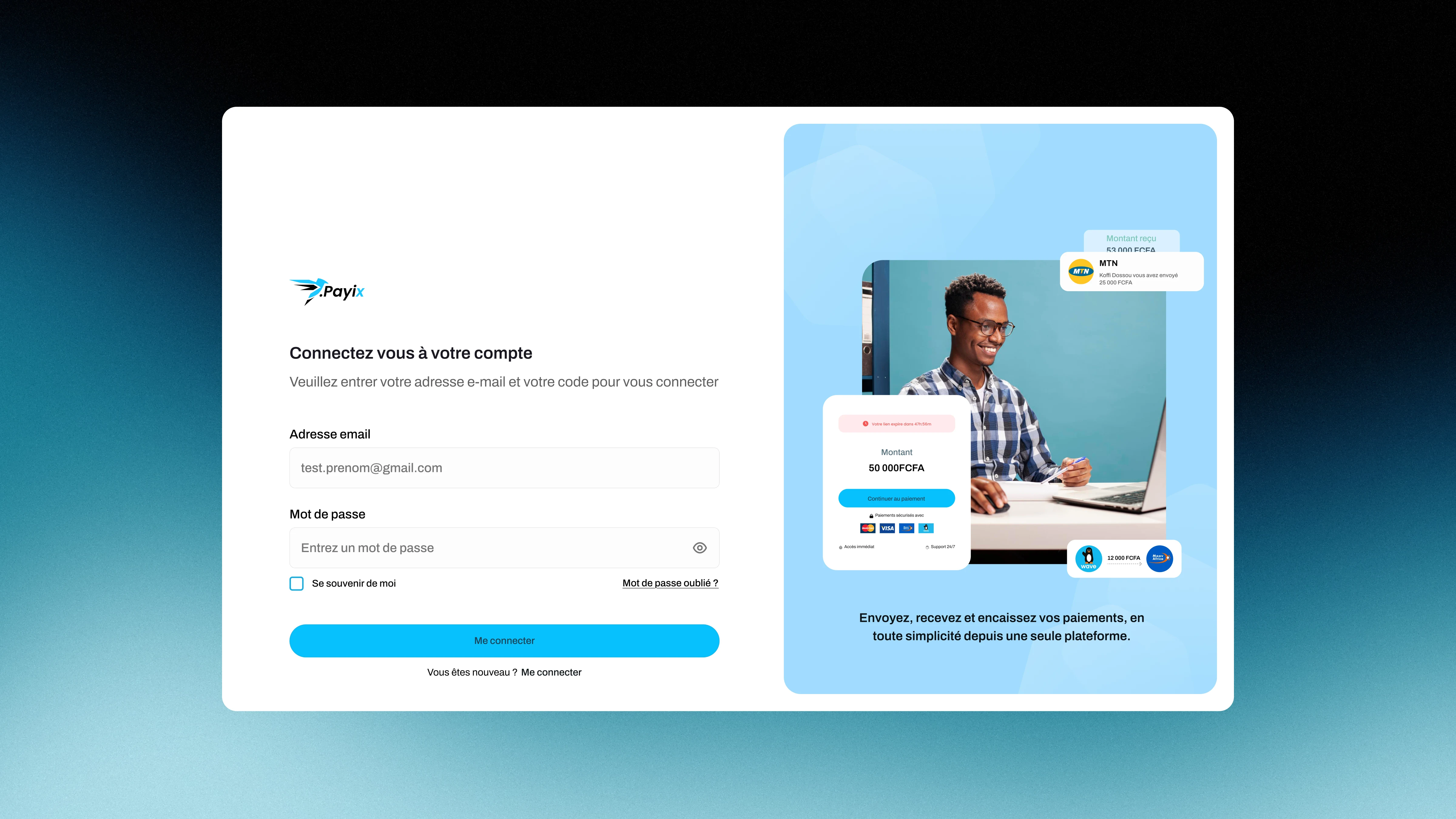
PAYIX Dashboard
PAYIX is a digital payment platform built for everyday transactions across West Africa. The brief was clear: make sending, receiving and managing money feel as simple and trustworthy as exchanging cash in person.
As lead UX/UI Designer, I rebuilt the product architecture, simplified core flows and designed a visual system built around one thing: confidence.
Understanding the challenge
The mobile payment ecosystem in West Africa is growing rapidly, but the experience often remains fragmented and complex. Users struggle with unclear onboarding, difficult transaction flows and confusing account management.
The challenge was not to create another payment app, but to rebuild the experience, removes friction and builds trust at every step.
The initial pain points
Long and inconsistent onboarding
Confusing deposit and withdrawal flows
Limited transaction clarity
Lack of transparency in status updates and histories
Users wanted the same thing: confidence and clarity.
Research and insight
Key competitors
To understand the existing fintech landscape, I analyzed key regional and international platforms, mapping where they built trust and where they lost it. I reviewed common user scenarios across onboarding, transactions and account management to identify recurring friction points.
One insight emerged consistently: people don't abandon payment apps because of missing features but because something felt unclear, slow or untrustworthy at a critical moment.
Trust and clarity became the two non-negotiables shaping every decision that followed.
Designing the product strategy
Three principles shaped every decision in the redesign.
Transparency at every step
In fintech, uncertainty costs trust. Every action needed to communicate status, confirmation and feedback in real time.
Frictionless flows
West African users are often managing money under time pressure. Every unnecessary step removed is a reason to come back.
A clear visual hierarchy
Users shouldn't have to think. They should immediately know what to do, what changed and what's next.
From these principles, I built the information architecture around fast decision-making and frequent transactions.
From architecture to flows
Key features
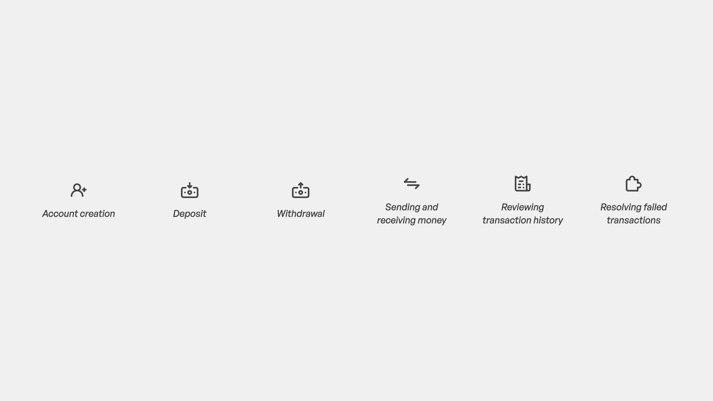
With the architecture defined, I mapped the four critical journeys every user would encounter: onboarding, sending and receiving money, deposits and withdrawals, and transaction history.
Each flow was built around three constraints: predictable actions so users always knew what came next, minimal input requirements to reduce drop-off at key moments, and immediate feedback loops so no action ever felt like it disappeared into a void.
The flows became the skeleton. Everything visual came after.
UI Design and product system
UI kit
The visual direction had one constraint above all: every design decision had to reinforce trust.
Clean and minimal wasn't an aesthetic choice but a strategic one. In a financial product, visual noise creates doubt. I kept the interface focused, with clear hierarchy and deliberate use of color to signal status rather than decorate.
I built a full design system from the ground up: brand colors and variants, typography hierarchy, buttons, forms and inputs, transaction status indicators, and notification and security patterns. Every component was designed to scale and to speak the same visual language across every screen.
The Solution
The redesigned PAYIX experience was built around one promise: no user should ever feel lost or uncertain while handling their money.
Onboarding
Stripped down to the essentials. Validated local phone numbers, clear security steps and a flow short enough to complete in under two minutes.
Dashboard
Real-time balance front and center. Quick actions accessible without scrolling. The most frequent tasks required the fewest taps.
Transactions
Every step confirmed. Every status visible. Completed, pending and failed states are visually distinct so users always know exactly where their money is.
Account and history
Fully categorized and searchable. No guessing, no clutter. Everything a user needs to understand their financial activity in one place.
Here's the full design preview:
Impact
The redesigned PAYIX experience delivered measurable results.
Onboarding completion rate increased by 20%, a direct result of removing friction and clarifying every step of the flow.
Core actions required fewer steps, reducing cognitive load and the likelihood of errors. Transaction visibility gave users real-time confidence over their money. A cleaner interface meant fewer support requests and a product that could scale without accumulating UX debt.
PAYIX went from a fragmented experience to a fintech product ready to compete in one of the fastest-growing payment markets in the world.
Final Thoughts
PAYIX reminded me that the best design in a financial product is the kind users never notice. No friction, no doubt, no moment where they have to stop and think. Just confidence at every step.
It also reinforced something I bring to every project: design decisions only matter when they're connected to real user behavior and real business outcomes. Aesthetics without strategy is decoration.
If you're building something that needs to earn user trust from the first interaction, that's exactly the kind of problem I work on.
Like this project
Posted Sep 10, 2025
Redesigned Payix for clearer, faster, and more trustworthy digital payments in West Africa.
Likes
2
Views
13
Timeline
Aug 10, 2025 - Sep 30, 2025
Clients
Payix
Collaborators