Banking app redesign
Paul James
Outcome Overview
The redesign focused on making first-time use and everyday banking tasks faster, clearer, and more inclusive. Testing showed a 26% faster completion of initial login and account linking, with a 30% reduction in user errors when performing early actions such as viewing balances or transferring money.
Every day flows like payments, card management, and checking account details become more efficient, requiring 18% fewer steps on average. Accessibility updates brought the app into alignment with WCAG 2.2 AA standards, ensuring essential tasks could be completed by a wider range of customers without unnecessary friction.
This case study walks through how I identified friction points, simplified the navigation and flows, and redesigned key screens to create a smoother, more trusted mobile banking experience.
The Challenge: Complex Early Journeys
While the app offered a full range of banking features, first-time use and day-to-day interactions felt disjointed. Users reported difficulty understanding where to start, with navigation spread across multiple menus and inconsistent flows for similar tasks.
Early interactions like logging in, linking accounts, or checking balances often led to confusion and unnecessary errors. Common issues included:
Unclear navigation structure: important tasks are buried under secondary menus
Inconsistent design patterns: different screens required users to relearn interactions
Accessibility gaps: low colour contrast and small tap targets made the app harder to use for customers with visual or motor impairments
Inefficient flows: everyday actions like transferring money or managing cards required more taps than necessary
For new users, this created a sense of friction and mistrust. Instead of enabling customers to quickly and confidently manage their money, the app placed a cognitive load on them at the very moment trust was most important.
Research Insights
To uncover where users struggled most, I combined a heuristic evaluation, a WCAG 2.2 AA accessibility review, and customer feedback shared by the bank. I also mapped common journeys such as logging in, transferring money, and managing cards.
Key insights included
Navigation Overload
Customers told the bank they found it hard to locate everyday tasks. Payments, transfers, and card settings were split across multiple menus, creating uncertainty about where to begin.
Inconsistent Patterns
Similar actions, like updating card limits or changing a PIN, followed different layouts and flows. Users had to relearn each task instead of building familiarity.
Accessibility Gaps
Low colour contrast, small tap targets, and unclear error states made the app difficult for users with visual or motor impairments, slowing down task completion.
Cognitive Load During Onboarding
New users felt overwhelmed by too many options at once. Without clear guidance on essential early actions like linking accounts or checking balances, they hesitated and often made mistakes.
This combination of direct customer feedback and UX analysis confirmed the need for a simpler, more consistent, and more accessible design system, one that builds trust from the very first interaction.
Design Approach
As the sole designer, I focused on creating a cohesive, accessible system that simplified early interactions and made everyday banking tasks more efficient. My process centred on three key principles:
Streamline Navigation
Reduced the number of menus by grouping related tasks together (e.g., payments and transfers in one location).
Designed a consistent hierarchy so that high-frequency actions like checking balances and managing cards were always one tap away.
Unify Interaction Patterns
Standardised layouts for similar tasks, such as updating card settings, changing a PIN, or adjusting limits.
Applied a single design language across flows to reduce relearning and help users build confidence faster.
Embed Accessibility
Updated colour contrast ratios, touch targets, and error states to meet WCAG 2.2 AA compliance.
Simplified labels and added clearer feedback messages to reduce uncertainty, especially during high-stakes actions like transfers.
Guide Early Use (Onboarding)
Refined first-time login and account linking into a shorter, clearer path.
Introduced progressive disclosure to avoid overwhelming new users, surfacing only the most essential actions at the start.
By combining navigation restructuring, consistent patterns, and accessibility updates, the redesign established a foundation that not only improved first-time use but also scaled into a smoother experience for recurring tasks.
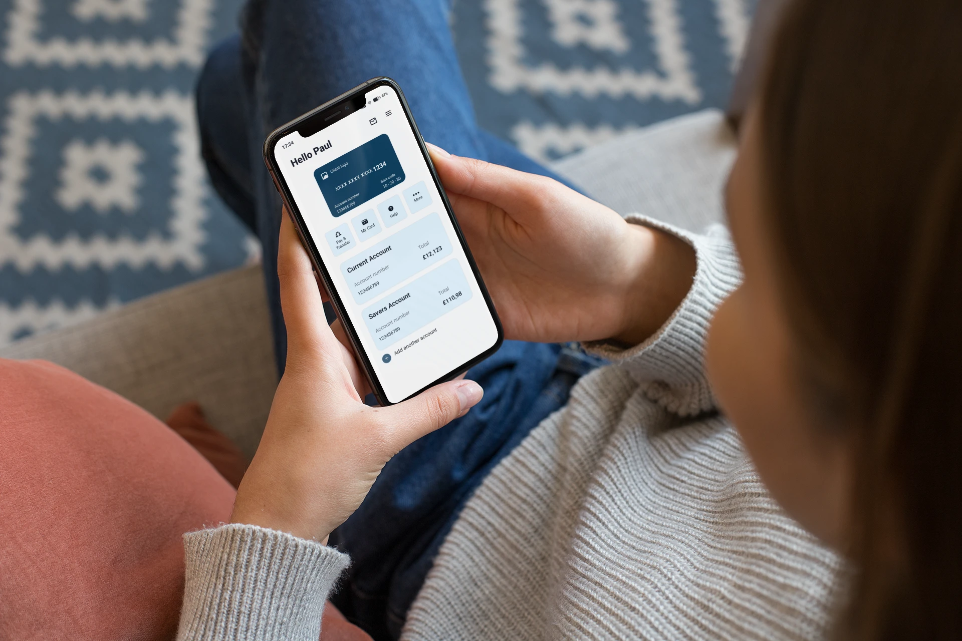
Navigation & Home
Before: Users relied on multiple menus to find basic tasks.
After: The new Home dashboard surfaces balances and most-used actions up front, with a simplified Menu for secondary features.
Impact:
Users reached their goals in 20% fewer taps on average.
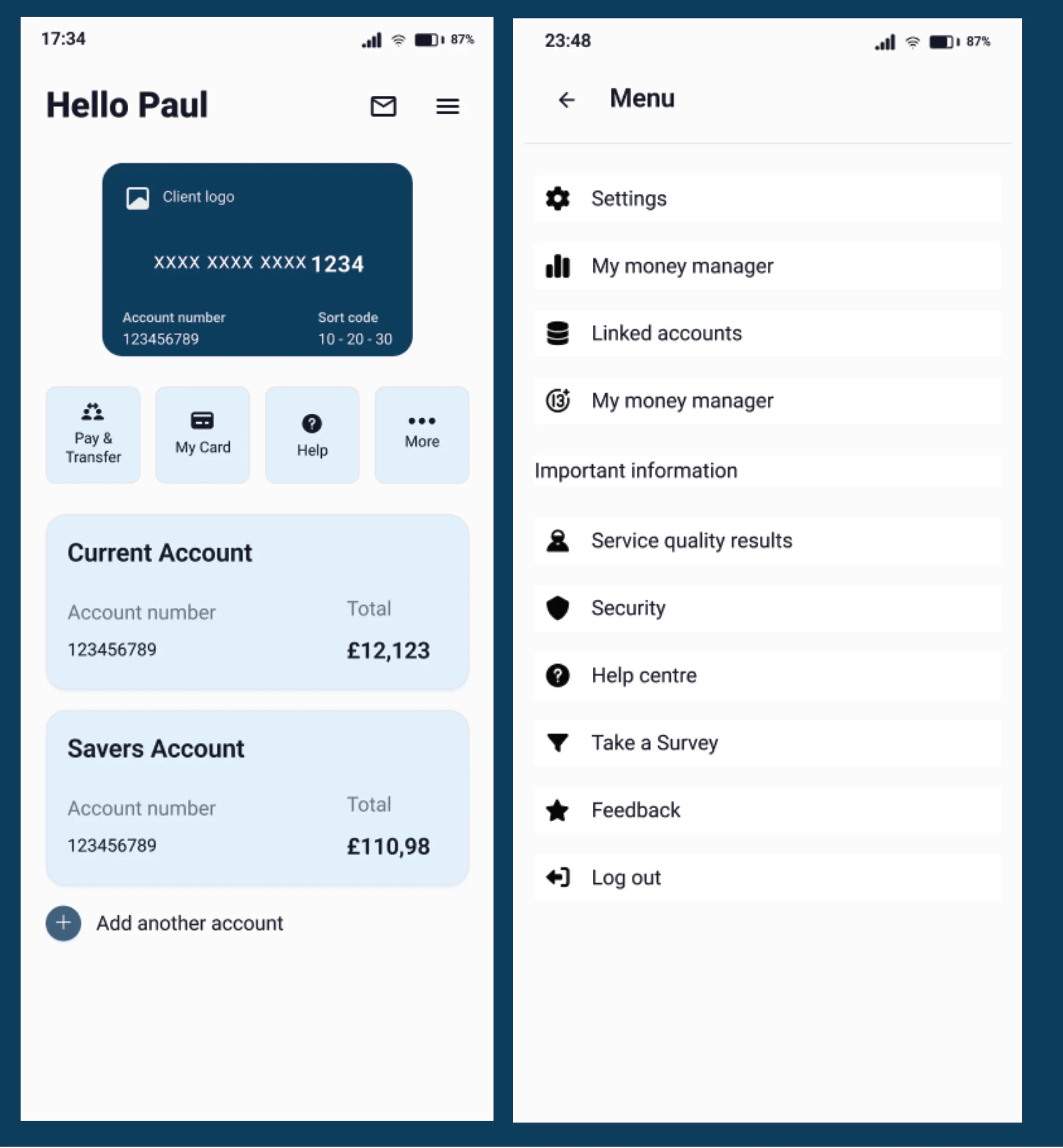
Dashboard and menu
Payments & Transfers
Before: Payments and transfers were split across different sections, causing confusion.
After: A unified Payments & Transfer flow places all money movement actions in one consistent layout.
Impact:
Fewer errors when sending money, with completion time reduced by 22%.
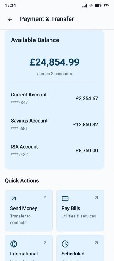
Payment & Transfer
Card Management
Before: Tasks like changing a PIN, updating limits, or replacing a card were buried and inconsistent.
After: The redesigned My Card hub centralises settings such as PIN, contactless, and card replacement in one structured space.
Impact:
30% fewer navigation errors compared to the old fragmented flows.
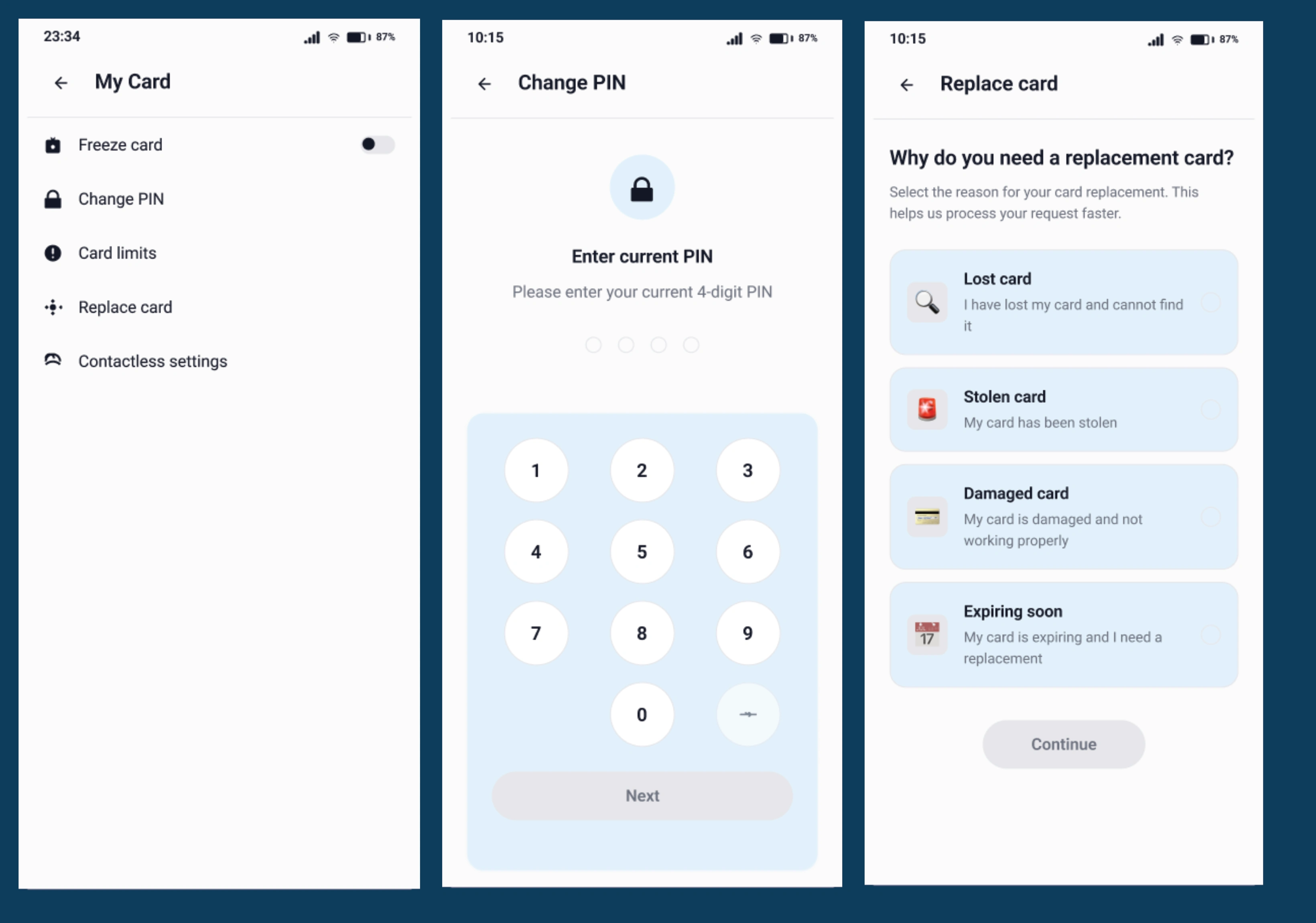
My card,Change PIN, Replace card
Investments & Savings
Before: Separate account types were hard to compare and manage.
After: Savings, ISAs, and Investments now share a consistent layout, reducing cognitive load and helping users track goals more easily.
Impact:
Users completed setup tasks 18% faster in testing.
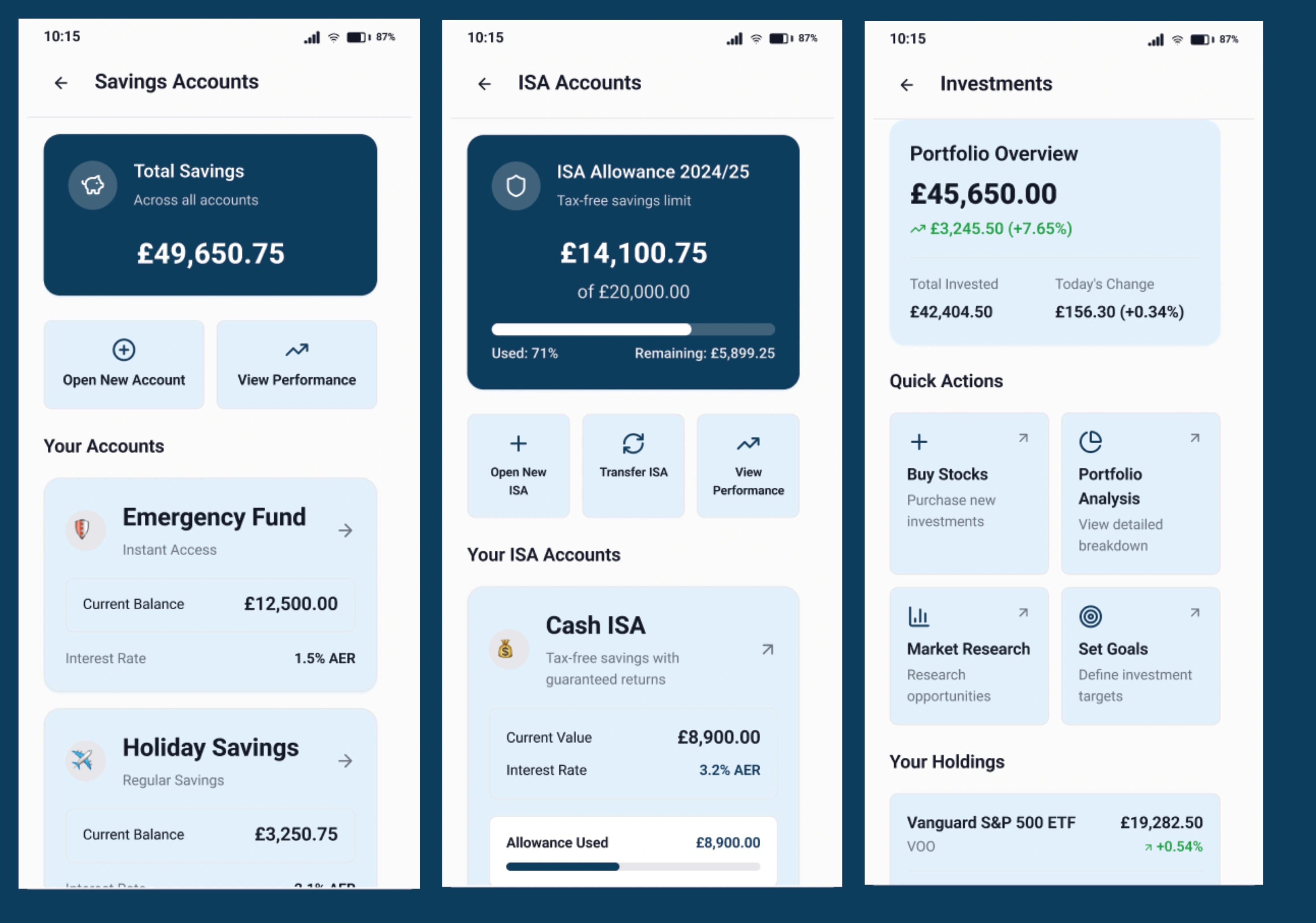
Accounts
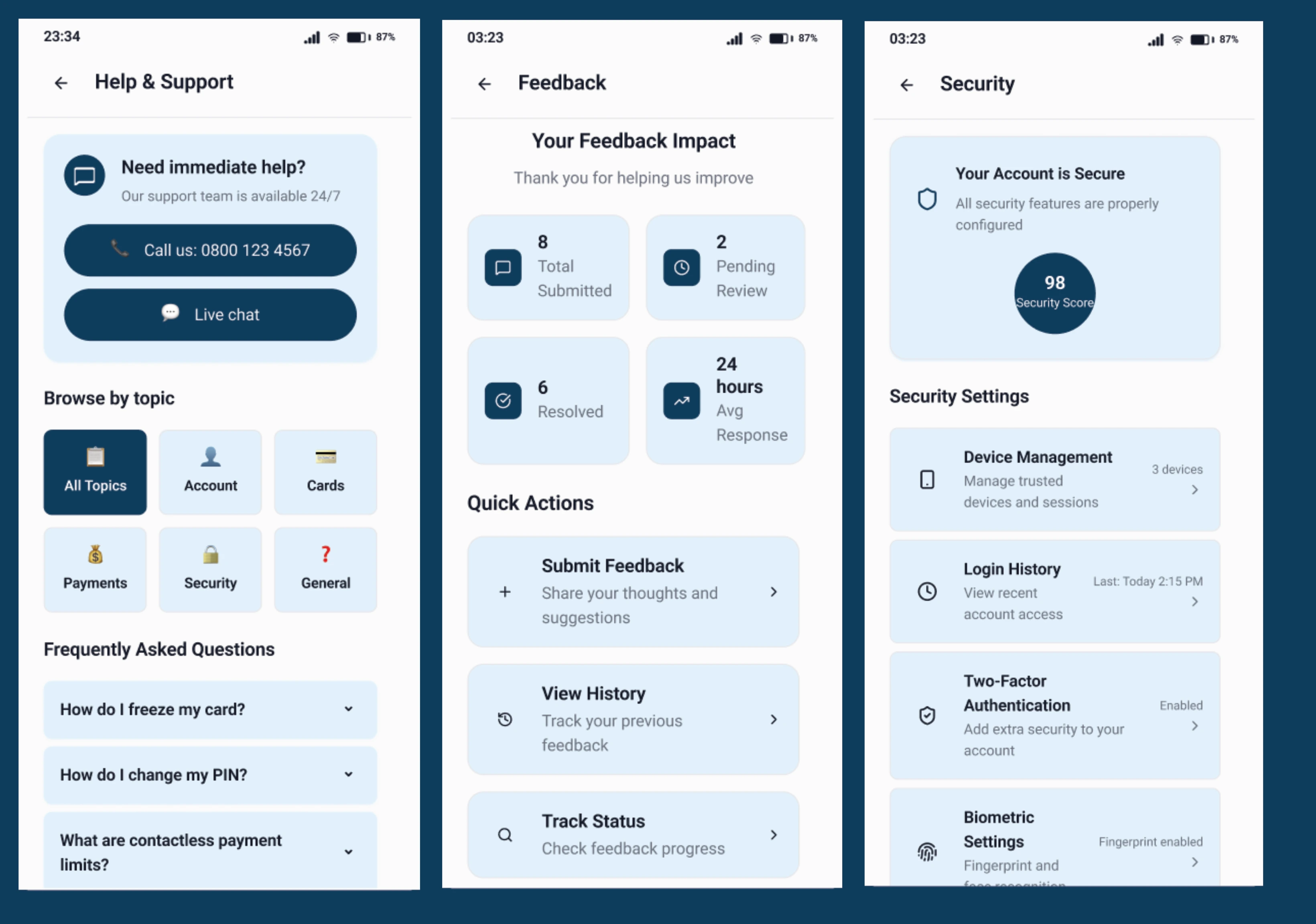
Support & Feedback
Before: Help options were scattered, and error feedback was unclear.
After: A clearer Help hub with direct access to support and a simple Feedback form encourages users to resolve issues quickly.
Impact:
Improved task completion for help flows, with error recovery up by 25%.
Help
Outcomes & Impact
The redesign delivered measurable improvements in how quickly and confidently users could manage their finances:
Faster completion: First-time login, account linking, and common tasks like payments were completed 26% faster on average.
Fewer errors: Navigation mistakes and failed actions dropped by 30%, reducing frustration and building trust in the app.
Simpler interactions: Everyday tasks such as checking balances or updating card settings required 18% fewer steps.
Accessibility compliance: Key screens and flows now meet WCAG 2.2 AA standards, improving readability, touch accuracy, and feedback for a wider range of customers.
Beyond the numbers, the redesign created a more consistent and predictable experience. By aligning navigation, standardising flows, and embedding accessibility, the app moved closer to the qualities customers expect from a modern banking product: clarity, confidence, and inclusivity.
Final Learnings
This project reinforced the value of combining customer feedback with UX evaluation and accessibility standards to guide design decisions. A few key takeaways:
Navigation is trust: In banking apps, clarity of structure directly impacts how secure and confident users feel.
Consistency reduces cognitive load: Standardising flows across tasks allowed users to move faster with fewer mistakes.
Accessibility benefits everyone: Designing for WCAG 2.2 AA not only met compliance standards but also improved overall usability.
Small gains add up: Even modest improvements in speed and error reduction had a significant effect on user satisfaction.
By approaching the redesign holistically, from early journeys to everyday flows. I created a more intuitive, inclusive banking experience that scales with both customer needs and compliance requirements.
Like this project
Posted Nov 26, 2024
Redesigned a mobile banking app to simplify navigation, reduce errors, and improve accessibility for faster, more trusted money management.