Usability study
Usability study
Recently, a usability study was conducted with five new users exploring the booking journey. The study revealed that customers with flexible dates, who navigated to the seat map page, wanted a way to identify the least busy performance within a month.

Recently, a usability study was conducted with five new users exploring the booking journey. The study revealed that customers with flexible dates, who navigated to the seat map page, wanted a way to identify the least busy performance within a month.
Business Goals
Increase Ticket Sales
By providing information on the least busy performances, the company can encourage bookings on less popular dates, potentially increasing overall ticket sales.
Optimize Seat Utilization
Spreading out attendance across performances can help optimize seat utilization, reducing the number of empty seats and maximizing revenue.
Enhance User Experience:
Improving the booking journey based on user feedback can enhance customer satisfaction and loyalty, leading to repeat business and positive word-of-mouth referrals.
Data-Driven Decisions
Gathering data on user preferences for less busy performances can help in making informed decisions about pricing, marketing strategies, and performance scheduling.
Competitive Advantage
Offering unique features that cater to user needs can differentiate the booking platform from competitors, attracting more users to the site.
User Goals
Identify the Best Performance for Their Needs
Find performances with the most available seats to accommodate their group size and preferences.
Locate the least busy date or time for a more comfortable experience, particularly for users seeking flexibility in scheduling.
Make Quick and Informed Decisions
Easily compare performance dates and times without needing to navigate through multiple pages.
View real-time availability information to make confident choices without feeling rushed or overwhelmed.
Streamline the Seat Selection Process
Navigate seamlessly to the seat map and select seats based on availability, location, and pricing.
Minimize frustration by avoiding unnecessary steps or having to start over due to unclear seat options.
Usability study insight
A usability study exploring the booking journey revealed a critical insight regarding the needs of customers with flexible schedules. These users, who were not tied to specific dates, sought an efficient way to identify the least busy performances within a given month. However, the existing system provided no high-level, comparative information about performance popularity or seat availability across dates.
This lack of visibility forced users to navigate manually to the seat map page for each individual performance, only to discover that many of their selected dates were nearly full or not optimal for their group size. This trial-and-error approach was described as “frustrating” and “time consuming,” requiring significant back-and-forth exploration to identify suitable options. Users expressed a strong preference for a solution that allowed them to view performance popularity or availability at a glance, empowering them to make faster and more confident booking decisions.
The frustration was particularly acute for those booking for groups, as they needed to find performances that could accommodate multiple adjacent seats. Without a way to quickly compare dates or assess seat availability across a broader timeframe, these users often abandoned the process or experienced a negative perception of the system’s usability.
User persona
Name: Emma Johnson
Age: 34
Occupation: Marketing Manager at a mid-sized company
Location: Suburban area; commutes regularly to a nearby city for work
Income: $65,000 annually
Education: Bachelor’s degree in Business or Marketing
Tech Proficiency: Moderate to high; regularly uses digital tools for both personal and professional purposes.
Goals
Find the Ideal Performance with Minimal Effort
Quickly identify less busy dates or times to enjoy a stress-free experience.
Compare performance options across multiple dates at a glance without having to navigate extensively.
Efficient Seat Selection
Easily locate and select seats that accommodate her group’s preferences and size.
Understand availability and pricing clearly through intuitive visuals.
Complete Transactions Confidently
Ensure the booking process is smooth and error-free, with clear payment methods and confirmation steps.
Feel reassured that the seats selected are optimal and the purchase process is secure.
Enjoy a Frictionless User Experience
Avoid unnecessary backtracking or repetitive tasks when exploring performance options.
Access real-time information and availability to avoid disappointment or missed opportunities.
Behavior Patterns
Event Planning Habits:
Attends cultural and entertainment events such as theater performances, concerts, and art exhibitions at least once a month.
Prefers to plan outings with friends or family, often purchasing tickets for groups of 2-4 people.
Balances planned outings with occasional last-minute bookings based on availability and mood.
Decision-Making
Flexible with dates but values efficiency in finding the best performance to match her schedule.
Places importance on having clear information about seat availability and event popularity.
Tends to make decisions quickly when provided with well-organized, comparative data
Pain Points
Lack of High-Level Information
Finds it frustrating to click through individual performance dates to assess availability.
Would prefer a feature that highlights the least busy dates for flexible planning.
Group Booking Challenges
Experiences difficulty ensuring that all members of her group can be seated together due to unclear availability or seat selection options.
Cumbersome Navigation
Dislikes having to repeatedly navigate between calendar, seat maps, and payment pages, which disrupts her flow.
User scenario
Emma is planning an evening outing with three friends. She’s flexible with dates within a two-week timeframe and hopes to find a performance with good availability so the group can sit together. Emma starts browsing options on her phone during her lunch break but switches to her laptop when ready to complete the booking. She values a quick and intuitive experience that allows her to identify less crowded performances, choose seats, and complete the transaction efficiently.
Wireframe
Wireframes


Low fidelity design
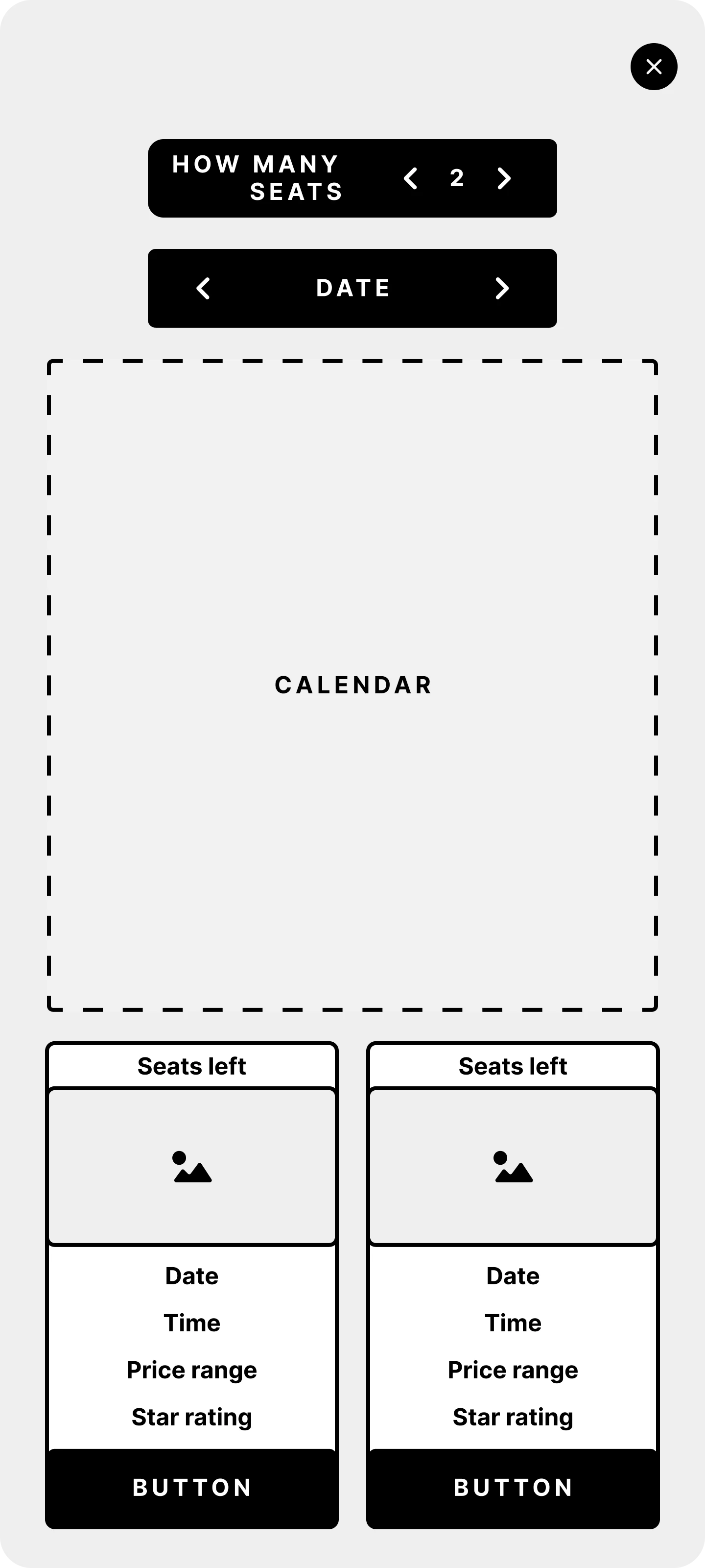
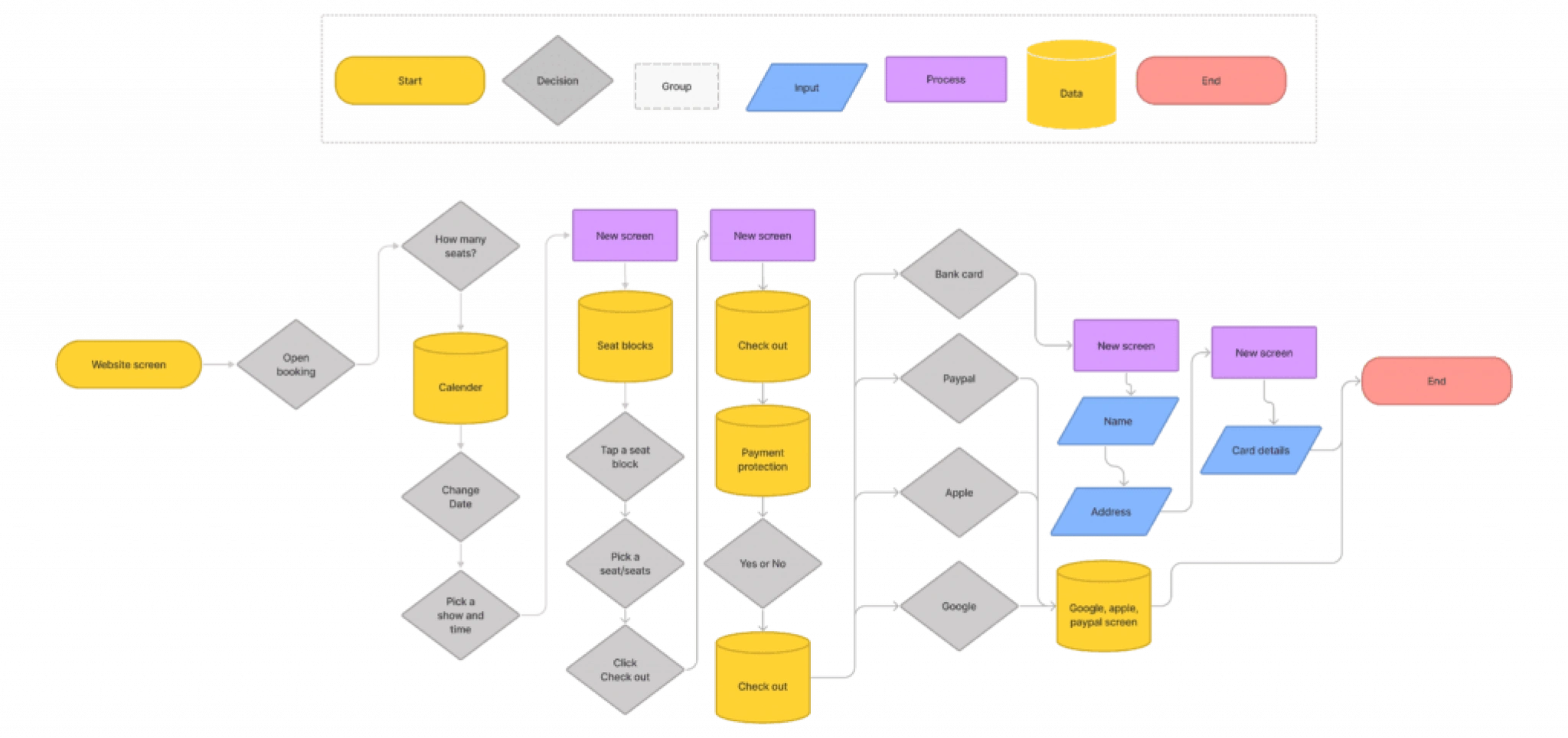
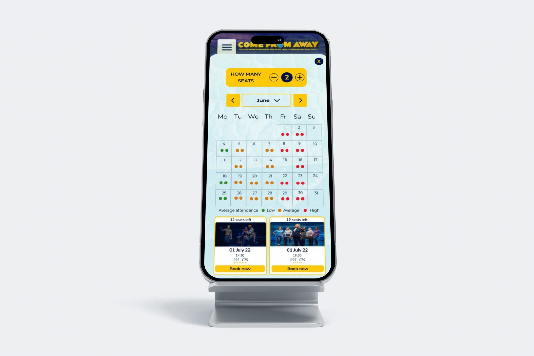
After several iterations and refinements, we finalized a solution that allows users to input the number of seats they need and select the month they wish to book for. Once applied, the interface dynamically updates to display availability using a dot indicator system. This system uses three color-coded dots to represent performance popularity levels for each day of the month:
Least popular days (low attendance on average).
Moderately attended days (average attendance levels for the month).
Busiest days (high attendance on average).
If no seats are available for a particular day, no dots are displayed, ensuring users can quickly identify suitable options.
When a user clicks on a specific day, they are presented with two cards, one for each available show on that day. Each card includes:
The remaining seats available for the selected quantity.
The day and date to reinforce their selection.
The time the show starts.
The price range for the tickets available.
A star rating to indicate the show’s popularity or quality.
A clickable button at the bottom for navigation to the next step, though the entire card is also clickable for ease of use.
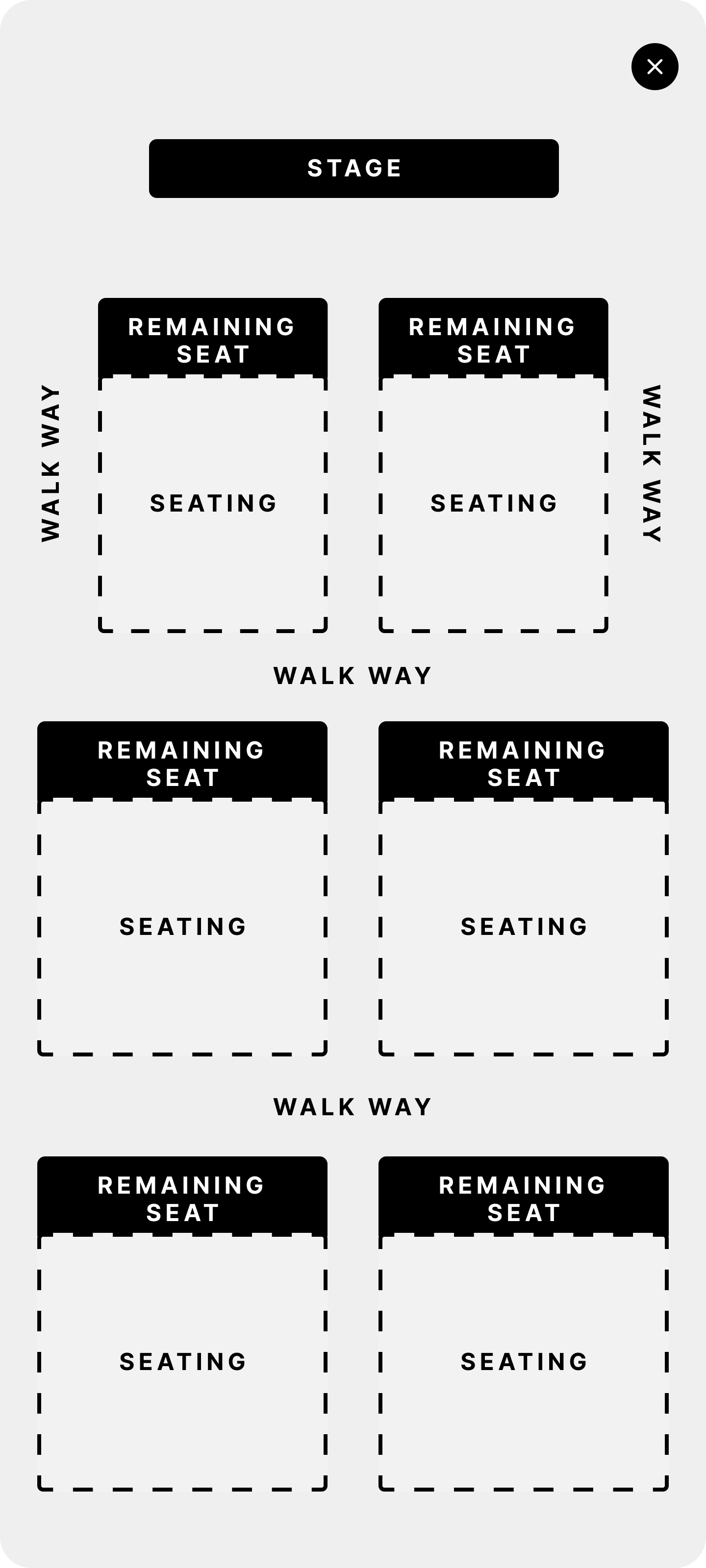
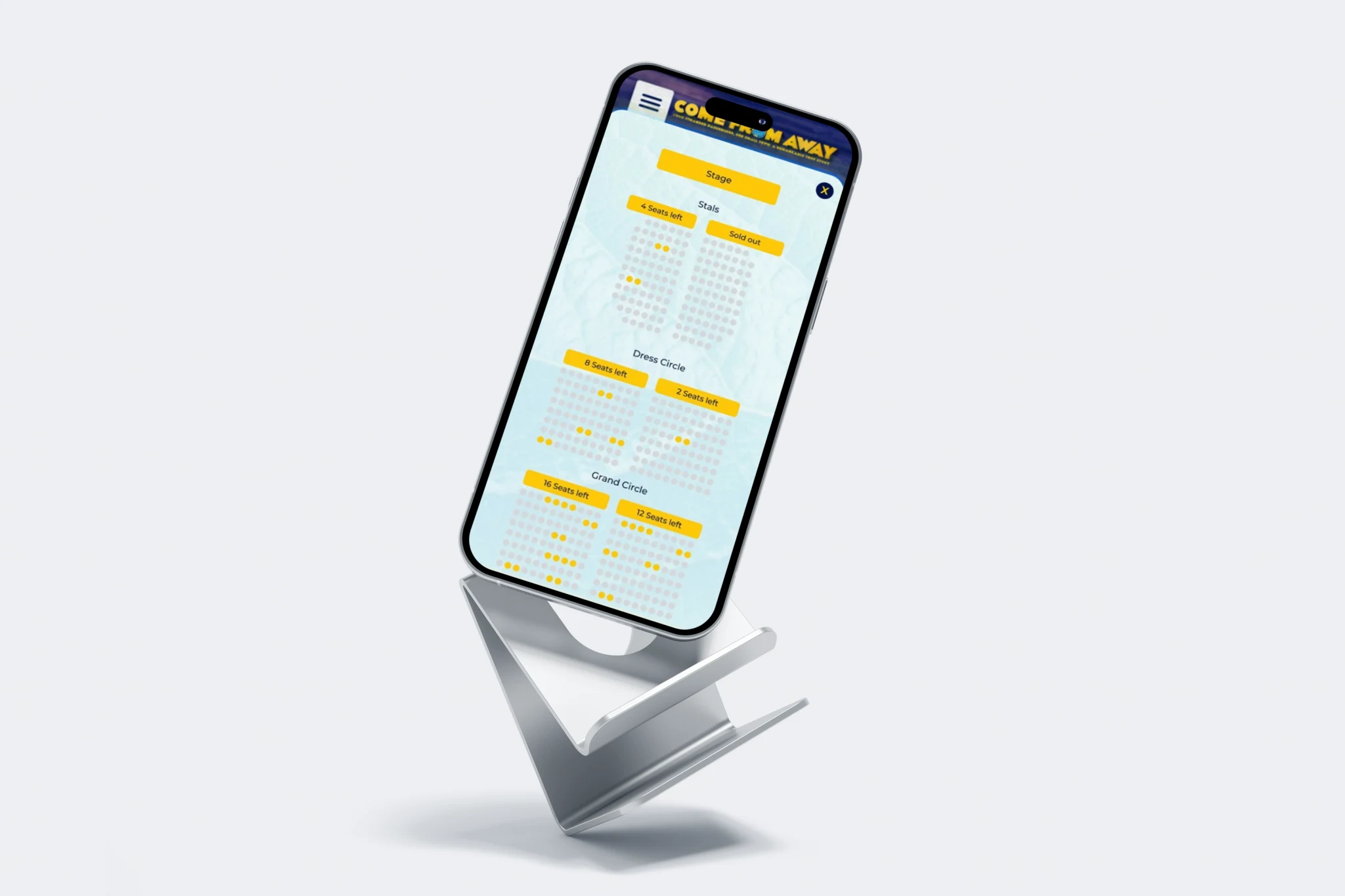
When users navigate to this screen, they are presented with a visual representation of the available seats. Each section displays the total number of remaining seats, allowing users to easily identify and select sections with fewer occupied seats if they prefer less crowded areas.
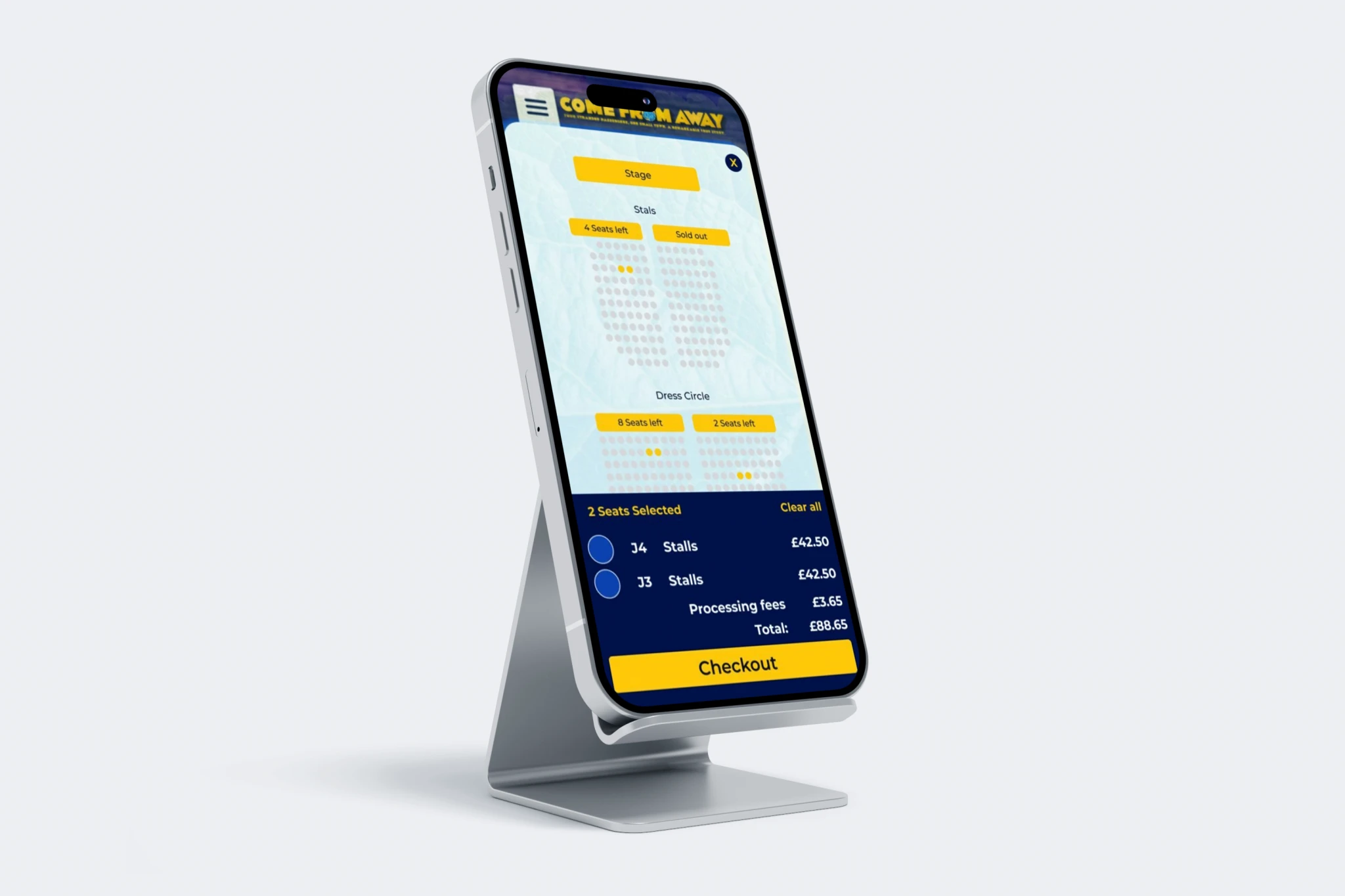
If users want a closer look at a specific section, they can either click on the section to open it or use pinch-to-zoom gestures to enlarge the area on their screen for better visibility. Once users select their desired seats, a basket summary pops up
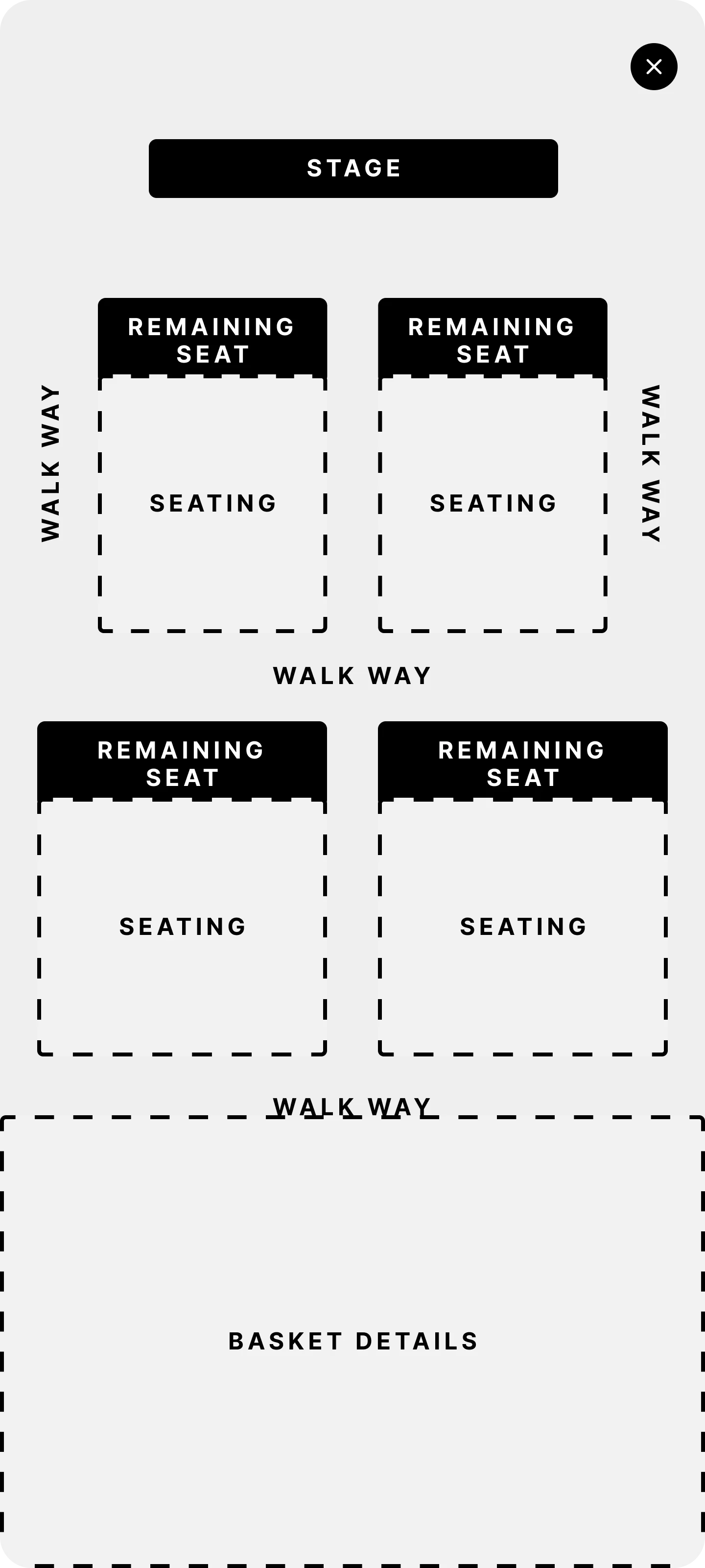
Once the basket pops up, the user will see a summary of their selected seats, including the seat numbers, the section they belong to, and the full price for each seat. The basket also displays the processing fees and the total amount for the booking. If the user is satisfied with their selection, they can click the Checkout button to proceed to the next page and complete their purchase.
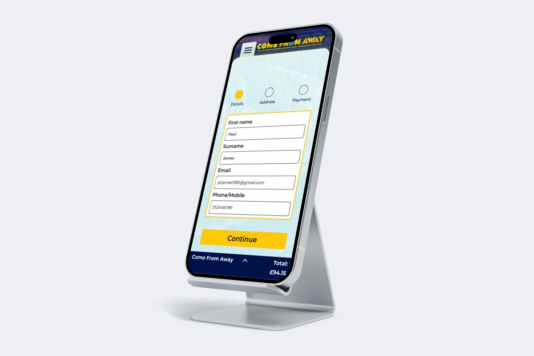
The user can choose from multiple payment options, including Google Wallet, Apple Pay, PayPal, or a bank card. If the user selects to pay by bank card, they will need to provide essential details, including their first name, surname, email address, and phone number. Once this information is entered, they can proceed to the next step in the payment process.
For users choosing Google Wallet, Apple Pay, or PayPal, the system will automatically use the details associated with their chosen payment method, enabling a faster and more seamless checkout experience.
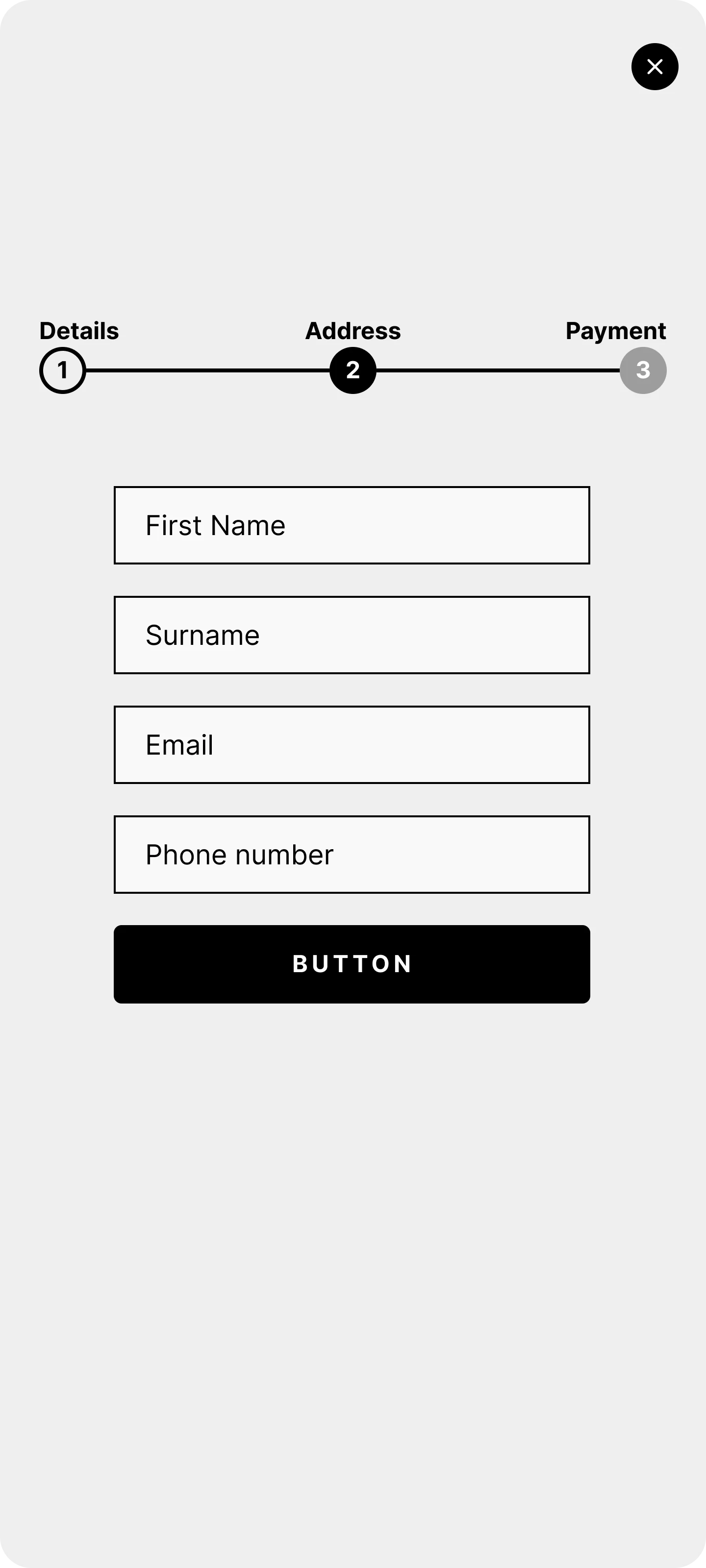
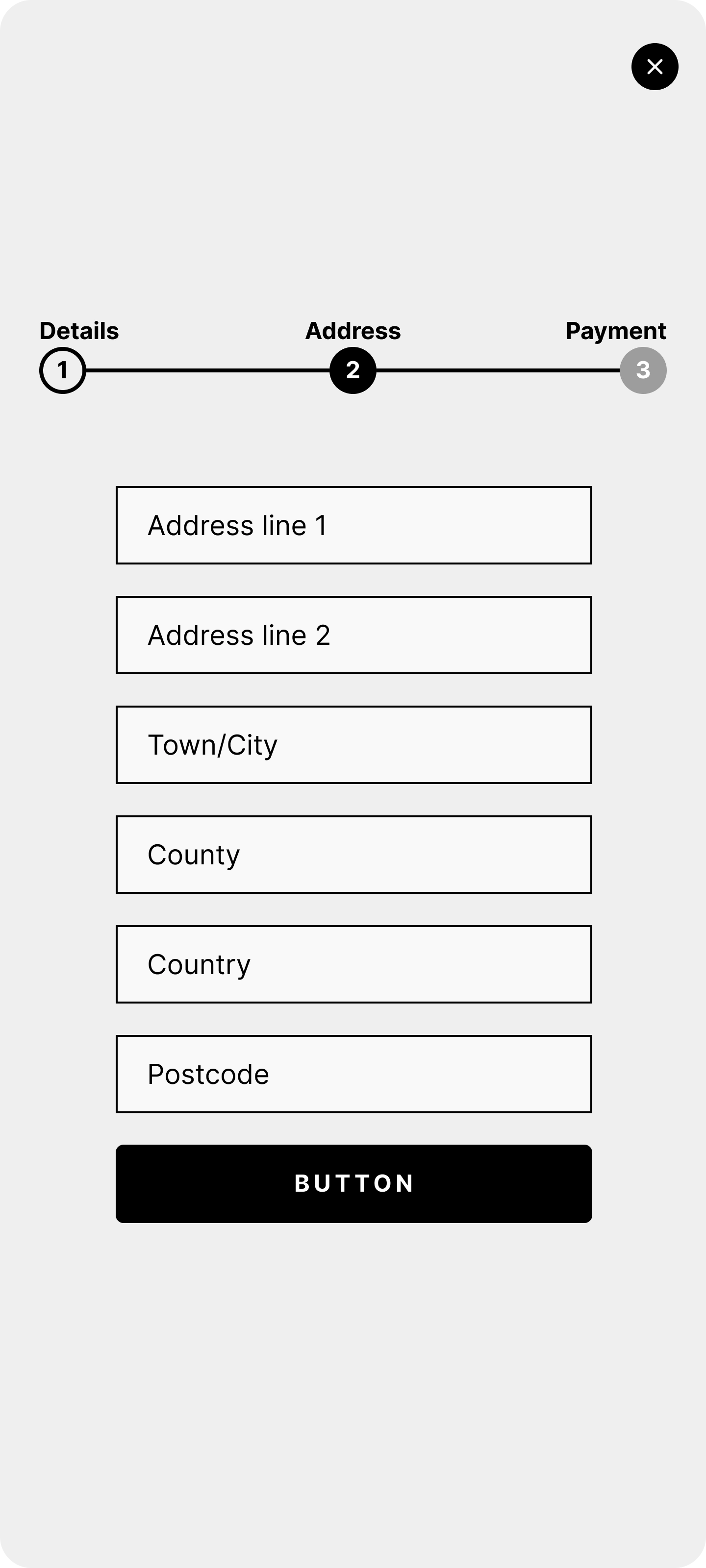
In the next step, we require the user to provide their address details to process their bank card payment. This information is necessary to ensure the payment is authorized, as the address must match the billing address associated with their bank account. Without this matching information, the payment cannot be processed.
In the final step, the user is required to enter their card details and click the Submit Payment button. The payment will be successfully processed as long as the name and address provided in the previous steps match the information associated with their bank account. If the entered details do not match the bank account, the payment will fail, and the user will need to review and correct the information.
Final designs
Conclusion
We primarily assessed the success of our design through qualitative methods, including usability testing and follow-up interviews. These evaluations demonstrated that our updates not only met but exceeded expectations, particularly in improving the ticket purchasing process and enabling users to easily discover proximity based information about remaining seats. Overall, the features we implemented were consistently described as helpful and highly effective, significantly enhancing the booking experience. Based on this feedback, I am confident that we successfully achieved the goals outlined in the project brief.
Copyright © UX designer Paul James 2024
Like this project
Posted Nov 25, 2024
Recently, a usability study was conducted with five new users exploring the booking journey. The study revealed that customers with flexible dates
Likes
0
Views
3


