Lca calculator design
LCA Calculator Kick-off
We started the project by having our first workshop to help understand what the project was:
Product name: Portfolio Pro
What is the product: Detailed information about the product and what it will do.
1. An LCA calculator that helps companies understand the environmental impacts of their products or services from cradle to grave, including resource extraction, production, use, and disposal.
Benefits and value: Main benefits for users and how the product solves a problem
1. To meet sustainability goals and reduce their carbon footprint, aligning with corporate social
responsibility (CSR).
2. To comply with environmental regulations and standards set by governments and industry bodies, such as ISO 14040 and ISO 14044.
3. To gain a competitive edge by demonstrating a commitment to sustainability, which can appeal to environmentally conscious consumers and investors.
Target audience: Who is this product for and why
1. Portfolio Pro is designed for companies aiming to comply with government regulations and those committed to sustainability, ensuring their products have the least possible impact on the environment.
Business Objectives:
The information we got from the workshop helped us understand the business needs.
1. Position Portfolio Pro as a user-friendly LCA tool that caters to both experts and non-experts.
2. Attract new clients and retain existing ones by offering an intuitive, efficient, and LCA solution that meets diverse user needs.
3. Increase profitability through subscription models, licensing, or consultancy services associated with the tool.
4. Enhance Anthesis's standing as a leader in sustainability solutions by delivering a high-quality, reliable product.
5. Develop a platform capable of handling large data amounts, from small assessments to large, complex assessments, to accommodate a broad user base.
User needs:
1. Provide a straightforward, easy-to-navigate interface that doesn’t require extensive training, for users with different levels of expertise.
2. Offer step-by-step assistance throughout the LCA process to help non-experts understand and complete assessments.
3. Present data and results through clear, concise visualizations to facilitate informed decision-making.
4. Allow users to input specific data relevant to their products and operations.
5. Ensure the tool covers all key aspects of LCA, including inventory analysis, and impact assessments.
Competitor research:
Ecochain Helix
Ecochain Helix aims to help manufacturing companies measure and improve the environmental footprint of large-scale production facilities and product portfolios. It is best for experienced LCA practitioners and offers support for bulk LCA creation and environmental performance dashboards.
Sphera GaBi
Sphera GaBi is a well-established LCA tool known for its extensive capabilities and suitability for LCA experts. It provides comprehensive tools for sustainable product development and supports various standards for LCA, life cycle costing, and reporting. GaBi is particularly favoured in its home market of Germany and offers numerous add-ons for detailed analyses.
OneClickLCA
OneClickLCA is specialized in the construction industry, providing tailored functionalities for building materials and construction projects. It supports certifications like LEED, DGNB, and BREEAM, making it a strong choice for experienced practitioners in the construction sector. The tool excels in modelling, reporting, and analysing the environmental impact of construction activities.
OpenLCA
OpenLCA is a free, open-source LCA software suitable for users with a technical background. It offers deep-dive functionalities, including the ability to adjust LCI datasets to match specific production processes. OpenLCA is versatile and allows for extensive environmental impact assessments, making it a good option for those seeking a cost-effective solution.
Empathy map
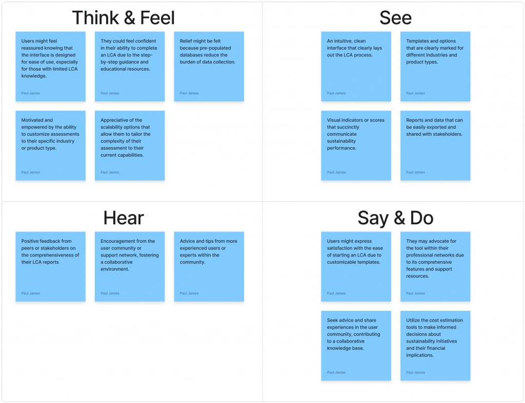
Problem Statement
The problem with current LCA calculators is that they are very hard to use unless you have expert knowledge. Our goal is to design an LCA calculator for non-LCA experts and LCA experts.
User personas
Name: Sarah Thompson
Age: 34
Occupation: Sustainability Manager at a mid-sized manufacturing company
Background:
Holds a degree in Environmental Science.
Oversees the company’s sustainability.
Limited experience with technical LCA tools.
Challenges:
Finds existing LCA tools complex and time-consuming
Needs a solution that doesn’t require extensive training
Requires clear visualizations to communicate findings effectively
Goals:
Assess the environmental impact of the company’s products
Identify areas for improvement to meet sustainability targets
Generate reports for internal stakeholders
User scenario
Sarah needs to evaluate the carbon footprint of a new product line. She logs into Portfolio Pro and is guided through the LCA process with step-by-step instructions. The intuitive interface allows her to input necessary data without confusion. Upon completion, the tool generates a comprehensive report with clear visualizations, which she presents to the team to discuss potential sustainability improvements.
Storyboards
We created mood boards to serve as inspiration for developing storyboards. From these, we selected three storyboards with the most potential and presented them to the team for feedback. After reviewing the options, we decided on the storyboard to move forward with:
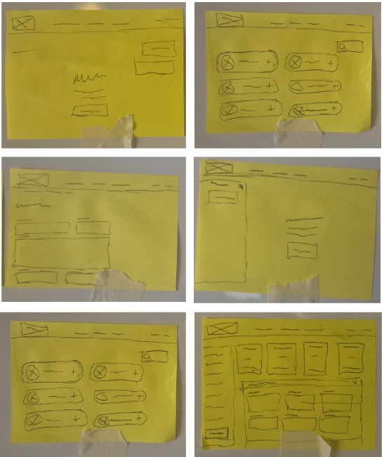
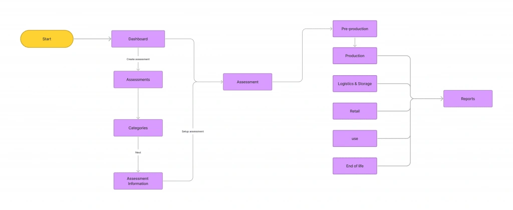
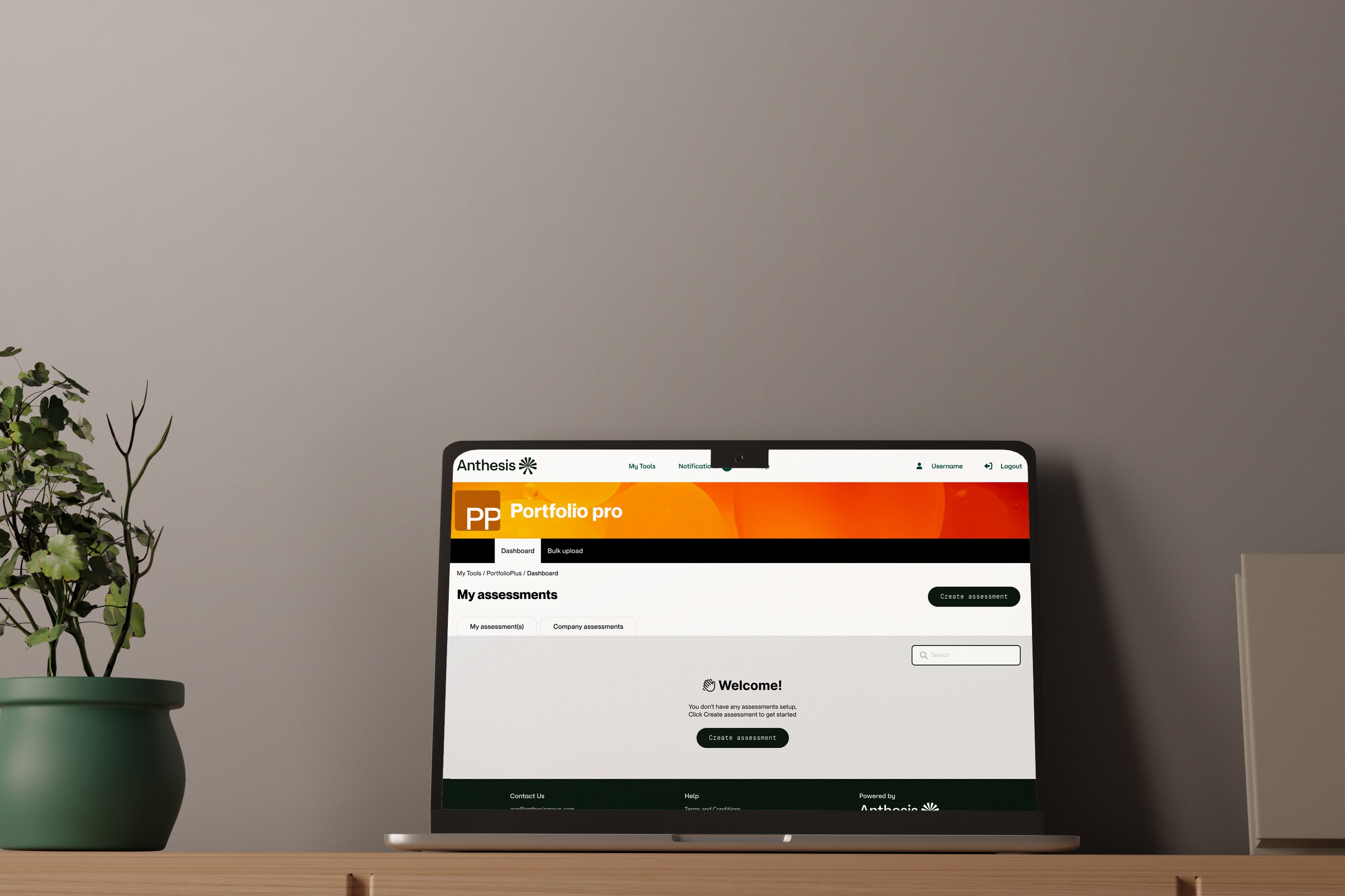
When a user first lands in Portfolio Pro, they are greeted with a welcome message explaining how to set up their first assessment. Upon clicking the CTA, they are redirected to the template page, where they can either select a predefined template or create their product from scratch. Once they make a selection, they are taken to the assessment information page to input details about their assessment. After completing this step, the user clicks the CTA to finalize the assessment setup.
After the assessment is set up, the user is redirected to their newly created assessment. If they set up the create your own assessment, they will see a message prompting them to add components to their assessment. Clicking the accompanying CTA redirects them to the component page, where they can add the components that make up their product. Once all components have been added, the user can return to the assessment to fill out the required information for their product.
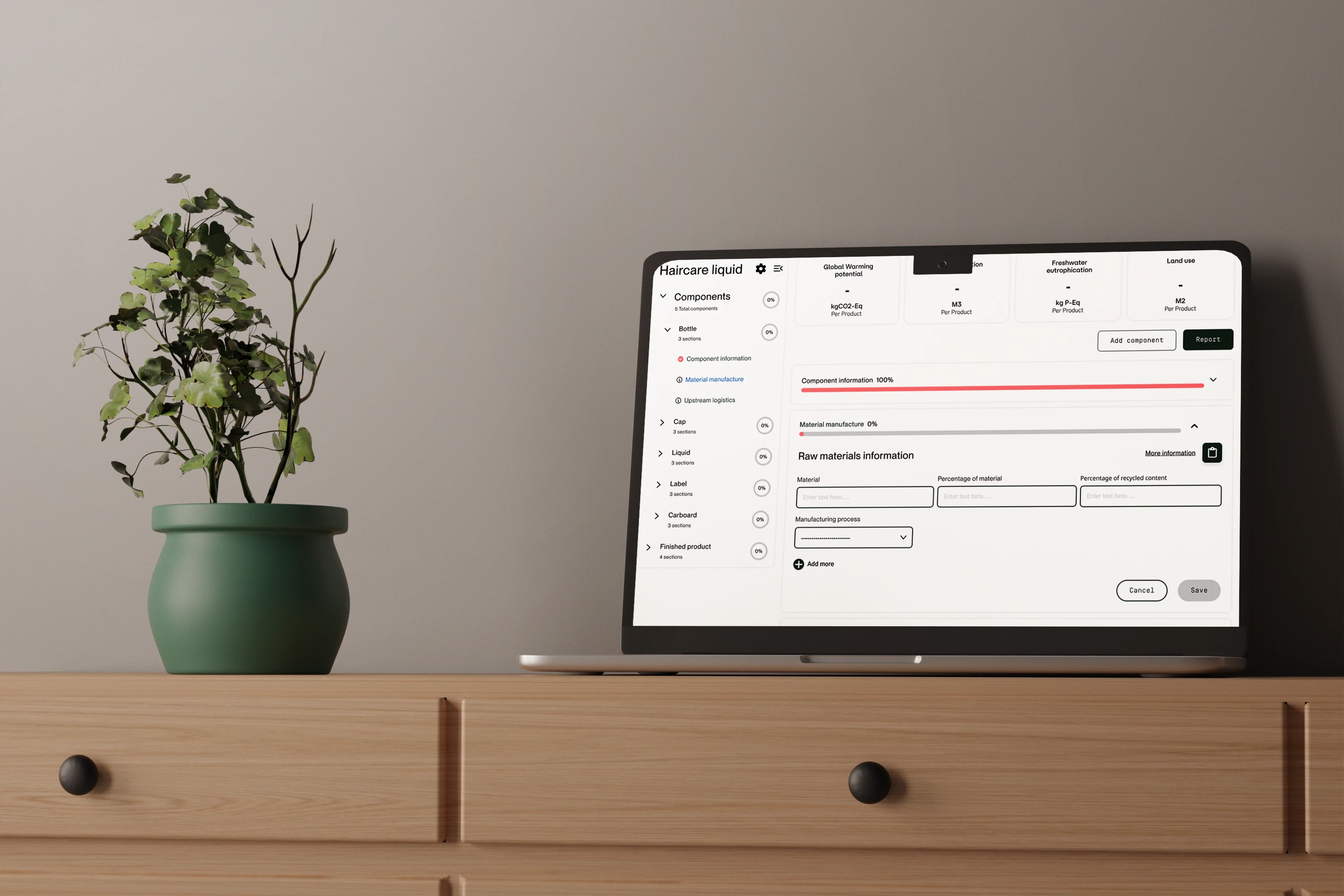
From the side menu, users can access and complete information for each component, with live numbers displayed at the top of the assessment as they input data. Once all information is completed, the user can proceed to the report page to review their assessment.
User flow
Wireframes
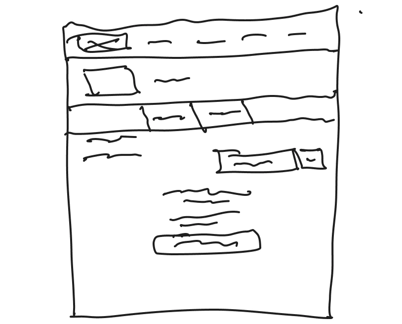
Low fidelity design
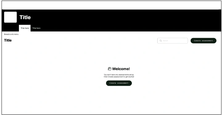
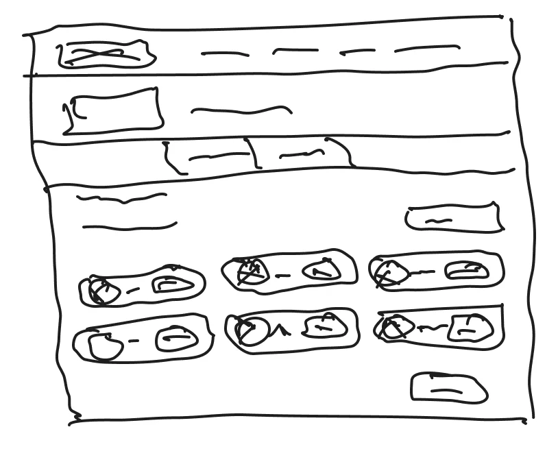
When users first log in to the LCA calculator, they will see a welcome message informing them that no assessments have been set up yet. To get started, they are prompted to click a ‘Create an Assessment’ CTA, which is displayed both under the welcome message and on the right-hand side of the page. This ensures that once the user creates their first assessment and the welcome message disappears, they can still easily find the CTA.
After users have created multiple assessments, a search box becomes available to help them quickly locate specific assessments. Additionally, at any stage, while using the software, if a user feels lost, a breadcrumb navigation is provided just below the secondary navigation bar, allowing them to see their current location and previous steps.
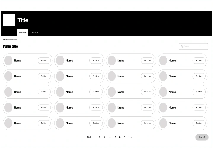
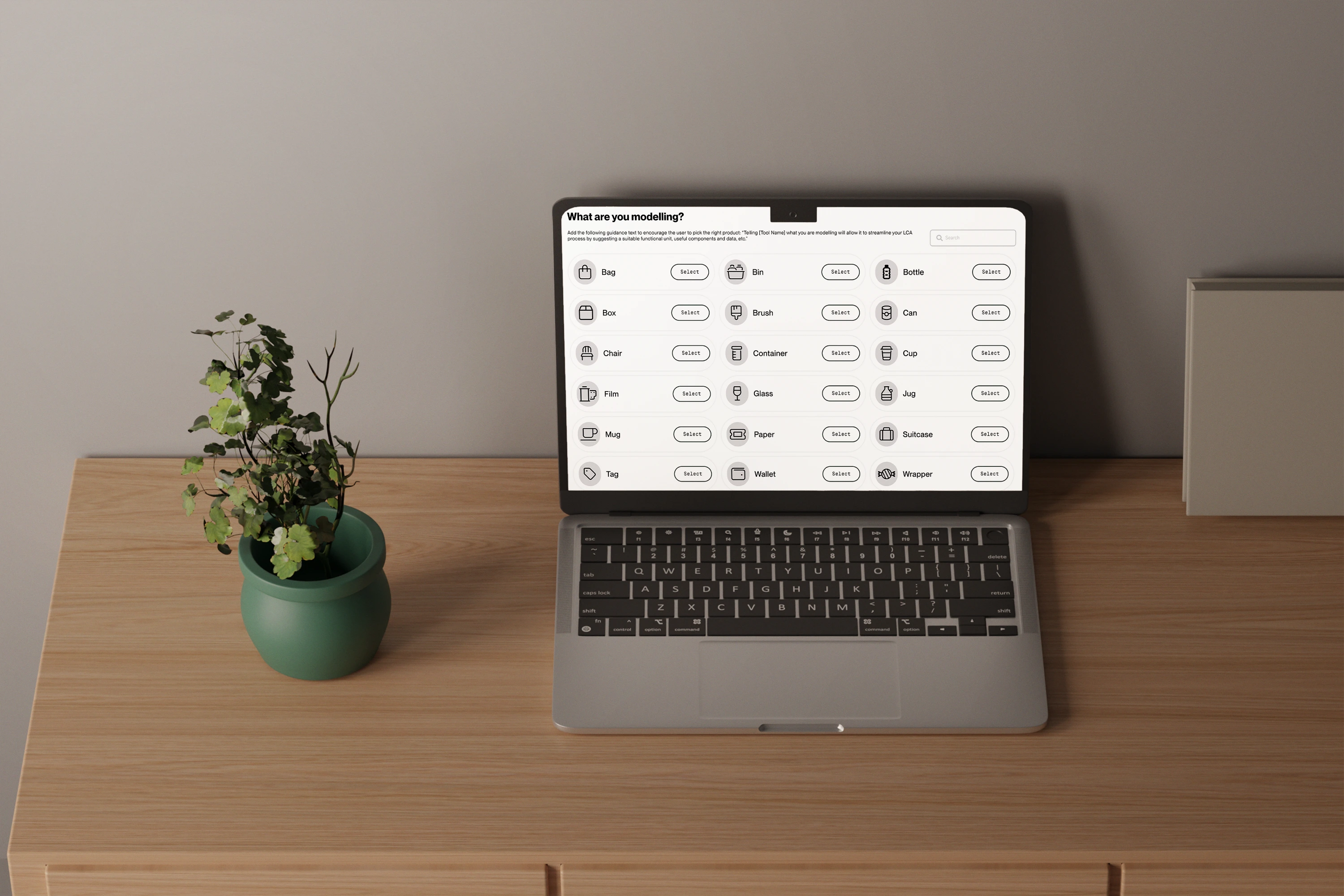
When users enter the flow for creating an assessment, they are presented with a list of templates. Each template is displayed with an image representing it, the template’s name, and a CTA that users can click to proceed to the next page. To make navigation easier, users can utilize the search box to quickly find a specific template instead of browsing through all the pages.
If the system doesn’t have a template for their product, users have the option to create their own. Should a user decide not to proceed with setting up the assessment, they can click ‘Cancel,’ which will redirect them back to the dashboard without creating an assessment. If the user selects a template by clicking its CTA, they will be redirected to the assessment information page to continue the setup process.
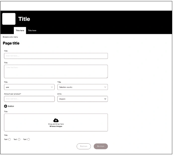
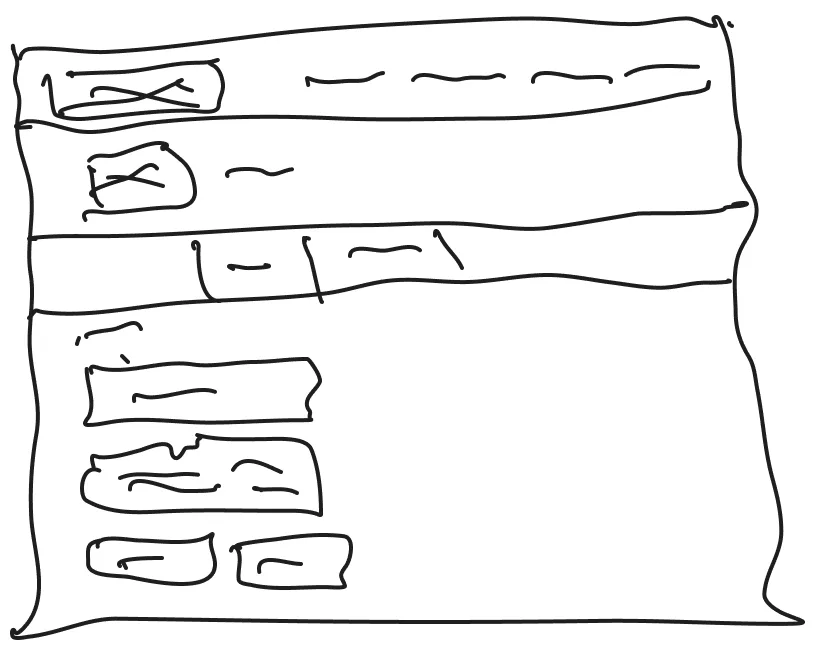
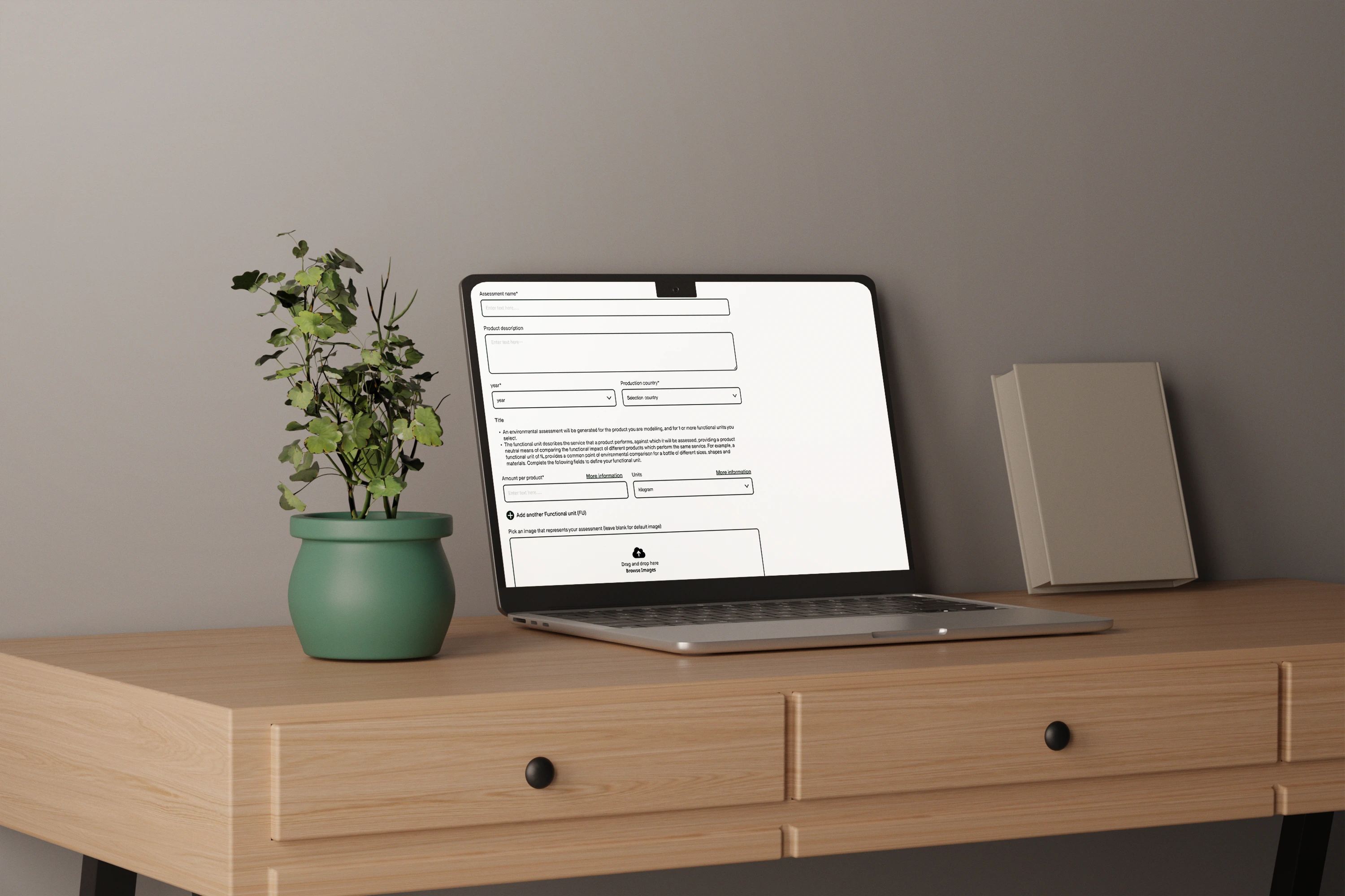
When users land on the assessment information page, they are required to fill out details about their assessment. This includes information that helps them easily identify the assessment from a card view, so they don’t have to click into the assessment to understand what it is.
Once all the information has been entered the user can click the cta to finish setting up the assessment or they can cancel and be redirected back to the dashboard without the assessment being set up.
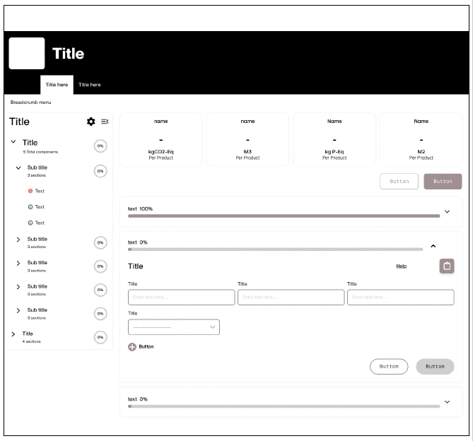
Depending on the template the user selects, the content within their assessment will vary. If the user chooses to create their own product, they will see a prompt asking them to add components and will be redirected to the component screen, which resembles the template selection screen. If the user selects a predefined template, the components specific to that template will automatically be added to their assessment.
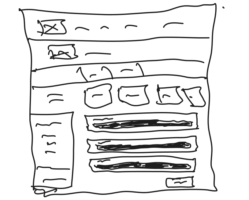
On the left-hand side, users will see a menu listing their components, providing quick access for navigation between components. When a user selects a component, they will be presented with different sections of information that need to be filled out. As the user completes these sections, live numbers at the top of the page will update in real-time, showing the environmental impact indicators for their product.
Once a section is filled out, users can save their progress and move to the next section. If they choose, they can cancel their changes, reverting the section to its previous state. If users need assistance, they can access a help section for guidance on formatting or use the built-in notepad to leave notes for themselves or other team members. These notes can include questions, that one of our experts can respond to directly.
After all required information has been completed, users will be directed to the report page for that assessment.
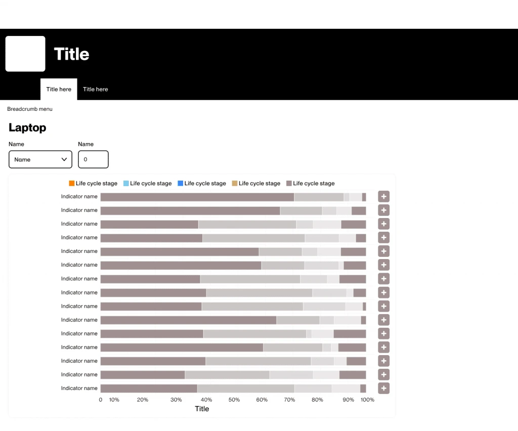
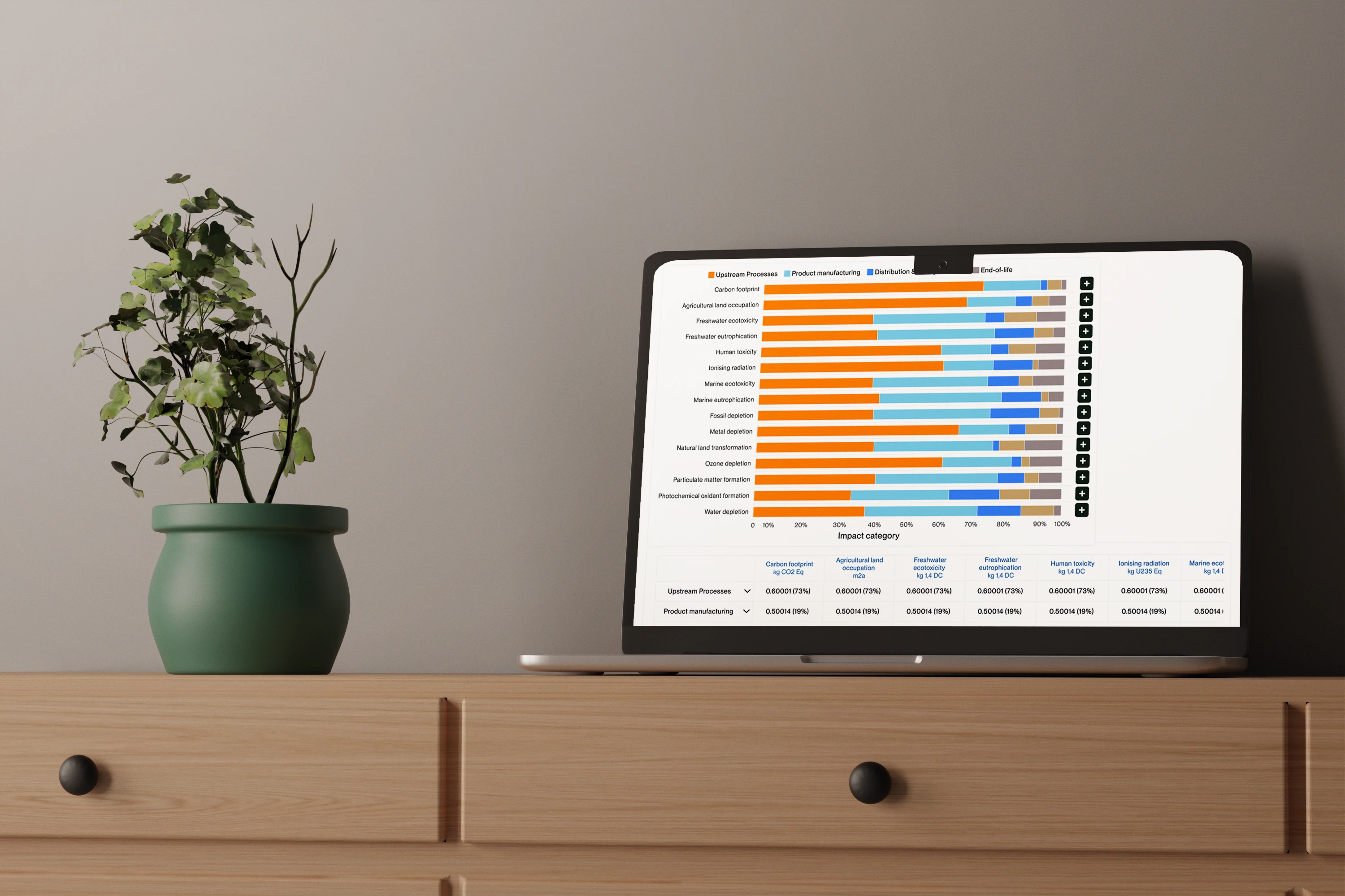
We conducted usability testing on two different navigation designs for interacting with the charts.
The first design allowed users to click a plus icon to expand the next section within the same chart. However, due to the large volume of data across years and indicators, users found it difficult to understand their location within the chart when multiple indicators were expanded in the same view.
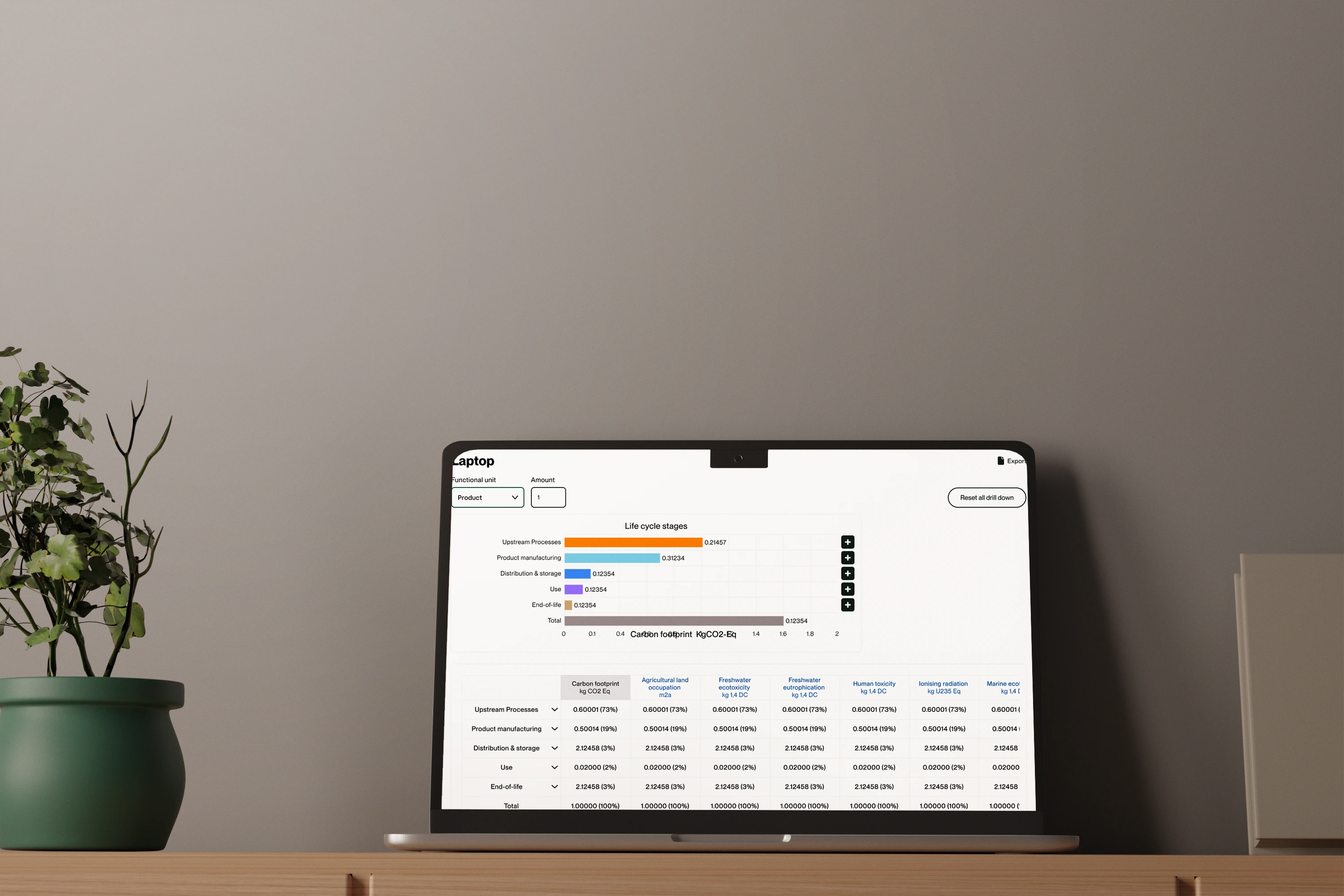
The second design maintained the same chart layout but navigated to a separate page when the plus icon was clicked. This page displayed only the life cycle stages within the selected indicator and allowed users to drill down further, all the way to the material level. This approach provided a more focused and manageable view for users.
During testing of the second design, it was highlighted that adding a back button and a ‘Reset All Indicators’ option was essential. Without a back button, users who wanted to return to a previous stage would have to reset all indicators and navigate through the drill-down process again, which hindered the user experience. Adding these features significantly improved usability by allowing users to return to a single stage or reset all drill-downs as needed.
Another suggestion that emerged was to include a pivot table option for users who prefer to view only the numerical data. Additionally, an export feature was requested to enable users to download the data for further analysis outside the system.
Final Designs
Challenges faced in designing the LCA calculator
The main challenges arose during the workshops. When discussing the tool with our experts, they would sometimes delve into very technical details. This required us to continually remind them that the tool is also intended for non-experts, and therefore, must remain accessible and straightforward.
One particular challenge was ensuring that the language and instructions used in the tool were comprehensible to users without a technical background. Experts often assume a certain level of prior knowledge, which is not always the case for all users. We had to emphasize the importance of clarity and simplicity in the design and functionality of the tool.
Additionally, we explained to our experts that while the tool should cater to their advanced needs, it must also provide an intuitive experience for beginners. Striking this balance required careful consideration and constant feedback during the development process. Our goal was to create a tool that feels approachable to non-experts, yet robust and professional for those with more experience.
Like this project
Posted Nov 26, 2024
In the current market, existing Life Cycle Assessment tools are often complex and require specialized expertise, making them inaccessible to many organizations


