Drive Subscriptions and Retention
Intro
The development of the comparison report for the LCA calculator began with a collaborative kickoff led by the product manager. This feature is designed to empower users to compare up to five assessments, with one serving as the benchmark for evaluating the others, delivering clear and actionable insights.
To ensure accuracy and relevance, the project is supported by a team of Life Cycle Assessment (LCA) specialists. Their deep expertise with industry-standard LCA calculators brings invaluable insights, guiding the design and development of a comparison tool that meets user needs and aligns with market expectations.

ux design focus group
Business requirements
Increase User Engagement
Encourage users to interact more frequently with the Portfolio Plus platform by providing valuable comparison insights.
Enhance User Satisfaction
Improve the overall user experience by offering a comprehensive and easy-to-use comparison tool, leading to higher satisfaction and loyalty.
Differentiate the Product
Set Portfolio Plus apart from competitors by offering unique and advanced comparison capabilities.
Drive Subscriptions and Retention
Boost subscription rates and retain existing users by demonstrating the added value of the comparison report feature.
Leverage Expert Knowledge
Utilize the expertise of LCA experts to ensure the accuracy and credibility of the comparison tool, enhancing the product’s reputation.
Support Decision Making
Aid businesses in making informed decisions based on thorough and reliable assessment comparisons, thus reinforcing the platform’s value proposition.
User Goals
Effortless Comparison
Easily compare multiple assessments clearly and concisely without requiring extensive manual effort.
Benchmarking
Use a benchmark to measure and evaluate other assessments, providing a standard for comparison.
Comprehensive Insights
Gain detailed insights and understand the differences between assessments to make well-informed decisions.
User-Friendly Interface
Navigate the comparison tool with ease, thanks to an intuitive and well-designed user interface.
Access to Expert Knowledge
Benefit from the inclusion of insights and best practices from LCA experts to ensure accurate and relevant comparisons.
Customization
Customize comparisons to meet specific needs and preferences, such as selecting different benchmarks or assessment criteria.
Time Efficiency
Save time by having a tool that quickly generates comprehensive comparison reports without the need for extensive manual analysis.
COMPETITOR RESEARCH
Ecochain Helix
Ecochain Helix is aimed at manufacturing companies to measure and improve the environmental footprint of large-scale production facilities and product portfolios. It is best for experienced LCA practitioners and offers support for bulk LCA creation and environmental performance dashboards.
Sphera GaBi
Sphera GaBi is a well-established LCA tool known for its extensive capabilities and suitability for LCA experts. It provides comprehensive tools for sustainable product development and supports various standards for LCA, life cycle costing, and reporting. GaBi is particularly favoured in its home market of Germany and offers numerous add-ons for detailed analyses.
OneClickLCA
OneClickLCA is specialized for the construction industry, providing tailored functionalities for building materials and construction projects. It supports certifications like LEED, DGNB, and BREEAM, making it a strong choice for experienced practitioners in the construction sector. The tool excels in modelling, reporting, and analysing the environmental impact of construction activities.
OpenLCA
OpenLCA is a free, open-source LCA software suitable for users with a technical background. It offers deep-dive functionalities, including the ability to adjust LCI datasets to match specific production processes. OpenLCA is versatile and allows for extensive environmental impact assessments, making it a good option for those seeking a cost-effective solution.
Problem statement
Businesses often struggle to compare multiple Life Cycle Assessments (LCAs) due to complex interfaces and limited benchmarking tools. This hinders their ability to make informed decisions and achieve sustainability goals. A streamlined comparison report feature is needed to enable users to benchmark up to five assessments easily, providing clear insights to drive environmental improvements and competitive differentiation.
User persona
Profile
Name: Sarah Mitchell
Role: Environmental Analyst
Industry: Manufacturing
Age: 35
Experience: 7+ years in sustainability and product lifecycle analysis
Background
Sarah works at a mid-sized manufacturing company, focusing on evaluating the environmental impacts of their products. Her role involves conducting Life Cycle Assessments (LCA), preparing detailed reports, and providing actionable insights to help her company make sustainable and cost-effective decisions. She collaborates closely with engineers, product managers, and supply chain teams.
Goals
Efficient Comparisons: Quickly and effectively compare multiple LCAs to understand the environmental trade-offs of different products or scenarios.
Data Clarity: Access clear, actionable insights to support decision-making.
Flexibility: Adjust benchmarks and data views easily to explore various scenarios.
Frustrations
Lack of an intuitive comparison tool that enables side-by-side assessment of multiple products.
Overly complex charts that are difficult to interpret at a glance.
Time-consuming workflows when needing to reconfigure benchmarks or metrics.
Needs
A tool that allows her to compare multiple assessments with a dynamic benchmarking feature.
Easy-to-understand data visualization that highlights key differences and trends.
The ability to toggle between percentages and absolute values for more comprehensive analysis.
Insights that align with industry standards and best practices for accuracy and credibility.
Behavior
Detail-Oriented: Values precision and accuracy in data analysis.
Time-Conscious: Prefers tools that streamline her workflow to meet tight deadlines.
Tech-Savvy: Comfortable with software tools but appreciates straightforward, intuitive interfaces.
User scenario
Sarah has been tasked with comparing the environmental impacts of five new product designs to identify which option aligns best with her company’s sustainability goals. She needs to evaluate the products against specific indicators such as carbon footprint, energy usage, and material sourcing, with one product designated as the benchmark.
USER FLOWs
Focus group
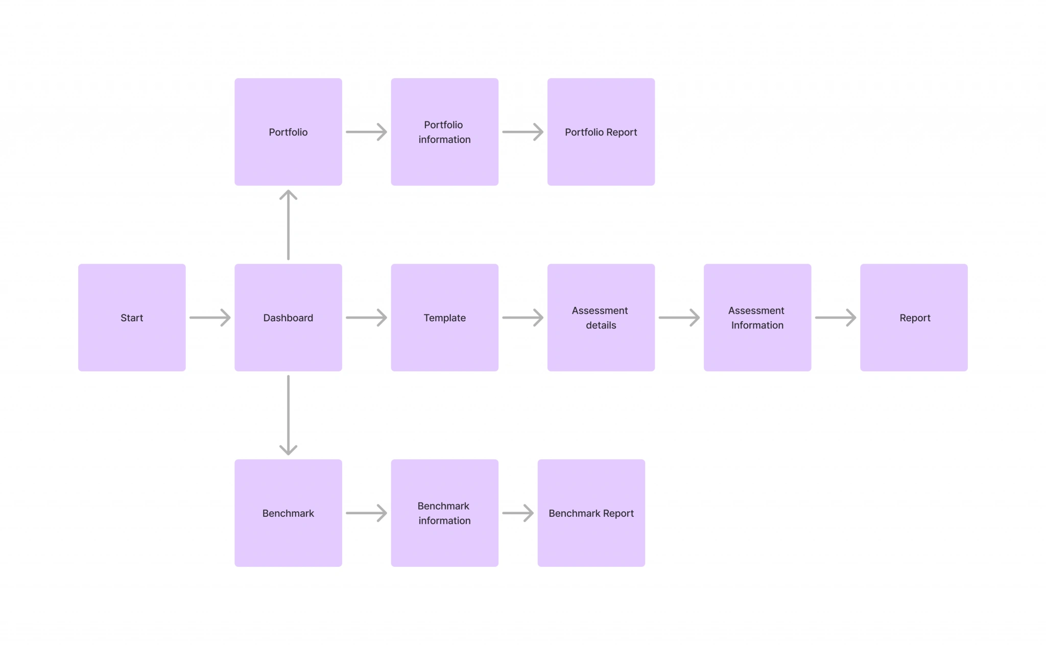
We conducted a focus group with the LCA experts to refine the comparison report flow. The discussion centered around maintaining a similar process to setting up an assessment but introducing the ability to select a benchmark assessment first, followed by up to four additional assessments for comparison.
When it came to chart visualization, the experts proposed using trellis charts for consistency across indicators. However, I raised a critical concern: displaying up to 75 charts for comparison could overwhelm users, creating cognitive overload and resulting in a suboptimal user experience. This feedback prompted a deeper discussion on how to balance detailed insights with usability, ensuring the interface remains accessible and user-friendly.
Wireframes
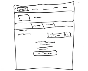
Frame 3550
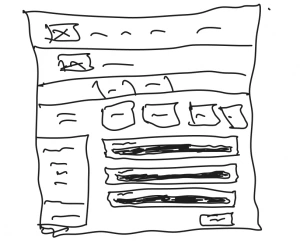
Frame 3552
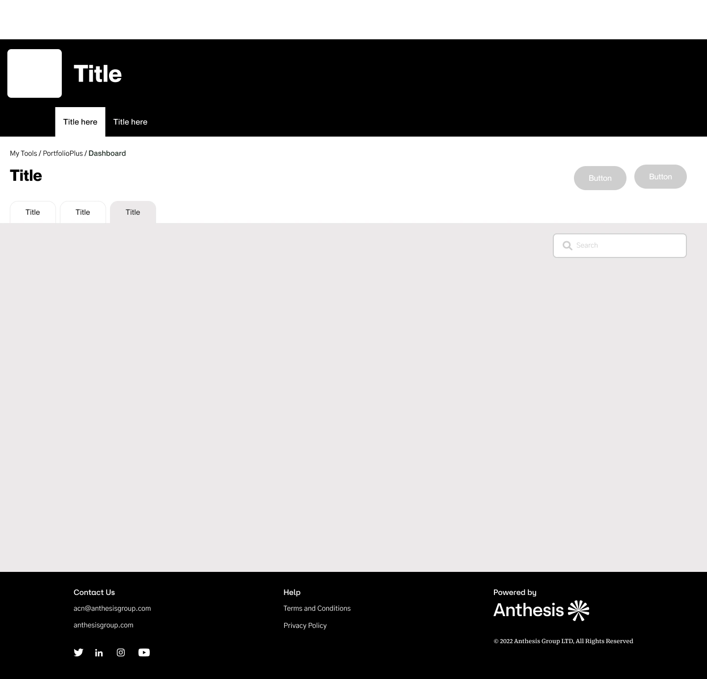
The business requested that the comparison feature be integrated into the dashboard to maintain a seamless workflow. The goal was to allow users to add their assessments to a comparison directly from the dashboard. However, the comparison button would only become visible once users had a minimum of two assessments set up, ensuring the feature is contextually relevant.
Since the dashboard was already designed, the update involved minimal changes: adding a new tab for the comparison feature and a single button for initiating the comparison. All other aspects of the dashboard remained unchanged, preserving its existing structure and usability.
Low fidelity design
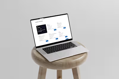
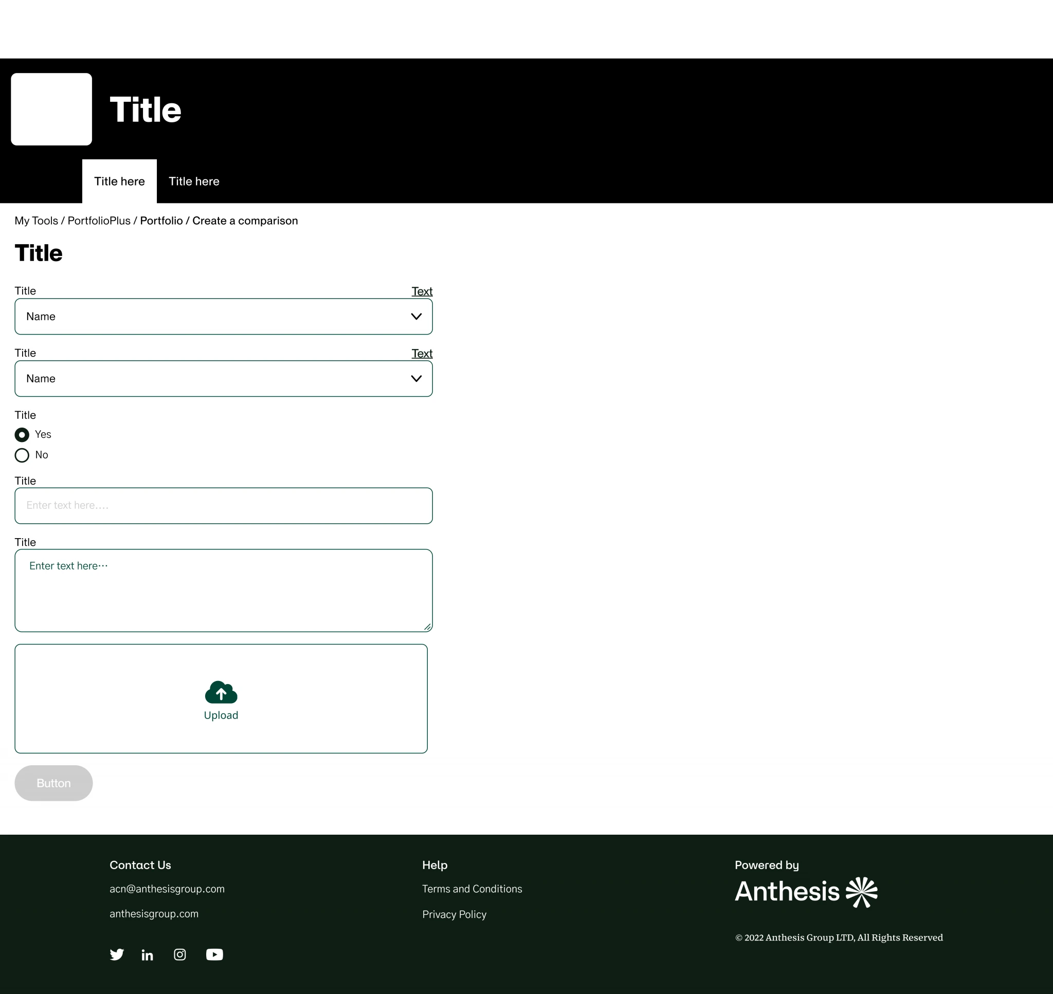
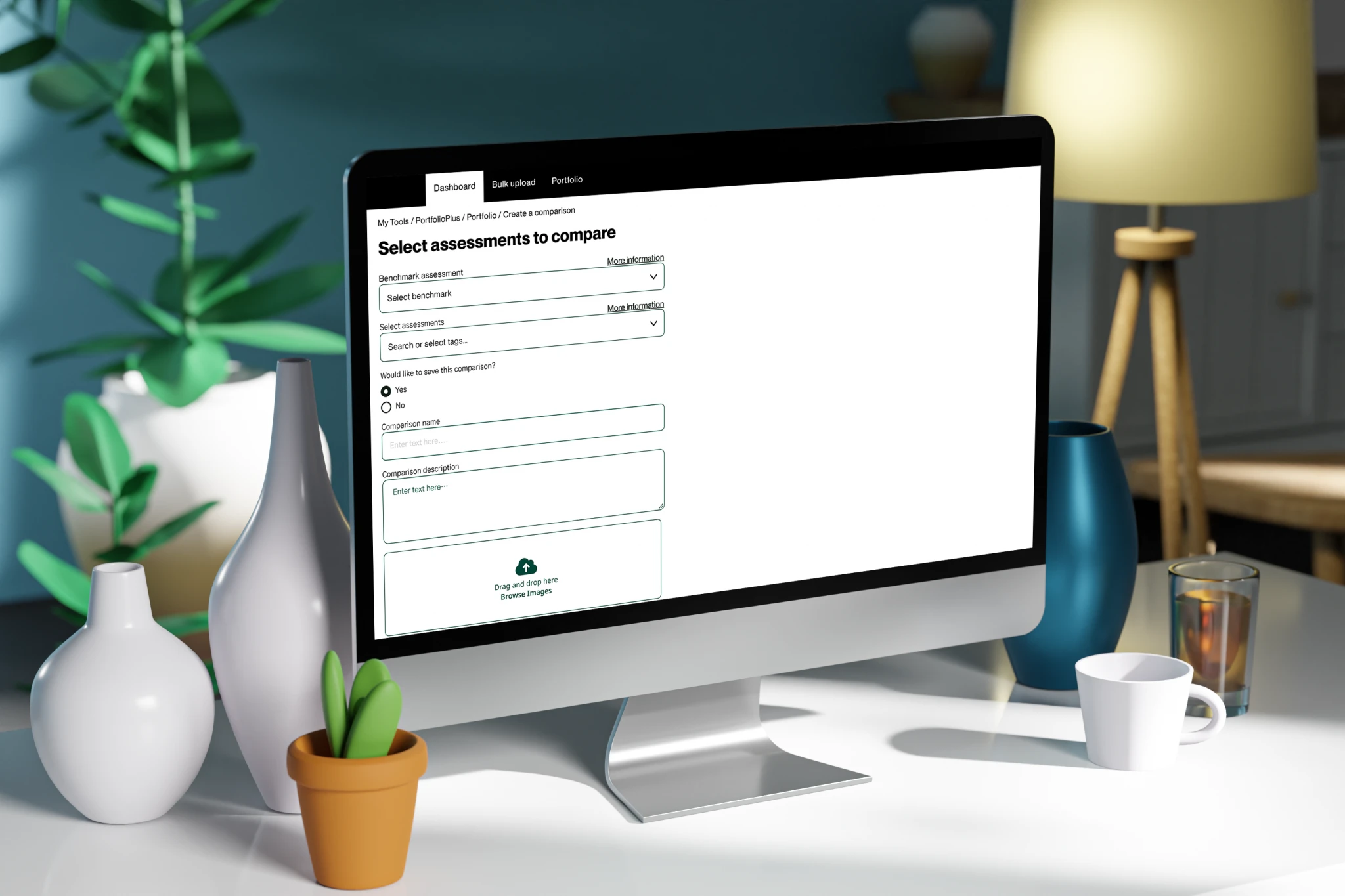
For the comparison setup process, we leveraged the existing assessment setup framework to maintain consistency and reduce redundancy. By reusing the established structure, we streamlined the page, removing unnecessary fields since the required data was already collected during the initial assessment setup. This allowed us to focus on adding only the essential functionality for comparisons.
The setup process now requires users to first select a benchmark assessment, after which the fields for selecting additional assessments become active. This step ensures clarity and enforces the logical flow of the process. The functional unit was removed from this page, as it is inherently tied to the individual assessments.
The remaining elements were designed to facilitate ease of use. Users can assign a name, description, and optionally upload an image to identify the comparison on the dashboard without needing to review detailed information. The addition of a save button completes the setup, making it straightforward and user-friendly.
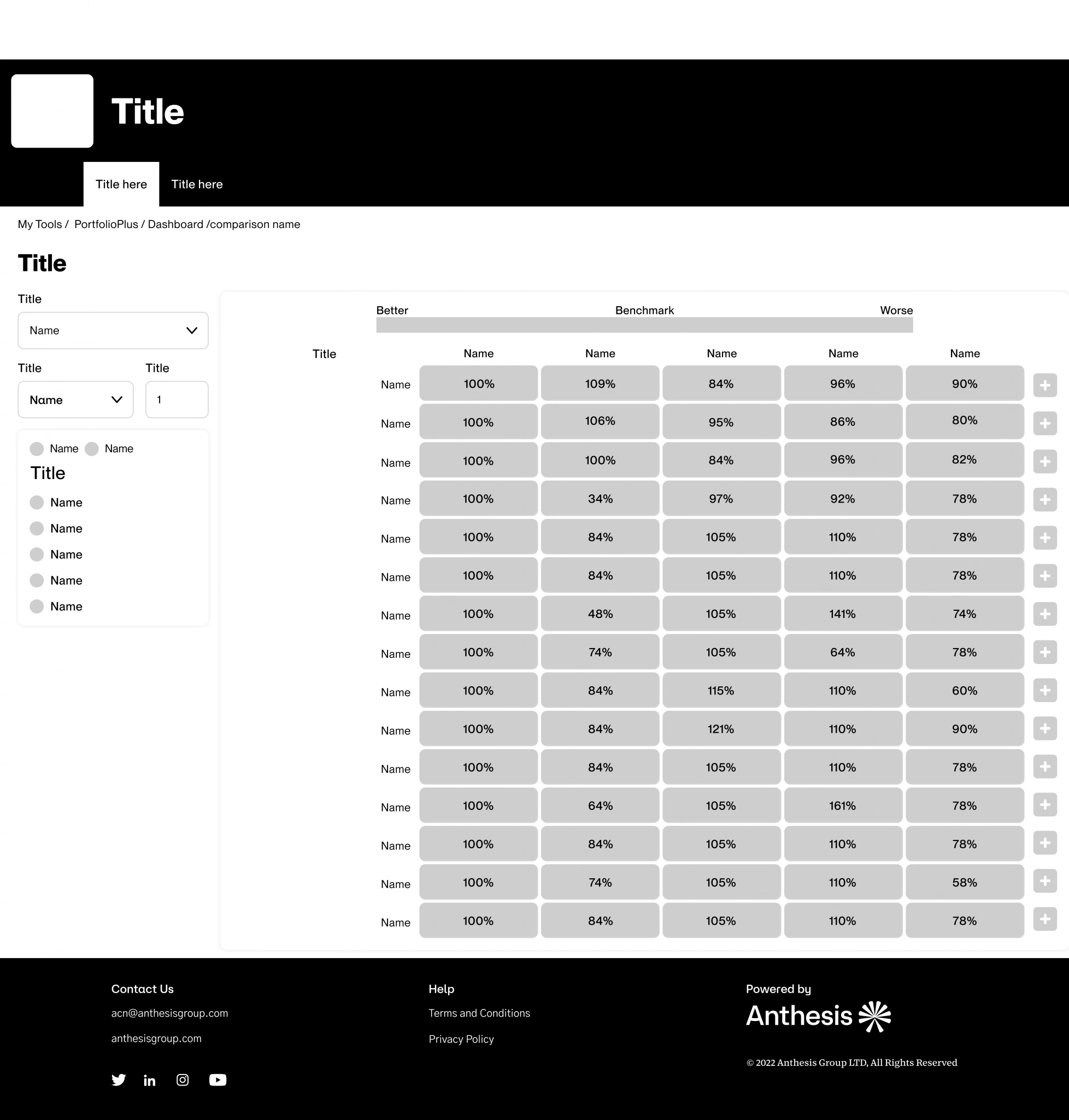
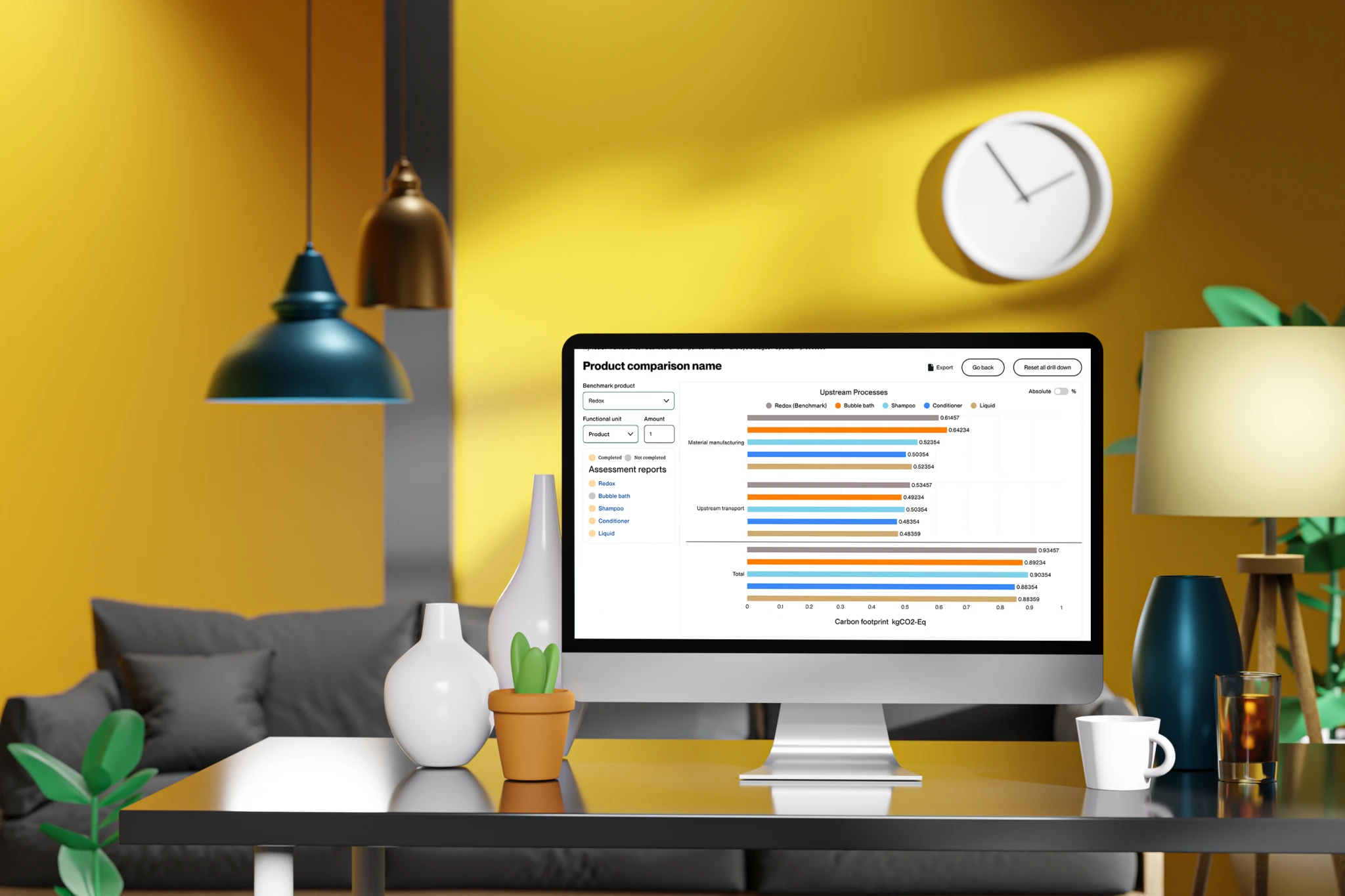
Within the comparison report, users have the flexibility to change the benchmark assessment to any of the other assessments included in the comparison. Additionally, they can adjust the functional unit, allowing for more tailored comparisons. However, since not all assessments may be fully completed, there is a risk of misleading interpretations. To mitigate this, we included a visual indicator that highlights which assessments are complete and which are incomplete, ensuring users are fully informed.
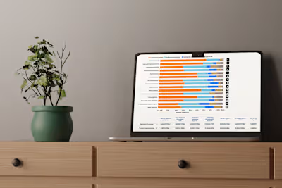
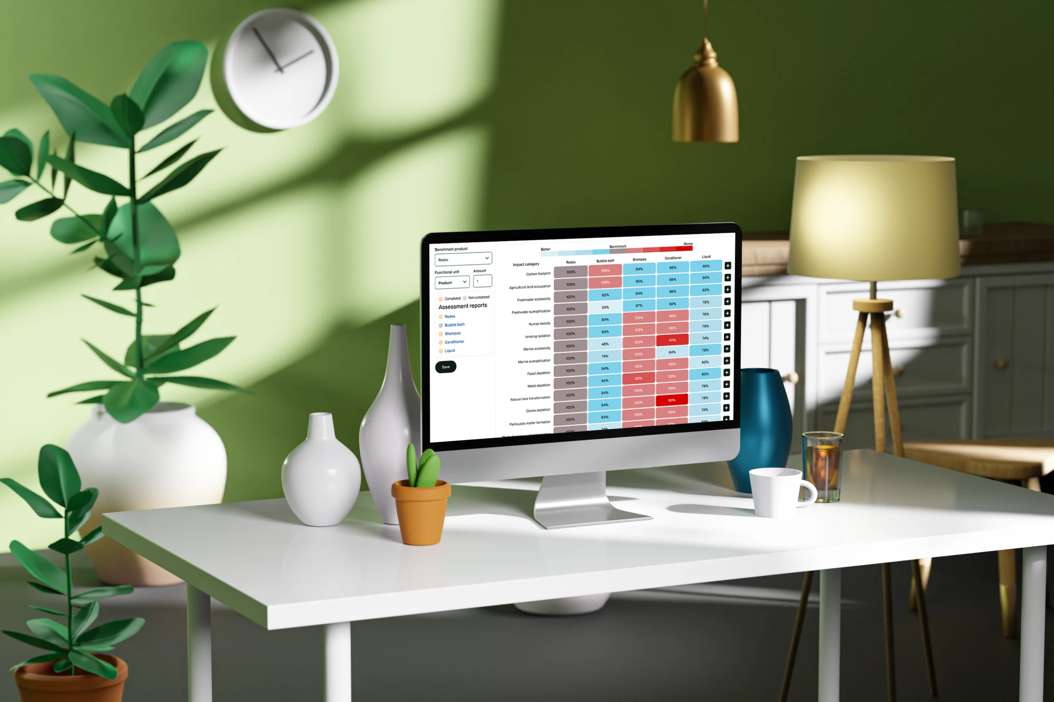
Instead of implementing a trellis chart as recommended by the experts, I dedicated half a day to designing an alternative visualization that improves usability. The final design allows users to quickly scan and identify standout products. Each product is displayed in a box with a percentage relative to the benchmark. The box changes color to indicate whether the product performs better or worse against the benchmark, creating an intuitive, at-a-glance comparison.
For more detailed analysis, users can drill down into specific information. By clicking a plus icon at the end of each row, they can expand into specific indicators, providing a deeper layer of insight while maintaining the overall simplicity of the interface. This approach balances speed, clarity, and depth, enhancing the user experience within the comparison report.
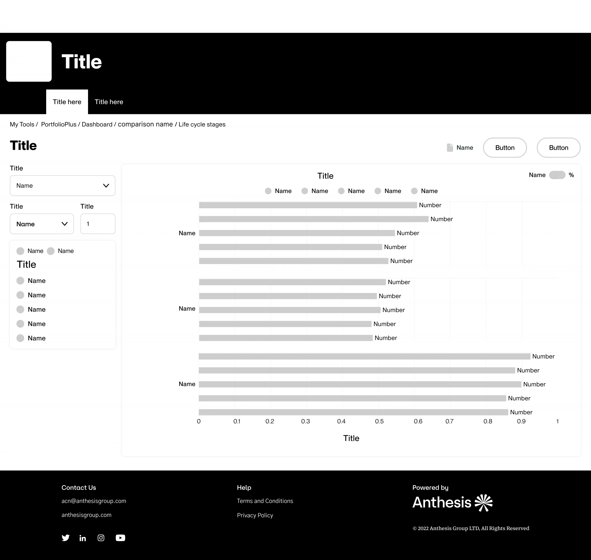
When the user clicks into an indicator, they are presented with a detailed breakdown showing how each assessment is measured against the benchmark for that specific indicator. This view includes individual values for each assessment and a total summary displayed at the bottom for comprehensive analysis.
To enhance flexibility and usability, the user can toggle between viewing data in absolute numbers or percentages, depending on their preference or the level of detail needed. This functionality ensures that users can analyze the data in the format that best supports their decision-making process.
USER TESTING
Once the team finalized the comparison design, we decided to conduct usability testing to gather feedback from a broader audience, particularly since we opted not to use trellis charts, which users were traditionally accustomed to.
The design was tested with five users, and the feedback was overwhelmingly positive. Users consistently highlighted the ease of benchmarking their products using the new main chart design. Many commented that it was significantly more intuitive and faster to compare products compared to trellis charts.
A standout feature that users appreciated was the ability to change the benchmark dynamically within the comparison report. This flexibility eliminated the need to create a new comparison setup whenever they wanted to test a different benchmark. Instead, they could seamlessly adjust the benchmark within the same comparison, enhancing both efficiency and user satisfaction. This feedback validated our design decisions and reinforced the importance of prioritizing usability and adaptability.
Final designs

Conclusion
The comparison feature for the LCA Calculator successfully addresses user needs by providing a flexible, intuitive, and efficient way to evaluate multiple assessments. The ability to dynamically select a benchmark and adjust settings without recreating the comparison setup enhances usability and streamlines workflows.
Through iterative design and usability testing, we validated key decisions, such as moving away from trellis charts in favor of a more user-friendly visualization. This approach allows users to quickly scan, interpret, and act on insights, making comparisons more accessible and impactful.
The integration of features like toggling between absolute numbers and percentages, visual indicators for incomplete assessments, and drill-down capabilities ensures that the comparison report meets both beginner and advanced users’ expectations. By balancing clarity with depth, the comparison functionality delivers on its goal of enabling meaningful, data-driven decision-making, while setting the foundation for future enhancements.
Copyright © UX designer Paul James 2024
Like this project
Posted Nov 25, 2024
Businesses often struggle to compare multiple Life Cycle Assessments (LCAs) due to complex interfaces and limited benchmarking tools.


