Gdgt.com Buying assistance app

Catherine Hicks

Picture a parent in a big-box store, staring at fifty routers, with no idea which one to pick. That's where this starts. I'll be straight about what it is: gdgt / Engadget was a take-home design exercise for a pair of consumer-electronics properties — a hiring exercise, not a shipped product. No launch, no metric at the end. The value on display is the thinking: how I made concrete decisions on a deliberately vague brief with no one to ask.
The ambiguity was the point
The ask was a single paragraph: design a companion mobile app that helps someone shopping for consumer electronics make an educated buying decision, using the rich product data gdgt and Engadget already had. The anchor scenario was the router shelf. That was it — no research, no personas, no KPIs, and critically, no ability to ask a single follow-up question. The exercise was quietly testing whether I could take a fuzzy question, state my assumptions out loud, and commit to a defensible answer. So I made the process the deliverable.
What to pin down first
Before sketching anything, I decided the thing to nail was what information people actually reach for when making a buying decision they don't feel qualified to make. I couldn't run a study, so I answered from prior e-commerce work and a working model of non-technical shoppers: price, ease of use, and compatibility. Those became the principles every screen had to earn its place against.
Meet the shopper in the aisle
My first instinct — search and click through products one at a time — I rejected fast: for someone staring at fifty routers, that's exactly the intimidating experience the brief was trying to fix. So I pivoted to guided entry points that meet the shopper where they physically stand: a curated Product Guide for the person who wants to be led, Search by Store so you only see what's carriable near you, and Scan UPC.
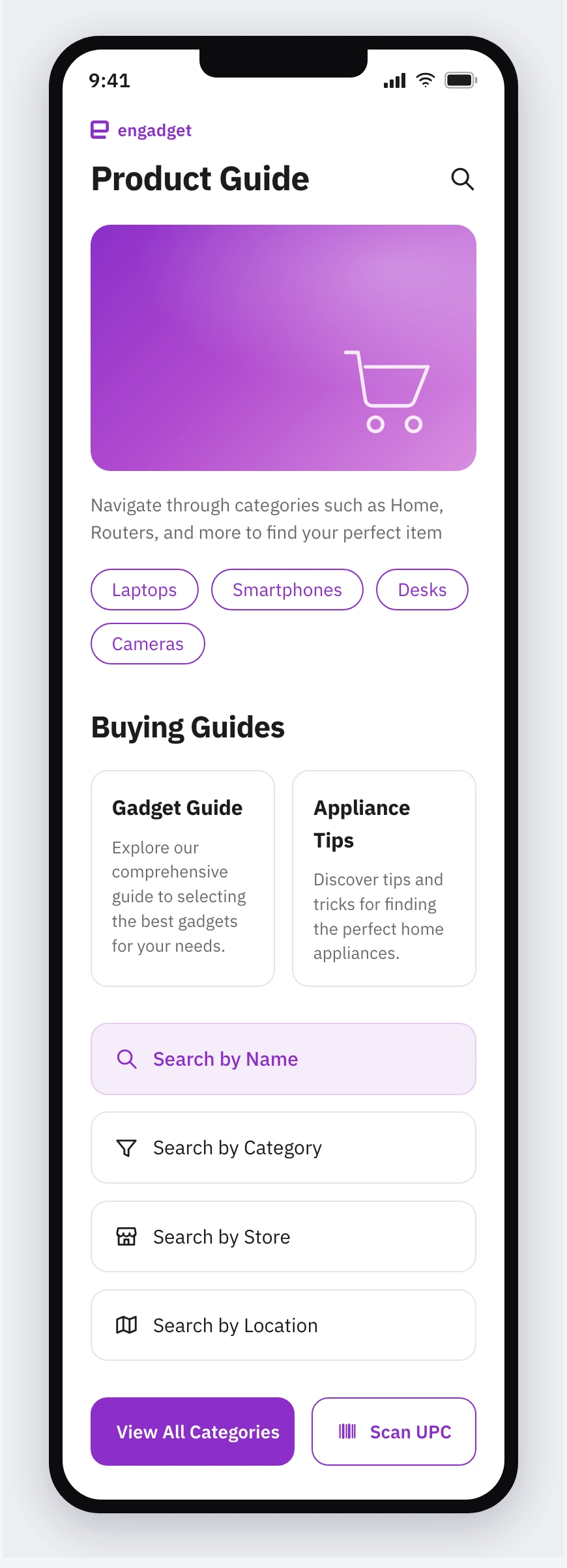
The guided Product Guide home — entry points that meet a non-technical shopper where they stand, instead of dropping them into a search box.
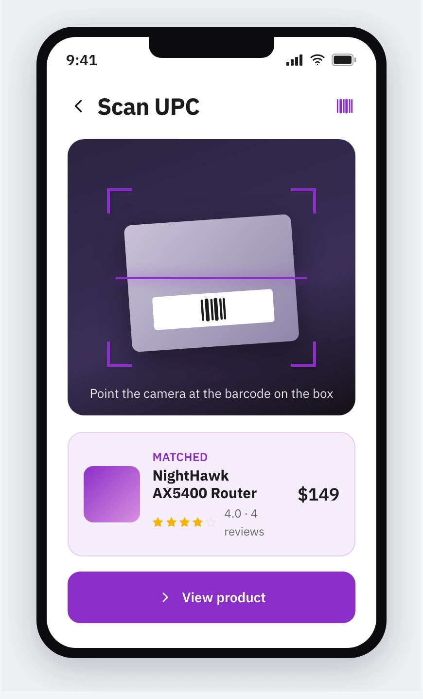
Scan UPC — point the camera at the barcode on the box and it pulls the exact product record, closing the gap between the shelf and the data.
Scan UPC was the move I was proudest of: point the camera at the box in your hand and pull the exact record. It collapses the gap between the physical shelf and the digital data — the real friction in the scenario.
Reviews and specs, layered
The product detail page is where the decision gets made, so I built it around what gdgt and Engadget do best: critic reviews with per-category breakdowns, user reviews kept separate, and a full-specs tab underneath. The principle: serve the primary user without amputating the power user — a trustworthy score at a glance for the non-techie, room to dig for the spec-hungry.
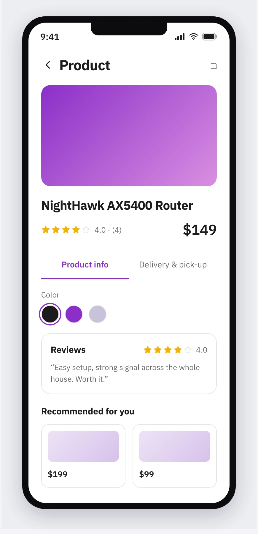
The layered detail page — critic score, user reviews, and full specs in tabs, so the casual shopper and the power user each get what they need.
Structure before styling
I translated the key screens into grayscale wireframes first — so the layout got pressure-tested before a single pixel was styled — then resolved them into a styled flow that leads with price and lets you refine by rating and category.
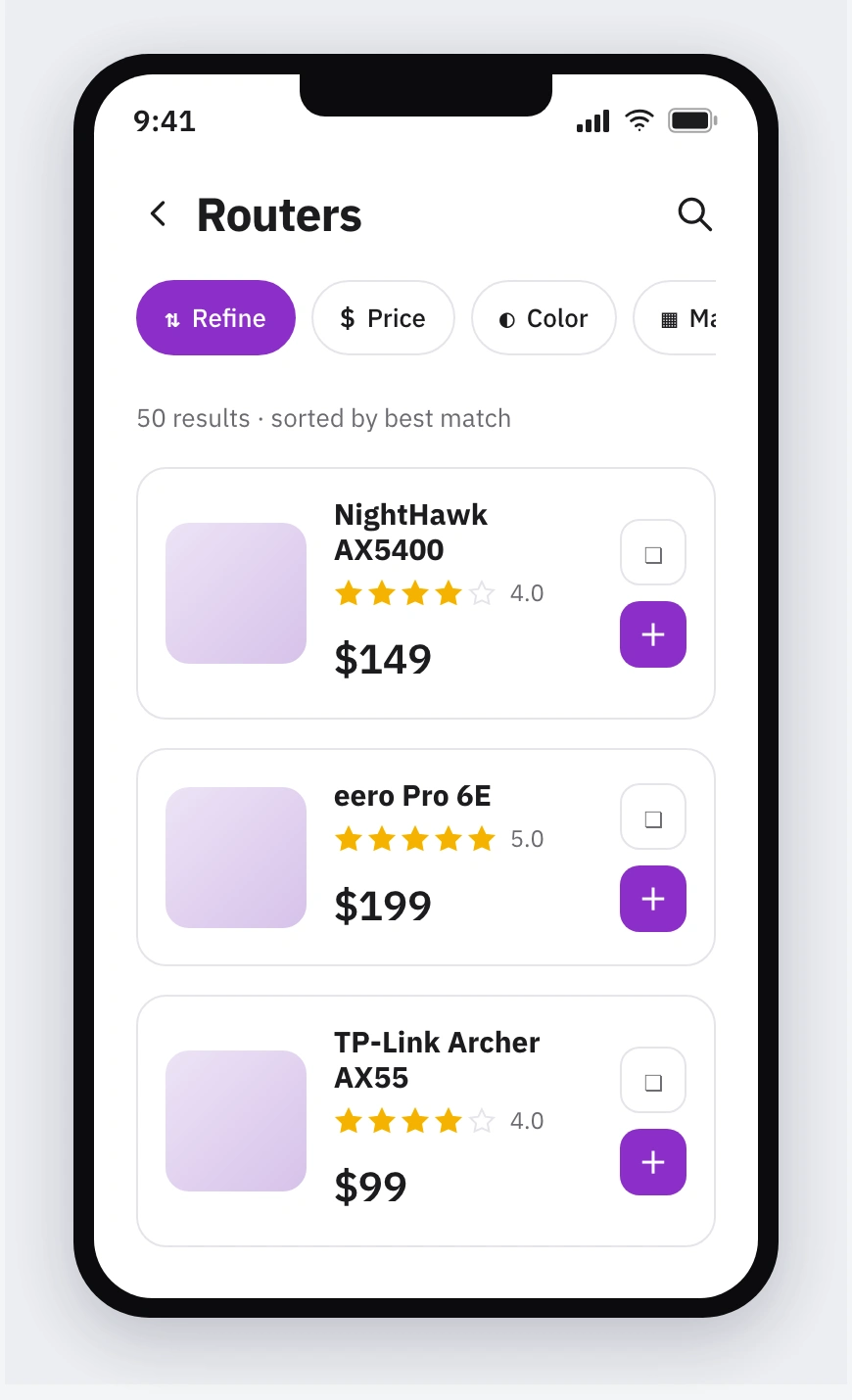
Refine-able results that lead with price — the ranking the shopper actually cares about, filterable by rating and category.
Where it landed
No launch, no metric, and I won't dress it up: after I submitted, there was no further contact. That's the honest ending. But the output was a complete point of view — a phone-in-the-aisle app with three entry points, price-led results, and a review-and-spec detail page, every assumption documented alongside. The lesson that outlived the exercise: stating your assumptions out loud is a design skill in its own right. On a vague brief, the answer isn't to guess the hidden intent — it's to reason from what you know, commit to a point of view, and make that reasoning legible enough to challenge.
See the full case study → https://design-case-studies.vercel.app/gdgt
Like this project
Posted Aug 3, 2026
A phone-in-the-aisle shopping companion for non-technical electronics buyers