Open Influence: making excellent analytics legible

Catherine Hicks

Open Influence is an influencer-marketing platform, and its whole value is data. It can tell you a creator's true reach, whether an audience is authentic, how a post performed, whether a campaign put a brand next to content it would rather avoid. The problem was that all of that intelligence was trapped in the shape of a spreadsheet. A brand manager opening a report shouldn't have to be a data analyst to read it. I came on as a Senior UX Consultant to close that gap — between how smart the data was and how legible it was — across the Go Prism platform.
The Brand Safety report is the problem in one screen
Brand safety is hard to visualize: you're compressing "how risky is it for this brand to work with this creator" into something a marketer trusts in about three seconds. I resolved it as a hierarchy. At the top, a single Overall Risk readout with a plain-language verdict and an info affordance. Below it, the evidence — a feed of creator-post cards, each carrying the content, the platform, a timestamp, and a tidy metric row with engagement rate pulled out and emphasized. Answer first, evidence underneath. That's the move that let a non-analyst act on an analyst's data.
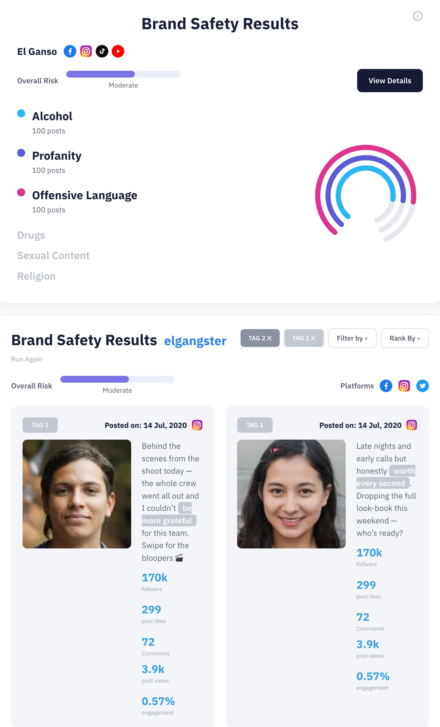
The Brand Safety report resolved as a hierarchy: a single plain-language Overall Risk verdict on top, the evidence feed of creator-post cards beneath. Answer first, evidence underneath.
The creator card shows the same discipline at the atomic level
This is the piece with a clear before/after. The existing card was a vertical stack of five raw numbers at roughly equal weight, so nothing told you where to look. The redesign cut that to the three metrics a brand actually scans — total reach, engagement rate, comments — added a Brand Safe shield badge and a one-tap View Safety Report action right on the card, and used a strip of recent-post thumbnails and platform icons to make each creator legible at a glance in a grid.
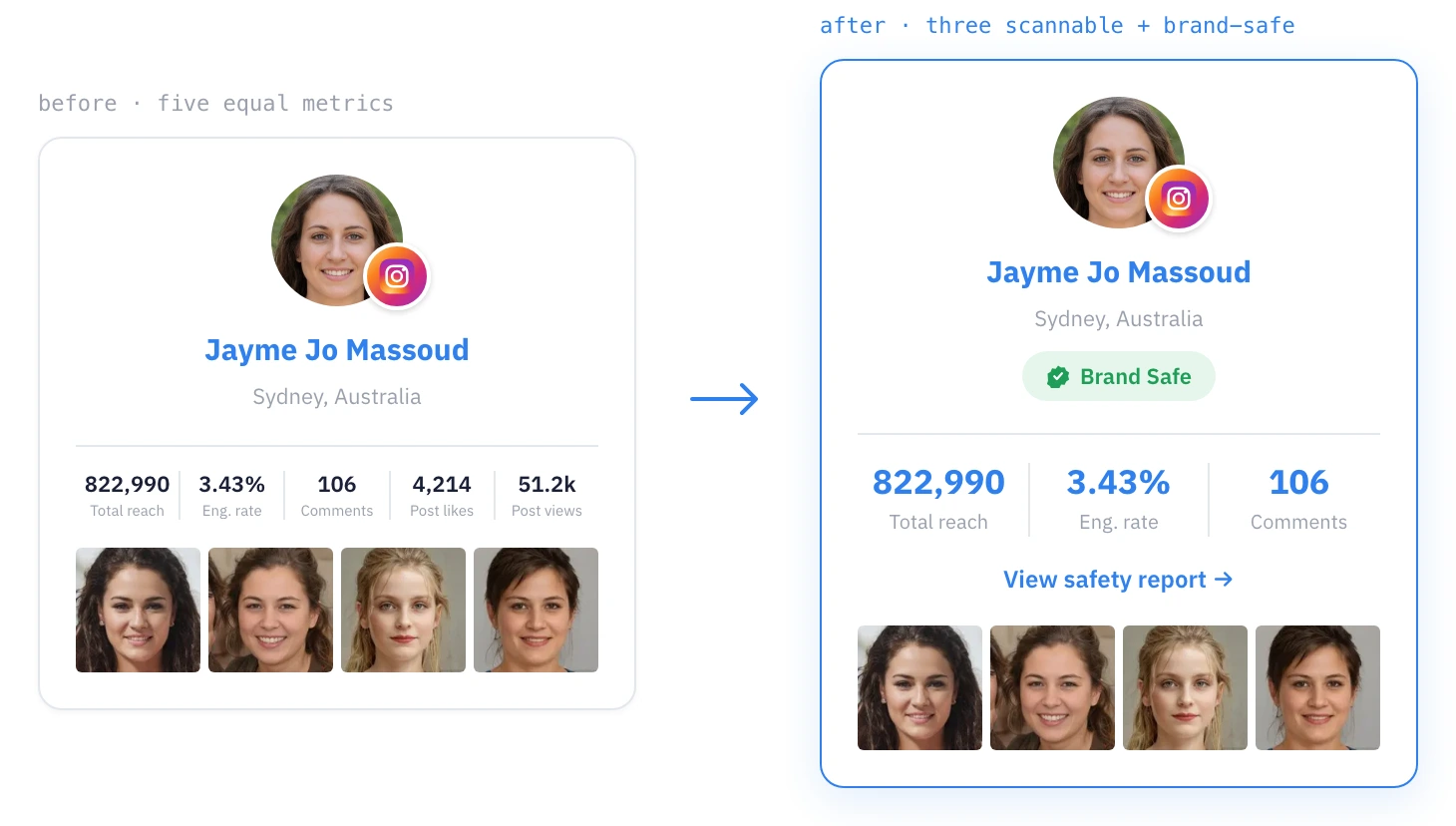
The creator card, before and after: five equal-weight numbers become the three metrics a brand actually scans, plus a Brand Safe badge and a one-tap route into the safety report.
Clarity versus fidelity — the oldest tension in data viz
Social-media performance data is messy and multi-dimensional — reach, authenticity, engagement, sentiment, brand risk, all at once, across platforms that each count things differently. The honest way to present it is complicated; the useful way is simple. My answer was hierarchy rather than omission — headline verdict, then primary metrics, then the drill-down evidence for anyone who wanted it. Nothing accurate got thrown away; it just got put in its proper place in the reading order. The report screens carried that grammar out to the storytelling end — demographics, a radial post-by-platform breakdown, trend lines, brand-activity heatmaps — so the whole surface felt like one product rather than a pile of one-off charts.
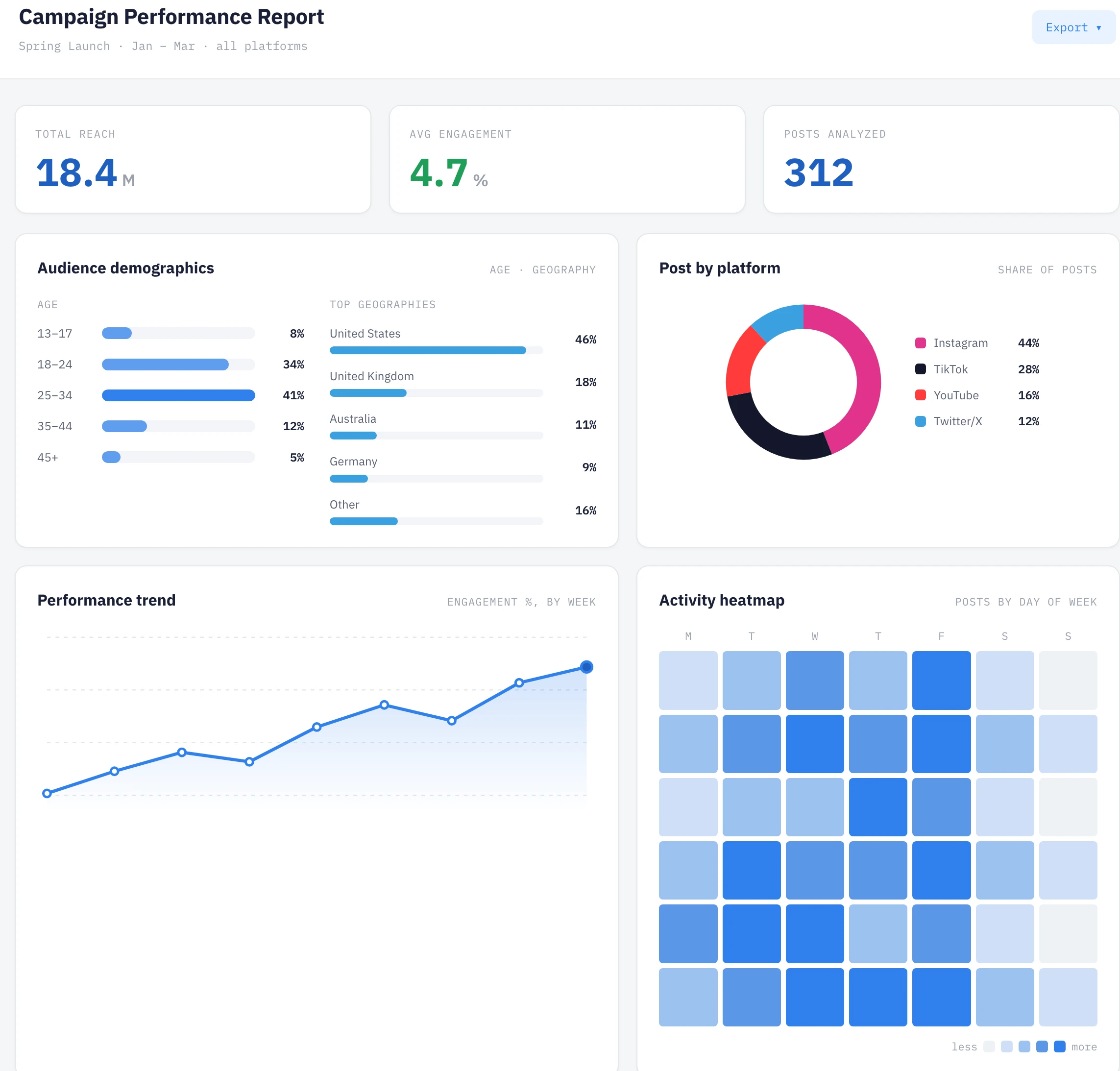
The report screens carry the same grammar to the storytelling end — demographics, a radial post-by-platform breakdown, trend lines — so every Go Prism report reads as one product.
The work was translation, and the recommendations came with evidence
I was a consultant dropped into an existing product and data pipeline, so the work was less invent-from-a-blank-page and more translate. The data already existed; my job was to find the right visual form for it. That made stakeholder collaboration the core of the process — I worked with the people who owned the data and the client relationships to understand what each number meant and what a brand was trying to decide when they looked at it, then turned that into hierarchy: what gets the big number, what gets a chart, what's a quiet supporting stat, what's noise that shouldn't be on the page at all. Alongside the design I audited more than fifteen platforms against a psychological-usability heuristics framework, paired it with a features-and-pricing teardown, and delivered an A/B testing plan so genuinely contested layout decisions could be settled by evidence rather than argument.
I'll keep it honest: those are the deliverables that shipped, not measured outcomes — no metrics or testimonials exist in the source, and I won't invent any.
Two lessons stuck. The visualization is the product, not a coat of paint on it — for a data company, information design is where the intelligence either lands or doesn't. And the fastest way to design a good chart wasn't to study chart types; it was to sit with the people who understood what each number meant and what decision it was meant to drive. Good data visualization is downstream of a good question.
See the full case study → https://design-case-studies.vercel.app/open-influence
Like this project
Posted Aug 3, 2026
Open Influence's whole value is data — reach, audience authenticity, brand risk — but it was trapped in the shape of a spreadsheet. As Senior UX Consultant I closed the gap between how smart the data was and how legible it was, across the Go Prism platform.